版权声明:本文为博主原创文章,未经博主允许不得转载。 https://blog.csdn.net/zhaihaohao1/article/details/84645955
display:flex 是一种布局方式。它即可以应用于容器中,也可以应用于行内元素。是W3C提出的一种新的方案,可以简便、完整、响应式地实现各种页面布局。目前,它已经得到了所有浏览器的支持。
Flex是Flexible Box的缩写,意为"弹性布局",用来为盒状模型提供最大的灵活性。设为Flex布局以后,子元素的float、clear和vertical-align属性将失效。
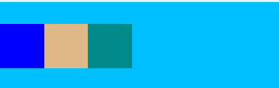
1子元素水平摆放,竖直居中
              display: flex;
              align-items: center;
效果图:
完整代码:
<!DOCTYPE html>
<html>
<head lang="en">
    <meta charset="UTF-8">
    <!-- 适配手机-->
    <meta content="width=device-width, initial-scale=1.0, user-scalable=no" name="viewport">
    <title></title>


      <style>
          *{
              margin: 0px;
              padding: 0px;
          }
          .main{
              width: 100%;
              height: 100px;
              background-color: deepskyblue;
              /*子元素水平摆放,竖直居中*/
              display: flex;
              align-items: center;
          }
      </style>

</head>
<body>

     <div class="main">
         <div style="width: 50px;height: 50px; background-color: blue"></div>
         <div style="width: 50px;height: 50px; background-color: burlywood"></div>
         <div style="width: 50px;height: 50px; background-color: darkcyan"></div>

     </div>

</body>
</html>
2和 justify-content 属性配合使用
2.1 justify-content: flex-start; 默认值。项目位于容器的开头。
              display: flex;
              justify-content: flex-start;

2.2 justify-content: flex-end; 项目位于容器的结尾。
 display: flex;
 justify-content: flex-end;

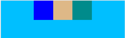
2.3 justify-content: center; 项目位于容器的中心。
              display: flex;
              justify-content: center;
2.4 justify-content:space-between;项目位于各行之间留有空白的容器内。
              display: flex;
              justify-content: space-between;

2.5 justify-content: space-around; 项目位于各行之前、之间、之后都留有空白的容器内。
              display: flex;
              justify-content: space-around;

参考:
http://www.runoob.com/cssref/css3-pr-justify-content.html