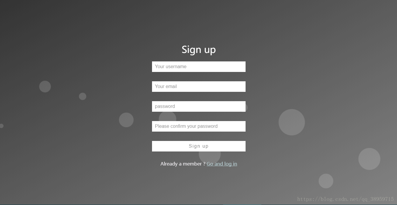
先上效果图吧
平面泡沫
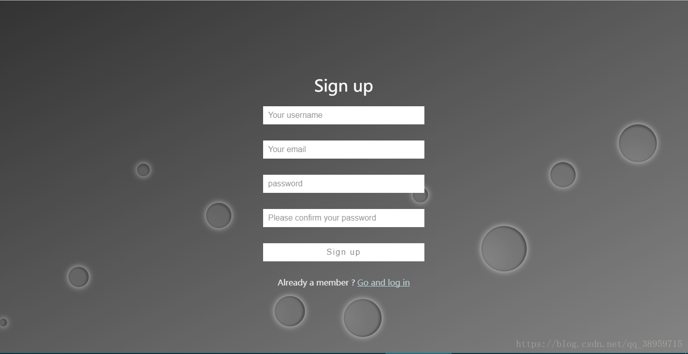
立体泡沫
之前想做动态泡泡的效果,在网上没有搜到类似的样式。所以自己做了一个发上来,给有需要的人参考参考。代码部分有疑问或者有错请在评论指出,尽量快点回复。
代码部分:(无奈,发代码格式一直乱码)
<!DOCTYPE html>
<html>
<head lang="en">
<meta charset="UTF-8">
<title>register</title>
<style type="text/css">
* {
box-sizing: border-box;
}
body {
margin: 0;
padding: 0;
font: 16px/20px microsft yahei;
}
.wrap {
width: 100%;
height: 100%;
padding: 10% 0;
position: fixed;
opacity: 0.8;
background: linear-gradient(to bottom right,#000000, #656565);
background: -webkit-linear-gradient(to bottom right,#50a3a2,#53e3a6);
}
.container {
width: 60%;
margin: 0 auto;
}
.container h1 {
text-align: center;
color: #FFFFFF;
font-weight: 500;
}
.container input {
width: 320px;
display: block;
height: 36px;
border: 0;
outline: 0;
padding: 6px 10px;
line-height: 24px;
margin: 32px auto;
-webkit-transition: all 0s ease-in 0.1ms;
-moz-transition: all 0s ease-in 0.1ms;
transition: all 0s ease-in 0.1ms;
}
.container input[type="text"] , .container input[type="password"] {
background-color: #FFFFFF;
font-size: 16px;
color: #50a3a2;
}
.container input[type='submit'] {
font-size: 16px;
letter-spacing: 2px;
color: #666666;
background-color: #FFFFFF;
}
.container input:focus {
width: 400px;
}
.container input[type='submit']:hover {
cursor: pointer;
width: 400px;
}
.to_login{
color: #a7c4c9;
}
.text{
color: #e2dfe4;
}
.wrap ul {
position: absolute;
top: 0;
left: 0;
width: 100%;
height: 100%;
z-index: -20;
}
.wrap ul li {
list-style-type: none;
display: block;
position: absolute;
bottom: -120px;
width: 15px;
height: 15px;
z-index: -8;
border-radius: 50%;
background-color:rgba(255, 255, 255, 0.15);
animotion: square 25s infinite;
-webkit-animation: square 25s infinite;
}
.wrap ul li:nth-child(1) {
left: 0;
animation-duration: 10s;
-moz-animation-duration: 10s;
-o-animation-duration: 10s;
-webkit-animation-duration: 10s;
}
.wrap ul li:nth-child(2) {
width: 40px;
height: 40px;
left: 10%;
animation-duration: 15s;
-moz-animation-duration: 15s;
-o-animation-duration: 15s;
-webkit-animation-duration: 11s;
}
.wrap ul li:nth-child(3) {
left: 20%;
width: 25px;
height: 25px;
animation-duration: 12s;
-moz-animation-duration: 12s;
-o-animation-duration: 12s;
-webkit-animation-duration: 12s;
}
.wrap ul li:nth-child(4) {
width: 50px;
height: 50px;
left: 30%;
-webkit-animation-delay: 3s;
-moz-animation-delay: 3s;
-o-animation-delay: 3s;
animation-delay: 3s;
animation-duration: 12s;
-moz-animation-duration: 12s;
-o-animation-duration: 12s;
-webkit-animation-duration: 12s;
}
.wrap ul li:nth-child(5) {
width: 60px;
height: 60px;
left: 40%;
animation-duration: 10s;
-moz-animation-duration: 10s;
-o-animation-duration: 10s;
-webkit-animation-duration: 10s;
}
.wrap ul li:nth-child(6) {
width: 75px;
height: 75px;
left: 50%;
-webkit-animation-delay: 7s;
-moz-animation-delay: 7s;
-o-animation-delay: 7s;
animation-delay: 7s;
}
.wrap ul li:nth-child(7) {
left: 60%;
width: 30px;
height: 30px;
animation-duration: 8s;
-moz-animation-duration: 8s;
-o-animation-duration: 8s;
-webkit-animation-duration: 8s;
}
.wrap ul li:nth-child(8) {
width: 90px;
height: 90px;
left: 70%;
-webkit-animation-delay: 4s;
-moz-animation-delay: 4s;
-o-animation-delay: 4s;
animation-delay: 4s;
}
.wrap ul li:nth-child(9) {
width: 50px;
height: 50px;
left: 80%;
animation-duration: 20s;
-moz-animation-duration: 20s;
-o-animation-duration: 20s;
-webkit-animation-duration: 20s;
}
.wrap ul li:nth-child(10) {
width: 75px;
height: 75px;
left: 90%;
-webkit-animation-delay: 6s;
-moz-animation-delay: 6s;
-o-animation-delay: 6s;
animation-delay: 6s;
animation-duration: 30s;
-moz-animation-duration: 30s;
-o-animation-duration: 30s;
-webkit-animation-duration: 30s;
}
@keyframes square {
0% {
-webkit-transform: translateY(0);
transform: translateY(0)
}
100% {
bottom: 400px;
-webkit-transform: translateY(-500);
transform: translateY(-500)
}
}
@-webkit-keyframes square {
0% {
-webkit-transform: translateY(0);
transform: translateY(0)
}
100% {
bottom: 400px;
-webkit-transform: translateY(-500);
transform: translateY(-500)
}
}
</style>
</head>
<body>
<div class="wrap">
<div class="container">
<h1>Sign up</h1>
<form>
<input type="text" placeholder="Your username"/>
<input type="text" placeholder="Your email"/>
<input type="password" placeholder="password" />
<input type="password" placeholder="Please confirm your password" />
<input type="submit" value="Sign up"/>
<p class="change_link" align="center">
<span class="text">Already a member ?</span>
<a href="login.html" class="to_login"> Go and log in </a>
</p>
</form>
</div>
<ul>
<li></li>
<li></li>
<li></li>
<li></li>
<li></li>
<li></li>
<li></li>
<li></li>
<li></li>
<li></li>
</ul>
</div>
</body>
</html>
立体效果的话,在无序列表li增加box-shadow属性,根据自己需求调整即可。
我把我的发出来
.wrap ul li {list-style-type: none;
display: block;
position: absolute;
bottom: -120px;
width: 15px;
height: 15px;
z-index: -8;
border-radius: 50%;
box-shadow: inset -30px -30px 75px rgba(0, 0, 0, .2),
inset 0px 0px 5px rgba(0, 0, 0, .5),
inset -3px -3px 5px rgba(0, 0, 0, .5),
0 0 20px rgba(255, 255, 255, .75);
background-color:rgba(255, 255, 255, 0.15);
animotion: square 25s infinite;
-webkit-animation: square 25s infinite;
}