目录
页面布局Padding Row Column Flex Expanded组件
页面布局 AspectRatio Card CircleAvatar
FloatingActionButton组件实现底部导航凸起按钮
Scaffold floatingActionButtonLocation
AppBar TabBar TabBarView实现顶部滑动导航
1、混入SingleTickerProviderStateMixin
Container容器组件
基本的代码结构
import 'package:flutter/material.dart';

class MyApp extends StatelessWidget {
  const MyApp({super.key});

  @override
  Widget build(BuildContext context) {
    return const Center(
      child: Text("hello flutter"),
    );
  }
}

main() {
  runApp(MaterialApp(
      home: Scaffold( //类型为Widget表示可以是任意组件类型
    appBar: AppBar(
      title: const Text("title!"),
    ),
    body: const MyApp(),
  )));
}
container是容器组件,与html中的div较类似。

Constains不是常量构造函数,所以其外部的const也要都去掉
class MyApp extends StatelessWidget {
  const MyApp({super.key});

  @override
  Widget build(BuildContext context) {
    return Center(
      child: Container(
        alignment: Alignment.center, //配置container容器内元素的方位
        width: 100,
        height: 100,
        //decoration设置背景
        decoration: const BoxDecoration(
            color: Colors.red), //这里提示要用Decoration类装饰decoration,我们用其子类也是可以的
        child: const Text(
          "hello flutter",
          style: TextStyle(color: Colors.white),
        ),
      ),
    );
  }
}
decoration属性


decoration设置背景,如背景色、背景边框等
decoration: BoxDecoration(//这里提示要用Decoration类装饰decoration,我们用其子类也是可以的
            color: Colors.yellow,
            border: Border.all(color: Colors.red, width: 5)
            ),
因为Border.all是个factory构造函数,不是常量的,所以上面的const BoxDecoration需要去掉const
decoration其他属性
borderRadius: BorderRadius.circular(10), //配置圆角,足够大则可以变成圆
            boxShadow: const [    //配置阴影效果
              BoxShadow(color: Colors.blue, blurRadius: 20.0)
            ]


//gradient设置背景颜色渐变,LinearGradient背景线性渐变(下面这个表示红色渐变到黄色),RadialGradient径向渐变
            gradient:
                const RadialGradient(colors: [Colors.red, Colors.yellow])
通过Container创建一个按钮
class MyButton extends StatelessWidget {
  //自定义一个按钮
  const MyButton({super.key});
  @override
  Widget build(BuildContext context) {
    return Container(
      alignment: Alignment.center,
      width: 200,
      height: 40,
      // 设置外边距,上下左右(EdgeInsets.all)都是10,分开设置EdgeInsets.fromLTRB
      margin: const EdgeInsets.all(10),
      decoration: BoxDecoration(
          color: Colors.blue,
          // 这里borderRadius提示应用BorderRadiusGeometry修饰,但BorderRadiusGeometry是个抽象类,我们要用其子类来修饰
          // 而BorderRadius是个命名构造函数,不是常量构造函数,外层const应去掉;当然我们也可以用BorderRadius的其他常量构造函数,此时就不用去掉const了,如borderRadius: BorderRadius.all(Radius.circular(10))
          borderRadius: BorderRadius.circular(10)
          ),
      child: const Text(
        "按钮",
        style: TextStyle(color: Colors.white, fontSize: 20),
      ),
    );
  }
}

main() {
  runApp(MaterialApp(
      home: Scaffold(
    //类型为Widget表示可以是任意组件类型
    appBar: AppBar(
      title: const Text("title!"),
    ),
    body: Column(
      //通过列加载多个组件
      children: const [MyApp(), MyButton()],
    ),
  )));
}

padding和maring属性
padding是让容器和里面的元素有相应的间距,margin是容器和容器外部的其他容器有相应的间距
transform属性
让容器旋转等
// 位移,分别向x、y、z位移的距离(在当前位置进行位移)
        transform: Matrix4.translationValues(40, 0, 0), //向右,负数则为向左

//旋转
transform: Matrix4.rotationZ(0.2),

//缩放
transform: Matrix4.skewY(0.2),
Text组件

TextStyle参数

class MyText extends StatelessWidget {
  const MyText({super.key});
  @override
  Widget build(BuildContext context) {
    return Container(
      width: 200,
      height: 200,
      margin: const EdgeInsets.fromLTRB(0, 60, 0, 0), //设置和上面一个间隔开一些
      decoration: const BoxDecoration(color: Colors.yellow),
      child: const Text(
        "Text组件",
        textAlign: TextAlign.center,  //文字居中显示
      ),
    );
  }
}


        maxLines: 1,    //最多显示一行
        overflow: TextOverflow.ellipsis,  //溢出时显示的内容
图片组件
Flutter中,可以通过Image组件来加载并显示图片,Image的数据源可以是asset、文件、内存以及网络
Image.asset:本地图片
Image.network:远程图片
Image组件常用属性:


其他属性参数:Image class - widgets library - Dart API
基本代码结构
import 'package:flutter/material.dart';
main(){
  runApp(MaterialApp(
    home: Scaffold(
      appBar: AppBar(title: const Text("title"),),
      body: const MyApp(),
    )
  ));
}

class MyApp extends StatelessWidget {
  const MyApp({super.key});
  @override
  Widget build(BuildContext context) {
    return Container();
  }
}
Widget build(BuildContext context) {
return Center(
// 一般放在容器里面,比较好控制
child: Container(
height: 150,
width: 150,
decoration: const BoxDecoration(color: Colors.yellow),
child: Image.network("https://img1.baidu.com/it/u=413643897,2296924942&fm=253&fmt=auto&app=138&f=JPEG?w=800&h=500"),
),
);
}
Image.network的一些属性
src:图片源地址
scale:缩放比例,如2即缩小一倍
alignment:设置位置,默认居中,可以通过Alignment.centerLeft设置靠左
fit:控制图片的拉伸和挤压,如BoxFit.fill为全图显示,图片会被拉伸充满父容器;BoxFit.cover对图片剪裁并充满容器(图片不变形);BoxFit.contain全图显示,默认的;BoxFit
Container实现圆形图片
通过container的decoration来实现
class Circular extends StatelessWidget {
  const Circular({super.key});

  @override
  Widget build(BuildContext context) {
    return Container(
      height: 150,
      width: 150,
      decoration: BoxDecoration(
        color: Colors.yellow,
        // 圆形需要配置成高度的一半
        borderRadius: BorderRadius.circular(75),
        image: const DecorationImage(
          image: NetworkImage("https://img1.baidu.com/it/u=413643897,2296924942&fm=253&fmt=auto&app=138&f=JPEG?w=800&h=500"),
          fit: BoxFit.cover
          )
      ),
    );
  }
}

ClipOval实现圆形图片
class ClipImage extends StatelessWidget {
  const ClipImage({super.key});
  @override
  Widget build(BuildContext context) {
    return ClipOval(  //默认可能会是椭圆,配置一下高宽
      child: Image.network(
        "https://img1.baidu.com/it/u=413643897,2296924942&fm=253&fmt=auto&app=138&f=JPEG?w=800&h=500",
        width: 150,
        height: 150,
        fit: BoxFit.cover,
      ),
    );
  }
}

Column(
        children: const [MyApp(), SizedBox(height: 20,), Circular(),SizedBox(height: 20,), ClipImage()],
      )
Scaffold的children中可以加入一个SizeBox区块实现分隔的效果
加载本地图片
本项目目录下新建一个images文件夹,里面新建两个文件夹:2.0x、3.0x,然后把文件在images及两个文件夹都放一份
接下来修改pubspec.yaml文件

class LocalImage extends StatelessWidget {
  const LocalImage({super.key});
  @override
  Widget build(BuildContext context) {
    return Container(
      height: 150,
      width: 150,
      decoration: const BoxDecoration(color: Colors.yellow),
      child: Image.asset("images/a.jpg", fit: BoxFit.cover),
    );
  }
}
图标组件
MaterialApp的theme,可以设置主题的相关样式,如ThemeData(primarySwatch:Colors.yellow)设置主题为黄色。
基本结构
import 'package:flutter/material.dart';
main(){
  runApp(const MyApp());
}

class MyApp extends StatelessWidget {
  const MyApp({super.key});
  @override
  Widget build(BuildContext context) {
    return MaterialApp(
      theme: ThemeData(primarySwatch: Colors.yellow),
      home:Scaffold(
        appBar: AppBar(title: const Text("title"),),
        body: const MyHomePage(),
      )
    );
  }
}
class MyHomePage extends StatelessWidget {
  const MyHomePage({super.key});
  @override
  Widget build(BuildContext context) {
    return const Text("hello");
  }
}

自带的Icons图标
class MyHomePage extends StatelessWidget {
  const MyHomePage({super.key});
  @override
  Widget build(BuildContext context) {
    return Column(
      children: const [
        Icon(Icons.home, size: 40, color: Colors.red,)    //定义大小和图标颜色
      ],
    );
  }
}
Materia Design所有图标可以在官网查看:https://material.io/tools/icons/
借助阿里巴巴图标库自定义字体图标
也是自定义字体图标,阿里巴巴图标库(iconfont-阿里巴巴矢量图标库)上右很多字体图标素材
可以选择自己需要的图标打包下载后,会生成一些不同格式的字体文件,flutter中用ttf格式即可。
在iconfont下载这些图标的代码
1、导入字体图标文件,假设路径为fonts/iconfont.ttf
2、在pubsepc.yaml中引入我们的图标文件。
在项目根目录下新建一个fonts文件夹,将从iconfont下载的文件中的.json(json不一定要复制,主要是引入的时候需要用到里面的编码)和.ttf文件放到这个目录下
接下来修改pubspec.yaml中的font
配置一个字体如下:

接下来再lib下新建一个MyFont.dart引入
MyFont.dart中的内容
import 'package:flutter/material.dart';

class MyFont{
  static const IconData book = IconData(
    0xf00a1,  //在json文件中每个图标有个unicode编码,再起前面加上0x就是这个参数
    fontFamily: "MyIcon", //pubspec.yaml中font参数的family
    matchTextDirection: true
  );
  static const IconData weixin = IconData(
    0xe8bb,
    fontFamily: "MyIcon",
    matchTextDirection: true
  );
  static const IconData cart = IconData(
    0xf0179,
    fontFamily: "MyIcon",
    matchTextDirection: true
  );
}
main.dart中引用
import './MyFont.dart';

Icon(MyFont.book, size: 40,color: Colors.orange,),
SizedBox(height: 20,),
Icon(MyFont.weixin, size: 40,color: Colors.green,),
SizedBox(height: 20,),
Icon(MyFont.cart, size: 40,color: Colors.black,),
多个图标文件加载,同样是将.ttf文件保存到font文件夹下,然后修改pubspec.yaml文件
  fonts:
    - family: MyIcon
      fonts:
        - asset: fonts/iconfont.ttf
    - family: MyIcon1
      fonts:
        - asset: fonts/iconfont1.ttf
接下来一样在lib的MyFont.dart中如上面那样编写,只不过要注意修改fontFamily参数。
ListView列表组件
列表布局是最常用的一种布局方式。flutter中可以通过ListView来定义列表项,支持垂直和水平方向展示。通过一个属性就可以控制列表的显示方向。
列表有以下几种分类:
- 垂直列表
- 垂直图文列表
- 水平列表
- 动态列表

前面用Column的时候如果超出界面范围,下面的就不显示了,我们直接把Column换成ListView即可,此时可以滑动。
垂直列表
    return ListView(
      children: const [
        ListTile(title: Text("列表"),),
        Divider(),  //横线
        ListTile(title: Text("列表"),),
        Divider(),  //横线
        ListTile(title: Text("列表"),),
        Divider(),  //横线
        ListTile(title: Text("列表"),),
        ListTile(title: Text("列表"),),
        ListTile(title: Text("列表"),),
        ListTile(title: Text("列表"),),
        ListTile(title: Text("列表"),),
        ListTile(title: Text("列表"),),
        ListTile(title: Text("列表"),),
      ],
    );

ListTile(列表项)的一些属性用法:
title:标题
subtitle:副标题
leading:可以在前面加图标或图片
trailing:可以在后面加图标或图片
onTap:配置点击事件
列表项显示图标和分割线
return ListView(
      children: const [
        ListTile(
          leading: Icon(Icons.home),
          title: Text("首页")
        ),
        Divider(),
        ListTile(
          leading: Icon(Icons.assignment, color: Colors.red,),
          title: Text("全部订单"),
        ),
        Divider(),
        ListTile(
          leading: Icon(Icons.payment, color: Colors.green,),
          title: Text("待付款"),
        ),
        ListTile(
          leading: Icon(Icons.favorite, color: Colors.lightGreen,),
          title: Text("我的收藏"),
        ),
        Divider(),
        ListTile(
          leading: Icon(Icons.people, color: Colors.black54,),
          title: Text("在线客服"),
          trailing: Icon(Icons.chevron_right_sharp),
        )
      ],
    );
实现图文列表,修改ListTile中的title、leading、subtitle。
return ListView(
      padding: const EdgeInsets.fromLTRB(0, 10, 0, 0),  //设备内部组件边距
      children: [
        ListTile(
          leading: Image.network("https://pic.rmb.bdstatic.com/bjh/news/80f7dbb7d23db98155e168d17521f5ec6303.jpeg"),
          title: const Text("iPhone SE4参数曝光:全面屏设计+A16处理器,起售价3499元起"),
          subtitle: const Text("最近关于iPhone SE4的相关爆料也越来越多,尤其是iPhone14系列爆冷,使得很多喜欢小屏党的用户更加期待iPhone SE4这款机型。"),
        ),
        const Divider(),
        ListTile(  //前后都加图片
          leading: Image.network("https://pic.rmb.bdstatic.com/bjh/news/80f7dbb7d23db98155e168d17521f5ec6303.jpeg"),
          title: const Text("iPhone SE4参数曝光:全面屏设计+A16处理器,起售价3499元起"),
          subtitle: const Text("最近关于iPhone SE4的相关爆料也越来越多,尤其是iPhone14系列爆冷,使得很多喜欢小屏党的用户更加期待iPhone SE4这款机型。"),
          trailing: Image.network("https://pic.rmb.bdstatic.com/bjh/news/dc4994713776e6038b5e79b6646e8c852704.jpeg"),
        )
      ]
    );

ListView用Widget修饰即可,因此可以用任意的组件。这里我们试试用Image组件
    return ListView(
      padding: const EdgeInsets.all(10),
      children: [
       Image.network("https://pic.rmb.bdstatic.com/bjh/news/80f7dbb7d23db98155e168d17521f5ec6303.jpeg"),
       Container(
        padding: const EdgeInsets.fromLTRB(0, 6, 0, 0),
        height: 44,
        child: const Text("标题1", textAlign: TextAlign.center,style: TextStyle(fontSize: 22),),
       ),
       Image.network("https://pic.rmb.bdstatic.com/bjh/news/80f7dbb7d23db98155e168d17521f5ec6303.jpeg"),
       Image.network("https://pic.rmb.bdstatic.com/bjh/news/dc4994713776e6038b5e79b6646e8c852704.jpeg"),
      ]
    );
水平列表 可左右滑动


ListView中的container的宽度是自适应的,改了也没有用(对于垂直列表来说)
return ListView(
      scrollDirection: Axis.horizontal, //水平列表 此时只能指定宽度 高度是自适应的
      padding: const EdgeInsets.fromLTRB(0, 6, 0, 0),
      children: [
        Container(
          height: 120,
          width: 120,
          decoration: const BoxDecoration(color: Colors.red),
        ),
        Container(
          height: 120,width: 120,
          decoration: const BoxDecoration(color: Colors.orange),
        ),
        Container(
          height: 120,width: 120,
          decoration: const BoxDecoration(color: Colors.black),
        ),
        Container(
          height: 120,width: 120,
          decoration: const BoxDecoration(color: Colors.blue),
        ),
      ],
    );
如果让高度有效?
在ListView外层加容器去控制高度
return SizedBox(
      height: 120,
      child: ListView(
      scrollDirection: Axis.horizontal, //水平列表 此时只能指定宽度 高度是自适应的
      padding: const EdgeInsets.fromLTRB(0, 6, 0, 0),
      children: [
        Container(
          height: 120,
          width: 120,
          decoration: const BoxDecoration(color: Colors.red),
        ),
        Container(
          height: 120,width: 120,
          decoration: const BoxDecoration(color: Colors.orange),
        ),
        Container(
          height: 120,width: 120,
          decoration: const BoxDecoration(color: Colors.black),
        ),
        Container(
          height: 120,width: 120,
          decoration: const BoxDecoration(color: Colors.blue),
        ),
      ],
    ),
    );
动态列表
常量构造函数里面不能执行语句,如果需要在构造函数里面跑语句,把const去掉。
for循环生成列表项
class MyHomePage extends StatelessWidget {
  const MyHomePage({super.key});
  List<Widget> _initListData(){
    List<Widget> ls = [];
      for(var i=0; i<20; i++){
        ls.add(ListTile(title: Text("列表 $i"),));
      }
      return ls;
  }

  @override
  Widget build(BuildContext context) {
    return ListView(
      children: _initListData(),
    );
  }
}

因为children需要一个list<Widget>类型,所以我们在外面定义一个方法返回List<Widget>即可
当然这里也可以通过map去遍历
  List<Widget> _initListData(){
    List listdata = [{"a":123, "b":456}, {"a":7, "b":8}];
    var templist = listdata.map((value) {
      return ListTile(
        leading: Image.network(value['a']),
        title: Text(value['b'])
      );
    });
    return templist.toList();
  }

通过ListView的构造函数builder来生成动态列表
class MyHomePage extends StatelessWidget {
  List<String> ls=[];
  MyHomePage({super.key}){
    for (var i=0; i<20; i++){
      ls.add("第$i条数据");
    }
  }


  @override
  Widget build(BuildContext context) {
    return ListView.builder(
      itemCount: ls.length, //遍历的长度
      itemBuilder: (context, index){  //index从0到itemCount
        return ListTile(
          title: Text(ls[index]),
        );
      },
    );
  }
}
GridView网格组件

GridView创建网格列表主要有下面三种方式
1、通过GridView.count实现网格布局
2、通过GridView.extent实现网格布局
3、通过GridView.builder实现动态网格布局
常用属性:

return GridView.count(
      crossAxisCount: 5,  //一行的Widget数量
      children: const [
        Icon(Icons.pedal_bike),
        Icon(Icons.pedal_bike),
        Icon(Icons.pedal_bike),
        Icon(Icons.pedal_bike),
        Icon(Icons.pedal_bike),
        Icon(Icons.pedal_bike),
        Icon(Icons.pedal_bike),
        Icon(Icons.pedal_bike),
      ],
); 

return GridView.extent(
      maxCrossAxisExtent: 200,  //横轴元素最大长度 会自动计算每行能显示多少个去排列
      children: const [
        Icon(Icons.pedal_bike),
        Icon(Icons.pedal_bike),
        Icon(Icons.pedal_bike),
        Icon(Icons.pedal_bike),
        Icon(Icons.pedal_bike),
        Icon(Icons.pedal_bike),
        Icon(Icons.pedal_bike),
        Icon(Icons.pedal_bike),
      ],
      );
GridView.count和GirdView.extent主要区别就是maxCrossAxisExtent和crossAxisCount,其他属性基本一致
GridView.count
class MyHomePage extends StatelessWidget {
  const MyHomePage({super.key});

  List<Widget> _initData(){
    List<Widget> tempList = [];
    for (var i=0; i<12; i++){
      tempList.add(
        Container(
          alignment: Alignment.center,
          decoration: const BoxDecoration(color: Colors.blue),
          child: Text("第${i+1}个元素", style: const TextStyle(fontSize: 20),),
        ),
      );
    }
    return tempList;
  }

  @override
  Widget build(BuildContext context) {
    return GridView.count(
      padding: const EdgeInsets.all(10), //配置GridView离四周的间距
      crossAxisCount: 2,  //横轴元素最大长度 会自动计算每行能显示多少个去排列
      crossAxisSpacing: 10,  //配置横轴子元素间距
      mainAxisSpacing: 10, //配置垂直子元素间距
      childAspectRatio: 0.7,  //配置子元素宽高比
      children:  _initData(),
      );
  }
}
GridView.extend
修改maxCrossAxisExtent参数即可,其他一样
动态生成
从listData.dart文件中拿数据
listData.dart数据样例
List listData = [
  {
    "title": "Candy Shop",
    "author": "Mohamed Chahin",
    "imageUrl": "https://www.itying.com/images/flutter/1.png"
  },
  {
    "title": "Childhood",
    "author": "Google",
    "imageUrl": "https://www.itying.com/images/flutter/1.png"
  },
];

main.dart
import "listData.dart";
class MyHomePage extends StatelessWidget {
  const MyHomePage({super.key});

  List<Widget> _initData(){
    var templist = listData.map((value){
      return Container(
        decoration: BoxDecoration(border: Border.all(color: Colors.black26)), //设置边框颜色
        child: Column(
          children: [
            Image.network(value["imageUrl"]),
            const SizedBox(height: 10,),
            Text(value["title"], style: const TextStyle(fontSize: 18))
          ],
        ),
      );
    });
    return templist.toList();
  }

  @override
  Widget build(BuildContext context) {
    return GridView.count(
      padding: const EdgeInsets.all(10), //配置GridView离四周的间距
      crossAxisCount: 2,  //横轴元素最大长度 会自动计算每行能显示多少个去排列
      crossAxisSpacing: 10,  //配置横轴子元素间距
      mainAxisSpacing: 10, //配置垂直子元素间距
      childAspectRatio: 1,  //配置子元素宽高比
      children:  _initData(),
      );
  }
}
GridView.builder实现动态列表
查看builder源码可以发现有两个必须参数:gridDelegate、itemBuilder
itemBuilder源码追踪:
required IndexedWidgetBuilder itemBuilder,
|
typedef IndexedWidgetBuilder = Widget Function(BuildContext context, int index);
因此需要一个方法修饰
itemBuilder: (context, index){

      },
gridDelegate源码追踪
required this.gridDelegate,
|
final SliverGridDelegate gridDelegate 因此需要SliverGridDelegate类
abstract class SliverGridDelegate { 而这个类是个抽象类,我们应该用非抽象的子类
class SliverGridDelegateWithFixedCrossAxisCount extends SliverGridDelegate {
class SliverGridDelegateWithMaxCrossAxisExtent extends SliverGridDelegate {
这两个都是SliverGridDelegate 的非抽象子类。
一个就是GridView.count的实现 一个是.extend的实现class MyApp extends StatelessWidget {
const MyApp({super.key});
@override
Widget build(BuildContext context) {
return MaterialApp(
theme: ThemeData(primarySwatch: Colors.yellow),
home:Scaffold(
appBar: AppBar(title: const Text("title"),),
body: const MyHomePage(),
)
);
}
}
class MyHomePage extends StatelessWidget {
const MyHomePage({super.key});
Widget _initData(context, index){
return Container(
decoration: BoxDecoration(border: Border.all(color: Colors.black26)), //设置边框颜色
child: Column(
children: [
Image.network(listData[index]["imageUrl"]),
const SizedBox(height: 10,),
Text(listData[index]["title"], style: const TextStyle(fontSize: 18))
],
),
);
}
@override
Widget build(BuildContext context) {
return GridView.builder(
padding: const EdgeInsets.all(10), //配置GridView离四周的间距
itemCount: listData.length,
gridDelegate: const SliverGridDelegateWithFixedCrossAxisCount(
crossAxisCount: 2,
crossAxisSpacing: 10,
mainAxisSpacing: 10,
childAspectRatio: 1
),
itemBuilder: _initData
);
}
}

gridDelegate用SliverGridDelegateWithMaxCrossAxisExtent 修饰也类似Grid.extend,这是需要用maxCrossAxisExtent修饰即可。
如果出现上面右边图这种场景,可能是溢出了,这时候可以设置宽高比来调整,后续则通过程序来设置。
页面布局Padding Row Column Flex Expanded组件
Padding
让里面的元素和上下左右有间距
Padding功能更单一,比Container组件占用内存更小,因为可以简单功能实现周围间距,可以考虑用Padding而不是创建Container然后设置其padding属性。
class MyHomePage extends StatelessWidget {
  const MyHomePage({super.key});

  @override
  Widget build(BuildContext context) {
    return const Padding(
      padding: EdgeInsets.all(20),
      child: Text("你好flutter"),
      );
  }
}
线性布局(Row和Column)
自定义图表类实现一个红色背景的图标
class MyHomePage extends StatelessWidget {
  const MyHomePage({super.key});

  @override
  Widget build(BuildContext context) {
    return IconContainer(Icons.home, color: Colors.red);
  }
}
//自定义一个IconContainer,可以传入color和icon实现不同IconContainer
class IconContainer extends StatelessWidget {
  Color color;
  IconData icon;
  /*
  this.icon就相当于正常的构造函数使用this.icon=icon一样
  */
  IconContainer(this.icon, {Key? key, required this.color}) : super(key: key);

  @override
  Widget build(BuildContext context) {
    return Container(
      alignment: Alignment.center,
      height: 120,
      width: 120,
      color: color,
      child: Icon(icon, color: Colors.white, size:28),
    );
  }
}

Row水平布局组件

在上面自定义图标容器类上实现Row
class MyHomePage extends StatelessWidget {
  const MyHomePage({super.key});

  @override
  Widget build(BuildContext context) {
    return Row(
      children: [
        IconContainer(Icons.home, color: Colors.yellow),
        IconContainer(Icons.search, color: Colors.red),
        IconContainer(Icons.ac_unit_sharp, color: Colors.orange),
      ],
    );
  }
}
mainAxisAlignment: MainAxisAlignment.center,设置居中显示
MainAxisAlignment.spaceBetween设置元素中间有间隔,与两边无间隔
还有spaceAround、spaceEvenly、end等其他可选


crossAxisAlignment设置次轴的排序方式(相对于外层容器)
如果没有Container包围此时单独设置crossAxisAlignment是没有效果的。
  @override
  Widget build(BuildContext context) {
    return Container(
      width: 400,
      height: 700,
      color: Colors.black12,
      child: Row(
      mainAxisAlignment: MainAxisAlignment.spaceEvenly,
      crossAxisAlignment: CrossAxisAlignment.center,
      children: [
        IconContainer(Icons.home, color: Colors.yellow),
        IconContainer(Icons.search, color: Colors.red),
        IconContainer(Icons.ac_unit_sharp, color: Colors.orange),
      ],
    ),
    );
} 
如何充满整个屏幕,此时需要把外层Container的宽高设置的足够大,当超过屏幕大小时,Container的宽高就是当前屏幕宽高
 return Container(
      width: double.infinity,
      height: double.infinity,}
double.infinity和double.maxFinite都可以让当前元素的width/height达到父元素的尺寸
Column垂直布局组件

与Row相反,此时主轴是纵轴,次轴是横轴
弹性布局(Flex Expanded)
Flex组件可以沿水平或垂直方向排列子组件,Row和Column都继承自Flex,参数基本相同,能试用Flex 的地方基本都可以用用Row或Column。Flex本身功能强大,可以和Expanded组件实现弹性布局。(Row或Column也可以和Expanded配合实现弹性布局)
通过Row或Column实现弹性布局
@override
  Widget build(BuildContext context) {
    return Row(
      children: [
        Expanded(
          flex: 1,  //左边占一块
          child: IconContainer(Icons.home, color: Colors.yellow), //此时该元素设置宽度是无效的
        ),
        Expanded(
          flex: 2,  //左边占一块
          child: IconContainer(Icons.search, color: Colors.red), //此时该元素设置宽度是无效的
        ),
        Expanded(
          flex: 3,  //左边占一块
          child: IconContainer(Icons.ac_unit_sharp, color: Colors.orange), //此时该元素设置宽度是无效的
        ),
      ],
    );
  }

通过Flex实现弹性布局
需要设置direction属性来设置是水平还是垂直排列
@override
  Widget build(BuildContext context) {
    return Flex(
      direction: Axis.vertical,
      children: [
        Expanded(
          flex: 1,  //左边占一块
          child: IconContainer(Icons.home, color: Colors.yellow), //此时该元素设置宽度是无效的
        ),
        Expanded(
          flex: 2,  //左边占一块
          child: IconContainer(Icons.search, color: Colors.red), //此时该元素设置宽度是无效的
        ),
        Expanded(
          flex: 3,  //左边占一块
          child: IconContainer(Icons.ac_unit_sharp, color: Colors.orange), //此时该元素设置宽度是无效的
        ),
      ],
    );
  }
左边自适应,右边固定:children中固定宽度的组件就不用Expanded嵌套即可
  Widget build(BuildContext context) {
    return ListView(
      children: [
        Container(
          width: double.infinity, //填充满行
          height: 200,
          color: Colors.black,
        ),
        Row(
          children: [
            SizedBox(
              height: 180,
              child: Expanded(
              flex: 2,
              child: Image.network("https://www.itying.com/images/flutter/2.png", fit: BoxFit.cover)
              ),
            ),
            SizedBox(
              height: 180,
              child:Expanded(
              flex: 1,
              child: Column(
                children: [
                  Expanded(
                    flex: 1,
                  child: Image.network("https://www.itying.com/images/flutter/3.png", fit: BoxFit.cover)
                          ),
                  Expanded(
                    flex: 1,
                  child: Image.network("https://www.itying.com/images/flutter/4.png", fit: BoxFit.cover)
                          ),
                ],),),) ],)],);
  }
实现这个效果,首先用个ListView实现列表项,其子元素第一行是个黑色的容器、第二个元素是个Row并实现自适应,左边占两块,右边占一块,右边又有两部分构成,通过Column实现自适应,上下各占一块。为了实现第二行固定高度,我们通过SizedBox对第二行进行嵌套
这里第二行右边两个图片没有占满一行,我们也可以对这两个Image在外层加一个父组件SizedBox,设置width=double.infinity来占满整行

层叠布局(Stack、Align、Positioned)
Stack组件
表示堆的意思,可以用Stack或者Stack结合Align或者Stack结合Positioned来实现页面的定位布局
| 属性 | 说明 |
| alignment | 配置所有子元素的显示位置 |
| children | 子组件 |
基础的main.dart模板
import 'package:flutter/material.dart';

void main(List<String> args) {
  runApp(const MyApp());
}

class MyApp extends StatelessWidget {
  const MyApp({super.key});

  @override
  Widget build(BuildContext context) {
    return MaterialApp(
      title: "Flutter Demo",
      theme: ThemeData(primarySwatch: Colors.blue),
      home: Scaffold(
        appBar: AppBar(
          title: const Text("Flutter App"),
        ),
        body: const HomePage(),
      ),
    );
  }
}

class HomePage extends StatelessWidget {
  const HomePage({super.key});

  @override
  Widget build(BuildContext context) {
    return const Text("Hello Flutter!");
  }
}


Stack可以使多个元素堆在在一起
Widget build(BuildContext context) {
    return Stack(
      children: [
        Container(height: 400, width: 300, color: Colors.red,),
        Container(height: 200, width: 200, color: Colors.yellow,),
        const Text("你好ss flutter")
      ],
    );
  }
通过设置Stack的alignment元素可以设置子元素的排列,如居中:
alignment: Alignment.center, 效果如上面右图(可以发现第一个元素并没有居中)
Stack是相对于父容器定位的,如果没有父容器,就相对于整个屏幕定位。
Positioned
使用Positioned必须设置width和height表示子组件的高宽,否则会报错

Stack结合Positioned控制子元素的显示位置
return Container(
        height: 400,
        width: 300,
        color: Colors.red,
        child: Stack(
          children: [
            Positioned(
                left: 0,
                bottom: 0, //居于最外层Container左侧和底部0
                child:
                    Container(height: 100, width: 100, color: Colors.yellow)),
            const Positioned(
                right: 0,
                top: 190, //居于右侧中间
                child: Text("hello flutter"))
          ],
)); 

获取屏幕宽高:
final size = MediaQuery.of(context).size;
size.width 或size.height即可获取
实现一个导航悬浮在列表顶部
如上面右图
Widget build(BuildContext context) {
    // 获取屏幕宽高
    final size = MediaQuery.of(context).size;
    return Stack(
      children: [
        ListView(
          padding: const EdgeInsets.only(top: 50),  //距离顶部一定距离,从而不会遮挡第一个元素
          children: const [
            ListTile(title: Text("列表1"),),
            ListTile(title: Text("列表2"),),
            ListTile(title: Text("列表"),),
            ListTile(title: Text("列表"),),
            ListTile(title: Text("列表"),),
            ListTile(title: Text("列表"),),
            ListTile(title: Text("列表"),),
            ListTile(title: Text("列表"),),
          ],
        ),
        Positioned(
            left: 0,
            top: 0,    //设置在顶部 也可以用bottom设置在底部
            width: size.width,
            height: 44,
            child: Container(
              alignment: Alignment.center,
              height: 44,
              color: Colors.black,
              child: const Text("二级导航", style: TextStyle(color: Colors.white)),
            ))
      ],
    );
  }
Align
Align组件可以调整子组件的位置,Stack组件中结合Align组件可以控制每个子元素的显示位置

例如下面这三段代码实现的是同样的效果,均是实现一个子元素在父元素居中显示。

Widget build(BuildContext context) {
    return Container(
      width: 300,
      height: 300,
      color: Colors.red,
      alignment: Alignment.center,
      child: const Text("你好 flutter"),
    );

Widget build(BuildContext context) {
    return Container(
      width: 300,
      height: 300,
      color: Colors.red,
      child: const Align(
        alignment: Alignment.center,
        child: Text("你好 flutter"),
      ),
    );
  }

Widget build(BuildContext context) {
    return Container(
      width: 300,
      height: 300,
      color: Colors.red,
      child: const Center(
        child: Text("你好 flutter"),
      ),
    );
  }
Alignment也可以使用构造函数const Alignment(this.x, this.y)来定位

Align结合Stack实现容器里两个组件分别居左居右
首先我们会先想到用Row来实现, 结果是不行的,会挤在一起
return Row(
      children: const [
        Align(
          alignment: Alignment.topLeft,
          child: Text("收藏"),
        ),
        Align(
          alignment: Alignment.topRight,
          child: Text("购买"),
        ),
      ],
    );
只需要将Row改成Stack即可。
接下来通过Column来实现,如果不在外面加容器Container,直接用Column是相对屏幕布局(Column并不知道容器宽高),因此我们在Stack外加个Container,并设置宽高

Widget build(BuildContext context) {
    return Column(
      children: [
        SizedBox(
          width: double.infinity,
          height: 40,
          child: Stack(
            children: const [
              Positioned(child: Text("收藏"), left: 10,),
              Positioned(child: Text("购买"), right: 10,)
            ],
          ),
        )
      ],
    );
  }
页面布局 AspectRatio Card CircleAvatar
AspectRatio

页面上显示一个容器 宽高是屏幕的宽度 高度是容器宽度的一半

return AspectRatio(
      aspectRatio: 2 / 1,
      child: Container(
        color: Colors.red,
      ),
    );
Card

Card实现一个通讯录/图文的卡片,如下


vscode 保存时会自动格式化代码,可以修改settings.json中"editor.formatOnSave": false 即可。
最简单版本的卡片
return ListView(
      children: [
        Card(
          child: Column(
            children: const [
              ListTile(title: Text("张三", style: TextStyle(fontSize: 28),),subtitle: Text("高级软件工程师")),
              Divider(),
              ListTile(title: Text("电话:123456789",)),
              ListTile(title: Text("地址:北京市海淀区",)),
            ],
          )),
          Card(
          child: Column(
            children: const [
              ListTile(title: Text("张三", style: TextStyle(fontSize: 28),),subtitle: Text("高级软件工程师")),
              Divider(),
              ListTile(title: Text("电话:123456789",)),
              ListTile(title: Text("地址:北京市海淀区",)),
            ],
          ))
      ],
); 


接下来配置阴影的深度, elevation: 10, color则配置卡片背景颜色
shape: RoundedRectangleBorder(borderRadius: BorderRadius.circular(20)), 可以配置阴影效果 如圆角。 margin可以配置外边距,shadowColor设置阴影颜色。
Card(
          elevation: 10,
          margin: const EdgeInsets.all(10),
          shape: RoundedRectangleBorder(borderRadius: BorderRadius.circular(20)),
          child: Column(
            children: const [
              ListTile(title: Text("张三", style: TextStyle(fontSize: 28),),subtitle: Text("高级软件工程师")),
              Divider(),
              ListTile(title: Text("电话:123456789",)),
              ListTile(title: Text("地址:北京市海淀区",)),
            ],
          )),
实现图文卡片
Widget build(BuildContext context) {
    return ListView(        //ListView设置的列表项可以滑动
      children: [
        Card(
          shape: RoundedRectangleBorder(    //实现圆角阴影
            borderRadius: BorderRadius.circular(20)
          ),
          margin: const EdgeInsets.all(10),    //设置一些外边距
          child: Column(        //通过列元素来实现
            children: [
              AspectRatio(        //列元素第一个行就是一个大图片,AspectRatio可以设置子元素的宽高比
                aspectRatio: 16/9,        //设置图片宽高比
                child: Image.network("https://www.itying.com/images/flutter/3.png", fit: BoxFit.cover,),
              ),
              ListTile(        // 列元素第一行通过ListTile实现,包括主副标题以及左边的图片
                leading: ClipOval(
                  child: Image.network("https://www.itying.com/images/flutter/3.png", fit: BoxFit.cover,height: 40,width: 40,),
                ),
                title: const Text("title"),
                subtitle: const Text("sub title"),
              )
            ],
          ),
        ),
      ],
    );
  }

这里我们使用ClipOval实现圆形图片,也可以用CircleAvatar实现圆形图片
CircleAvatar(
                  radius: 200,
                  backgroundImage: NetworkImage("https://www.itying.com/images/flutter/3.png"),
                ),
CircleAvatar实现圆形图片
效果如上面右图
Widget build(BuildContext context) {
    return const CircleAvatar(
      radius: 110,
      backgroundColor: Color(0xffFDCF09),
      child: CircleAvatar(
        radius: 100,
        backgroundImage:
            NetworkImage("https://www.itying.com/images/flutter/3.png"),
      ),
    );
  }
接下来通过数据动态生成Card
import "./res/listdata.dart";
class HomePage extends StatelessWidget {
  const HomePage({super.key});

  List<Widget> _initCardData() {
    var tempList = listData.map((value) {
      return Card(
        shape: RoundedRectangleBorder(
            //实现圆角阴影
            borderRadius: BorderRadius.circular(20)),
        margin: const EdgeInsets.all(10), //设置一些外边距
        child: Column(
          //通过列元素来实现
          children: [
            AspectRatio(
              //列元素第一个行就是一个大图片,AspectRatio可以设置子元素的宽高比
              aspectRatio: 16 / 9, //设置图片宽高比
              child: Image.network(
                value["imageUrl"],
                fit: BoxFit.cover,
              ),
            ),
            ListTile(
              // 列元素第一行通过ListTile实现,包括主副标题以及左边的图片
              leading: ClipOval(
                child: Image.network(
                  value["imageUrl"],
                  fit: BoxFit.cover,
                  height: 40,
                  width: 40,
                ),
              ),
              title: Text(value["title"]),
              subtitle: Text(value["author"]),
            )
          ],
        ),
      );
    });

    return tempList.toList();
  }

  @override
  Widget build(BuildContext context) {
    return ListView(
      children: _initCardData(),
    );
  }
}
Flutter按钮组件
按钮组件的属性

ButtonStyle里面的常用参数
Widget build(BuildContext context) {
    return ListView(children: [
      Row(
        mainAxisAlignment: MainAxisAlignment.spaceAround, //居中
        children: [
          ElevatedButton(
              onPressed: () { //设置点击时的回调函数
                print("ElevatedButton");
              },
              child: const Text("普通按钮")),
          TextButton(onPressed: () {}, child: const Text("文本按钮")),
          const OutlinedButton(onPressed: null, child: Text("带边框的按钮")),
          IconButton(onPressed: (){}, icon: const Icon(Icons.thumb_up)) //图标按钮,

        ],
      )
    ]);
  }

带图标的按钮
ElevatedButton、TextButton、OutlinedButton都有一个icon构造函数,通过这个可以创建带图标的按钮(如上面右图)
Row(
        children: [
          ElevatedButton.icon(onPressed: (){}, icon:const Icon(Icons.send), label:const Text("发送")),
          TextButton.icon(onPressed: null, icon: const Icon(Icons.info), label: const Text("消息")),
          OutlinedButton.icon(onPressed: null, icon: const Icon(Icons.add), label: const Text("增加"))
        ],
      )
修改按钮的背景颜色已经文字颜色,通过style参数来设置
ElevatedButton(
        style: ButtonStyle(
          backgroundColor: MaterialStateProperty.all(Colors.red),   //背景颜色
          foregroundColor: MaterialStateProperty.all(Colors.black)  //文字和图标的颜色
        ),
        onPressed: () {}, child: const Text("修改颜色")
      ),
修改按钮的宽高
可以发现ElevatedButton组件里面并没有设置宽高的参数,因此我们需要在ElevatedButton外层加一个SizedBox或者Container来控制宽高
SizedBox(
        height: 80,
        width: 200,
        child: ElevatedButton(
        style: ButtonStyle(
          backgroundColor: MaterialStateProperty.all(Colors.red),   //背景颜色
          foregroundColor: MaterialStateProperty.all(Colors.black)  //文字和图标的颜色
        ),
        onPressed: () {}, child: const Text("设置宽高")
      ),
      )
自适应按钮
在外层嵌套一个Expanded
Row(
        mainAxisAlignment: MainAxisAlignment.center,
        children: [
          Expanded(child: Container(
            height: 60,
            margin: const EdgeInsets.all(10), //通过设置外边距实现
            child: ElevatedButton(
              child: const Text("自适应按钮"),
              onPressed: () {},
            ),
          ))
        ],
      )
圆角按钮
ElevatedButton style中的shape来设置圆角
ElevatedButton(
              child: const Text("自适应按钮"),
              onPressed: () {},
                //设置圆角效果
              style: ButtonStyle(shape: MaterialStateProperty.all(RoundedRectangleBorder(borderRadius: BorderRadius.circular(10)))),
            ),
圆形按钮
同样设置ElevatedButton style中的shape
ElevatedButton(
              child: const Text("自适应按钮"),
              onPressed: () {},
              style: ButtonStyle(shape: MaterialStateProperty.all(CircleBorder(side: BorderSide(color: Colors.yellow)))),
            ),
修改OutlinedButton边框
这个按钮组件默认有边框,不带阴影且背景透明。按下后,边框颜色会变亮,同时出现背景和阴影。
Row(
        mainAxisAlignment: MainAxisAlignment.center,
        children: [
          OutlinedButton(
            style: ButtonStyle(
            //设置边框粗细以及边框颜色
              side: MaterialStateProperty.all(const BorderSide(width: 1, color: Colors.red))
            ),
            onPressed: (){}, child: const Text("边框按钮")
            )
        ],
      )
Wrap组件
Wrap可以实现流布局,单行的Wrap跟Row几乎一致,单列的Wrap则跟Row几乎一致。但Row与Column都是单行单列,Wrap突破了这个限制,mainAxis上空间不足时,则向crossAxis上扩展显示。

例如实现下面的效果:


最简单的Wrap效果,如上面右图
class HomePage extends StatelessWidget {
  const HomePage({super.key});

  @override
  Widget build(BuildContext context) {
    return Wrap(
      children: [
        Button("test1", onPressed: () {}),
        Button("test2", onPressed: () {}),
        Button("test3", onPressed: () {}),
        Button("test4", onPressed: () {}),
        Button("test5", onPressed: () {}),
        Button("test6", onPressed: () {}),
        Button("test7", onPressed: () {}),
        Button("test8", onPressed: () {}),
        Button("test9", onPressed: () {}),
      ],
    );
  }
}

class Button extends StatelessWidget {
  String text; //按钮文字
  void Function()? onPressed; //按钮回调函数
  Button(this.text, {super.key, required this.onPressed});

  @override
  Widget build(BuildContext context) {
    return ElevatedButton(
        style: ButtonStyle(
            foregroundColor: MaterialStateProperty.all(Colors.black45),
            backgroundColor:
                MaterialStateProperty.all(Color.fromARGB(240, 202, 199, 199))),
        onPressed: onPressed,
        child: Text(text));
  }
}
spacing 设置在主轴(x轴/横轴)上的间距;
runSpacing:设置在y轴 纵轴上的间距
如果要设置外边距 可以在Wrap外面嵌套一个Padding组件。
direction:设置主轴方向(默认是横轴),使用Axis.vertical可以改成纵轴为主轴;
alignment:设置对其方式,如居中 居左等;
完整实现搜索页布局
class HomePage extends StatelessWidget {
  const HomePage({super.key});

  @override
  Widget build(BuildContext context) {
    return ListView(
      padding: const EdgeInsets.all(10),
      children: [
        Row(
          children: [
            Text("热搜", style: Theme.of(context).textTheme.titleLarge,)
          ],
        ),
        const Divider(),
        Wrap(
          spacing: 10,
          runSpacing: 10,
          children: [
            Button("test1", onPressed: () {}),
            Button("test2", onPressed: () {}),
            Button("test3", onPressed: () {}),
            Button("test4", onPressed: () {}),
            Button("test5", onPressed: () {}),
            Button("test6", onPressed: () {}),
          ],
        ),
      const SizedBox(height: 10,),
      Row(
          children: [
            Text("历史记录", style: Theme.of(context).textTheme.titleLarge,)
          ],
        ),
      Column(
        children: const [
          ListTile(title: Text("服装"),),
          Divider(),
          ListTile(title: Text("手机"),),
          Divider(),
          ListTile(title: Text("电脑"),),
        ],
      ),
      Padding(
        padding: const EdgeInsets.all(40),
        child: OutlinedButton.icon(
          style: ButtonStyle(
            foregroundColor: MaterialStateProperty.all(Colors.black45)
          ),
          onPressed: (){}, icon: const Icon(Icons.delete), label: const Text("清空记录")
          ),
      ),
      ],

    );
  }
}

class Button extends StatelessWidget {
  String text; //按钮文字
  void Function()? onPressed; //按钮回调函数
  Button(this.text, {super.key, required this.onPressed});

  @override
  Widget build(BuildContext context) {
    return ElevatedButton(
        style: ButtonStyle(
            foregroundColor: MaterialStateProperty.all(Colors.black45),
            backgroundColor:
                MaterialStateProperty.all(Color.fromARGB(240, 202, 199, 199))),
        onPressed: onPressed,
        child: Text(text));
  }
}
StatefulWidget有状态组件

StatefulWidget实现计数器功能
首先我们用传统的StatelessWidget 来实现这个功能
import "./res/listdata.dart";

import 'package:flutter/material.dart';

void main(List<String> args) {
  runApp(const MyApp());
}

class MyApp extends StatelessWidget {
  const MyApp({super.key});
  @override
  Widget build(BuildContext context) {
    return MaterialApp(
      title: "Flutter Demo",
      theme: ThemeData(primarySwatch: Colors.blue),
      home: Scaffold(
        appBar: AppBar(
          title: const Text("Flutter App"),
        ),
        body: HomePage(),
      ),
    );
  }
}

class HomePage extends StatelessWidget {
  int countNum = 0;    //定义变量
  HomePage({super.key});    //构造函数此时也不是常量的了

  @override
  Widget build(BuildContext context) {
    return Center(
      child: Column(
        mainAxisAlignment: MainAxisAlignment.center,
        children: [
          Text(
            "$countNum",
            style: Theme.of(context).textTheme.headline1,
          ),
          const SizedBox(
            height: 100,
          ),
          ElevatedButton(
              onPressed: () {
                countNum++;
                print(countNum);
              },
              child: const Text("增加"))
        ],
      ),
    );
  }
}
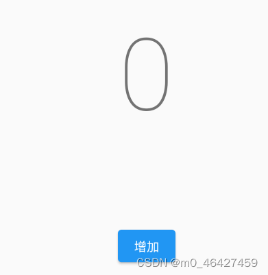

可以发现 虽然点击按钮countNum会增加,但是页面上并不会变化,永远显示的是最开始的0.
接下来用StatefulWidget来实现:
StatefulWidget(抽象类)里有一个createState抽象方法,因此要继承抽象类就必须实现其中的抽象方法。
createState返回State对象,因此我们还需要有一个类实现State类。
基本的结构
class HomePage extends StatefulWidget {
  const HomePage({super.key});

  @override
  State<HomePage> createState() => _HomePageState();
}

class _HomePageState extends State<HomePage> {
  @override
  Widget build(BuildContext context) {
    return Container();
  }
}
接下来在_HomePageState的build方法实现这个功能
class _HomePageState extends State<HomePage> {
  int numCount = 0;
  @override
  Widget build(BuildContext context) {
    return Center(
      child: Column(
        mainAxisAlignment: MainAxisAlignment.center,
        children: [
          Text(
            "$numCount",
            style: Theme.of(context).textTheme.headline2,
          ),
          const SizedBox(
            height: 60,
          ),
          ElevatedButton(
              onPressed: () {
                setState(() {    //这个只能在StatefulWidget使用,StatelessWidget是没有的
                  numCount++;
                  print(numCount);
                });
              },
              child: const Text("增加"))
        ],
      ),
    );
  }
}

可以发现每次点击都走了一次build()
Scaffold有一个floatingActionButton属性 可以在右下角设置一个浮动的按钮,我们通过这个也能实现增加的功能
StatefulWidget实现动态列表
基本结构
import "./res/listdata.dart";

import 'package:flutter/material.dart';

void main(List<String> args) {
  runApp(const MyApp());
}

class MyApp extends StatelessWidget {
  const MyApp({super.key});
  @override
  Widget build(BuildContext context) {
    return MaterialApp(
        title: "Flutter Demo",
        theme: ThemeData(primarySwatch: Colors.blue),
        home: const HomePage());
  }
}
final定于的List,在运行时可以多次add 往里面添加元素。
class HomePage extends StatefulWidget {
  const HomePage({super.key});

  @override
  State<HomePage> createState() => _HomePageState();
}

class _HomePageState extends State<HomePage> {
  List<String> list = [];
  @override
  Widget build(BuildContext context) {
    return Scaffold(
        appBar: AppBar(
          title: const Text("Flutter App"),
        ),
        floatingActionButton: FloatingActionButton(
          child: const Icon(Icons.add),
          onPressed: () {
            // 改变数据必须在setState中
            setState(() {
              list.add("新增的列表");
            });
          },
        ),
        body: ListView(
          //遍历数据生成ListTile
            children: list.map((value) {
          return ListTile(
            title: Text(value),
          );
        }).toList()));
  }
}
Scaffold组件
BottomNavigationBar自定义底部导航

BottomNavigationBar常用属性

class MyApp extends StatelessWidget {
  const MyApp({super.key});
  @override
  Widget build(BuildContext context) {
    return MaterialApp(
        title: "Flutter Demo",
        theme: ThemeData(primarySwatch: Colors.blue),
        home: Scaffold(
          appBar: AppBar(title: const Text("Flutter"),),
          body: const Text("Flutter1"),
          bottomNavigationBar: BottomNavigationBar(
            items: const [
              BottomNavigationBarItem(icon: Icon(Icons.home), label: "首页"),
              BottomNavigationBarItem(icon: Icon(Icons.settings), label: "设置")
            ],
          ),
        )
    );
  }
}
currentIndex索引从0开始
iconSize:设置底部菜单大小
fixedColor:设置底部菜单选中时的颜色
onTap:(传入的参数value是当前选中的Tab页的索引)
onTap: (value) {print(value);},因此要实现点击Tab项,切换到对应的Tab页,我们需要设置变量,onTap回调函数中设置currentIndex。(需要在StatefulWidget实现,它才是有状态的)
class MyApp extends StatelessWidget {
  const MyApp({super.key});
  @override
  Widget build(BuildContext context) {
    return MaterialApp(
        title: "Flutter Demo",
        theme: ThemeData(primarySwatch: Colors.blue),
        home: const Tabs());
  }
}

class Tabs extends StatefulWidget {
  const Tabs({super.key});

  @override
  State<Tabs> createState() => _TabsState();
}

class _TabsState extends State<Tabs> {
  int _currentIndex = 0;
  @override
  Widget build(BuildContext context) {
    return Scaffold(
      appBar: AppBar(
        title: const Text("Flutter"),
      ),
      body: const Text("Flutter1"),
      bottomNavigationBar: BottomNavigationBar(
        currentIndex: _currentIndex,
        onTap: (value) {
          setState(() {
            _currentIndex = value;
          });
          print(value);
        },
        items: const [
          BottomNavigationBarItem(icon: Icon(Icons.home), label: "首页"),
          BottomNavigationBarItem(icon: Icon(Icons.settings), label: "设置")
        ],
      ),
    );
  }
}


接下来实现点击对应的Tab页展示对应的组件
在lib新建文件夹pages,在pages中新建一个tabs文件夹,tabs中对应三个Tab页建立category.dart、home.dart、setting.dart三个文件。
目录结构


main.dart
import 'package:flutter/material.dart';
import './pages/tabs.dart';

void main(List<String> args) {
  runApp(const MyApp());
}

class MyApp extends StatelessWidget {
  const MyApp({super.key});
  @override
  Widget build(BuildContext context) {
    return MaterialApp(
        title: "Flutter Demo",
        theme: ThemeData(primarySwatch: Colors.blue),
        home: const Tabs());
  }
}
tabs.dart
import 'package:flutter/material.dart';
import './tabs/category.dart';
import './tabs/home.dart';
import './tabs/setting.dart';

class Tabs extends StatefulWidget {
  const Tabs({super.key});

  @override
  State<Tabs> createState() => _TabsState();
}

class _TabsState extends State<Tabs> {
  int _currentIndex = 0;
  final List<Widget> _pages = const [HomePage(), CategoryPage(), SettingPage()];
  @override
  Widget build(BuildContext context) {
    return Scaffold(
      appBar: AppBar(
        title: const Text("Flutter"),
      ),
      body: _pages[_currentIndex],
      bottomNavigationBar: BottomNavigationBar(
        currentIndex: _currentIndex,
        onTap: (value) {
          setState(() {
            _currentIndex = value;
          });
          print(value);
        },
        items: const [
          BottomNavigationBarItem(icon: Icon(Icons.home), label: "首页"),
          BottomNavigationBarItem(icon: Icon(Icons.category), label: "分类"),
          BottomNavigationBarItem(icon: Icon(Icons.settings), label: "设置")
        ],
      ),
    );
  }
}
home.dart/category.dart/setting.dart
import 'package:flutter/material.dart';

class HomePage extends StatefulWidget {
  const HomePage({super.key});

  @override
  State<HomePage> createState() => _HomePageState();
}

class _HomePageState extends State<HomePage> {
  @override
  Widget build(BuildContext context) {
    return const Center(
      child: Text("首页"),
    );
  }
}
type属性
当配置三个以上菜单时,需要设置type,否则会有菜单被挤掉
设置为type: BottomNavigationBarType.fixed
FloatingActionButton组件实现底部导航凸起按钮
设置Scaffold的floatingActionButton属性。


基本代码与前面一直,加多了两个tab
FloatingActionButton可实现浮动按钮,常用属性如下:
简单设置,这个浮动按钮会在底部右侧:


我们需要将他放到消息这个tab中间。
Scaffold floatingActionButtonLocation
接下来通过设置Scaffold的floatingActionButtonLocation属性可以设置这个按钮在哪个位置,如设置floatingActionButtonLocation: FloatingActionButtonLocation.centerDocked 可以在底部中间。

要设置这个悬浮按钮的大小,我们需要在外层用一个Container,因为 FloatingActionButton无法指定宽高。
并且点击这个按钮还可以跳转到消息页面
tabs.dart
import 'package:flutter/material.dart';
import './tabs/category.dart';
import './tabs/home.dart';
import './tabs/setting.dart';
import './tabs/message.dart';
import './tabs/user.dart';

class Tabs extends StatefulWidget {
  const Tabs({super.key});

  @override
  State<Tabs> createState() => _TabsState();
}

class _TabsState extends State<Tabs> {
  int _currentIndex = 0;
  final List<Widget> _pages = const [
    HomePage(),
    CategoryPage(),
    MessagePage(),
    SettingPage(),
    UserPage()
  ];
  @override
  Widget build(BuildContext context) {
    return Scaffold(
        appBar: AppBar(
          title: const Text("Flutter"),
        ),
        body: _pages[_currentIndex],
        bottomNavigationBar: BottomNavigationBar(
          type: BottomNavigationBarType.fixed,
          currentIndex: _currentIndex,
          onTap: (value) {
            setState(() {
              _currentIndex = value;
            });
            print(value);
          },
          items: const [
            BottomNavigationBarItem(icon: Icon(Icons.home), label: "首页"),
            BottomNavigationBarItem(icon: Icon(Icons.category), label: "分类"),
            BottomNavigationBarItem(icon: Icon(Icons.message), label: "消息"),
            BottomNavigationBarItem(icon: Icon(Icons.settings), label: "设置"),
            BottomNavigationBarItem(icon: Icon(Icons.person), label: "用户")
          ],
        ),
        floatingActionButton: Container(
          height: 60,
          width: 60,

          padding: const EdgeInsets.all(2),
          margin: const EdgeInsets.only(top: 6),
          decoration: BoxDecoration(
              color: Colors.yellow, borderRadius: BorderRadius.circular(30)),
          child: FloatingActionButton(
            child: const Icon(Icons.add),
            onPressed: () {
              setState(() {
                _currentIndex = 2;
              });
            },
          ),
        ),
        floatingActionButtonLocation:
            FloatingActionButtonLocation.centerDocked);
  }
}
也可以设置点击悬浮按钮时修改背景颜色。
FloatingActionButton有个backgroundColor属性就用于设置按钮背景颜色
backgroundColor: _currentIndex==2? Colors.red: Colors.blue,Scaffold 左右侧菜单Drawer


可以发现左右出现了按钮 点击就可以弹出左右的菜单栏,也可以通过滑动引出。
DrawerHeader

在Drawer的child元素中可以添加一个Column,里面的chidren设置DrawerHeader就可以设置左右侧菜单栏的头部了。


UserAccountsDrawHeader

使用内置的UserAccountsDrawHeader组件快速实现左侧菜单栏头部用户信息的效果


AppBar TabBar TabBarView实现顶部滑动导航
AppBar自定义顶部按钮图标、颜色

首先在顶部左侧加一个按钮,通过leading来设置;
设置actions来在AppBar的右边加一些图标或者按钮;


实现后右上角有一个debug图标,我们通过MaterialApp去掉这个图标

类似头条的Appbar结合TabBar来实现顶部Tab切换

1、混入SingleTickerProviderStateMixin

2、定义TabController

3、配置TabBar和TabBarView
TabBar中的tabs与TabBarView中children的元素一一对应,点击tab的哪一个就对显示tabBarView中的哪一个。
class _HomePageState extends State<HomePage>
    with SingleTickerProviderStateMixin {
  late TabController _tabController;
  //生命周期函数:当组件初始化时会触发
  @override
  void initState() {
    super.initState();
//length为tab的数量
    _tabController = TabController(length: 3, vsync: this);
  }

  @override
  Widget build(BuildContext context) {
    return Scaffold(
      appBar: AppBar(
        backgroundColor: Colors.red,
        title: const Text("Flutter App!"),
        leading: IconButton(
            onPressed: (() {
              print("左侧按钮图标!");
            }),
            icon: const Icon(Icons.menu)),
        actions: [
          IconButton(
              onPressed: (() {
                print("右侧搜索图标!");
              }),
              icon: const Icon(Icons.search)),
          IconButton(
              onPressed: (() {
                print("更多");
              }),
              icon: const Icon(Icons.more_horiz)),
        ],
        bottom: TabBar(
          controller: _tabController,
          tabs: const [
            Tab(child: Text("关注"),),
            Tab(child: Text("热门"),),
            Tab(child: Text("视频"),),
          ],
        ),
      ),
      body: TabBarView(
        controller: _tabController,
        children: [
        ListView(
          children: const[
            ListTile(title: Text("关注列表"),),
          ],
        ),
        ListView(
          children: const[
            ListTile(title: Text("热门列表"),),
          ],
        ),
        ListView(
          children: const[
            ListTile(title: Text("视频列表"),),
          ],
        )
      ]

      )
    );
  }
}

TabBar属性

顶部导航bottomNavigationBar与TabBar一起使用
在底部导航的各个tab中都加上Scaffold并且实现tabbar,相当于Scaffold中嵌套Scaffold
home.dart
import 'package:flutter/material.dart';

class HomePage extends StatefulWidget {
  const HomePage({super.key});

  @override
  State<HomePage> createState() => _HomePageState();
}

class _HomePageState extends State<HomePage>
    with SingleTickerProviderStateMixin {
  late TabController _tabController;
  @override
  void initState() {
    super.initState();
    _tabController = TabController(length: 3, vsync: this);
  }

  @override
  Widget build(BuildContext context) {
    return Scaffold(
      appBar: PreferredSize(
        preferredSize: const Size.fromHeight(40), //配置AppBar的高度,改成40之后可能会太小 导致底部指示器被盖住,可以在AppBar外层在设置一个Container,指定一个更小的高度,从而让指示器显示出来.
        child: AppBar(
          elevation: 1, //设置阴影
          backgroundColor: Colors.white,  //设置Appbar背景颜色

        title: TabBar(
          isScrollable: true,
          indicatorColor: Colors.red, //设置底部指示器颜色
          unselectedLabelColor: Colors.black, //label未选中时的颜色
          labelColor: Colors.red,
          indicatorSize: TabBarIndicatorSize.label, //底部指示器的宽度=label宽度
          controller: _tabController,
          tabs: const [
            Tab(child: Text("关注"),),
            Tab(child: Text("热门"),),
            Tab(child: Text("热门"),),
          ],
        ),
      ),
      ),
      body: TabBarView(
        controller: _tabController,
        children: const [
          Text("关注"),
          Text("热门"),
          Text("热门"),
        ],
      ),
    );
  }
}
自定义KeepAliveWrapper缓存页面
比如从一个tab切换到另一个tab,不使用状态保存的话切换回去会从最开始的地方展示;而保存状态的话即使切换回去也是从之前的地方开始展示。
KeepAliveWrapper.dart
import 'package:flutter/material.dart';

class KeepAliveWrapper extends StatefulWidget {
  const KeepAliveWrapper(
      {super.key, required this.child, this.keepAlive = true});

  final Widget? child;
  final bool keepAlive;
  @override
  State<KeepAliveWrapper> createState() => _KeepAliveWrapperState();
}

class _KeepAliveWrapperState extends State<KeepAliveWrapper>
    with AutomaticKeepAliveClientMixin {
  @override
  Widget build(BuildContext context) {
    return widget.child!;
  }

  @override
  bool get wantKeepAlive => widget.keepAlive;
  @override
  void didUpdateWidget(covariant KeepAliveWrapper oldWidget) {
    if (oldWidget.keepAlive != widget.keepAlive) {
      //keepAlive状态需要更新,实现在AutomaticKeepAliveClientMixin中
      updateKeepAlive();
    }
    super.didUpdateWidget(oldWidget);
  }
}
使用,如home.dart中
import '../../tools/keepAliveWrapper.dart';
只需在需要保存状态的组件外层调用一个KeepAliveWrapper
顶部导航监听事件
在initState函数中监听tab改变事件,此处既能监听点击也能监听滑动事件

这里要注意一下_tabController.animation是可空类型,因此我们需要用可空断言 !.

或者再TabBar中也可以通过onTap设置监听函数(只能监听点击事件,不能监听滑动事件)

能获取到索引就能动态变化数据了。
  @override
  void dispose() {
    // 销毁_tabController
    super.dispose();
    _tabController.dispose();
  }