
媒体查询(Media Queries)是一种在CSS中使用的技术,用于根据设备的特性和属性(如屏幕宽度、设备类型等)来应用不同的样式规则。通过媒体查询,可以根据不同的设备或屏幕尺寸为用户提供优化的布局和样式。
1、Web中CSS的媒体查询
1.1 根据屏幕宽度应用样式
@media screen and (max-width: 768px) {
  /* 当屏幕宽度小于等于 768px 时应用的样式 */
  /* 适用于移动设备或小屏幕 */
}

@media screen and (min-width: 769px) and (max-width: 1024px) {
  /* 当屏幕宽度在 769px 到 1024px 之间时应用的样式 */
  /* 适用于平板设备或中等屏幕 */
}

@media screen and (min-width: 1025px) {
  /* 当屏幕宽度大于等于 1025px 时应用的样式 */
  /* 适用于桌面设备或大屏幕 */
}
1.2 根据设备类型应用样式
@media screen and (orientation: landscape) {
  /* 当设备处于横向(landscape)方向时应用的样式 */
}

@media screen and (orientation: portrait) {
  /* 当设备处于纵向(portrait)方向时应用的样式 */
}

@media print {
  /* 在打印时应用的样式 */
}
1.3 组合多个条件的媒体查询
@media screen and (min-width: 768px) and (max-width: 1024px),
       (orientation: portrait) {
  /* 当屏幕宽度在 768px 到 1024px 之间或设备处于纵向方向时应用的样式 */
}
2、Web中JS的媒体查询
可以使用window.matchMedia()方法来执行媒体查询,并根据查询结果执行相应的操作。这个方法返回一个MediaQueryList对象,该对象具有matches属性,表示查询是否匹配。将查询的结果存储在Window全局变量即可。
// 创建一个媒体查询对象
var mediaQuery = window.matchMedia('(max-width: 768px)');

// 检查媒体查询的匹配状态
if (mediaQuery.matches) {
  // 当媒体查询匹配时执行的操作
  // 适用于移动设备或小屏幕
  console.log('Media query matches!');
} else {
  // 当媒体查询不匹配时执行的操作
  // 适用于平板设备或大屏幕
  console.log('Media query does not match!');
}

// 添加一个媒体查询监听器
mediaQuery.addListener(function(mediaQueryList) {
  if (mediaQueryList.matches) {
    // 当媒体查询匹配时执行的操作
    console.log('Media query matches!');
  } else {
    // 当媒体查询不匹配时执行的操作
    console.log('Media query does not match!');
  }
});
3、Vue/React中的媒体查询
3.1 Vue中使用媒体查询
3.1.1 计算属性
<template>
  <div :class="containerClass">
    <p>Content goes here</p>
  </div>
</template>

<script>
import { ref, onMounted, onUnmounted } from 'vue';

export default {
  setup() {
    const containerClass = ref('');

    const updateContainerClass = () => {
      containerClass.value = window.innerWidth < 768 ? 'small-screen' : 'large-screen';
    };

    onMounted(() => {
      updateContainerClass();
      window.addEventListener('resize', updateContainerClass);
    });

    onUnmounted(() => {
      window.removeEventListener('resize', updateContainerClass);
    });

    return {
      containerClass
    };
  }
};
</script>

<style>
.small-screen {
  /* 在小屏幕上应用的样式 */
}

.large-screen {
  /* 在大屏幕上应用的样式 */
}
</style>
3.1.2 三方库(vue-mq)
- vue-mq(以这个为例)
- vue-breakpoint-component
- vue-responsive
- vue-media-query-mixin
npm install vue-mq// main.js中配置
import { createApp } from 'vue';
import App from './App.vue';
import VueMq from 'vue-mq';
const app = createApp(App);
app.use(VueMq, {
breakpoints: {
mobile: 768,
tablet: 1024,
desktop: 1280,
// 根据需要添加其他断点
}
});
app.mount('#app');
// 使用
<template>
  <div :class="$mq">
    <p>Content goes here</p>
  </div>
</template>

<style>
.mobile {
  /* 在移动设备上应用的样式 */
}

.tablet {
  /* 在平板设备上应用的样式 */
}

.desktop {
  /* 在桌面设备上应用的样式 */
}
</style>
3.2 React中使用媒体查询(三方库)
- react-responsive(以这个为主)
- react-responsive-hooks
- react-media
- react-match-media
import React from 'react';
import styles from './MyComponent.module.css';
import { useMediaQuery } from 'react-responsive';

const MyComponent = () => {
  const isSmallScreen = useMediaQuery({ maxWidth: 768 });
  const isMediumScreen = useMediaQuery({ minWidth: 769, maxWidth: 1024 });
  const isLargeScreen = useMediaQuery({ minWidth: 1025 });

  return (
    <div className={`${styles.container} ${isSmallScreen ? styles.smallScreen : ''} ${isMediumScreen ? styles.mediumScreen : ''} ${isLargeScreen ? styles.largeScreen : ''}`}>
      <p>Content goes here</p>
    </div>
  );
};

export default MyComponent;4、Harmony中的媒体查询
鸿蒙中主要通过 @ohos.mediaquery 实现媒体查询,进行断点
// 参考:https://developer.harmonyos.com/cn/docs/documentation/doc-references-V3/js-apis-mediaquery-0000001478181613-V3#ZH-CN_TOPIC_0000001573928789__mediaquerymatchmediasync

import mediaquery from '@ohos.mediaquery'
4.1 封装媒体查询方法(.ts)
import mediaQuery from '@ohos.mediaquery'

class BreakpointSystem {
  private currentBreakpoint: string = 'md'
  private smListener: mediaQuery.MediaQueryListener
  private mdListener: mediaQuery.MediaQueryListener
  private lgListener: mediaQuery.MediaQueryListener

  private updateCurrentBreakpoint(breakpoint: string) {
    if (this.currentBreakpoint !== breakpoint) {
      this.currentBreakpoint = breakpoint
      AppStorage.Set<string>('currentBreakpoint', this.currentBreakpoint)
    }
    console.log('======currentBreakpoint======', this.currentBreakpoint)
  }

  private isBreakpointSM = (mediaQueryResult) => {
    if (mediaQueryResult.matches) {
      this.updateCurrentBreakpoint('sm')
    }
  }

  private isBreakpointMD = (mediaQueryResult) => {
    if (mediaQueryResult.matches) {
      this.updateCurrentBreakpoint('md')
    }
  }

  private isBreakpointLG = (mediaQueryResult) => {
    if (mediaQueryResult.matches) {
      this.updateCurrentBreakpoint('lg')
    }
  }

  public register() {
    this.smListener = mediaQuery.matchMediaSync('(320vp<=width<600vp)')
    this.smListener.on('change', this.isBreakpointSM)
    this.mdListener = mediaQuery.matchMediaSync('(600vp<=width<840vp)')
    this.mdListener.on('change', this.isBreakpointMD)
    this.lgListener = mediaQuery.matchMediaSync('(840vp<=width)')
    this.lgListener.on('change', this.isBreakpointLG)
  }

  public unregister() {
    this.smListener.off('change', this.isBreakpointSM)
    this.mdListener.off('change', this.isBreakpointMD)
    this.lgListener.off('change', this.isBreakpointLG)
  }
}

export default new BreakpointSystem()
4.2 使用封装的函数
4.2.1 轮播图中使用
import breakpointSystem from '../common/BreakpointSystem'

@Component
export default struct IndexSwiper {
  @StorageProp('currentBreakpoint') currentBreakpoint: string = 'md'

  @Builder swiperItem(imageSrc) {
    Image(imageSrc)
      .width('100%')
      .aspectRatio(2.5)
      .objectFit(ImageFit.Fill)
  }

  aboutToAppear() {
    breakpointSystem.register()
  }

  aboutToDisappear() {
    breakpointSystem.unregister()
  }

  build() {
    Swiper() {
      this.swiperItem($r('app.media.ic_public_swiper1'))
      this.swiperItem($r('app.media.ic_public_swiper2'))
      this.swiperItem($r('app.media.ic_public_swiper3'))
      this.swiperItem($r('app.media.ic_public_swiper1'))
      this.swiperItem($r('app.media.ic_public_swiper2'))
      this.swiperItem($r('app.media.ic_public_swiper3'))
    }
    .autoPlay(true)
    .indicator(false)
    .itemSpace(10)
    .displayCount(this.currentBreakpoint === 'sm' ? 1 : (this.currentBreakpoint === 'md' ? 2 : 3))
    .width('100%')
    .padding({ left: 12, right: 12, bottom: 16, top: 16 })
  }
}
4.2.2 TarBar中使用
import breakpointSystem from '../common/BreakpointSystem'

@Entry
@Component
struct Index {
  @State currentIndex: number = 0
  @StorageProp('currentBreakpoint') currentBreakpoint: string = 'md'
  private onTabChange = (index: number) => {
    this.currentIndex = index
  }

  aboutToAppear() {
    breakpointSystem.register()
  }

  aboutToDisappear() {
    breakpointSystem.unregister()
  }

  @Builder
  tabItem(index: number, title: Resource, icon: Resource, iconSelected: Resource) {
    TabBarItem({
      index: index,
      currentIndex: this.currentIndex,
      title: title,
      icon: icon,
      iconSelected: iconSelected
    })
  }

  build() {
    Tabs({ barPosition: this.currentBreakpoint === 'lg' ? BarPosition.Start : BarPosition.End }) {
      TabContent() {
        Home()
      }
      .tabBar(this.tabItem(0, $r('app.string.tabBar1'), $r('app.media.ic_home_normal'), $r('app.media.ic_home_actived')))

      TabContent() {
      }
      .tabBar(this.tabItem(1, $r('app.string.tabBar2'), $r('app.media.ic_app_normal'), $r('app.media.ic_app_actived')))

      TabContent() {
      }
      .tabBar(this.tabItem(2, $r('app.string.tabBar3'), $r('app.media.ic_game_normal'), $r('app.media.ic_mine_actived')))

      TabContent() {
      }
      .tabBar(this.tabItem(3, $r('app.string.tabBar4'), $r('app.media.ic_search_normal'), $r('app.media.ic_search_actived')))
    }
    .barWidth(this.currentBreakpoint === 'lg' ? 96 : '100%')
    .barHeight(this.currentBreakpoint === 'lg' ? '60%' : 56)
    .vertical(this.currentBreakpoint === 'lg')
    .onChange(this.onTabChange)
    .backgroundColor('#F1F3F5')
  }
}
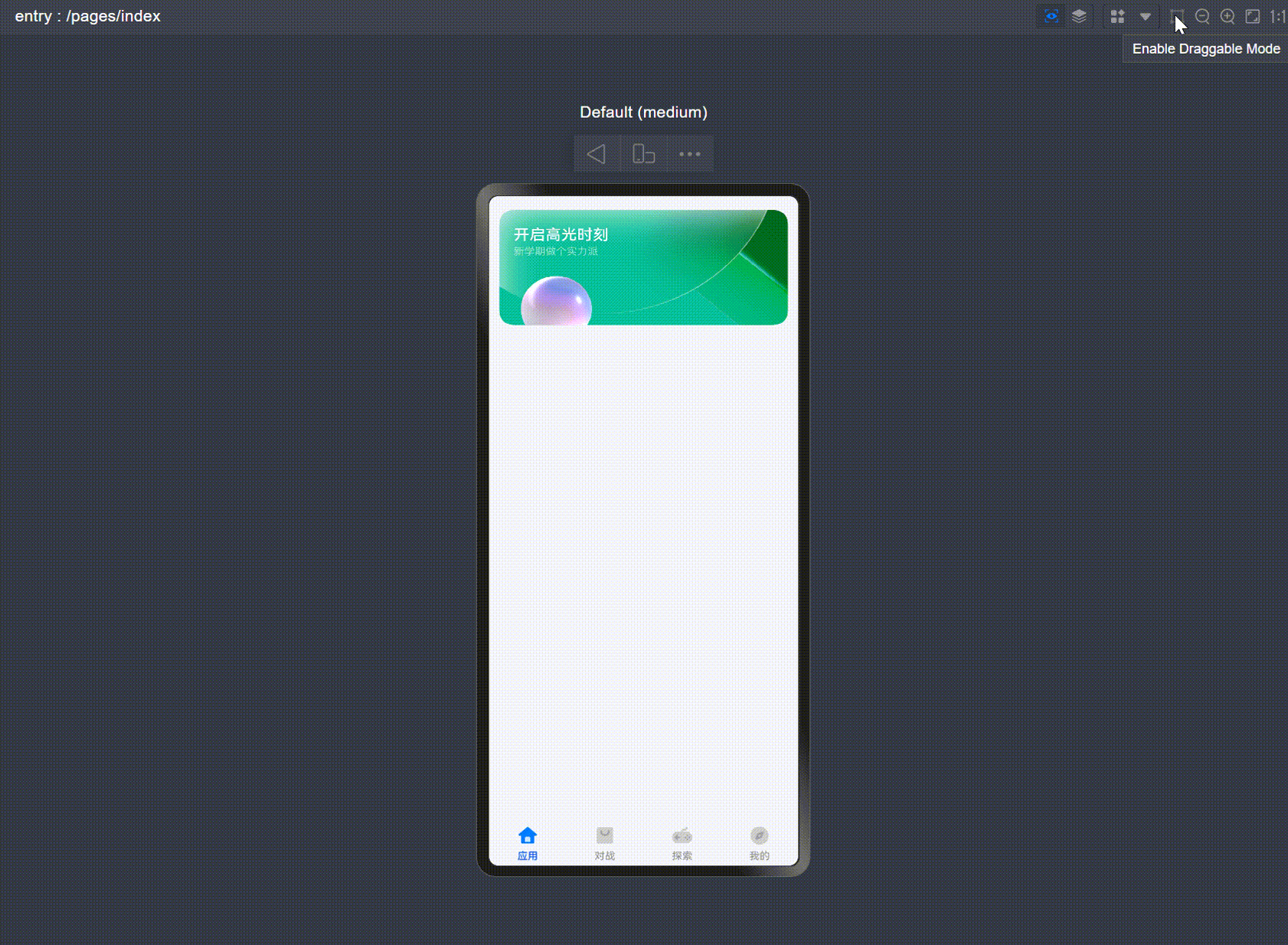
4.3 效果图
5、额外加一个Hilog的封装扩展(.ts)
import hilog from '@ohos.hilog';

export class Logger {
  // 日志对应的领域标识
  private domain: number = 0xF811;
  // tag日志标识
  private prefix: string = '[Logger_Utils]';
  // 格式字符串,用于日志的格式化输出
  private format: string = '%{public}s, %{public}s';

  constructor(prefix: string) {
    this.prefix = prefix;
  }

  debug(...args: string[]): void {
    hilog.debug(this.domain, this.prefix, this.format, args);
  }

  info(...args: string[]): void {
    hilog.info(this.domain, this.prefix, this.format, args);
  }

  warn(...args: string[]): void {
    hilog.warn(this.domain, this.prefix, this.format, args);
  }

  error(...args: string[]): void {
    hilog.error(this.domain, this.prefix, this.format, args);
  }
}

export default new Logger('[Logger_Utils]');