目录
书接上文:
前端写微信聊天界面 https://blog.csdn.net/m0_54066656/article/details/129875630?spm=1001.2014.3001.5501
前端写红包封面https://blog.csdn.net/m0_54066656/article/details/129895315?spm=1001.2014.3001.5501
接着进入~~
正文:
经过上两个例子,我们已经可以写出微信聊天界面和红包封面了,那么下一步,我们要做的就是把这两者解合起来。那么,接下来就跟着我的思路一起完成吧。
背景变暗效果的实现:
大伙都知道,我们收到红包的时候,背景会变暗的,那么怎么用前端来实现这个效果呢?
这个时候,就需要用到JS了,如果你没有学过,也不要着急,其实蛮简单的。
先做一个按钮:
我们先用前端写出一个按钮来,这就是我们的收到红包信息的按钮:

代码其实很简单:
<div class="box">
        <input class="red" type="button" value="恭喜发财" onclick="display()">
    </div>
css的代码:
  .box {
            width: 200px;
            height: 200px;
            margin: auto;
        }

        .red {
            cursor: pointer;
            width: 200px;
            height: 78px;
            background-color: rgb(230, 0, 0);
            border: 0;
            border-radius: 8px;
        }
最后的效果如下:

加入红包封面:
这个时候我们点击这个红包,就应该打开红包了,于是把我们上次写的红包封面加入,代码是这样的:
<div class="window">
    <div class="open">
        <div class="cir"></div>
        <button onclick="hide()">开</button>
        <input type="button" value="×" onclick="hide()">
    </div>
</div>
CSS代码是这样的:
.window {
            display: none;
            margin: 100px;
            width: 260px;
            height: 460px;
            position: relative;
            border-radius: 36px;
            background-color: rgb(230, 0, 0);
            /* 层级为1,最高层 */
            z-index: 1;
        }

        .open>.cir {
            overflow: hidden;
            position: relative;
            top: 36px;
            width: 260px;
            height: 324px;
            border-bottom: 2px solid rgb(255, 215, 0);
            border-radius: 72px 72px 480px 480px;
            background-color: rgb(230, 0, 0);
            z-index: 1;
        }

        .open>button {
            cursor: pointer;
            position: relative;
            transform: translate(105px, 8px);
            width: 50px;
            height: 50px;
            border: 0;
            border-radius: 50%;
            background: rgb(255, 215, 0);
            z-index: 2;
        }

        .open>input {
            cursor: pointer;
            position: relative;
            transform: translate(65px, 136px);
            width: 20px;
            height: 20px;
            background: rgb(255, 215, 0);
            border: 0;
            border-radius: 50%;
        }
做到这步,我们的效果还是跟上图一样,这是因为我们没有做JS效果:
<script>
// 获取元素
const win = document.querySelector('.window')
function display() {
win.style.display = "block";
shadow.style.display = "block";
console.log(shadow)
}
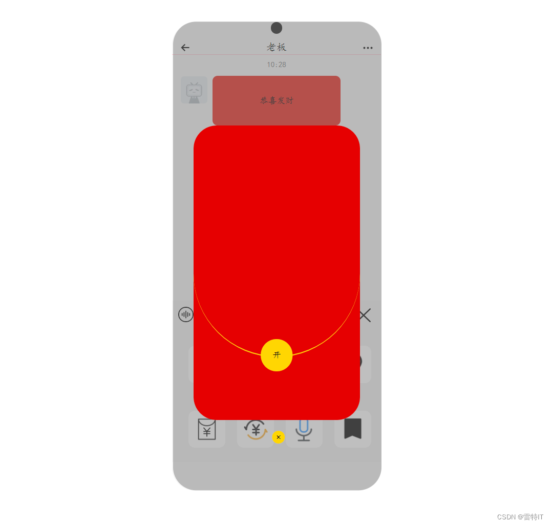
</script>做完之后,我们就可以点击红包,并出现红包封面了:

背景变暗:
我们知道,前端其实就是一层一层堆叠起来的,在这里,我们可以这样理解:
body就是背景板,div-box就是我们放在上面的一个小板子,红包就是我在这个小板子添置的一个按钮,点击这个按钮,红包封面就会出现。
这个时候,如果我们在这个按钮上面,红包封面的下面(也就是这两者的夹层上)加入一层背景,那么就可以实现背景变暗了,这就是层级关系:z-index了,在MDN中关于z-index的解释如下:
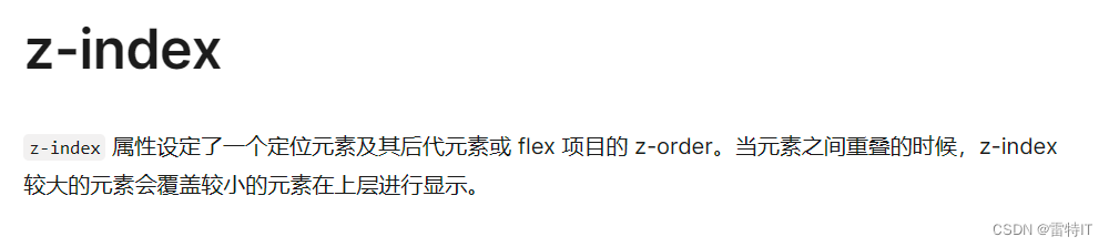
简单地说,z-index数值越大,层级越高。
加入背景之后,效果是这样的:
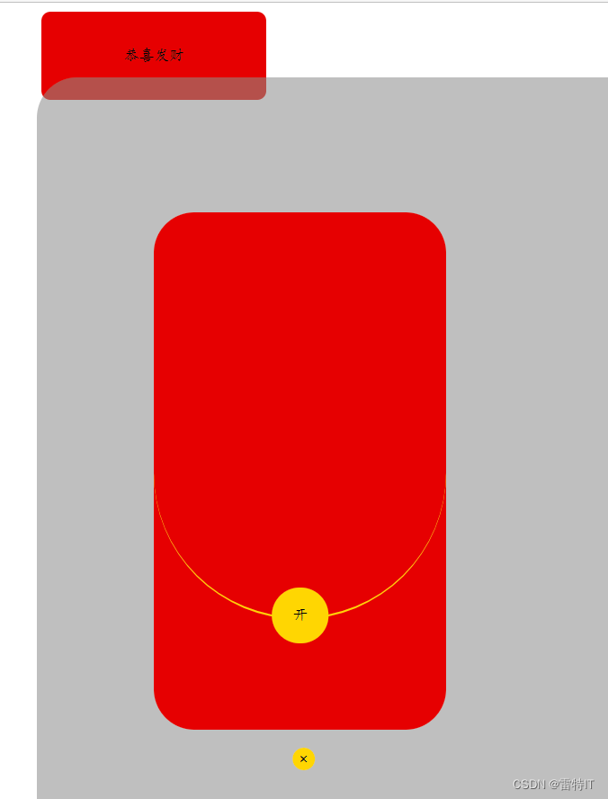
这个背景的长度和宽度要按照实际来进行设定。
代码如下:
<div class="box">
        <input class="red" type="button" value="恭喜发财" onclick="display()">

        <div class="window">
            <div class="open">
                <div class="cir"></div>
                <button onclick="hide()">开</button>
                <input type="button" value="×" onclick="hide()">
            </div>
        </div>

        <div class="shadow"></div>

    </div>
css样式:
.shadow {
            display: none;
            width: 1000px;
            height: 800px;
            border-radius: 36px;
            position: relative;
            left: -4px;
            transform: translateY(-85%);
            background-color: rgba(128, 128, 128, .5);
            /* 层级为0,最低层 */
            z-index: 0;
        }
JS:
<script>
        // 获取元素
        const win = document.querySelector('.window')
        const shadow = document.querySelector('.shadow')

        function display() {
            win.style.display = "block";
            shadow.style.display = "block";
            console.log(shadow)
        }

        function hide() {
            win.style.display = "none";
            shadow.style.display = "none";
        }
    </script>
总结:
其实整个代码还是非常简单的,那么现在我们来做一个汇总:
<div class="box">
        <input class="red" type="button" value="恭喜发财" onclick="display()">

        <div class="window">
            <div class="open">
                <div class="cir"></div>
                <button onclick="hide()">开</button>
                <input type="button" value="×" onclick="hide()">
            </div>
        </div>

        <div class="shadow"></div>

    </div>
css样式:
.box {
            width: 200px;
            height: 200px;
            margin: auto;
        }

        .red {
            cursor: pointer;
            width: 200px;
            height: 78px;
            background-color: rgb(230, 0, 0);
            border: 0;
            border-radius: 8px;
        }

        .window {
            display: none;
            margin: 100px;
            width: 260px;
            height: 460px;
            position: relative;
            border-radius: 36px;
            background-color: rgb(230, 0, 0);
            /* 层级为1,最高层 */
            z-index: 1;
        }

        .open>.cir {
            overflow: hidden;
            position: relative;
            top: 36px;
            width: 260px;
            height: 324px;
            border-bottom: 2px solid rgb(255, 215, 0);
            border-radius: 72px 72px 480px 480px;
            background-color: rgb(230, 0, 0);
            z-index: 1;
        }

        .open>button {
            cursor: pointer;
            position: relative;
            transform: translate(105px, 8px);
            width: 50px;
            height: 50px;
            border: 0;
            border-radius: 50%;
            background: rgb(255, 215, 0);
            z-index: 2;
        }

        .open>input {
            cursor: pointer;
            position: relative;
            transform: translate(65px, 136px);
            width: 20px;
            height: 20px;
            background: rgb(255, 215, 0);
            border: 0;
            border-radius: 50%;
        }

        .shadow {
            display: none;
            width: 1000px;
            height: 800px;
            border-radius: 36px;
            position: relative;
            left: -4px;
            transform: translateY(-85%);
            background-color: rgba(128, 128, 128, .5);
            /* 层级为0,最低层 */
            z-index: 0;
        }
JS代码:
 <script>
        // 获取元素
        const win = document.querySelector('.window')
        const shadow = document.querySelector('.shadow')

        function display() {
            win.style.display = "block";
            shadow.style.display = "block";
            console.log(shadow)
        }

        function hide() {
            win.style.display = "none";
            shadow.style.display = "none";
        }
    </script>
整个实现效果还是很简单的,这期主要是讲怎么加上背景,其实最主要的代码还是display和hide的运用。
下期,我们将整合这些代码到我们的微信上去,敬请期待~~