在接触div+css做页面布局的时候,难免会碰到position进行定位操作。网面布局中分为标准流和定位以及层级结构布局。先看看一下什么是标准流的布局。
1.标准流布局
在标准流的布局中常见的有块级和内联布局。
- 块级布局:div,p
首先,定义了两个div,他们在浏览器中呈现的就是块级布局,即我们常说的独占一行。
<定义了!DOCTYPE html>
<html>
<head lang="en">
    <meta charset="UTF-8">
    <title></title>
    <style type="text/css">
        .div1{
            width:100px;
            height: 100px;
            background: red;
        }
        .div2{
            width:100px;
            height: 100px;
            background: blue;
        }
    </style>
</head>
<body>
    <div class="div1"></div>
    <div class="div2"></div>
</body>
</html>

- 内联布局:span,a,input等
所谓内联布局就是在,长度元素允许的情况下,会呈现一行的排序,当长度不够时才会出现换行
<!DOCTYPE html>
<html>
<head lang="en">
    <meta charset="UTF-8">
    <title></title>
    <style type="text/css">
        .div1{
            width:100px;
            height: 100px;
            background: red;
        }
        .div2{
            width:100px;
            height: 100px;
            background: blue;
        }
    </style>
</head>
<body>
    <div class="div1"></div>
    <div class="div2"></div>
    <input type="checkbox" name="chenck_name">打开
    <input type="checkbox" name="chenck_name">关闭
    <span>我和上面的CheckBox是内联的</span>
</body>
</html>

2. 定位布局和层级布局
从上面的例子中可以看出来,如果定义不同的div,那么正常会在页面显示出多个块级元素,依次往下堆叠。然而在实际需求中,我们会发现并非如此,我们有时需要嵌套,需要打乱元素的基本布局即标准流布局方式,来达到更人性化更加美观的布局方式。
那么我们来看看css体用的用于打破标准流布局的position是怎么使用的。
2.1 position分类
position包含四个属性:
- relative:相对定位
- absolute:绝对定位
- fiexed:固定定位
- inherit:继承
只是定义position的四种属性是没有任何意义的,需要配合top,bottom,left,right来使用。
2.2 position之relative
relative:相对定位,它相对的是当前位置top:距离窗口上距bottom:距离窗口下距left:距离窗口左距right:距离窗口右距
来看一个简单的例子
<!DOCTYPE html>
<html>
<head lang="en">
    <meta charset="UTF-8">
    <title></title>
    <style type="text/css">
        .div1{
            width:100px;
            height: 100px;
            background: red;
            position: relative;
            left:50px;
            top:50px;
        }
        .div2{
            width:100px;
            height: 100px;
            background: blue;
        }
    </style>
</head>
<body>
    <div class="div1"></div>
    <div class="div2"></div>
</body>
</html>

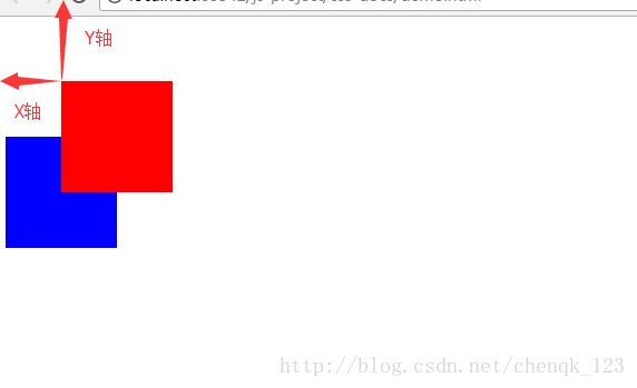
从上面的例子中可以看出,红色区块相对于左上窗口产生了偏移,当指定top和left时,它是以左上角为圆点位置向如图的方向进行X正轴和Y正轴进行偏移的。
如果换成其他的形式呢,来看看top,bottom,left,right的不同组合会产生什么情况呢?
<!DOCTYPE html>
<html>
<head lang="en">
    <meta charset="UTF-8">
    <title></title>
    <style type="text/css">
        .div1{
            width:100px;
            height: 100px;
            background: red;
            position: relative;
            right:50px;
            top:50px;

        }
        .div2{
            width:100px;
            height: 100px;
            background: blue;
        }
    </style>
</head>
<body>
    <div class="div1"></div>
    <div class="div2"></div>
</body>
</html>

从上面我们可以看出它其实是在圆点的位置向右偏移了,也就是说它是以自身为左上为相对位置来进行偏移的。
2.2 position之absolute
absolute:绝对定位top:距离窗口上距bottom:距离窗口下距left:距离窗口左距right:距离窗口右距
<!DOCTYPE html>
<html>
<head lang="en">
    <meta charset="UTF-8">
    <title></title>
    <style type="text/css">
        .div1{
            width:100px;
            height: 100px;
            background: red;
            position: absolute;
            left:50px;
            top:50px;

        }
        .div2{
            width:100px;
            height: 100px;
            background: blue;
        }
    </style>
</head>
<body>
    <div class="div1"></div>
    <div class="div2"></div>
</body>
</html>

红色确实产生了偏移,而且是在窗口的左上角作为圆点的基础上进行了偏移。
<!DOCTYPE html>
<html>
<head lang="en">
    <meta charset="UTF-8">
    <title></title>
    <style type="text/css">
        .div1{
            width:100px;
            height: 100px;
            background: red;
            position: absolute;
            right:50px;
            top:50px;

        }
        .div2{
            width:100px;
            height: 100px;
            background: blue;
        }
    </style>
</head>
<body>
    <div class="div1"></div>
    <div class="div2"></div>
</body>
</html>
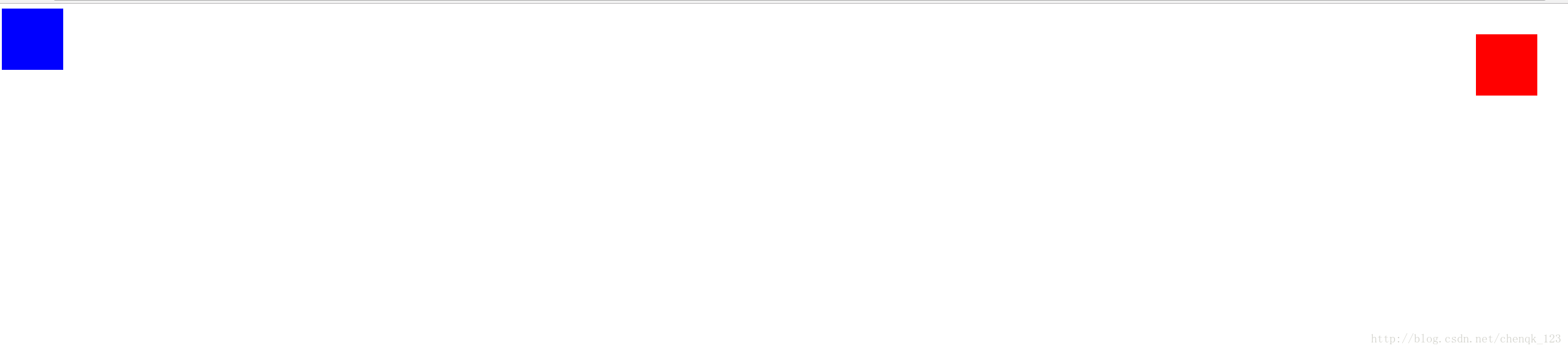
从上面看出来,它是以窗口右上角作为圆点向左作为X正轴,向下作为Y轴正方面。
<!DOCTYPE html>
<html>
<head lang="en">
    <meta charset="UTF-8">
    <title></title>
    <style type="text/css">
        .div1{
            width:100px;
            height: 100px;
            background: red;
            position: absolute;
            left:50px;
            bottom:50px;

        }
        .div2{
            width:100px;
            height: 100px;
            background: blue;
        }
    </style>
</head>
<body>
    <div class="div1"></div>
    <div class="div2"></div>
</body>
</html>

到这里我们就能理解absolute是怎么进行绝对定位的了,它是以窗口或者父元素的左上顶点,右上顶点,右下顶点,左下顶点作为圆点向其他方面进行偏移的,这点就跟relative不同的。
2.3 position之fixed
fixed:固定定位,指的是固定在窗口的某个位置,不随着滚动改变而改变,常用于悬浮窗口的使用。
<!DOCTYPE html>
<html>
<head lang="en">
    <meta charset="UTF-8">
    <title></title>
    <style type="text/css">
        body{
            hieght:3000px;
        }
        .pre{
            width:100%;
            height: 4000px;
        }
        .div1{
            width:100px;
            height: 100px;
            background: red;
            position: fixed;
            left:0;
            top:50%;
            margin-top: -50px;

        }
    </style>
</head>
<body>


<div class="pre">
    <div class="div1"></div>
</div>

</body>
</html>
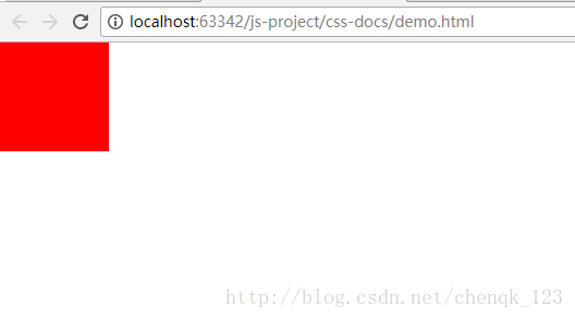
可以看出效果是固定在了左侧中间的位置,不随滚动条的滚动而发生改变,始终是窗体的中间位置。
2.4 postion之inherit
inherit:继承,意思就是需要依赖于父元素才能实现,单独定义没有实际意思,不会生效。我们来看一下简单的demo
<!DOCTYPE html>
<html>
<head lang="en">
    <meta charset="UTF-8">
    <title></title>
    <style type="text/css">
        *{
            margin: 0;
            padding: 0;
        }
        body{
            hieght:3000px;
        }
        .pre{
            width:100%;
            height: 4000px;
        }
        .div1{
            width:100px;
            height: 100px;
            background: red;
            position: inherit;
            left:200px;
            top:200px;

        }
    </style>
</head>
<body>
<div class="pre">
    <div class="div1"></div>
</div>

</body>
</html>
可以看出,红块并未产生任何偏移,说明没有时间生效。我们来修改一下父元素的属性
<!DOCTYPE html>
<html>
<head lang="en">
    <meta charset="UTF-8">
    <title></title>
    <style type="text/css">
        *{
            margin: 0;
            padding: 0;
        }
        body{
            hieght:3000px;
        }
        .pre{
            width:100%;
            height: 4000px;
            position: relative;
        }
        .div1{
            width:100px;
            height: 100px;
            background: red;
            position: inherit;
            left:200px;
            top:200px;

        }
    </style>
</head>
<body>
<div class="pre">
    <div class="div1"></div>
</div>

</body>
</html>

这下是发生了偏移,说明他从父元素中继承了relative属性,并产生了作用
2.5 综合实例
通过上面得例子我们来实现一个综合的实例,做一个悬浮框,使用到position。首先来看一下效果图

上面的例子分三层结构目录,常用于一般的门户购物网站的应用。
- 创建整体窗口
清空所有边距
* {
            padding: 0;
            margin: 0;
        }
定义父窗体
.page {
            width: 100%;
            height: 4000px;
            background: url("") center top no-repeat;
        }
<div class="page">
    </div>
- 定义导航栏
在父窗体的基础上定义导航菜单
.nav {
            width: 160px;
            height: auto;
            background: red;
            border-bottom: 1px solid #666;
            position: fixed;
            top: 50%;
            left: 0;
            margin-top: -100px;
        }

        .nav-li {
            width: 160px;
            height: auto;
            text-align: center;
            font-size: 16px;
            border-bottom: 1px solid #666666;
        }

        .tit {
            width: 160px;
            height: 40px;
            text-align: center;
            line-height: 40px;
            font-size: 16px;
            border-bottom: 1px solid #666666;
        }
<div class="nav">
        <div class="nav-li">
            <div class="tit">蔬菜推荐</div>
        </div>
        <div class="nav-li">
            <div class="tit">水果推荐</div>
        </div>
        <div class="nav-li">
            <div class="tit">肉类推荐</div>
        </div>
        <div class="nav-li">
            <div class="tit">熟食推荐</div>
        </div>
        <div class="nav-li">
            <div class="tit">礼包推荐</div>
        </div>
    </div>
生成的效果图

- 定义二级菜单
我们可以在一级菜单的基础上添加二级菜单,简单的添加几个ul
<!DOCTYPE html>
<html>
<head lang="en">
    <meta charset="UTF-8">
    <title></title>
    <style type="text/css">
        * {
            padding: 0;
            margin: 0;
        }

        .page {
            width: 100%;
            height: 4000px;
            background: url("") center top no-repeat;
        }

        .nav {
            width: 160px;
            height: auto;
            background: red;
            border-bottom: 1px solid #666;
            position: fixed;
            top: 30%;
            left: 0;
            margin-top: -100px;
        }

        .nav-li {
            width: 160px;
            height: auto;
            text-align: center;
            font-size: 16px;
            border-bottom: 1px solid #666666;
        }

        .tit {
            width: 160px;
            height: 40px;
            text-align: center;
            line-height: 40px;
            font-size: 16px;
            border-bottom: 1px solid #666666;
        }

        .nav-li ul {
            width: 160px;
            height: auto;
            text-align: center;
            line-height: 40px;


        }

        .nav-li ul li {
            height: 40px;
            width: 160px;
            line-height: 40px;
            text-align: center;
            font-size: 14px;
            border-bottom: 1px dashed #666666;
            background: gray;
            position: relative;
        }


    </style>
</head>
<body>
<div class="page">
    <div class="nav">
        <div class="nav-li">
            <div class="tit">蔬菜推荐</div>
            <ul>
                <li>大白菜

                </li>
                <li>空心菜

                </li>
                <li>马铃薯

                </li>
                <li>油白菜

                </li>
            </ul>
        </div>
        <div class="nav-li">
            <div class="tit">水果推荐</div>
            <ul>
                <li>红富士

                </li>
                <li>樱桃

                </li>
                <li>葡萄

                </li>
                <li>西瓜

                </li>
            </ul>
        </div>
        <div class="nav-li">
            <div class="tit">肉类推荐</div>
            <ul>
                <li>五花肉

                </li>
                <li>牛肉

                </li>
                <li>鸡肉

                </li>
                <li>羊肉

                </li>
            </ul>
        </div>
        <div class="nav-li">
            <div class="tit">熟食推荐</div>
            <ul>
                <li>猪耳朵

                </li>
                <li>猪蹄

                </li>
                <li>腊肠

                </li>
                <li>猪肝

                </li>
            </ul>
        </div>
        <div class="nav-li">
            <div class="tit">礼包推荐</div>
            <ul>
                <li>中秋大礼包

                </li>
                <li>坚果大礼包

                </li>
                <li>薯片大礼包

                </li>
                <li>熟食大礼包

                </li>
            </ul>
        </div>
    </div>

</div>
</body>
</html>

但是这样看起来就有点不太美观了,我们来优化一下,当我鼠标移动到一级菜单上,才会显示二级菜单,要怎么定义呢?首先我们会将二级菜单隐藏掉,然后给一级菜单一个hover事件来处理,使用伪类的方式。
.nav-li ul {
            width: 160px;
            height: auto;
            display: none;
            text-align: center;
            line-height: 40px;


        }
 .nav-li:hover ul {
            display: block;
        }
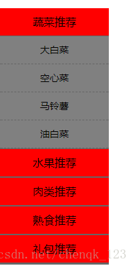
这样看上去还是不错的。
- 定义三级菜单
其实在这里就可以想到了,添加三级菜单也是很容易的跟二级菜单差不多,唯一不同的地方就是需要将三级菜单使用,需要注意的就是使用绝对定位absolute。
.list-3 {
            width:160px;
            height:auto;
            font-size: 14px;
            display: none;
            position: absolute;
            left:160px;
            top:0;
        }
        .list-3 ul li{
            width:160px;
            height:40px;
            text-align: center;
            line-height: 40px;
            font-size: 14px;
            border-bottom: 1px solid #fff;
            background: green;
        }
        .nav-li ul li:hover div{
            display: block;
        }
<div class="page">
    <div class="nav">
        <div class="nav-li">
            <div class="tit">蔬菜推荐</div>
            <ul>
                <li>大白菜
                    <div class="list-3">
                        <ul>
                            <li>国内大白菜</li>
                            <li>国外大白菜</li>
                        </ul>
                    </div>
                </li>
                <li>空心菜
                    <div class="list-3">
                        <ul>
                            <li>国内空心菜</li>
                            <li>国外空心菜</li>
                        </ul>
                    </div>
                </li>
                <li>马铃薯
                    <div class="list-3">
                        <ul>
                            <li>国内马铃薯</li>
                            <li>国外马铃薯</li>
                        </ul>
                    </div>
                </li>
                <li>油白菜
                    <div class="list-3">
                        <ul>
                            <li>国内油白菜</li>
                            <li>国外油白菜</li>
                        </ul>
                    </div>
                </li>
            </ul>
        </div>
        <div class="nav-li">
            <div class="tit">水果推荐</div>
            <ul>
                <li>红富士
                    <div class="list-3">
                        <ul>
                            <li>国内红富士</li>
                            <li>国外红富士</li>
                        </ul>
                    </div>
                </li>
                <li>樱桃
                    <div class="list-3">
                        <ul>
                            <li>国内樱桃</li>
                            <li>国外樱桃</li>
                        </ul>
                    </div>
                </li>
                <li>葡萄
                    <div class="list-3">
                        <ul>
                            <li>国内葡萄</li>
                            <li>国外葡萄</li>
                        </ul>
                    </div>
                </li>
                <li>西瓜
                    <div class="list-3">
                        <ul>
                            <li>国内西瓜</li>
                            <li>国外西瓜</li>
                        </ul>
                    </div>
                </li>
            </ul>
        </div>
        <div class="nav-li">
            <div class="tit">肉类推荐</div>
            <ul>
                <li>五花肉
                    <div class="list-3">
                        <ul>
                            <li>国内五花肉</li>
                            <li>国外五花肉</li>
                        </ul>
                    </div>
                </li>
                <li>牛肉
                    <div class="list-3">
                        <ul>
                            <li>国内牛肉</li>
                            <li>国外牛肉</li>
                        </ul>
                    </div>
                </li>
                <li>鸡肉
                    <div class="list-3">
                        <ul>
                            <li>国内鸡肉</li>
                            <li>国外鸡肉</li>
                        </ul>
                    </div>
                </li>
                <li>羊肉
                    <div class="list-3">
                        <ul>
                            <li>国内羊肉</li>
                            <li>国外羊肉</li>
                        </ul>
                    </div>
                </li>
            </ul>
        </div>
        <div class="nav-li">
            <div class="tit">熟食推荐</div>
            <ul>
                <li>猪耳朵
                    <div class="list-3">
                        <ul>
                            <li>国内猪耳朵</li>
                            <li>国外猪耳朵</li>
                        </ul>
                    </div>
                </li>
                <li>猪蹄
                    <div class="list-3">
                        <ul>
                            <li>国内猪蹄</li>
                            <li>国外猪蹄</li>
                        </ul>
                    </div>
                </li>
                <li>腊肠
                    <div class="list-3">
                        <ul>
                            <li>国内腊肠</li>
                            <li>国外腊肠</li>
                        </ul>
                    </div>
                </li>
                <li>猪肝
                    <div class="list-3">
                        <ul>
                            <li>国内猪肝</li>
                            <li>国外猪肝</li>
                        </ul>
                    </div>
                </li>
            </ul>
        </div>
        <div class="nav-li">
            <div class="tit">礼包推荐</div>
            <ul>
                <li>中秋大礼包
                    <div class="list-3">
                        <ul>
                            <li>国内中秋大礼包</li>
                            <li>国外中秋大礼包</li>
                        </ul>
                    </div>
                </li>
                <li>坚果大礼包
                    <div class="list-3">
                        <ul>
                            <li>国内坚果大礼包</li>
                            <li>国外坚果大礼包</li>
                        </ul>
                    </div>
                </li>
                <li>薯片大礼包
                    <div class="list-3">
                        <ul>
                            <li>国内薯片大礼包</li>
                            <li>国外薯片大礼包</li>
                        </ul>
                    </div>
                </li>
                <li>熟食大礼包
                    <div class="list-3">
                        <ul>
                            <li>国内熟食大礼包</li>
                            <li>国外熟食大礼包</li>
                        </ul>
                    </div>
                </li>
            </ul>
        </div>
    </div>

</div>

效果就出来了。