1.Principio
El spline cúbico restringido (RCS) es uno de los métodos más comunes para analizar relaciones no lineales. RCS utiliza una función cúbica para ajustar las curvas entre diferentes nodos y conectarlos suavemente, logrando así el proceso de ajustar toda la curva y probar su linealidad. Como puede imaginar, la cantidad de nodos en RCS es muy importante para los resultados de ajuste. Por lo general, se utilizan 3 nodos para muestras pequeñas con menos de 30 muestras y 5 nodos para muestras grandes.
Implementación 2.R
1.cox regresa
#Used for RCS(Restricted Cubic Spline)
#我们使用rms包

library(ggplot2)
library(rms)
library(survminer)
library(survival)
Aquí utilizamos los datos pulmonares en el paquete de supervivencia.
#####基于cox回归
#这里用survival包里的lung数据集来做范例分析
head(lung)

# inst time status age sex ph.ecog ph.karno pat.karno meal.cal wt.loss
#    3  306      2  74   1       1       90       100     1175      NA
#    3  455      2  68   1       0       90        90     1225      15
#    3 1010      1  56   1       0       90        90       NA      15
#    5  210      2  57   1       1       90        60     1150      11
#    1  883      2  60   1       0      100        90       NA       0
#   12 1022      1  74   1       1       50        80      513       0
#status:	censoring status 1=censored, 2=dead
#sex:	Male=1 Female=2
#ph.ecog:医生对患者的体能状态评级
#ph.karno:医生对患者的另一种体能状态评级karnofsky
#pat.karno:患者karnofsky自评
#meal.cal:摄入卡路里
#wt.loss:过去半年体重减轻


# 对数据进行打包,整理
dd <- datadist(lung) #为后续程序设定数据环境
options(datadist='dd') #为后续程序设定数据环境


#用AIC法计算不同节点数选择下的模型拟合度来决定最佳节点数
for (knot in 3:10) {
  fit <- cph(Surv(time,status) ~ rcs(meal.cal,knot) + sex+age , x=TRUE, y=TRUE,data=lung)
  tmp <- extractAIC(fit)
  if(knot==3){AIC=tmp[2];nk=3}
  if(tmp[2]<AIC){AIC=tmp[2];nk=knot}
}
nk  #3


#cox回归中自变量对HR的rcs
fit <- cph(Surv(time,status) ~ rcs(meal.cal,3) + sex+age , x=TRUE, y=TRUE,data=lung)#大样本5节点,小样本(<30)3节点
#比例风险PH假设检验,p>0.05满足假设检验
cox.zph(fit,"rank")
#非线性检验,p<0.05为有非线性关系
anova(fit)
#这里的结果是
#               Wald Statistics          Response: Surv(time, status)
#
# Factor     Chi-Square d.f. P
# meal.cal    0.42      2    0.8113
#  Nonlinear  0.09      1    0.7643,呈线性
# sex         6.61      1    0.0101
# age         1.99      1    0.1582
# TOTAL      10.29      4    0.0358
#查看各meal.cal对应的HR值
HR<-Predict(fit, meal.cal,fun=exp)
head(HR)
#画图
ggplot()+
  geom_line(data=HR, aes(meal.cal,yhat),
            linetype="solid",size=1,alpha = 0.7,colour="#0070b9")+
  geom_ribbon(data=HR,
              aes(meal.cal,ymin = lower, ymax = upper),
              alpha = 0.1,fill="#0070b9")+
  theme_classic()+
  geom_hline(yintercept=1, linetype=2,size=1)+
  labs(title = "Lung Cancer Risk", x="Age", y="HR (95%CI)")
El resultado se dibuja como se muestra en la figura:
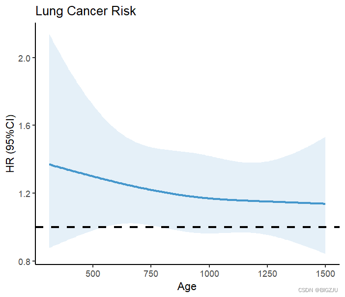
Los resultados de anova(fit) y la presentación visual muestran una relación lineal entre la ingesta de energía dietética y la mortalidad bajo RCS.
Busquemos otro ejemplo no lineal. Este ejemplo utiliza los datos de dos puntos del paquete de supervivencia:
#结肠癌病人数据
Colon <- colon
Colon$sex <- as.factor(Colon$sex)#1 for male,0 for female
Colon$etype <- as.factor(Colon$etype-1)
dd <- datadist(Colon)
options(datadist='dd')
for (knot in 3:10) {
  fit <- cph(Surv(time,etype==1) ~ rcs(age,knot) +sex , x=TRUE, y=TRUE,data=Colon)
  tmp <- extractAIC(fit)
  if(knot==3){AIC=tmp[2];nk1=3}
  if(tmp[2]<AIC){AIC=tmp[2];nk1=knot}
}
nk1 #3
fit <- cph(Surv(time,etype==1) ~ rcs(age,3) +sex , x=TRUE, y=TRUE,data=Colon)
cox.zph(fit,"rank")
anova(fit)
#               Wald Statistics          Response: Surv(time, etype == 1)
#
# Factor     Chi-Square d.f. P
# age        6.90       2    0.0317
#  Nonlinear 6.32       1    0.0120,非线性
# sex        1.20       1    0.2732
# TOTAL      7.54       3    0.0565
HR<-Predict(fit, age,fun=exp)
head(HR)
ggplot()+
  geom_line(data=HR, aes(age,yhat),
            linetype="solid",size=1,alpha = 0.7,colour="#0070b9")+
  geom_ribbon(data=HR,
              aes(age,ymin = lower, ymax = upper),
              alpha = 0.1,fill="#0070b9")+
  theme_classic()+
  geom_hline(yintercept=1, linetype=2,size=1)+
  geom_vline(xintercept=47.35176,size=1,color = '#d40e8c')+#查表HR=1对应的age
  geom_vline(xintercept=65.26131,size=1,color = '#d40e8c')+
  labs(title = "Colon Cancer Risk", x="Age", y="HR (95%CI)")
El resultado es el siguiente: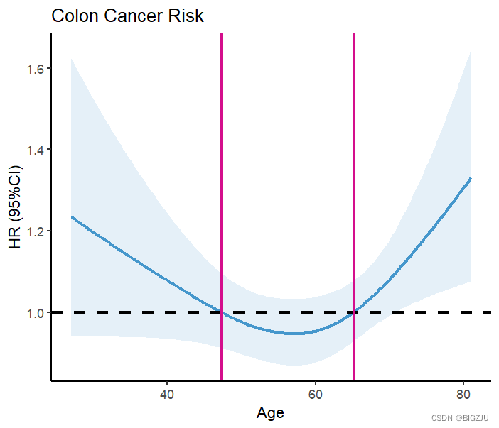
Los resultados de anova(fit) y la presentación visual muestran que el ejemplo exhibe una relación no lineal
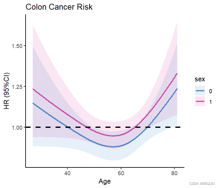
También podemos realizar investigaciones agrupadas y presentaciones visuales, simplemente modifique los parámetros en la función Predict()
HR1 <- Predict(fit, age, sex=c('0','1'),
               fun=exp,type="predictions",
               conf.int = 0.95,digits =2)
HR1
ggplot()+
  geom_line(data=HR1, aes(age,yhat, color = sex),
            linetype="solid",size=1,alpha = 0.7)+
  geom_ribbon(data=HR1,
              aes(age,ymin = lower, ymax = upper,fill = sex),
              alpha = 0.1)+
  scale_color_manual(values = c('#0070b9','#d40e8c'))+
  scale_fill_manual(values = c('#0070b9','#d40e8c'))+
  theme_classic()+
  geom_hline(yintercept=1, linetype=2,size=1)+
  labs(title = "Colon Cancer Risk", x="Age", y="HR (95%CI)")
resultado:
2.regresión logística
Si en lugar de la regresión de Cox se utiliza la regresión logística, el resultado general es casi el mismo, sólo hay que reemplazar el modelo.
#####基于logistic回归的rcs
#建模型
fit <-lrm(status ~ rcs(age, 3)+sex,data=lung)
OR <- Predict(fit, age,fun=exp)
#画图
ggplot()+
  geom_line(data=OR, aes(age,yhat),
            linetype="solid",size=1,alpha = 0.7,colour="#0070b9")+
  geom_ribbon(data=OR,
              aes(age,ymin = lower, ymax = upper),
              alpha = 0.1,fill="#0070b9")+
  theme_classic()+
  geom_hline(yintercept=1, linetype=2,size=1)+
  geom_vline(xintercept=38.93970,size=1,color = '#d40e8c')+ #查表OR=1对应的age
  labs(title = "Lung Cancer Risk", x="Age", y="OR (95%CI)")
3. Regresión lineal
Lo mismo ocurre con la regresión lineal.
#####基于线性回归的rcs
fit <- ols(meal.cal ~rcs(age,3)+sex,data=lung)
Kcal <- Predict(fit,age)
#画图
ggplot()+
  geom_line(data=Kcal, aes(age,yhat),
            linetype="solid",size=1,alpha = 0.7,colour="#0070b9")+
  geom_ribbon(data=Kcal,
              aes(age,ymin = lower, ymax = upper),
              alpha = 0.1,fill="#0070b9")+
  theme_classic()+
    labs(title = "RCS", x="Age", y="Kcal")