Grid Grid Layout
Overview: Grid will be divided into a container grids, through any combination of different grid layout want to make you think
Grid and flex similar layout, the whole Grid into the container with child (grid)
Grid three important concepts container:
- Rows and Columns
- Cell
- Gridlines
Rows and Columns
Concept Concept systems and raster rows and columns similar to
Cells aligned in one row in the horizontal direction all the way
Made into a cell in the vertical direction along a
Cell
As a minimum unit of the container, the Grid mesh composed of one cell
Gridlines
For separating the cell line of intersection. The cell gridlines each row, each column are partitioned among full closed rectangular
Each row, the number of each of the grid lines is the current number of rows and columns plus one; closed Well
Grid lines is also a factor in controlling the cell size;
Grid container attribute ( common )
1. Specify a Grid container
display property values:
Grid : Specifies element using a grid layout, default block element container is a separate line
inline-grid: designated row within Grid
2. Set Grid number of rows and columns
grid-template-rows: Specifies the number of lines
grid-template-columns: Specifies the number of columns
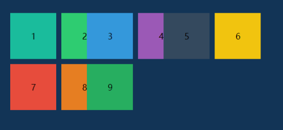
Do a 3 x 3 grid

.container{
width: 300px;
height: 300px;
display: grid;
grid-template-rows: 100px 100px 100px;
grid-template-columns: 100px 100px 100px;
background-color: #123456;
margin: 200px;
}
.container div{
width: 100px;
height: 100px;
background-clip: content-box;
padding: 5px;
border: 1px solid #fff;
background-color: #eee;
display: flex;
justify-content: center;
align-items: center;
box-sizing: border-box;
}
<div class="container">
<div>1</div>
<div>2</div>
<div>3</div>
<div>4</div>
<div>5</div>
<div>6</div>
<div>7</div>
<div>8</div>
<div>9</div>
</div>
Properties may also be used in combination: Grid-Template
grid-template: 100px 100px 100px/100px 100px 100px;
The new unit fr
fraction of the acronym meaning " fragments " . It will be appreciated that the current cell occupied by the row / proportion column,
The code can be changed
grid-template-rows: 1fr 1fr 1fr;

grid-template-columns: 1fr 1fr 1fr;
If the number of rows or columns under a particularly large number of cases, the write is especially cumbersome;
Ever since there was a repeat () function
grid-template-rows: repeat(3,1fr);
grid-template-columns: repeat(3,1fr);
repeat()
The first parameter is set rows / columns
The second parameter is set for each row / column in the current share of share of container
The second parameter can fill a plurality of values
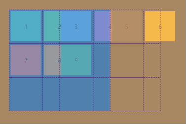
grid-template-rows: repeat(3,1fr );
grid-template-columns: repeat(3,1fr 50px);
Look at the results:
understanding:
The container is divided . 3 columns, each column has been divided into 1fr and 50px , that is to say divided into . 6 columns
Content area for the element 1 accounted for 1fr + 50px in 1fr
Content area for the element 2 accounted for 1fr + 50px is 50px
So the question is, why 6 is complete?
In fact, every div is complete, only 2 half were 3 covered it
6 half beyond the grid container
Why 359 will cover a front div it?
It goes to the action of the grid lines, grid lines not only the role of each cell division
While cell division is also specifies the starting position in the horizontal and vertical directions of each single cell and an end position
3 actually is in position 1fr + 50px position here, i.e. the second column of the cable, the end position is the third grid lines
Cell distribution and a good review can see elements of gridlines
minmax () sum auto
auto cell width / height adaptation
grid-template-rows: repeat(3,1fr );
grid-template-columns: 50px auto 50px;
The second column of this excess width will vary Grip change change container
The third column will change gridlines
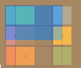
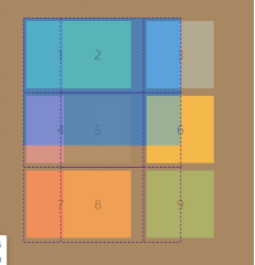
() MINMAX cell width / height ( min , max endo) range
grid-template-rows: repeat(3,1fr );
grid-template-columns: 50px minmax(120px,1fr) 50px;
Here 1fr indicates the remaining positions. Because there is no other columns occupy the remaining space.
If the maximum value exceeds the portion grip capacity of the container, only the maximum remaining capacity allocation
3. Grip-GAP : set the row / column directly gap
GAP-Grip : 5px 5px rows gap 5 column gap 5
Shorthand: Grip-GAP : 5px
You can also write two separate properties
grid-column-gap:5px;
grid-row-gap:5px;
4. Grid-Template-Areas : designated area within the grid
Attribute must be changed with child in grid-area used
Area-Grid : Used to specify the name of the region
You can put grid-area as a canvas, the grid-area designated as a regional block painting
To get the layout you want by mosaic picture blocks;
You can easily make a layout (and size can be adaptive)
code show as below:
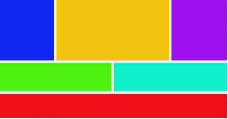
.container{
width: 100vw;
height: 100vh;
display: grid;
grid-template: repeat(4,1fr)/repeat(4,1fr);
grid-template-areas: "hl m m hr"
"hl m m hr"
"al al ar ar "
"f f f f ";
background: #eee;
grid-gap: .7em
}
.container .main{
grid-area: m;
background-color: #f1c40f
}
.container .asideL{
grid-area: al;
background-color: #4ff10f
}
.container .asideR{
grid-area: ar;
background-color: #0ff1cb
}
.container .headerL{
grid-area: hl;
background-color: #0f26f1
}
.container .headerR{
grid-area: hr;
background-color: #9e0ff1
}
.container .footer{
grid-area: f;
background-color: #f10f1a
}
<div class="container">
<div class="main"></div>
<div class="headerL"></div>
<div class="headerR"></div>
<div class="asideL"></div>
<div class="asideR"></div>
<div class="footer"></div>
</div>
Suddenly feeling actually so simple page layout
Note: In the grid-template-areas within the designated area must be named rectangle, or browsers do not render
grid-template:是grid-template-columns、grid-template-rows和grid-template-areas
5. The Grid-Auto-Flow : setting the direction of cell arrangement.
Property values:
Row : from the horizontal direction from left to right (the default)
column : from the vertical direction from the top-down arrangement
row dense: arranged horizontally from the left to the right, automatically fill the space, filled as much as possible
Dense column : from the vertical direction from the top downward, so far as possible filled
6. The The justify-items / align = left-items : setting within the cells in the horizontal direction / the vertical direction of its embodiment
Property values:
Start : start aligned with the edge of the cell.
End : alignment of the cell's end edge.
Center : internal grid cell center.
Stretch : stretching the entire width of the (default) filled cell
place-items are justify-items and align-items combined properties
7. The The justify-Content / align = left-Content : setting grid all cells within the grid in the horizontal direction / the vertical direction of its embodiment
Property values:
Start : alignment of the container starting border.
end: end of frame alignment of the container.
center: the inner container is centered.
stretch: when the project size is not specified, a tensile occupy the entire grid containers.
space-around: at equal intervals on both sides of each item. Therefore, the gap between the project twice the size of the project and the interval border of the container.
BETWEEN-Space : distance from project to project equal, there is no gap between the item and the container frame.
space-evenly: interval equal to project to project, is the same length of the interval between the item and the container frame.
place-content is align = left-conten T and justify-content of the combined properties .
Grid project properties ( common )
1. Grid-column / Grid-Row : The specified cell location gridlines
background-color: red;
grid-column: 2 / 3;
grid-row: 1 / 2;
Is meant herein that the cell
X share in the direction of the second position to a third root root gridlines gridlines
Y occupies the first position in the direction of the grid line to the third root root gridline
2. Grid-Area : area specifying unit cell in that
grid-area: is Grid-column / Grid Row- synthetic nature
grid-area: 1/2/2/3;
You can also specify which named range , with a grid-template-areas use
3. The justify Self- / align = left Self- : alignment of cell content
Start : start aligned with the edge of the cell.
End : alignment of the cell's end edge.
Center : internal grid cell center.
Stretch : stretching the entire width of the (default) filled cell.
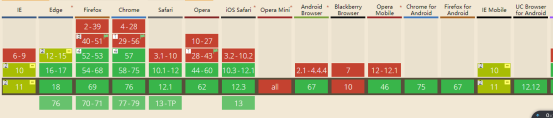
Grid Grid compatibility issues:
If you have questions about the content, discussions and exchange welcome
Reference links:
http://www.ruanyifeng.com/blog/2019/03/grid-layout-tutorial.html
https://www.jianshu.com/p/21fc2c091b98