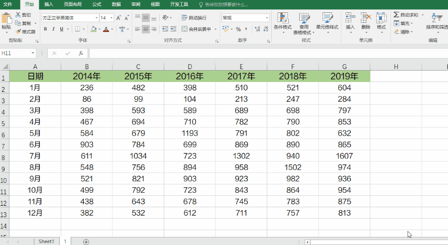
Too many data dimensions, line change cobwebs how to do? You need to learn to chart slices.
The first step in the transfer guiding function PivotTable
Generally in Excel, this feature is not functional [area], therefore, we need to take the initiative to adjust.
[File] → [Open] function options, custom Ribbon [click], the left [Select] commands from the drop-down menu, select command [not] functional region, and then locate the PivotTable and [ PivotChart Wizard];
On the right side of the main tab] [→] [insert the tab, select [New Group], and the [PivotTable PivotChart Wizard] added to the new group, and then it can OK ~
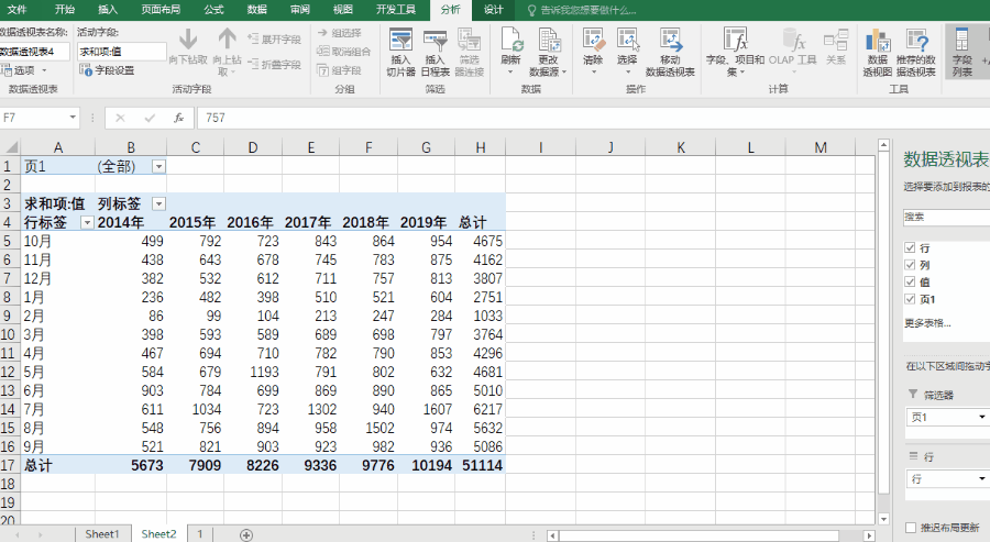
After the second step region merging multiple added PivotTable
[Click just added PivotTable and PivotChart Wizard], select [Multiple consolidation area], then [] Next, select the add a data table.

The third step is to adjust the pivot table, line chart insert
PivotTable newly obtained in the October, November, December manually moved back to September.
Fast moving method:
select the three months of data, move the mouse pointer to the cell realized, occurs when the cross pointer to drag down the table.
After the move is complete, PivotTable is selected, clicking [insert] [→] FIG fold line, then you will get the same S sister very beginning - hot line graph cobweb
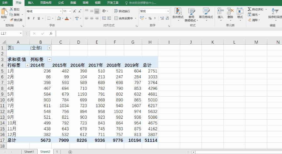
Continue to remove the extra buttons, so that the icon screen cleaner.
Step Four: Insert slicer
Select icon, click on the [insert] → [slicer], [check] column by column selection section analysis, and then click on the button in different years slicer, it can view data on a per year -
Hold down the Ctrl, you can also click on simultaneously multiple years, hold down Shift, you can select a continuous year, click on the slicer [Clear filter], it can display all of the recovery cobwebs state.
This dynamic line chart to show data, whether their own or colleagues and bosses see, are very clear at a glance friends ~
In addition to this dynamic display icons, as well as intuitive to let the boss see the "long" line chart historical data trends, but also simpler than the current practice, to find out?
The first step: data decomposition
The following year, the data is sequentially drag down between annual data are separated by a line, and then copy and paste columns A month, until the last line.
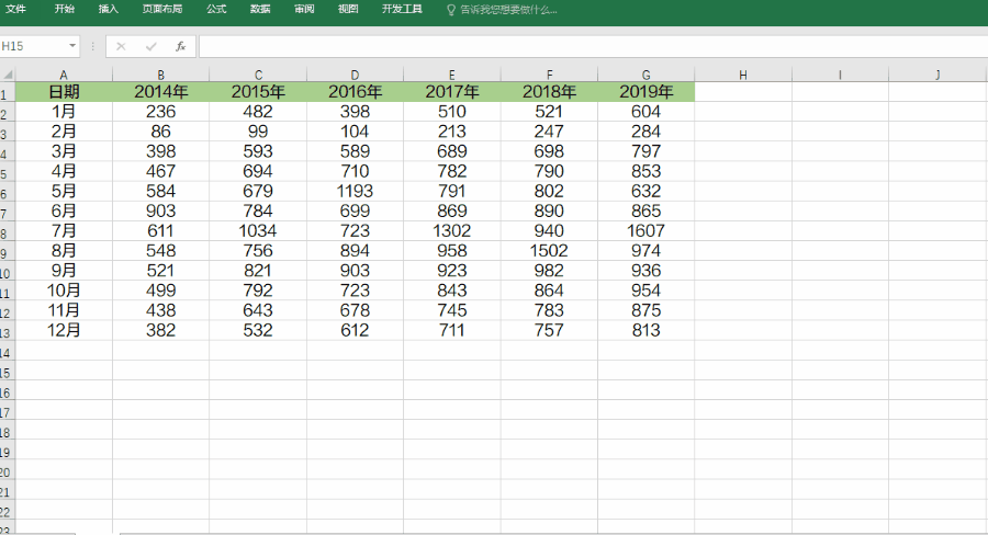
Step Two: Insert a line chart
After the decomposition of the new data, the direct line chart illustrations, you can get a segment display data about the year and month of all friends ~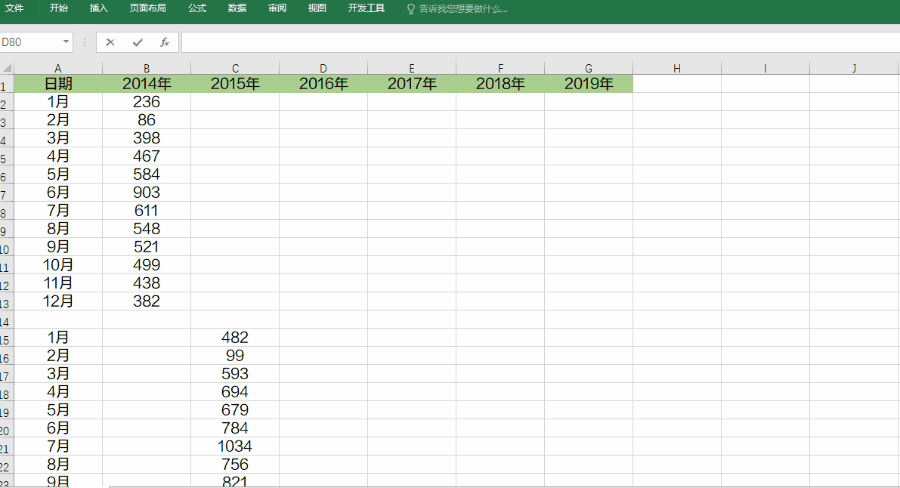
Moreover, this feature is quite useful in the work we clatter, often I see other colleagues to use, but they do not know how to do a small partner, this time we must learn friends ~