Preface
In web design and front-end development, CSS properties are a very important part. Mastering the commonly used CSS properties can not only make your webpage look more beautiful, but also improve the user experience. Today I will introduce 8 common CSS tips to you:
1. Modify the scroll bar style
The picture below is our common scroll bar. Now we need to change the width and color of the scroll bar, and make it rounder.

(common scroll bars)
This can be achieved using ::-webkit-scrollbar:
/*设置滚动条的宽度*/
::-webkit-scrollbar{


 width: 10px;
}
/*将轨道改为蓝色,并设置圆形边框*/
::-webkit-scrollbar-track{


 background-color: blue;
 border-radius: 10px;
}
/* 将滚动条设置为灰色并将其设置为圆形*/
::-webkit-scrollbar-thumb{


 background: gray;
 border-radius: 10px
}
/*悬停时呈深灰色*/
::-webkit-scrollbar-thumb:hover{


 background: darkgray;
}

(Scroll bar after change)
2. Modify the style of the page where the cursor stays on
Generally, the mouse cursor style is an arrow. To change the mouse cursor style to another type:
/*类为first的元素,设置鼠标为不可用状态 。 */
.first{


 cursor: not-allowed;
}
/* 类为second的元素,将鼠标指针设置为放大镜效果 */
.second{


 cursor: zoom-in;
}
/* 类为third的元素,将鼠标指针设置为十字准星形状*/
.third{


 cursor: crosshair;
}

(cursor after change)
3. Maintain aspect ratio size of components
When building responsive components, the mismatch between the height and width of the component often causes videos and images to stretch, affecting the reader's perception. Therefore, we need to set the aspect ratio attribute of the component:
.example{


 /* 设置纵横比 */
 aspect-ratio: 1 / .25;
 /* 设置宽度后,高度自动设置 */
 width: 200px;
 /*设置边框.*/
 border: solid black 1px;
}
After setting the width, we will automatically get a height equal to 125 pixels to maintain the aspect ratio.

(display effect)
4. Smooth page scrolling
Smoothly jump from one page to another through code:
<!DOCTYPE html\>

<html\>

<head\>

<style\>

/*设置页面平滑地滚动*/

html {

scroll-behavior: smooth;

}

#section1 {

height: 600px;

background-color: pink;

}

#section2 {

height: 600px;

background-color: yellow;

}

<style\>

<head\>

<body>

<h1\>Smooth Scroll</h1\>

<div class="main" id="section1"\>

<h2>Section 1</h2>

<p>Click on the link to see the "smooth" scrolling effect.</p>

<a href="\#section2">Click Me to Smooth Scroll to Section 2 Below</a>

<p>Note: Remove the scroll-behavior property to remove smooth scrolling.</p>

</div>

<div class="main" id="section2">

<h2>Section 2</h2>

<a href="#section1">Click Me to Smooth Scroll to Section 1 Above</a>

</div>

<p><strong>Note:</strong> The scroll-behavior property is not supported in Internet Explorer.</p>

</body>

</html>
Click here to see the effect:
5. Screening
Add filters to images using CSS:
img{


 filter: /*YOUR VALUE */;
}
There are many filters available. You can blur, brighten, and saturate filters. You can make an image grayscale, change its opacity, invert the colors, and more.

Normal image (left), blurred image (middle), and high-contrast image (right)

Brightened image (left), grayscale image (center), and tonally rotated image (right)
Click this page for more details about screening.
6.Background effects
Use background-filter to add a background to your image.
<div class="image"\>
 <div class="effect">
 backdrop-filter: blur(5px);
 </div>
</div>

<style>
.image{


 background-image: url(YOUR URL);
 background-size: cover;
 width: 400px;
 height: 400px;
 display: flex;
 align-items: center;
 justify-content: center;
}
.effect{


 font-size: x-large;
 color: white;
 font-weight: 800;
 background-color: rgba(255, 255, 255, .3);
 backdrop-filter: blur(5px);
 padding: 20px;
}
</style>

(Achieved effect)
7. Component reflection
Create a reflection below the SVG:
.example{


 /* 反射将出现在下面。其他可能的值如下:| left | right */
 -webkit-box-reflect: below;
}
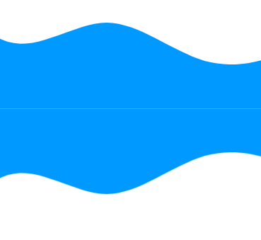
(frame reflection)
To counteract reflections:
.example{


 /* 反射将出现在下面。其他可能的值如下:| left | right */
 -webkit-box-reflect: below 20px;
}

(reflection with offset)
Gradient Reflection:
.example{


 /* 反射将出现在下面。其他可能的值如下:| left | right */
 -webkit-box-reflect: below 0px linear-gradient(to bottom, rgba(0,0,0,0), rgba(0,0,0,.5));
}
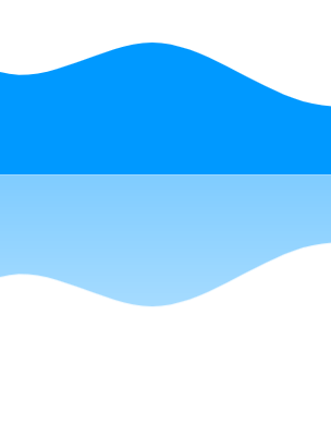
(Gradient Reflection)
8. Check if the browser supports a certain attribute
Use @Supports to check whether CSS supports a specific property.
/* 检查浏览器是否支持显示 */
@supports (display: flex){


 /* 如果支持,则显示为flex。*/
 div{


 display: flex
 }
}
The above are 8 tips about CSS, I hope they can help you.
This article is a translation, original address:
https://medium.com/@anirudh.munipalli/10-powerful-css-properties-that-every-web-developer-must-know-e5d7f8f04e10
Extension link:
Advanced SQL analysis functions-how to use window functions for ranking calculations
React + Springboot + Quartz, realize Excel report automation from 0