1. Partial scrolling of the basic version
The point is to add overflow: auto; attribute to the area that needs to be scrolled
Without further ado, let’s start with the partial scrolling code of the basic version :
<!DOCTYPE html>
<html lang="en"><head>
<meta charset="UTF-8">
<meta http-equiv="X-UA-Compatible" content="IE=edge">
<meta name="viewport" content="width=device-width, initial-scale=1.0">
<title>Document</title>
</head>
<style>
/* 清除浏览器默认样式 */
* {
margin: 0;
padding: 0;
box-sizing: border-box;
}body,
html {
width: 100%;
height: 100%;
}/* The width and height of the parent box should be the width and height of the base page, so body and html should give the width and height*/
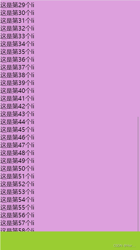
main { display: flex; position: relative; width: 100%; height: 100%; background-color: plum; }/* The content in ul must exceed the height of main to have scrolling effect*/
ul { flex: 1; overflow: auto; }/* The bottom box is fixed, the middle box is adaptive*/
footer { position: absolute; bottom: 0; left: 0; width: 100%; height: 50px; background-color: yellowgreen; } </style><body>
<main>
<ul>
<li>This is the first li</li>
<li>This is the second li</li>
<li>This is the third li</li>
<li>This is The 4th li</li>
<li>This is the 5th li</li>
<li>This is the 6th li</li>
<li>This is the 7th li</li>
<li> This is the 8th li</li>
<li>This is the 9th li</li>
<li>This is the 10th li</li>
<li>This is the 11th li</li>
< li>This is the 12th li</li>
<li>This is the 13th li</li>
<li>This is the 14th li</li>
<li>This is the 15th li</li >
<li>This is the 16th li</li>
<li>This is the 17th li</li>
<li>This is the 18th li</li>
<li>This is the 19th li</li>
<li>This is the 20th li</li>
<li>This is the 21st li</li> li>
<li>This is the 22nd li</li>
<li>This is the 23rd li</li>
<li>This is the 24th li</li>
<li>This is the 25th li</li>
<li>This is the 26th li</li> li>
<li>This is the 27th li</li>
<li>This is the 28th li</li>
<li>This is the 29th li</li>
<li>This is the 30th li </li>
<li>This is the 31st li</li>
<li>This is the 32nd li</li>
<li>This is the 33rd li</li>
<li>This is the 34th li</li>
<li>This is the 35th li</li>
<li>This is the 36th li</li>
<li>This is the 37th li</li>
<li>This is The 38th li</li>
<li>This is the 39th li</li>
<li>This is the 40th li</li>
<li>This is the 41st li</li>
<li>This is the 42nd li</li>
<li>This is the 43rd li</li>
<li>This is the 44th li</li> li>
<li>This is the 45th li</li>
<li>This is the 46th li</li>
<li>This is the 47th li</li>
<li>This is the 48th li</li>
<li>This is the 49th li</li> li>
<li>This is the 50th li</li>
<li>This is the 51st li</li>
<li>This is the 52nd li</li>
<li>This is the 53rd li </li>
<li>This is the 54th li</li>
<li>This is the 55th li</li>
<li>This is the 56th li</li>
<li>This is the 57th li</li>
<li>This is the 58th li</li>
<li>This is the 59th li</li>
<li>This is the 60th li</li>
</ul>
< /main>
<footer></footer></body>
</html>
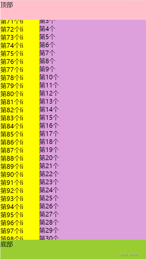
2. Partial scrolling in the advanced version --> there are scrolling effects on the left and right sides of the box (imitating the layout of Jingdong commodity classification)
<!DOCTYPE html>
<html lang="en">

<head>
  <meta charset="UTF-8">
  <meta http-equiv="X-UA-Compatible" content="IE=edge">
  <meta name="viewport" content="width=device-width, initial-scale=1.0">
  <title>Document</title>
</head>
<style>
  /* 清除浏览器默认样式 */
  * {
    margin: 0;
    padding: 0;
    box-sizing: border-box;
    /* 祛除小圆点 */
    list-style: none;
  }

  body,
  html {
    width: 100%;
    height: 100%;
  }

  .big {
    display: flex;
    position: relative;
    width: 100%;
    height: 100%;
    background-color: plum;
    overflow: hidden;
  }

  .top {
    position: absolute;
    top: 0;
    left: 0;
    width: 100%;
    height: 50px;
    background-color: pink;
  }

  /* 父盒子的宽高要基础页面的宽高,所以 body、html要给宽高 */
  main {
    flex: 1;
    overflow: auto;
    display: flex;
    justify-content: space-between;
    flex-direction: row;
  }

  /* ul里面的内容要超出main的高度,才会有滚动效果 */
  ul {
    overflow: auto;
  }

  .one {
    background-color: yellow;
    width: 100px;
  }

  .two {
    flex: 1;
  }


  /* 底部盒子固定,中间盒子自适应 */
  footer {
    position: absolute;
    bottom: 0;
    left: 0;
    width: 100%;
    height: 50px;
    background-color: yellowgreen;
  }
</style>

<body>
  <div class="big">
    <div class="top">顶部</div>
    <main>
      <ul class="one">
        <!-- ul>li*100{第$个li} -->
      </ul>
      <ul class="two">
        <!-- ul>li*100{第$个li元素} -->
      </ul>
    </main>
    <footer>底部</footer>
  </div>

</body>

</html>