introduction
Page referencing pop-up box components is a frequently encountered requirement. If you force the pop-up box component to be placed on the page, although the function works, the decoupling between the component and the page is not realized, which is very unfavorable for later maintenance and function expansion. Give an example to illustrate the drawbacks of this approach.
<template>
  <div>
    <button @click="openModal()">点击</button>
    <Modal :is_open="is_open" @close="close()"/>
  </div>
</template>
<script>
import Modal from "../components/Modal/Modal";//外部引入的弹出框组件
export default {
  components: {
    Modal,
  },
  data(){
    return {
       is_open:false  //控制弹出框关闭或打开
    }
  },
  methods: {
    openModal() {  //显示弹出框
        this.is_open = true;
    },
    close(){  //子组件触发的事件,关闭弹出框
      this.is_open = false;
    }
  },
};
</script>
Modal is a pop-up box component introduced from the outside, and the parent component is_opencontrols the hiding and display of the pop-up box. Carefully analyze the problems of the above structure as follows.
- The Modal component is hard-coded, forcibly
componentsregistered in the parent component and rendered in the template of the parent component<Modal />. Imagine that a pop-up box component needs to be written in the parent component once, and 5 pop-up boxes must also be in the template of the parent component Write five in it. This will make the page structure of the parent component complicated and unfavorable for reading. Secondly, the pop-up box component should be decoupled from the parent component, and it should not be written in the template of the parent component. - The parent component needs to set a separate state
is_opento control the display and hiding of the pop-up box.If the parent component needs to introduce multiple pop-up boxes, it is bound to define multiple states to control the pop-up box.
In order to achieve the decoupling of the pop-up box and the parent component, the most ideal way is to use the idea of functional programming.In the parent component, you only need to call a function to display the pop-up box. Next, let's see how to achieve it.
Handling of pop-up box components
Next, we will implement a very simple but powerful tool function, with which the pop-up box component can be encapsulated. If the parent component needs to use which pop-up box component directly calls the function, it can be easily displayed or hidden.
achieve
import Vue from 'vue';
export const createModal = (Component, props) => {
  const vm = new Vue({
    render: (h) =>
      h(Component, {
        props,
      }),
  }).$mount();
  document.body.appendChild(vm.$el);
  const ele = vm.$children[0];
  ele.destroy = function() {
    vm.$el.remove();
    ele.$destroy();
    vm.$destroy();
  };
  return ele;
};
ComponentIt is the pop-up box component called by the parent component, whichpropsis passed in as a parameter here. It is finally passed to the inside of the pop-up box componentpropsnewOneVueexample,renderthe attribute in the corresponding function,hthe role of the pop-up frame assembly into virtual dom$mountMust be called, it will convert the virtual dom into a real dom elementvm.$elIt corresponds toComponentthe real dom rendered by the incoming pop-up box component , mount it under the body, and the page will display a pop-up box- It is not enough to show the pop-up box. We also need to create a destruction method for the pop-up box component
destroy, whichvm.$children[0]corresponds to thevueinstance of the pop-up box component , which can bedestroydestroyed by calling the method. Finally, the instance is returned for external calls, and the external can be passed through the instance. Call the properties and methods inside the popup component.
application
As a test Demo, the pop-up box component structure is as follows, the template content is very simple. Render a header titleand content content. Define two methods show()and hide()operate the is_openstate to control the display and hiding of the pop-up box.
<template>
  <div class="modal" v-if="is_open">
    <div class="content">
      <p class="close" @click="hide()">close</p>
      <p class="title">{

   { title }}</p>
      <div>{

   { content }}</div>
    </div>
  </div>
</template>
<script>
export default {
  props: ["title", "content"],
  data() {
    return {
      is_open: false,
    };
  },
  methods: {
    show() {
      this.is_open = true;
    },
    hide() {
      this.is_open = false;
    },
  },
};
<style lang="scss" scoped>
.modal {
  position: fixed;
  top: 0;
  left: 0;
  right: 0;
  bottom: 0;
  background-color: rgba(0, 0, 0, 0.6);
  .content {
    width: 200px;
    height: 200px;
    background-color: #fff;
    margin: 0px auto;
    margin-top: 200px;
    text-align: center;
    font-size: 14px;
    color: #333;
    padding: 5px;
    .title {
      margin-bottom: 20px;
      font-size: 16px;
    }
    .close {
      text-align: right;
    }
  }
}
</style>
Page component
<template>
  <div class="test-v2">
    <button @click="openModal()">点击</button>
  </div>
</template>
<script>
import Modal from "../../components/Modal/Modal";
import { createModal } from "../../util/Modal";
export default {
  methods: {
    openModal() {
      this.ele = createModal(Modal, {
          title: "弹出框",
          content: "内容",
      });
      this.ele.show();
    }
  },
};
The page parent component createModalcan get Modalthe instance of the pop-up box component by calling the method this.ele. Through this.eleit, you can get all the properties and methods inside the pop-up box component, including display show()and hide hide().
- After the above transformation, the decoupling between the pop-up box component and the parent component is realized. The pop-up box component does not need to be registered in the parent component and rendered in the template.
- If the parent component needs to pass data to the pop-up box component, you can use the
createModalsecond parameter object, which will eventually bepropsinjected into the pop-up box component in the form of. show()The andhide()methods are defined inside the pop-up box, and the parent component can be directly called to control its display and hide. In addition, it should be called once when the page is destroyed tothis.ele.destroy()prevent memory leaks.
Page effect
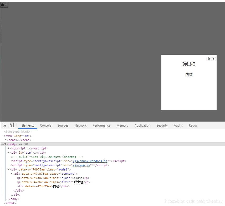
From the final dom structure diagram, you can clearly see that the pop-up box is mounted bodybelow, rather than inside the page component. In this way, it is much easier and more convenient to define some styles related to the CSS positioning of the pop-up box, and it will not be affected by page components. Influence and interference.
extend
Through the explanation of the pop-up box above, we can also do many other things on this basis, such as the processing of the message prompt box.
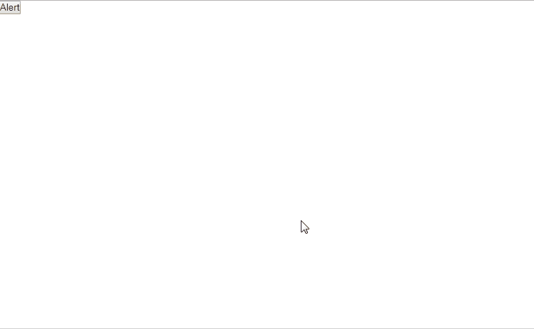
The message prompt box is also a pop-up box. The best practice is that you only need to write a line of code Alert("Hello world"), and a message prompt will pop up on the page Hello world. The effect is as follows.
achieve
The parent page structure is as follows, call the Alert()function, the page will display a prompt box.
<template>
  <div class="test-v2">
    <button @click="alert()">Alert</button>
  </div>
</template>
<script>
import { Alert } from "../../util/Modal";
export default {
  methods: {
    alert() {
      Alert("Hello world");
    },
  },
};
</script>
AlertThe function is implemented as follows.
const alert_array = []; //用来存储弹出框的实例

export const Alert = (msg, duration = 3000) => {
  let top = 100; //默认距离顶部100px

  if (alert_array.length > 0) {
    const index = alert_array.length;
    top = top + index * 50;
  }

  const ele = createModal(AlertComponent, {
    title: msg,
    top,
  });

  alert_array.push(ele);

  const timer = setTimeout(() => {
    clearTimeout(timer);
    const index = alert_array.indexOf(ele);
    index !== -1 && alert_array.splice(index, 1);
    ele.destroy();
  }, duration);
};
AlertComponentIt is a custom disappearing prompt box component (need to be introduced), andcreateModal()the instance of each prompt box is called and stored in an arrayalert_array.- Click the button once and a message prompt box appears. When you click the second button, the second prompt box should appear below the first box. Therefore, you need to
alert_arraydynamically calculate the absolute positioning top value based on the array , which is used as a pop-up box instance when creating a pop-up box instance. The parameters are passed in. - The timer control removes the pop-up box after 3 seconds by default.
AlertComponentThe content of the message prompt box component is as follows. Initially top_valueassign a value this.top - 30, and mountedthen this.topassign it again in the middle , in order to achieve the animation effect of sliding from top to bottom when the prompt box appears.
<template>
  <div
    class="alert-component"
    :style="{ top: `${top_value}px`, opacity: opacity }"
  >
    {

   { title }}
  </div>
</template>

<script>
export default {
  props: ["title", "top"],
  data() {
    return {
      top_value: this.top - 30,
      opacity: 0,
    };
  },
  mounted() {
    const timer = setTimeout(() => {
      clearTimeout(timer);
      this.top_value = this.top;
      this.opacity = 1;
    });
  },
};
</script>

<style>
.alert-component {
  height: 20px;
  border-radius: 4px;
  position: absolute;
  min-width: 300px;
  left: 50%;
  transform: translateX(-50%);
  background-color: #f0f9eb;
  color: #67c23a;
  align-items: center;
  padding: 10px 16px;
  transition: all 0.25s linear;
  opacity: 0;
}
</style>
end
With the help of createModaltool functions, not only the message prompt box, but also the message confirmation box, and the dynamic form modal box can be further encapsulated and simplified. When the pop-up box and the page are decoupled, the overall code logic will become more Clear, which has huge benefits for post-maintenance and expansion.