1. Implementation principle
The implementation principle of the grid system is very simple, just by defining the size of the container, dividing it into 12 parts (there are also 24 or 32 parts, but 12 parts are the most common), then adjust the inner and outer margins, and finally combine the media query. Produced a powerful responsive grid system. The grid system in the Bootstrap framework divides the container into 12 equal parts.
<div class="row">
    <div class="col-md-1">.col-md-1</div>
    <div class="col-md-1">.col-md-1</div>
    <div class="col-md-1">.col-md-1</div>
    <div class="col-md-1">.col-md-1</div>
    <div class="col-md-1">.col-md-1</div>
    <div class="col-md-1">.col-md-1</div>
    <div class="col-md-1">.col-md-1</div>
    <div class="col-md-1">.col-md-1</div>
    <div class="col-md-1">.col-md-1</div>
    <div class="col-md-1">.col-md-1</div>
    <div class="col-md-1">.col-md-1</div>
    <div class="col-md-1">.col-md-1</div>
</div>
2. Working principle
The data row ( .row) must be contained in the container ( .container) in order to give it proper alignment and padding ( padding). Row ( .row) can be added to a column ( .column), the number of the column can not exceed the total number of columns and bisected, such as 12. The specific content should be placed in the column container ( .column), and only the column ( .column) can be used as .rowa direct child element of the row container ( ). paddingCreate the column-to-column spacing by setting the inner margin ( ). Then marginoffset paddingthe influence of the inner distance ( ) by setting negative outer distances ( ) for the first and last columns .

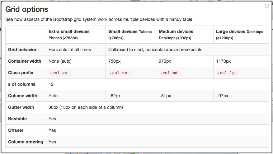
Briefly explain the picture: the outermost border, with a large white area, is equivalent to the visible area of the browser. There is a responsive effect in the grid system of the Bootstrap framework. It has four types of browsers (ultra small screen, small screen, medium screen and large screen). The breakpoints (the dividing point of pixels) are 768px, 992pxand 1220px. The second border (1) is equivalent to the container ( .container). For different browsers resolution, which is not the same width: auto, 750px, 970pxand 1170px. The horizontal bar No. 2 explains that the row ( .row) of the container is equally divided into 12 equal parts, that is, the columns. Each column has one padding-left: 15px(the pink part in the padding-right: 15pxpicture ) and one (the purple part in the picture). This also led to the first column padding-leftand the last column padding-rightoccupies the total width 30px, causing unsightly page, of course, if you need to leave a certain distance, this practice is good. No. 3 is the row bar container ( .row), which defines margin-leftand margin-rightis -15pxused to counteract the first column from the left and right inner from the last column. Combine the rows and columns to see the effect of horizontal bar 4. That is the effect we expect to see, .containerthere is no space between the first and last column and the container ( ). Bar 5 just wants to show you that you can combine columns and columns as you like, but the sum of their combinations should not exceed the total number of columns.
The official explanation: through the "column ( .columnset)" paddingproperty to create space between the columns and columns (, gutter). Is by .rowsetting a negative element marginin order to offset the .containerset of elements padding, it indirectly "line ( .row)" contained "column ( .column)" canceled out padding.
3. Basic usage
The grid system is used for layout, which is actually a combination of columns. There are four basic usages in the grid system of the Bootstrap framework.
Column combination of simple understanding is to change the numbers to merge column (principle: Column total sum can not exceed 12), somewhat similar to the form of colspanproperty.
<div class="container">
  <div class="row">
    <div class="col-md-4">.col-md-4</div>
    <div class="col-md-8">.col-md-8</div>
  </div>
  <div class="row">
    <div class="col-md-4">.col-md-4</div>
    <div class="col-md-4">.col-md-4</div>
    <div class="col-md-4">.col-md-4</div>
  </div>
  <div class="row">
    <div class="col-md-3">.col-md-3</div>
    <div class="col-md-6">.col-md-6</div>
    <div class="col-md-3">.col-md-3</div>
 </div>
</div>
The way to achieve column combination is very simple, and only involves two CSS features: float and width percentage.
4. Column offset
Sometimes, we do not want two adjacent columns close together, but do not want to use marginor other technical means. At this time, you can use the column offset ( offset) function to achieve. Using column offset is also very simple, just add the class name to the column element col-md-offset-*(where the asterisk represents the number of column combinations to be offset), then the column with this class name will be shifted to the right. For example, if you add to the column element col-md-offset-4, it means that the column is moved to the right by the width of 4 columns. The realization principle is very simple, that is, one-twelfth (1/12) is used margin-left. Then there will be as many offsetas there are margin-left. However, there is a need to pay attention to detail, use col-md-offset-*when the columns are shifted to the right, to ensure that the total number of columns and rows offset no more than 12, otherwise it will cause a column break lines.
<div class="container">
    <div class="row">
        <div class="col-md-4">.col-md-4</div>
        <div class="col-md-2 col-md-offset-4">列向右移动四列的间距</div>
        <div class="col-md-2">.col-md-3</div>
    </div>
    <div class="row">
        <div class="col-md-4">.col-md-4</div>
        <div class="col-md-4 col-md-offset-4">列向右移动四列的间距</div>
    </div>
</div>
Try to make a grid:
1) A grid with 4 columns.
2) The grid in the first column occupies 2 grids wide without offset.
3) The second and third column grids occupies 2 grids wide and are offset by 1 grid.
4) The fourth column of grid occupies 3 grids wide and is offset by 1 grid.
<div class="row">
    <div class="col-md-2">.col-md-2</div>
    <div class="col-md-2 col-md-offset-1">col-md-2 col-md-offset-1</div>
    <div class="col-md-2 col-md-offset-1">col-md-2 col-md-offset-1</div>
    <div class="col-md-3 col-md-offset-1">col-md-3 col-md-offset-1</div>
</div>
5. Column sorting
Column sorting is actually to change the direction of the column, that is, to change the left and right floating, and set the floating distance. By adding the class name in the frame of the grid system Bootstrap col-md-push-*and col-md-pull-*(wherein the combination of the mobile columns represented by an asterisk).
6, the nesting of columns
The grid system of the Bootstrap framework also supports column nesting. You can add one or more row ( .row) containers to a column , and then insert columns in this row container (use columns as described above). But in the row container ( .row) in the column container, when the width is 100%, it is the width of the current outer column. The total number of nested columns also needs to follow no more than 12 columns. Otherwise, the last column will be displayed in a new line.
appendix
Read the original text:https://blog.mazey.net/1959.html