Data visualization mainly aims to convey and communicate information clearly and effectively with the help of graphical means. To put it simply, the complicated data can be made intuitive, making it easier to understand the trends and models represented by the data. As long as the data is designed and visualized, we can have a brand new way to understand the data and change the way of presenting and thinking about the data.
What are the key elements of an excellent data visualization interface?
Clarity: A good data visualization interface must be able to clearly display the information users need. When users see the content of the interface, they should be able to understand its purpose within 5 seconds, rather than spending at least a few minutes to understand the meaning of each data.
Meaningful: Every piece of information on a useful data visualization interface should be meaningful. These meaningful information can accurately convey what the designer wants to express. Behind every piece of data, the user should be able to read it.
Consistency: An excellent data visualization interface will have a very rigorous and consistent layout. Consistency here requires consideration of layout, structure and content.
Simplicity: The complex interface violates the original intention of data visualization design. If an information presentation is not straightforward enough, then there must be a design problem.
So how to do a good data visualization interface?
First of all, we must clarify our own thinking. When we need to use high-quality data visualization in the analysis to convey relevant information to the executive management team, we must pay attention to understanding who the target users are and what value can be provided to them. At the same time, to do a good job of data visualization, three problems must be solved:
Dimensions: Consider which aspects of the data need to be displayed, and which chart type to use. For example, a single statistical result or percentage of a certain aspect of one dimension.
Chart layout: The visualization screen is usually displayed on a larger widescreen, usually with a large business-related background. According to the actual situation, consider dividing it into several columns. At the same time, pay attention to the reasonable combination of colors and highlight the key points. For the map or key information that needs to be further expanded, related trigger events can be added.
Data loading mechanism: data source, update mechanism, etc.
Learning this kind of thinking can help you make valuable designs. Your data visualization interface can be more attractive than others, and you can win at work. Is there a quick way to help you make such a beautiful visual interface? Yes, as long as you use data visualization products, you can save more time and energy.
Are there any useful data visualization products?
I have a treasure tool to introduce to you. Smartbi supports not only Excel static graphics but also Echarts dynamic graphics. Excel data visualization (conditional formatting, etc.) and echarts data visualization (maps, word clouds, etc.) work together, and the rich combination of dynamic and static effects clearly and intuitively express the story hidden behind the data.
I believe that many people have seen these large-screen charts. Does it feel that the effect is very cool and it will be very complicated to do it? According to the traditional way, it may take several months to make it using data analysis tools combined with ps beautification. But at this time, use the Smartbi self-service dashboard function to meet various data visualization scenarios in an all-round way. You do not need to master programming or sql skills, and business personnel can easily and quickly master the operation of data visualization self-service dashboards.
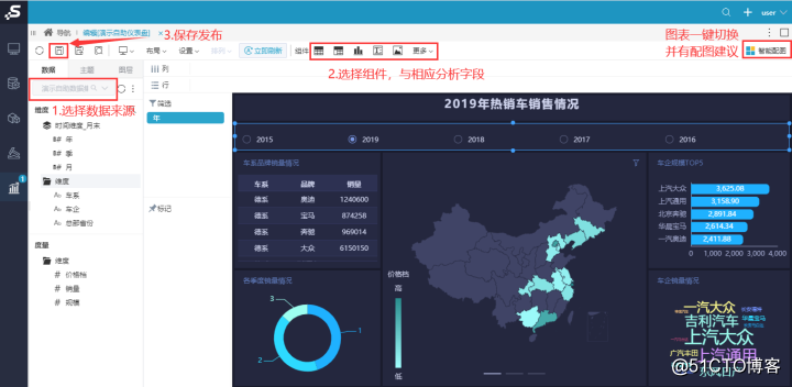
Next, let's discuss how to use Smartbi to make a large visual screen.
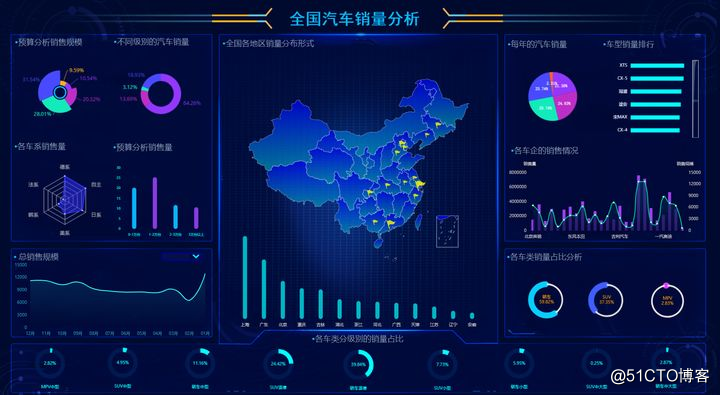
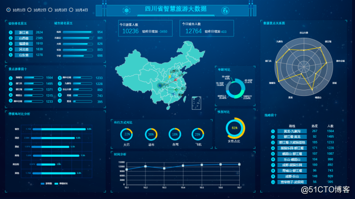
Now let's take a closer look at these visualization charts. They are composed of simple tables, circular pie charts, maps, horizontal bar graphs, word cloud graphs, and so on.
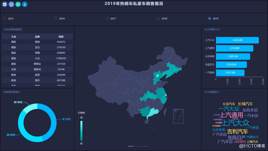
If we divide the overall goal into small plans, as long as we make these individual charts, and then put them on the same interface for display, and then adjust the layout of each component and the style adjustment of the overall visual dashboard, it can form a cool The visualization data dashboard is now available.
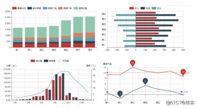
At this time, everyone may have concerns. The line chart and histogram shown in the chart are so beautiful. We usually make excel and other tools that are very simple and unsightly. How to deal with it. Smartbi can help you at this time. Smartbi supports a complete ECharts graphics library and supports a variety of graphics, including waterfall graphs, relationship graphs, radar graphs, oil volume graphs, heat graphs, tree graphs, etc. dozens of dynamic interactions Graphics; supports 3D dynamic graphics effects, such as 3D route graphs, 3D scatter plots, and 3D bar graphs for data visualization display.
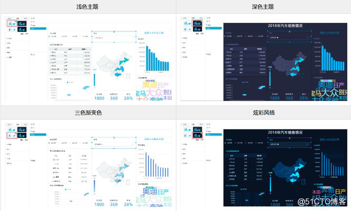
After completing the dimensions we need to analyze and the corresponding components, and after adjusting the location of each component, the system provides four sets of default themes: light theme, dark theme, three-color gradient, and colorful style. You can also set items to customize the theme, and save the customized theme for later use, or overwrite the current theme.
By dragging and dropping, the system improves a flexible and convenient operation interface, allowing customers to arbitrarily select indicators, dimensions and filter conditions, etc., and quickly generate multi-dimensional analysis tables and dashboards.
Finally, I want to emphasize that when you make data visualization interfaces, you mainly express complex and abstract data in a simpler form, so that others can convey key information to them in a way that can be understood. Therefore, I personally recommend that the chart can highlight the points of concern and highlight the advantages. It is appropriate to have high-complex charts, and effective color schemes can be used to attract everyone's attention and help them browse the information easily. And use Smartbi's self-service dashboard function to make the interface presented by your data analysis more exciting. The above only shows some of the functions. If you have a heart-warming partner, you can go to Smartbi's official website to experience it.
Does your boss still like the visual interface that comes out like this? Come and try it together!