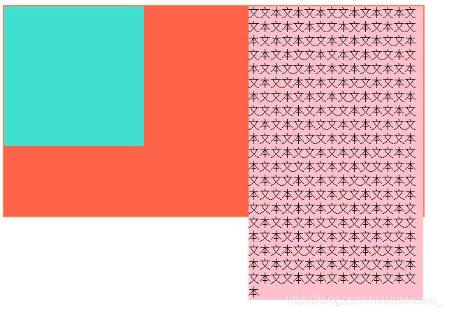
通过第二周的逆战班的学习,总结了解决高度塌陷的几种办法。
高度塌陷是由于第一级子元素浮动造成父元素高度自适应,从而形成高度塌陷。
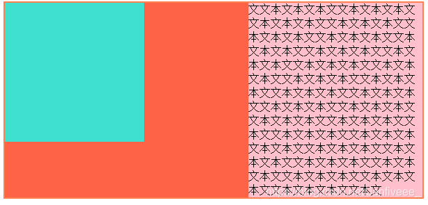
像这样:
	<head>
		<meta charset="UTF-8">
		<title></title>
		<style type="text/css">
			.box{
				width: 600px;
				height: auto;
				border: 2px solid coral;
				background:tomato ;
			}
			.box1{
				width: 200px;
				height: 200px;
				background: turquoise;
				float: left;
			}
			.box2{
				width: 250px;
				height: 250px;
				background: pink;
				float: right;
			}
		</style>
	</head>
	<body>
		<div class="box">
			<div class="box1">

			</div>
			<div class="box2">

			</div>
		</div>
	</body>

解决的办法一共有五种:
第一种:给父元素固定高度
这种方法可以解决高度塌陷,但没有办法高度自适应。
.box{
				width: 600px;
				height: 300px;
				border: 2px solid coral;
				background: tomato;
				}
			.box1{
				width: 200px;
				height: 200px;
				background: turquoise;
				float: left;
			}
			.box2{
				width: 250px;
				height: auto;
				background: pink;
				float: right;
			}
第二种:给父元素添加overflow:hidden;属性
这种方法是使父元素遵循BFC规则。
.box{
				width: 600px;
				height: auto;
				border: 2px solid coral;
				background: tomato;
				overflow: hidden;
				}
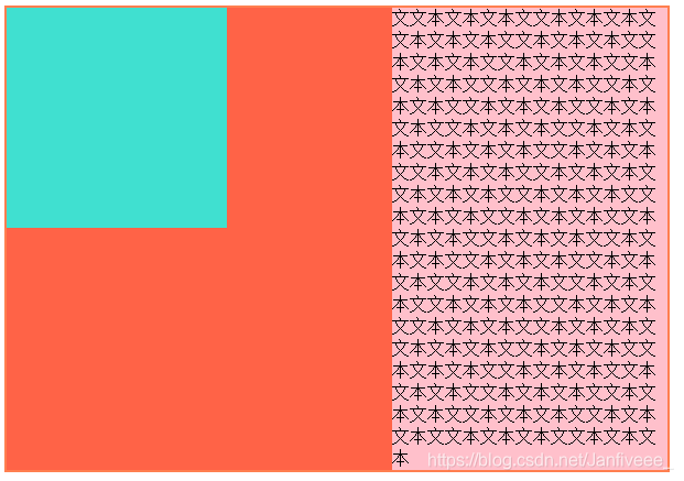
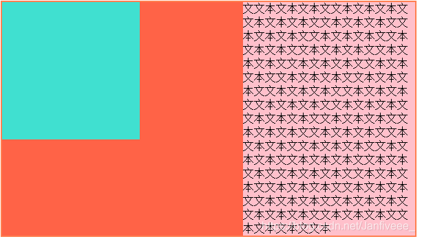
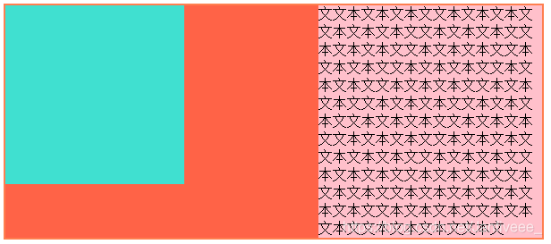
第三种:在浮动元素下方加上一个空标记
这种方法会造成结构负担和代码冗余。
利用空标记的属性,使其清除自身浮动,再设置高度为0,撑开父元素。
.box3{
				clear: both;
				height: 0;
				overflow: hidden;
			}
		</style>
	</head>
	<body>
		<div class="box">
			<div class="box1">
			</div>
			<div class="box2">
				文文本文本文本文文本文本文本文文本文本文本文文本文本文本文文本文本文本文文本文本文本文文本文本文本文文本文本文本文文本文本文本文文本文本文本文文本文本文本文文本文本文本文文本文本文本文文本文本文本文文本文本文本文文本文本文本文文本文本文本文文本文本文本文文本文本文本文文本文本文本文文本文本文本文文本文本文本文文本文本文本文文本文本文本文文本文本文本文文本文本文本文文本文本文本文文本文本文本文文本文本文本文文本文本文本文文本文本文本文文本文本文本文文本文本文本文文本文本文本文文本文本文本文文本
			</div>
			<div class="box3">
			</div>
		</div>
第四种:给父元素添加display:table;属性
这种方法是使元元素具有表格属性,但同时也改变了父元素原有属性
.box{
				width: 600px;
				height: auto;
				border: 2px solid coral;
				background: tomato;
				display: table;
				}
第五种:万能清除法
给父元素本身设置一个块元素,使其隐藏。
.box{
				width: 600px;
				height: auto;
				border: 2px solid coral;
				background: tomato;
				}
			.box:after{
				content:"";
				clear: both;
				display: block;
				height: 0;
				overflow: hidden;
				visibility: hidden;
			}
这些就是高度自适应的方法,同时也是解决浮动元素高度自适应的办法。
