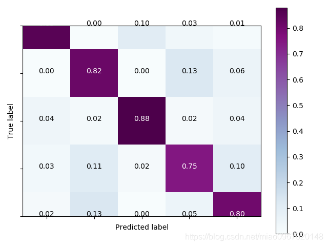
不正常显示:
正常显示:
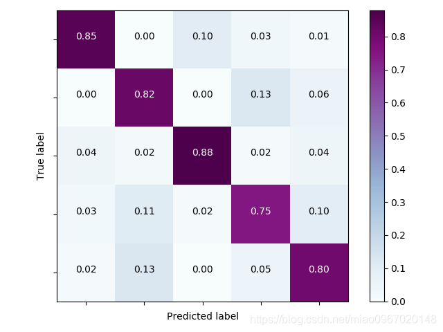
原因:
matplotlib版本3.1.1和3.1.2版本问题解决方法:
plt.imshow(cm, interpolation='nearest', cmap=cmap)

plt.ylim(len(cm) - 0.5, -0.5)
或
fig, ax = plt.subplots()
im = ax.imshow(cm)

ax.set_ylim(len(cm)-0.5, -0.5)
matplotlib版本<3.1.1时,绘制混淆矩阵的代码:
import numpy as np
import matplotlib
import matplotlib.pyplot as plt
# sphinx_gallery_thumbnail_number = 2
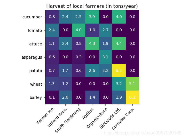
vegetables = ["cucumber", "tomato", "lettuce", "asparagus",
"potato", "wheat", "barley"]
farmers = ["Farmer Joe", "Upland Bros.", "Smith Gardening",
"Agrifun", "Organiculture", "BioGoods Ltd.", "Cornylee Corp."]
harvest = np.array([[0.8, 2.4, 2.5, 3.9, 0.0, 4.0, 0.0],
[2.4, 0.0, 4.0, 1.0, 2.7, 0.0, 0.0],
[1.1, 2.4, 0.8, 4.3, 1.9, 4.4, 0.0],
[0.6, 0.0, 0.3, 0.0, 3.1, 0.0, 0.0],
[0.7, 1.7, 0.6, 2.6, 2.2, 6.2, 0.0],
[1.3, 1.2, 0.0, 0.0, 0.0, 3.2, 5.1],
[0.1, 2.0, 0.0, 1.4, 0.0, 1.9, 6.3]])
fig, ax = plt.subplots()
im = ax.imshow(harvest)
# We want to show all ticks...
ax.set_xticks(np.arange(len(farmers)))
ax.set_yticks(np.arange(len(vegetables)))
# ... and label them with the respective list entries
ax.set_xticklabels(farmers)
ax.set_yticklabels(vegetables)
# Rotate the tick labels and set their alignment.
plt.setp(ax.get_xticklabels(), rotation=45, ha="right",
rotation_mode="anchor")
# Loop over data dimensions and create text annotations.
for i in range(len(vegetables)):
for j in range(len(farmers)):
text = ax.text(j, i, harvest[i, j],
ha="center", va="center", color="w")
ax.set_title("Harvest of local farmers (in tons/year)")
fig.tight_layout()
plt.show() matplotlib版本3.1.1时,绘制混淆矩阵的代码:
import numpy as np
import matplotlib
import matplotlib.pyplot as plt
# sphinx_gallery_thumbnail_number = 2

vegetables = ["cucumber", "tomato", "lettuce", "asparagus",
              "potato", "wheat", "barley"]
farmers = ["Farmer Joe", "Upland Bros.", "Smith Gardening",
           "Agrifun", "Organiculture", "BioGoods Ltd.", "Cornylee Corp."]

harvest = np.array([[0.8, 2.4, 2.5, 3.9, 0.0, 4.0, 0.0],
                    [2.4, 0.0, 4.0, 1.0, 2.7, 0.0, 0.0],
                    [1.1, 2.4, 0.8, 4.3, 1.9, 4.4, 0.0],
                    [0.6, 0.0, 0.3, 0.0, 3.1, 0.0, 0.0],
                    [0.7, 1.7, 0.6, 2.6, 2.2, 6.2, 0.0],
                    [1.3, 1.2, 0.0, 0.0, 0.0, 3.2, 5.1],
                    [0.1, 2.0, 0.0, 1.4, 0.0, 1.9, 6.3]])


fig, ax = plt.subplots()
im = ax.imshow(harvest)

# We want to show all ticks...
ax.set_xticks(np.arange(len(farmers)))
ax.set_yticks(np.arange(len(vegetables)))
# ... and label them with the respective list entries
ax.set_xticklabels(farmers)
ax.set_yticklabels(vegetables)
ax.set_ylim(len(harvest)-0.5, -0.5)

# Rotate the tick labels and set their alignment.
plt.setp(ax.get_xticklabels(), rotation=45, ha="right",
         rotation_mode="anchor")

# Loop over data dimensions and create text annotations.
for i in range(len(vegetables)):
    for j in range(len(farmers)):
        text = ax.text(j, i, harvest[i, j],
                       ha="center", va="center", color="w")

ax.set_title("Harvest of local farmers (in tons/year)")
fig.tight_layout()
plt.show()