CSS中一共有五种定位:
position:static;默认值
position:absolute;绝对定位
position:relative;相对对定位
position:fixed;固定定位
position:sticky;粘性定位
其中,粘性定位是CSS3新增加的 兼容性比较差
定位的作用:
在正常情况下,可以让一个元素覆盖在另外一个元素上面
可以移动一个元素的位置
可以固定某个容器在浏览器窗口的某个位置不动。(运用fixed属性)
可以做吸顶效果,比如百度新闻的导航(运用sticky属性)
我们研究定位正常从三个方便研究,即文档流,移动位置的时候参照物,层叠顺序。
A.position:static 定位的默认值,实际意义不大
B.position:absolute;绝对定位
1、文档流
脱离文档流 当一个元素绝对定位之后,该元素是悬空的,下面的元素如果没有定位则会上去,被覆盖(全脱离)
浮动之后也是脱离文档流,但是浮动之后下面的容器会上去,里面的文字会环绕显示。(半脱离)
如果多个元素同时给了绝对定位,他们之间的层叠顺序是,结构在后的元素在最上面。
2、移动位置的时候参照物
定位之后想要移动位置,可以用margin或者用
left top bottom right属性移动位置
参照物1: 浏览器的第一屏
参照物2:是父元素 前提条件是有父元素且父元素有定位(可以是绝对、固定、相对)。
3、层叠顺序(z-index必须有定位才可以用)
如果想要改变定位之后的层叠顺序,可以通过一个属性 z-index属性改变
z-index的默认值是0 不带单位可以给负值
值越大,层越靠上 没有最大值也没有最小值
<!DOCTYPE html>
<html>
<head>
<meta charset="utf-8">
<title></title>
<style type="text/css">
body{margin: 0; padding: 0;}
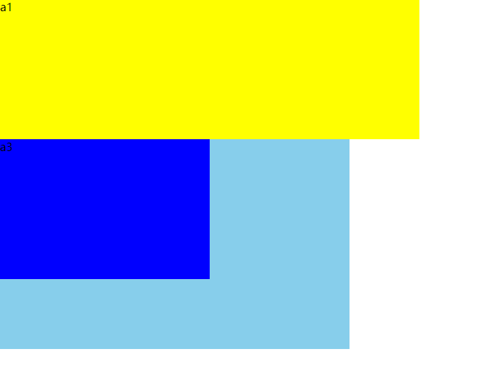
.a1{width: 600px;height: 200px;background: yellow;}
.a2{width: 500px;height: 500px;background: skyblue; position: absolute;top: 50px;}
.a3{width: 300px;height: 300px;background: blue;position: absolute; }
</style>
</head>
<body>
<div class="a1">a1</div>
<div class="a2">a2</div>
<div class="a3">a3</div>
</body>
</html>
演示结果
C.position:relative;相对对定位
1、文档流
不脱离文档流,相对定位之后,该元素是占浏览器位置
2、移动位置的时候参照物 只有1个
利用left right bottom top移动位置的时候
参照物是自己的初始位置 移动位置之后,原来的空间还在。
3、层叠顺序
多个元素给完相对定位之后,如果没有移动位置,那么他们之间就不会覆盖现象。
如果移动了位置,那么后面的元素还是会覆盖前面的元素。
可以通过z-index改变层叠顺序
<!DOCTYPE html>
<html>
<head>
<meta charset="utf-8">
<title></title>
<style type="text/css">
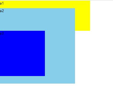
body{margin: 0; padding: 0;}
.a1{width: 600px;height: 200px;background: yellow;}
.a2{width: 500px;height: 500px;background: skyblue; position: relative;top: 50px;}
</style>
</head>
<body>
<div class="a1">a1</div>
<div class="a2">a2</div>
</body>
</html>
演示结果
D.position:fixed;固定定位
1、文档流
脱离文档流,但是该元素会固定在某个位置不动
2、用top left right bottom移动位置的时候参照物
参照物是浏览器的当前窗口
3、层叠顺序
多个元素同时给了固定定位,结构上后面的元素会盖在最上面
固定定位的层叠顺序也可以用z-index改变
<!DOCTYPE html>
<html>
<head>
<meta charset="utf-8">
<title></title>
<style type="text/css">
body{margin: 0; padding: 0;}
.a1{width: 600px;height: 200px;background: yellow;}
.a2{width: 500px;height: 300px;background: skyblue; position: fixed;}
.a3{width: 300px;height: 900px;background: blue; }
</style>
</head>
<body>
<div class="a1">a1</div>
<div class="a2">a2</div>
<div class="a3">a3</div>
</body>
</html>
演示结果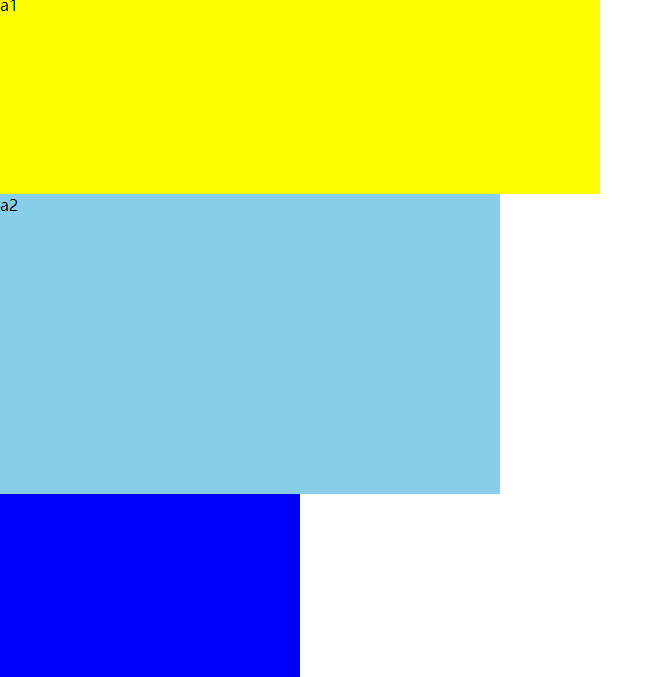
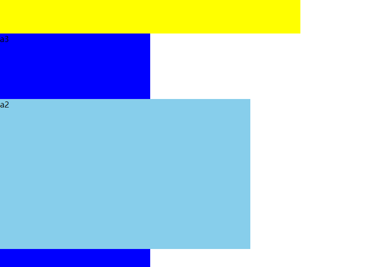
(拖动鼠标向下后的结果)
E.position:sticky;粘性定位
定位中的一个特例,设置position:sticky同时给一个(top,bottom,right,left)之一即可
其使用条件:
1、父元素不能overflow:hidden或者overflow:auto属性。
2、必须指定top、bottom、left、right4个值之一,否则只会处于相对定位
3、父元素的高度不能低于sticky元素的高度
4、sticky元素仅在其父元素内生效
<!DOCTYPE html>
<html>
<head>
<meta charset="utf-8">
<title></title>
<style type="text/css">
body{margin: 0; padding: 0;}
div{height: 60px; background: red; margin-bottom: 200px;}
.box2{position: sticky; top: 0; font-size: 30px;background: yellow;}
</style>
</head>
<body>
<div></div>
<div class="box2">222222222222</div>
<div></div>
<div></div>
<div></div>
</body>
</html>
实际运用中,我们经常使用的定位是绝对定位和相对定位,他们可以一起使用,在一个包含结构里面,父元素给相对定位,子元素给绝对定位,这样的话,子元素的参照物是父元素,父元素的参照物是自己的初始位置,就可以实现子元素覆盖在父元素,也就是“子绝父相”。
<!DOCTYPE html>
<html>
<head>
<meta charset="utf-8">
<title></title>
<style type="text/css">
body{margin: 0; padding: 0;}
.a1{width: 600px;height: 200px;background: yellow;}
.a2{width: 500px;height: 300px;background: skyblue; position: relative;}
.a3{width: 300px;height: 200px;background: blue; position: absolute;}
</style>
</head>
<body>
<div class="a1">a1</div>
<div class="a2">
<div class="a3">a3</div>
</div>
</body>
</html>