好处
- 兼容性强
几乎可以在不声明的情况下用于全部浏览器。 - 稳定性高
与纯三维模型相比量更小,对电脑和浏览器要求较低 - 易加载
- 易开发
坏处
1.动画效果有局限
只能完成某一角度或者某一形状的动画
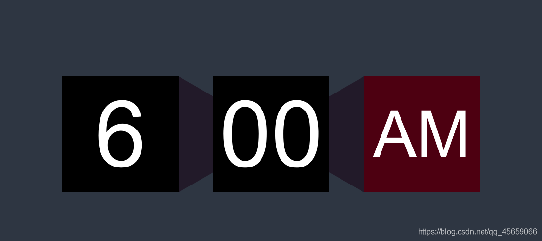
效果
由于CSDN不能放视频演示动画效果(可放大缩小旋转跳跃我闭着眼),无奈只能挂张图片
代码
html
<div id="mainBottom">
    <div id="faceBottom">
        <div id="face1">
            <text id="hourText">6</text>
        </div>
        <div id="faceTurn1"></div>
        <div id="face2">
            <text id="minText">00</text>
        </div>
        <div id="faceTurn2"></div>
        <div id="face_AM_PM">
            <text id="apmText">AM</text>
        </div>
    </div>
    <div id="change">
        <select id="timeHourSelect">
            <option>  1</option>
            <option>  2</option>
            <option>  3</option>
 </select>
        <text class="H_M_text">时</text>
        <select id="timeMinSelect">
            <option>  01</option>
            <option> 02</option>
xt>
        <select id="timeAPMSelect">
            <option>  PM</option>
            <option>  AM</option>
        </select>
        <button id="setTimeButton" οnclick="setTime()">set time</button>
    </div>
</div>
css
#mainBottom{
    background: #2e3642;
    width: 100%;
    height: 100%;
    position: absolute;
    display: flex;
    align-items: center;
    justify-content: center;
}
#faceBottom{
    width: auto;
    height: auto;
    top: 15%;
    position: absolute;
    display: flex;
    align-items: center;
    justify-content: center;
}
#face1{
    width: 150px;
    height: 150px;
    display: flex;
    align-items: center;
    justify-content: center;
    background-color: black;
    color: white;
    font-weight: 200;
    font-size: 7vw;
    font-family: Arial;
    animation: focusFace 2s;
}
#face2{
    width: 150px;
    height: 150px;
    display: flex;
    align-items: center;
    justify-content: center;
    background-color: black;
    color: white;
    font-weight: 200;
    font-size: 7vw;
    font-family: Arial;
    animation: focusFace 2s;
}
@keyframes focusFace {
    0%{width: 150px;height: 150px;font-size: 7vw;}
    50%{width: 200px;height: 200px;font-size: 10vw;}
    100%{width: 150px;height: 150px;font-size: 7vw;}
}
@keyframes focusFace1_1 {
     0%{width: 150px;height: 150px;font-size: 7vw;}
     100%{width: 0px;height: 0px;font-size: 0vw;}
 }
@keyframes focusFace1_2 {
    0%{width: 0px;height: 0px;font-size: 0vw;}
    100%{width: 150px;height: 150px;font-size: 7vw;}
}
#face_AM_PM{
    width: 150px;
    height: 150px;
    display: flex;
    align-items: center;
    justify-content: center;
    background-color: #4d0011;
    color: white;
    font-weight: 200;
    font-size: 5vw;
    font-family: Arial;
    animation: focusFace_AM_PM 2s;
}
@keyframes focusFace_AM_PM {
    0%{width: 150px;height: 150px;font-size: 5vw;}
    50%{width: 200px;height: 200px;font-size: 7vw;}
    100%{width: 150px;height: 150px;font-size: 5vw;}
}
@keyframes focusFace_AM_PM1_1 {
    0%{width: 150px;height: 150px;font-size: 5vw;}
    100%{width: 0px;height: 0px;font-size: 0vw;}
}
@keyframes focusFace_AM_PM1_2 {
    0%{width: 0px;height: 0px;font-size: 0vw;}
    100%{width: 150px;height: 150px;font-size: 5vw;}
}
#faceTurn1{
    width: 0px;
    height: 110px;
    border-left: 30px solid #221a29;
    border-top: 20px solid transparent;
    border-bottom: 20px solid transparent;
    display: flex;
    align-items: center;
    justify-content: center;
    animation: focusFaceTurn1 2s;

}
@keyframes focusFaceTurn1 {
    0%{height: 110px;border-left: 30px solid #221a29;border-top: 20px solid transparent;border-bottom: 20px solid transparent;}
    50%{height: 130px;border-left: 60px solid #221a29;border-top:35px solid transparent;border-bottom: 35px solid transparent;}
    100%{height: 110px;border-left: 30px solid #221a29;border-top: 20px solid transparent;border-bottom: 20px solid transparent;}
}
@keyframes focusFaceTurn1_1_1 {
    0%{height: 110px;border-left: 30px solid #221a29;border-top: 20px solid transparent;border-bottom: 20px solid transparent;}
    100%{height: 0px;border-left: 0px solid #221a29;border-top: 0px solid transparent;border-bottom: 0px solid transparent;}
}
@keyframes focusFaceTurn1_1_2 {
    0%{height: 0px;border-left: 0px solid #221a29;border-top: 0px solid transparent;border-bottom: 0px solid transparent;}
    100%{height: 110px;border-left: 30px solid #221a29;border-top: 20px solid transparent;border-bottom: 20px solid transparent;}
}
#faceTurn2{
    width: 0px;
    height: 110px;
    border-right: 30px solid #221a29;
    border-top: 20px solid transparent;
    border-bottom: 20px solid transparent;
    display: flex;
    align-items: center;
    justify-content: center;
    animation: focusFaceTurn2 2s;
}
@keyframes focusFaceTurn2 {
    0%{height: 110px;border-right: 30px solid #221a29;border-top: 20px solid transparent;border-bottom: 20px solid transparent;}
    50%{height: 130px;border-right: 60px solid #221a29;border-top: 35px solid transparent;border-bottom: 35px solid transparent;}
    100%{height: 110px;border-right: 30px solid #221a29;border-top: 20px solid transparent;border-bottom: 20px solid transparent;}
}
@keyframes focusFaceTurn2_1_1 {
    0%{height: 110px;border-right: 30px solid #221a29;border-top: 20px solid transparent;border-bottom: 20px solid transparent;}
    100%{height: 0px;border-right: 0px solid #221a29;border-top: 0px solid transparent;border-bottom: 0px solid transparent;}
}
@keyframes focusFaceTurn2_1_2 {
    0%{height: 0px;border-right: 0px solid #221a29;border-top: 0px solid transparent;border-bottom: 0px solid transparent;}
    100%{height: 110px;border-right: 30px solid #221a29;border-top: 20px solid transparent;border-bottom: 20px solid transparent;}
}css是核心,主要靠的是position: absolute和display: flex实现各div动画中的粘合,动画这里用的是*@keyframes*,采用非线性动画。
JavaScript
function setTime() {
    var hour=6;
    var min=10;
    var apm="AM";
    var obj=document.getElementById("timeHourSelect");
    var index=obj.selectedIndex;
    hour=obj.options[index].text;
    // alert(hour);
     obj=document.getElementById("timeMinSelect");
     index=obj.selectedIndex;
    min=obj.options[index].text;
    // alert(min);
    obj=document.getElementById("timeAPMSelect");
    index=obj.selectedIndex;
    apm=obj.options[index].text;

    // alert(apm);
    document.getElementById("face1").style.animation="focusFace1_1 1s";
    document.getElementById("face2").style.animation="focusFace1_1 1s";
    document.getElementById("face_AM_PM").style.animation="focusFace_AM_PM1_1 1s";
    document.getElementById("faceTurn1").style.animation="focusFaceTurn1_1_1 1s";
    document.getElementById("faceTurn2").style.animation="focusFaceTurn2_1_1 1s";
    setTimeout(function(){
        document.getElementById("apmText").innerHTML=apm;
        document.getElementById("minText").innerHTML=min;
        document.getElementById("hourText").innerHTML=hour;
        document.getElementById("face1").style.animation = "focusFace1_2 1s";
        document.getElementById("face2").style.animation = "focusFace1_2 1s";
        document.getElementById("face_AM_PM").style.animation = "focusFace_AM_PM1_2 1s";
        document.getElementById("faceTurn1").style.animation = "focusFaceTurn1_1_2 1s";
        document.getElementById("faceTurn2").style.animation = "focusFaceTurn2_1_2 1s";
        if(apm=="PM") {
            document.getElementById("face_AM_PM").style.background="#092d45";
            document.getElementById("setTimeButton").style.background="#092d45";
            document.getElementById("setTimeButton").style.border="3px solid #092d45";
        }else {
            document.getElementById("face_AM_PM").style.background="#4d0011";
            document.getElementById("setTimeButton").style.background="#4d0011";
            document.getElementById("setTimeButton").style.border="3px solid #4d0011";
        }
    },1000)

 }
拓展
这里用梯形阴影和正方形正面表现了一个长方体的三维动画效果,我也尝试了用椭圆和圆形塑造一个球的伸缩和跳动动画,下次一定。
