3.移动端适配
3.1.百分比适配
<!DOCTYPE html>
<html lang="en">
<head>
  <meta charset="UTF-8">
  <meta name="viewport" content="width=device-width, initial-scale=1.0">
  <meta ="X-UA-Compatible" content="ie=edge">
  <title>Document</title>
  <style>
    div {
      width: 25%;
      height: 100px;
      float: left;
    }
    .box_1{
      background-color: #673AB7;
    }
    .box_2 {
      background-color: #E91E63;
    }
    .box_3 {
      background-color: #009688;
    }
    .box_4 {
      background-color: #FF5722;
    }
  </style>
</head>
<body>
  <div class="box_1"></div>
  <div class="box_2"></div>
  <div class="box_3"></div>
  <div class="box_4"></div>
</body>
</html>
百分比适配这种方式比较简单,但缺点是高度无法适配,因为高度通常都不确定,所以,百分比适配这种方案一般是宽度适配
3.2.viewport适配
<!DOCTYPE html>
<html lang="en">
<head>
  <meta charset="UTF-8">
  <!-- <meta name="viewport" content="width=device-width, initial-scale=1.0"> -->
  <script>
  (function(){
    // 固定目标宽度
    var targetWidth = 320
    // 获取屏幕宽度
    var w = window.screen.width
    // 算出设备屏幕宽度是目标宽度的多少倍
    var scale = w / targetWidth
    // 创建一个meta标签
    var  meta = document.createElement('meta')
    meta.name = "viewport"
    meta.content="user-scalable=no, initial-scale="+scale+",minimum-scale="+scale+",maximum-scale="+scale
    document.head.appendChild(meta)
  })()
  </script>
  <meta ="X-UA-Compatible" content="ie=edge">
  <title>Document</title>
  <style>
    body{
      margin: 0;
    }
    div {
      width: 80px;
      height: 100px;
      float: left;
    }
    .box_1{
      background-color: #673AB7;
    }
    .box_2 {
      background-color: #E91E63;
    }
    .box_3 {
      background-color: #009688;
    }
    .box_4 {
      background-color: #FF5722;
    }
  </style>
</head>
<body>
  <div class="box_1"></div>
  <div class="box_2"></div>
  <div class="box_3"></div>
  <div class="box_4"></div>
</body>
</html>
viewpoint的适配的核心思想是通过控制viewport的缩放来实现各种设备的适配,我们在写的时候是按某个固定宽度来写的
3.3.rem适配
rem是一个字体单位,值会根据html元素大小变化而变化,宽度和高度我们都可以用rem来表示,使用rem做适配的原理就是把页面元素的px单位换成rem单位,然后动态的修改html的字体大小,html字体大小变化了,那么以rem为单位的子元素大小也会跟着变化
这里比较关键的是动态的去设置html字体的大小,这里设置的依据是根据不同设备的宽度来进行设置的,这样我们就能在不同的设备上展示不同的大小,从而达到不同尺寸设备的适配
1.1rem等于浏览器默认的html元素的font-size值
.html {
  font-size: 16px;
}
p {
  font-size: 2rem; /* 2 * 16 =  32px */
}
2.动态的修改html元素font-size大小,通俗的说就是设置1rem的长度
var rem = document.documentElement.clientWidth / 10

document.document.documentElement.style.fontSize = rem + "px"
注意:上面 “document.documentElement.clientWidth / 10” 这里的10可以是其他的值, 20、30 都可以,我们在做px转rem的时候要用到
3.使用的时候,我们需要将px转成rem,举个例子:设计稿宽度是750px, 其中有一个盒子的宽度是100px,高度是100px,如果在iphone6下面显示,应该如何用rem来表示这个盒子的宽高呢
公式: 像素/rem基准值在iphone下面,document.documentElement.clientWidth的值为375,rem基准值为 375/10=37.5,那么,100px转换成rem为:
100px/37.5 = 2.66667rem(约等于)3.4.基于vw的适配方案
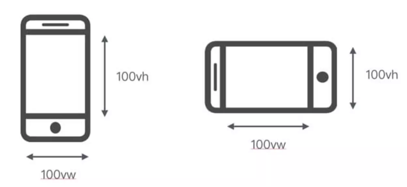
在css3中引入了视口单位,vw表示视口的宽度,vh表示视口的高度,也就是把视口平均分成100份,每一份为1个单位,那么1vw = 1%视口宽度,1vh = 1%视口高度
<!DOCTYPE html>
<html lang="en" >
<head>
  <meta charset="UTF-8">
  <meta name="viewport" content="width=device-width, initial-scale=1">
  <!-- <script>
    document.documentElement.style.fontSize = document.documentElement.clientWidth / 100 + "px"
  </script> -->
  <meta ="X-UA-Compatible" content="ie=edge">
  <title>Document</title>
  <style>
    body{
      margin: 0;
    }
    div {
      width: 100vw;
      height: 10vh;
      float: left;
    }
    .box_1{
      background-color: #673AB7;
    }
    .box_2 {
      background-color: #E91E63;
    }
    .box_3 {
      background-color: #009688;
    }
    .box_4 {
      background-color: #FF5722;
    }
  </style>
</head>
<body>
  <div class="box_1"></div>
  <div class="box_2"></div>
  <div class="box_3"></div>
  <div class="box_4"></div>
</body>
</html>螺钉课堂视频课程地址:http://edu.nodeing.com