首先说明的是,我们做APP开发,Tab分页不管是顶部还是底部,都是必不可少的,网上也有太多太多的实现方式了,我在这里总结一下:
第一种方式: TabHost原始方式:(链接另一篇文章)
这里实现的是底部菜单:
布局文件:(我们通过RelativeLayout 可以把TabWidget定位在底部)
<?xml version="1.0" encoding="utf-8"?>
<TabHost xmlns:android="http://schemas.android.com/apk/res/android"
    android:id="@android:id/tabhost"
    android:layout_width="fill_parent"
    android:layout_height="fill_parent" >

    <RelativeLayout
        android:layout_width="fill_parent"
        android:layout_height="fill_parent"
        android:orientation="vertical"
        android:padding="3dp" >

        <FrameLayout
            android:id="@android:id/tabcontent"
            android:layout_width="fill_parent"
            android:layout_height="fill_parent"
            android:layout_weight="1" >
        </FrameLayout>

        <TabWidget
            android:id="@android:id/tabs"
            android:layout_width="fill_parent"
            android:layout_height="wrap_content"
            android:layout_alignBottom="@android:id/tabcontent"
            android:background="@drawable/tabbar_bg" />
    </RelativeLayout>

</TabHost>
在这里我们将说明一下:之前我是获取到TabWidget的view试图及内部icon和title,然后控制实现其效果,但是我们也可以用另外一种方式,也就是我们调用TabHost.TabSpec 的setIndicator(View view);这个方法,我们可以定制显示的view,
代码片段:
/***
 * 创建footerview
 */
public void createFooterView() {
	tabHost = getTabHost(); // The activity TabHost


	view = new TabView(this, R.drawable.tabbar_icon_home,
			R.drawable.tabbar_icon_home);
	// view.setBackgroundDrawable(this.getResources().getDrawable(R.drawable.selecttabbackground));
	intent = new Intent(MainActivity.this, HomeActivity.class);
	spec = tabHost.newTabSpec("num1").setIndicator(view).setContent(intent);
	tabHost.addTab(spec);


	view = new TabView(this, R.drawable.tabbar_icon_search,
			R.drawable.tabbar_icon_search);
	intent = new Intent(MainActivity.this, HomeActivity.class);
	spec = tabHost.newTabSpec("num3").setIndicator(view).setContent(intent);
	tabHost.addTab(spec);


	view = new TabView(this, R.drawable.tabbar_icon_cart,
			R.drawable.tabbar_icon_cart);
	intent = new Intent(MainActivity.this, HomeActivity.class);
	spec = tabHost.newTabSpec("num4").setIndicator(view).setContent(intent);
	tabHost.addTab(spec);


	view = new TabView(this, R.drawable.tabbar_icon_more,
			R.drawable.tabbar_icon_more);
	intent = new Intent(MainActivity.this, HomeActivity.class);
	spec = tabHost.newTabSpec("num2").setIndicator(view).setContent(intent);
	tabHost.addTab(spec);
}
class TabView extends LinearLayout {
	ImageView imageView;
	public TabView(Context c, int drawable, int drawableselec) {
		super(c);
		imageView = new ImageView(c);
		// 可以定制点击后状态
		StateListDrawable listDrawable = new StateListDrawable();
		// 未选
		listDrawable.addState(SELECTED_STATE_SET, this.getResources()
				.getDrawable(drawableselec));
		// 选择
		listDrawable.addState(ENABLED_STATE_SET, this.getResources()
				.getDrawable(drawable));
		imageView.setImageDrawable(listDrawable);// 引用 StateListDrawable
		imageView.setBackgroundColor(Color.TRANSPARENT);
		setGravity(Gravity.CENTER);
		addView(imageView);
	}
}
这样我们就实现想要的效果了.(建议使用这种方法)
如果我是图标和文字分开的,我们也可以用(RadioButton代替,也许大家都不陌生,一会我简单介绍下)
第二种方法:GridView+ActivityGroup (图片 ,文字)
(为了省事,我把上下tab分页整理到一个demo里面了.)
这个的布局文件我就不显示了,因为比较简单,我们还是来看代码吧.
代码片段:
/***
 * 适配器
 *
 * @author Administrator
 *
 */
public class ImageAdapter extends BaseAdapter {

	private Context mContext;
	private ImageTextButton[] imgItems;
	private int selResId;

	/***
	 *
	 * @param c
	 * @param picIds
	 * @param titles
	 * @param width
	 * @param height
	 * @param selResId
	 */
	public ImageAdapter(Context c, int[] picIds, String titles[], int width,
			int height, int selResId) {
		mContext = c;
		this.selResId = selResId;
		imgItems = new ImageTextButton[picIds.length];
		for (int i = 0; i < picIds.length; i++) {
			imgItems[i] = new ImageTextButton(mContext);

			imgItems[i]
					.setLayoutParams(new GridView.LayoutParams(width, height));// 设置ImageView宽高
			imgItems[i].setPadding(2, 2, 2, 2);
			// 显示图片与文本
			imgItems[i].setImageResource(picIds[i], titles[i]);
		}
	}

	@Override
	public int getCount() {
		return imgItems.length;
	}

	@Override
	public Object getItem(int position) {
		return position;
	}

	@Override
	public long getItemId(int position) {
		return position;
	}

	/***
	 * 设置选中后的效果
	 */
	public void SetFocus(int index) {

		for (int i = 0; i < imgItems.length; i++) {
			// 先把所有设为最初状态
			if (i != index) {
				imgItems[i].setBackgroundResource(0);// 回到最初样式
			}
		}
		// 选中设置
		imgItems[index].setBackgroundResource(selResId);
	}

	@Override
	public View getView(int position, View convertView, ViewGroup parent) {
		ImageTextButton imageView;
		if (convertView == null) {
			imageView = imgItems[position];
		} else {
			imageView = (ImageTextButton) convertView;
		}
		return imageView;
	}

}
在这里我们用到了自定义控件,其实就是把imageview 和textview 整到一起了,
/***
 * 自定义控件(图片文字)
 */
public class ImageTextButton extends LinearLayout {
	private ImageView button = null;
	private TextView text = null;
	private Context context;


	public ImageTextButton(Context context) {
		this(context, null);
		this.context = context;
	}


	public ImageTextButton(Context context, AttributeSet attrs) {
		super(context, attrs);
		LayoutInflater.from(context).inflate(R.layout.imagetextbutton, this,
				true);
		button = (ImageView) this.findViewById(R.id.button);
		text = (TextView) this.findViewById(R.id.btnText);
		text.setSingleLine(true);
	}


	public void setImageResource(int image_id, String title) {
		Bitmap bitmap = BitmapFactory.decodeResource(context.getResources(),
				image_id);
		button.setBackgroundDrawable(new BitmapDrawable(bitmap));
		text.setText(title);
	}


	public void setImageBitmap(Bitmap bitmap) {
		if (button != null)
			button.setImageBitmap(bitmap);
	}


	public void setBackgroundDrawable(Drawable drawable, int Width, int Hdight) {
		if (button != null) {
			button.setBackgroundDrawable(drawable);
			button.setMinimumHeight(Hdight);
			button.setMinimumWidth(Width);
		}


	}


	public void setText(String title) {
		if (text != null)
			text.setText(title);
	}


	public void setText(int ResID) {
		if (text != null)
			text.setText(ResID);
	}


	public void setWidth(int width) {
		button.setMaxWidth(width);
	}


	public void setHeight(int height) {
		button.setMaxHeight(height);
	}


}
我们只需要在oncreate中调用即可:
@Override
	public void onCreate(Bundle savedInstanceState) {
		super.onCreate(savedInstanceState);
		setContentView(R.layout.main);
		Navigation_Top_Bar = (GridView) this
				.findViewById(R.id.Navigation_Top_Bar);
		Navigation_Buttom_Bar = (GridView) this
				.findViewById(R.id.Navigation_Buttom_Bar);
		// 获取显示宽度
		int width = this.getWindowManager().getDefaultDisplay().getWidth()
				/ topbar_image_array.length;

		topImgAdapter1 = new ImageAdapter(this, topbar_image_array, titles,
				width, 100, R.drawable.cover);

		Init(Navigation_Top_Bar, topImgAdapter1);

		ButtomImgAdapter2 = new ImageAdapter(this, topbar_image_array, titles,
				width, 100, R.drawable.cover);

		Init(Navigation_Buttom_Bar, ButtomImgAdapter2);

	}
这个实现起来有点复杂,不过用习惯了会觉得别有一翻风味的.我之前就一直用这个方法.在这里我要说明一点:
imgItems[i].setLayoutParams(new GridView.LayoutParams(width, height));// 设置ImageView宽高
其他的都是细节上的问题,我想你们看过都会ok的.
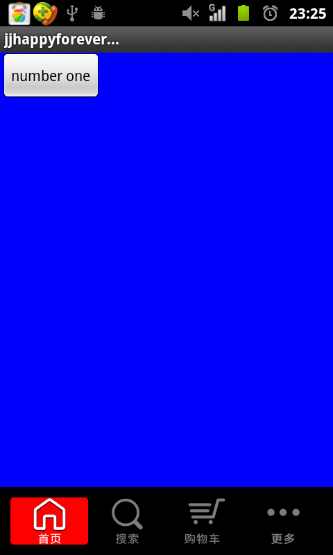
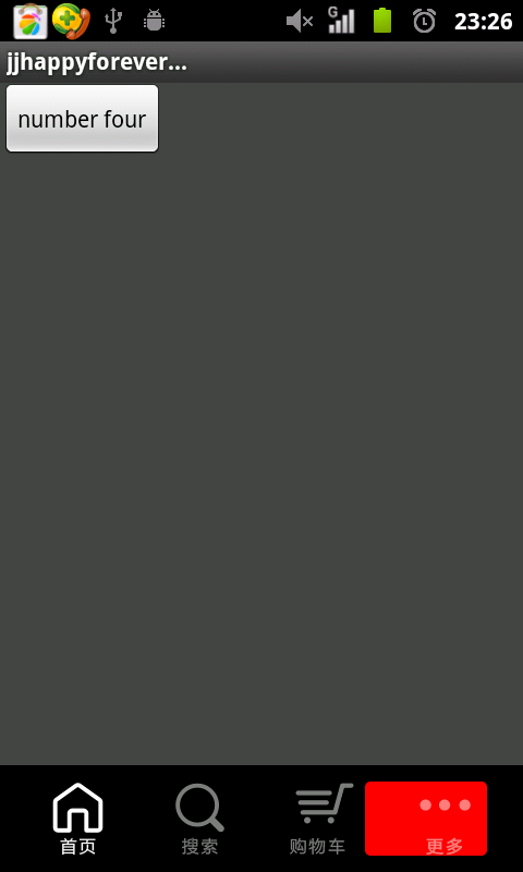
效果图:

(怎么样,效果还不错吧。就是实现起来有点负责,不过习惯就好.)
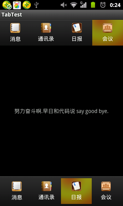
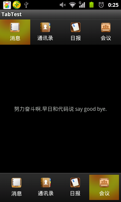
第三种方法:ActivityGroup+一些TextView布局.(在这里我们自定实现动态滚动效果)
详情请查看前面一片文章:android 分页Title栏滑块效果--ActionBar(模拟网易 腾讯等动态效果)
分页Tab的实现方法和上面方法类是,都是运用ActivityGroup的性质,而上面是通过GridView生成,而我们这边是我们自定义View控件实现.
这里我主要说一下怎样实现ActionBar:
代码片段:
/***
 * 自定义控件
 *
 * @author zhangjia
 *
 *         在这里我要说明一点 我们在创建RectF矩形的时候,
 *
 *         参照物原点是所在"父控件的左上角".
 *
 */
public class ActionBar extends LinearLayout implements OnClickListener {

	private ImageView tv1;
	private ImageView tv2;
	private ImageView tv3;
	private ImageView tv4;
	private Paint paint;// 画笔
	private RectF curRectF;// draw当前bar
	private RectF tarRectF;// draw被点击bar

	private final int space_x = 0;// 相当于pading.
	private final int space_y = 0;// 相当于pading
	private final double step = 32;// 速度step.


	public ActionBar(Context context) {
		super(context);
	}

	/***
	 * 构造方法
	 *
	 * @param context
	 * @param attrs
	 */
	public ActionBar(Context context, AttributeSet attrs) {
		super(context, attrs);
		setWillNotDraw(false);
		LayoutInflater.from(context).inflate(R.layout.action_bar, this, true);
		paint = new Paint();
		paint.setAntiAlias(true);
		tv1 = (ImageView) findViewById(R.id.tv1);
		tv2 = (ImageView) findViewById(R.id.tv2);
		tv3 = (ImageView) findViewById(R.id.tv3);
		tv4 = (ImageView) findViewById(R.id.tv4);
		tv1.setOnClickListener(this);
		tv2.setOnClickListener(this);
		tv3.setOnClickListener(this);
		tv4.setOnClickListener(this);
		curRectF = null;
		tarRectF = null;
	}

	/***
	 * invalidate():调用这个方法会执行onDraw()方法,但是前提是:自己把invalidate()方法执行结束在进行执行.
	 */

	@Override
	protected void onDraw(Canvas canvas) {
		super.onDraw(canvas);
		canvas.drawColor(Color.BLACK);
		paint.setColor(Color.RED);
		// 如果当前curRectF=null,也就是第一次访问,则默认为draw第一个bar
		if (curRectF == null)
			curRectF = new RectF(tv1.getLeft() + space_x, tv1.getTop()
					+ space_y, tv1.getRight() - space_x, tv1.getBottom()
					- space_y);

		// 第一次方位tarRectF=null,默认为draw
		if (tarRectF == null)
			tarRectF = new RectF(tv1.getLeft() + space_x, tv1.getTop()
					+ space_y, tv1.getRight() - space_x, tv1.getBottom()
					- space_y);
		/***
		 * 作用:如果在这个范围内则,以这个为最终位置,(不明的白的话,你可以把这个注释运行下你就知道why了.)
		 */
		if (Math.abs(curRectF.left - tarRectF.left) < step) {
			curRectF.left = tarRectF.left;
			curRectF.right = tarRectF.right;
		}

		/***
		 * 说明目标在当前的左侧,需要向左移动(每次矩形移动step,则进行invalidate(),从新进行移动...)
		 */
		if (curRectF.left > tarRectF.left) {
			curRectF.left -= step;
			curRectF.right -= step;
			invalidate();// 继续刷新,从而实现滑动效果,每次step32.
		}
		/***
		 * 说明目标在当前的右侧,需要向右移动(每次矩形移动step,则进行invalidate(),从新进行移动...)
		 */
		else if (curRectF.left < tarRectF.left) {
			curRectF.left += step;
			curRectF.right += step;
			invalidate();
		}
		// canvas.drawRect(curRectF, paint);
		// 参数,矩形,弧度,画笔
		canvas.drawRoundRect(curRectF, 5, 5, paint);
	}

	/****
	 * 这里要记录目标矩形的坐标
	 */
	@Override
	public void onClick(View v) {
		tarRectF.left = v.getLeft() + space_x;
		tarRectF.right = v.getRight() - space_x;
		invalidate();// 刷新

		System.out.println("tarRectF.top=" + tarRectF.top + ",v.getTop()="
				+ v.getTop() + ", v.getBottom()" + v.getBottom());
	}

}
上面已经讲的很详细了,就不啰嗦了.
效果图:
大致就这么多了。
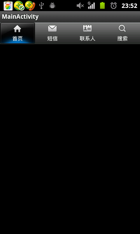
额外:还有一点就是有的会用到RadioButton这个控件,其实就是对其进行了一些调整,这里我简单说明一下应用:
可以取消button样式,用android:drawableTop显示图片,从而达到想要的效果.
<RelativeLayout xmlns:android="http://schemas.android.com/apk/res/android"
    xmlns:tools="http://schemas.android.com/tools"
    android:layout_width="match_parent"
    android:layout_height="match_parent" >

    <RadioGroup
        android:layout_width="fill_parent"
        android:layout_height="wrap_content"
        android:layout_gravity="bottom"
        android:background="@drawable/maintab_toolbar_bg"
        android:gravity="center"
        android:orientation="horizontal" >

        <RadioButton
            android:id="@+id/button1"
            android:layout_width="match_parent"
            android:layout_height="match_parent"
            android:layout_gravity="center"
            android:layout_weight="1"
            android:background="@drawable/home_btn_bg"
            android:button="@null"
            android:drawableTop="@drawable/icon_1_n"
            android:gravity="center"
            android:paddingTop="5dp"
            android:text="首页"
            android:textSize="12sp" />

        <RadioButton
            android:id="@+id/button2"
            android:layout_width="match_parent"
            android:layout_height="match_parent"
            android:layout_weight="1"
            android:background="@drawable/home_btn_bg"
            android:button="@null"
            android:drawableTop="@drawable/icon_2_n"
            android:gravity="center"
            android:paddingTop="5dp"
            android:text="短信"
            android:textSize="12sp" />

        <RadioButton
            android:id="@+id/button3"
            android:layout_width="match_parent"
            android:layout_height="match_parent"
            android:layout_weight="1"
            android:background="@drawable/home_btn_bg"
            android:button="@null"
            android:drawableTop="@drawable/icon_3_n"
            android:gravity="center"
            android:paddingTop="5dp"
            android:text="联系人"
            android:textSize="12sp" />

        <RadioButton
            android:id="@+id/button4"
            android:layout_width="match_parent"
            android:layout_height="match_parent"
            android:layout_weight="1"
            android:background="@drawable/home_btn_bg"
            android:button="@null"
            android:drawableTop="@drawable/icon_4_n"
            android:gravity="center"
            android:paddingTop="5dp"
            android:text="搜索"
            android:textSize="12sp" />
    </RadioGroup>

</RelativeLayout>
这里我们还需要selector.xml
实现点击效果.
<?xml version="1.0" encoding="utf-8"?>
<selector xmlns:android="http://schemas.android.com/apk/res/android">


    <item android:drawable="@drawable/home_btn_bg_s" android:state_enabled="true" android:state_focused="true" android:state_pressed="false"/>
    <item android:drawable="@drawable/home_btn_bg_s" android:state_enabled="true" android:state_pressed="true"/>
    <item android:drawable="@drawable/home_btn_bg_d" android:state_checked="true" android:state_enabled="true"/>


</selector>
示例图: