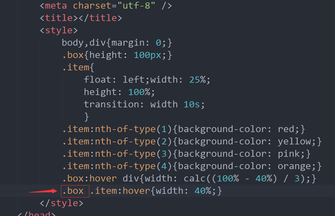
手风琴效果代码:
<!DOCTYPE html>
<html>
<head>
<meta charset="utf-8" />
<title></title>
<style>
body,div{margin: 0;}
.box{height: 100px;}
.item{
float: left;width: 25%;
height: 100%;
transition: width 10s;
}
.item:nth-of-type(1){background-color: red;}
.item:nth-of-type(2){background-color: yellow;}
.item:nth-of-type(3){background-color: pink;}
.item:nth-of-type(4){background-color: orange;}
.box:hover div{width: calc((100% - 40%) / 3);}
.box .item:hover{width: 40%;}
</style>
</head>
<body>
<div class="box">
<div class="item"></div>
<div class="item"></div>
<div class="item"></div>
<div class="item"></div>
</div>
</body>
</html>
去掉红色框后,手风琴效果出错(原因在于 hover选择器分别作用父子元素的同一个属性时,当鼠标在子元素上时,父元素设置的属性值也生效了,最终以父元素的属性值的效果体现出来)
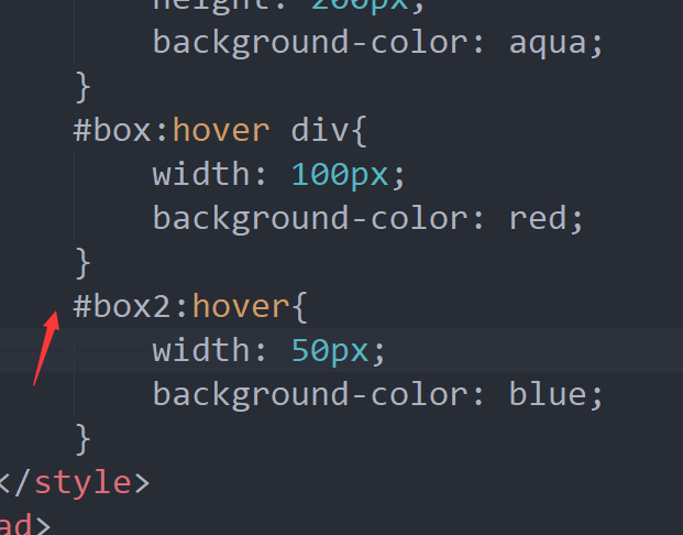
再看一个例子(鼠标先移到box再移到box2,看到呈现的效果为 “#box:hover div” 选择器设置的属性值的 效果):
<!DOCTYPE html>
<html>
<head>
<meta charset="utf-8" />
<title></title>
<style>
#box{
width: 200px;
height: 200px;
background-color: aqua;
}
#box:hover div{
width: 100px;
background-color: red;
}
#box2:hover{
width: 50px;
background-color: blue;
}
</style>
</head>
<body>
<div id="box">
<div id="box2">dfdfdfd</div>
</div>
</body>
</html>
先测试以上代码,再在下图中的红色箭头处加上#box 进行测试(鼠标先移到box再移到box2),结果 可想而知