一、静态页面
/* index.html */

<!DOCTYPE html>
<html lang="zh-cn">
<head>
    <meta charset="UTF-8">
    <link href="index.css" type="text/css" rel="stylesheet"/>
    <title>自定义响应式开发(静态页面)</title>
</head>
<body>
<div id="main-container">
    <div class="header-wrapper">
        <div class="more-list fr">
            <button id="btnMore">
                <div class="i-line"></div>
                <div class="i-line"></div>
                <div class="i-line"></div>
            </button>
        </div>
        <div class="nav-collapse">
            <ul class="nav-list">
                <li><a href="#">Bootstrap2中文文档</a></li>
                <li><a href="#">Bootstrap3中文文档</a></li>
                <li><a href="#">Bootstrap4中文文档</a></li>
                <li><a href="#">Less 教程</a></li>
                <li><a href="#">jQuery API</a></li>
                <li><a href="#">网站实例</a></li>
                <li><a href="#">看视频学前端</a></li>
            </ul>
        </div>
    </div>
</div>
</body>
</html>
/* index.css */
body{
margin: 0;
padding:0;
font: normal 12px/12px "Microsoft YaHei";
background-color: #00ff00;
}
ul,li{
padding: 0;
margin: 0;
list-style: none;
}
#main-container .header-wrapper{
background-color: #3c3f41;
height:50px;
line-height: 50px;
position: relative;
}
.header-wrapper .nav-list li{
float: left;
}
.header-wrapper .nav-list {
background-color: #333;
}
.header-wrapper .nav-list li a{
display: block;
height:50px;
line-height: 50px;
padding: 0 18px 0 18px;
color: #9d9d9d;
text-decoration: none;
font-size:14px;
}
.header-wrapper .nav-list li a:hover{
background-color: #1c1c1c;
}
.header-wrapper .nav-list li.active{
background-color: #1c1c1c;
}
.fr{
float: right;
}
.more-list{
padding: 2px 0;
}
.more-list button{
display: none;
border: 1px solid #cccccc;
border-radius: 4px;
background-image: linear-gradient(rgb(21, 21, 21), rgb(4, 4, 4));
border-color: rgba(0, 0, 0, 0.1) rgba(0, 0, 0, 0.1) rgba(0, 0, 0, 0.25);
padding: 1px 13px 1px 13px;
box-shadow: inset 0 1px 0 rgba(255, 255, 255, 0.1), 0 1px 0 rgba(255, 255, 255, 0.075);
text-shadow: 0 -1px 0 rgba(0, 0, 0, 0.25);
outline: none;
width: 40px;
height:30px;
}
.i-line{
height:2px;
line-height: 2px;
width:100%;
background-color: #fff;
margin: 3px 0 3px 0;
}
二、响应式页面(传统方法)
传统方法需要分别设计样式(宽屏、窄屏各一套),如下:
宽屏设计的一套样式
/* index-large-screen.css */


.header-wrapper .nav-list li{
    float: left;
}
.more-list button{
    display: none;
}
窄屏设计的一套样式
/* index-small-screen.css */


 .header-wrapper .nav-collapse{
     position: relative;
     top:40px;
     background-color: #3c3f41;
 }
 .header-wrapper .nav-list li:not(:first-child){
     margin-top: 1.2px;
 }
 .more-list button {
     display:block;
 }
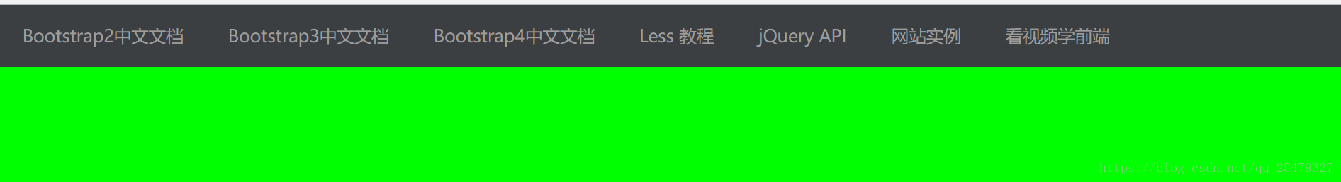
效果图:
响应式页面(传统方法)demo
完整代码如下:
/* index.html */


<!DOCTYPE html>
<html lang="zh-cn">
<head>
    <meta charset="UTF-8">
    <title>响应式开发(传统方法)</title>
    <link type="text/css" href="index.css" rel="stylesheet"/>
    <script type="text/javascript" src="jquery-3.3.1.min.js"></script>
</head>
<body>
<div id="main-container">
    <div class="header-wrapper">
        <div class="more-list fr">
            <button id="btnMore">
                <div class="i-line"></div>
                <div class="i-line"></div>
                <div class="i-line"></div>
            </button>
        </div>
        <div class="nav-collapse">
            <ul class="nav-list">
                <li><a href="#">Bootstrap2中文文档</a></li>
                <li><a href="#">Bootstrap3中文文档</a></li>
                <li><a href="#">Bootstrap4中文文档</a></li>
                <li><a href="#">Less 教程</a></li>
                <li><a href="#">jQuery API</a></li>
                <li><a href="#">网站实例</a></li>
                <li><a href="#">看视频学前端</a></li>
            </ul>
        </div>
    </div>
</div>

<script>
    var btnMore;
    ;$(function () {
        btnMore = $("#btnMore");
        $(btnMore).click(function () {//按钮点击事件
            $(".nav-collapse").toggle("slow", "linear");//菜单显示和隐藏之间切换
        });
        reSize_ChangeStyle();//调用大小调节的方法
    });


    //调节窗体的大小
    function reSize_ChangeStyle() {
        var lnk_Large = $("#lnk-large");//获取引用宽屏的样式
        var lnk_Small = $("#lnk-small");//获取引用窄屏的样式

        var innerWidth = $(this).innerWidth();//获取窗体的宽度
        if (innerWidth > 992) { //宽屏的情况
            if (lnk_Small.length > 0) {
                lnk_Small.remove();//移除窄屏样式文件的引用
            }
            if (lnk_Large.length == 0) {//宽频文件不存在,则引入
                $("head").append('<link id="lnk-large" href="index-large-screen.css" type="text/css" rel="stylesheet"/>');
                $(btnMore).hide("slow");//隐藏更多按钮
                $(".nav-collapse").show("slow"); //
            }
        } else {//窄屏处理
            if (lnk_Large.length > 0) {//移除宽屏样式文件
                lnk_Large.remove();
            }
            if (lnk_Small.length <= 0) {//引入窄屏样式文件
                $("head").append('<link id="lnk-small" href="index-small-screen.css" type="text/css" rel="stylesheet"/>');
                $(btnMore).show("slow");
            }
        }
    }

    //窗体大小改变事件
    $(this).resize(function () {
        reSize_ChangeStyle()
    });

</script>
</body>
</html>
/* index.css */


body{
    margin: 0;
    padding:0;
    font: normal 12px/12px "Microsoft YaHei";
    background-color: #00ff00;
}
ul,li{
    padding: 0;
    margin: 0;
    list-style: none;
}
#main-container .header-wrapper{
    background-color: #3c3f41;
    height:50px;
    line-height: 50px;
    position: relative;
}
/*.header-wrapper .nav-list li{
    float: left;
}  */
.header-wrapper .nav-list{
    background-color: #333;
}
.header-wrapper .nav-list li a{
    display: block;
    height:50px;
    line-height: 50px;
    padding: 0 18px 0 18px;
    color: #9d9d9d;
    text-decoration: none;
    font-size:14px;
}
.header-wrapper .nav-list li a:hover{
    background-color: #1c1c1c;
}
.header-wrapper .nav-list li.active{
    background-color: #1c1c1c;
}
.fr{
    float: right;
}
.more-list{
    padding: 2px 0;
}
.more-list button{
    display: none;
    border: 1px solid #cccccc;
    border-radius: 4px;
    background-image: linear-gradient(rgb(21, 21, 21), rgb(4, 4, 4));
    border-color: rgba(0, 0, 0, 0.1) rgba(0, 0, 0, 0.1) rgba(0, 0, 0, 0.25);
    padding: 1px 13px 1px 13px;
    box-shadow: inset 0 1px 0 rgba(255, 255, 255, 0.1), 0 1px 0 rgba(255, 255, 255, 0.075);
    text-shadow: 0 -1px 0 rgba(0, 0, 0, 0.25);
    outline: none;
    width: 40px;
    height:30px;
}
.i-line{
    height:2px;
    line-height: 2px;
    width:100%;
    background-color: #fff;
    margin: 3px 0 3px 0;
}
宽屏设计的一套样式
/* index-large-screen.css */


.header-wrapper .nav-list li{
    float: left;
}
.more-list button{
    display: none;
}
窄屏设计的一套样式
/* index-small-screen.css */


 .header-wrapper .nav-collapse{
     position: relative;
     top:40px;
     background-color: #3c3f41;
 }
 .header-wrapper .nav-list li:not(:first-child){
     margin-top: 1.2px;
 }
 .more-list button {
     display:block;
 }
三、响应式页面(媒体查询)
/* index.html */


<!DOCTYPE html>
<html lang="zh-cn">
<head>
<meta charset="UTF-8">
<meta name="viewport" content="width=device-width, initial-scale=1, maximum-scale=1, user-scalable=no">
<title>自定义响应式开发(bootstrap方法)</title>
<link type="text/css" href="index.css" rel="stylesheet"/>
<script type="text/javascript" src="jquery-3.3.1.min.js"></script>
</head>
<body>
<div id="main-container">
    <div class="header-wrapper">
        <div class="more-list fr">
            <button id="btnMore">
                <div class="i-line"></div>
                <div class="i-line"></div>
                <div class="i-line"></div>
            </button>
        </div>
        <div class="nav-collapse">
            <ul class="nav-list">
                <li><a href="#">Bootstrap2中文文档</a></li>
                <li><a href="#">Bootstrap3中文文档</a></li>
                <li><a href="#">Bootstrap4中文文档</a></li>
                <li><a href="#">Less 教程</a></li>
                <li><a href="#">jQuery API</a></li>
                <li><a href="#">网站实例</a></li>
                <li><a href="#">看视频学前端</a></li>
            </ul>
        </div>
    </div>
</div>
<script>
    var $btnMore;
    ;$(function () {
        $btnMore = $("#btnMore");
        $btnMore.click(function () {
            $(".nav-collapse").toggle("slow", "linear");
        });
        reSize_ChangeStyle();
    });

    //调节窗体的大小
    function reSize_ChangeStyle() {
        var innerWidth = $(this).innerWidth();//获取窗体的宽度
        if (innerWidth > 992) { //宽屏的情况
            $(btnMore).hide("slow");
            $(".nav-collapse").show("slow");
        } else {//窄屏处理
            $(btnMore).show("slow");
        }
    }

    // 窗体大小改变事件
    $(this).resize(function () {
        reSize_ChangeStyle();
    });


</script>
</body>
</html>
/* index.css */
/*媒体查询,宽屏*/
@media screen and (min-width: 992px) {
.header-wrapper .nav-list li{
float: left;
}
.more-list button{
display: none;
}
}
/*媒体查询,窄屏*/
@media screen and (max-width: 992px) {
/*对展开列表定位、设置背景颜色*/
.header-wrapper .nav-collapse{
position: relative;
top:40px;
background-color: #3c3f41;
}
/*列表第一个元素除外列表上边距为1.2px*/
.header-wrapper .nav-list li:not(:first-child){
margin-top: 1.2px;
}
.more-list button{
display:block;
}
}
body{
margin: 0;
padding:0;
font: normal 12px/12px "Microsoft YaHei";
background-color: #00ff00;
}
ul,li{
padding: 0;
margin: 0;
list-style: none;
}
#main-container .header-wrapper{
background-color: #3c3f41;
height:50px;
line-height: 50px;
position: relative;
}
/*.header-wrapper .nav-list li{
float: left;
} */
.header-wrapper .nav-list{
background-color: #333;
}
.header-wrapper .nav-list li a{
display: block;
height:50px;
line-height: 50px;
padding: 0 18px 0 18px;
color: #9d9d9d;
text-decoration: none;
font-size:14px;
}
.header-wrapper .nav-list li a:hover{
background-color: #1c1c1c;
}
.header-wrapper .nav-list li.active{
background-color: #1c1c1c;
}
.fr{
float: right;
}
.more-list{
padding: 2px 0;
}
.more-list button{
display: none;
border: 1px solid #cccccc;
border-radius: 4px;
background-image: linear-gradient(rgb(21, 21, 21), rgb(4, 4, 4));
border-color: rgba(0, 0, 0, 0.1) rgba(0, 0, 0, 0.1) rgba(0, 0, 0, 0.25);
padding: 1px 13px 1px 13px;
box-shadow: inset 0 1px 0 rgba(255, 255, 255, 0.1), 0 1px 0 rgba(255, 255, 255, 0.075);
text-shadow: 0 -1px 0 rgba(0, 0, 0, 0.25);
outline: none;
width: 40px;
height:30px;
}
.i-line{
height:2px;
line-height: 2px;
width:100%;
background-color: #fff;
margin: 3px 0 3px 0;
} 参考:
响应式开发从原理到实战案例(二):制作没有响应式的静态页面
响应式开发从原理到实战案例(三):静态页面转响应式页面
响应式开发从原理到实战案例(四):媒体查询语法介绍
响应式开发从原理到实战案例(五):使用媒体查询改进响应式页面