一、文本显示固定行数,多余的省略
1、文本只显示一行
<style type="text/css">
    .text {
      width: 300px;
      white-space: nowrap;
      overflow: hidden;
      text-overflow: ellipsis;
      border: solid red 1px;
    }
 </style>
<div class="text">
  《枫桥夜泊》是唐朝安史之乱后,诗人张继途经寒山寺时,写下的一首羁旅诗。
</div>
2、文本显示多行
<style type="text/css">
    .text {
      width: 300px;
      white-space: nowrap;
      display: -webkit-box;
      -webkit-box-orient: vertical;
      -webkit-line-clamp: 3;
      overflow: hidden;
    }
 </style>
<div class="text">
  《枫桥夜泊》是唐朝安史之乱后,诗人张继途经寒山寺时,写下的一首羁旅诗。在这首诗中,诗人精确而细腻地讲述了一个客船夜泊者对江南深秋夜景的观察和感受,勾画了月落乌啼、霜天寒夜、江枫渔火、孤舟客子等景象,有景有情有声有色。
</div>
3、父div中嵌套块级元素
<style type="text/css">
    .parent{
      width: 300px;
      border: solid red 1px;
    }
    .children{
      /*display: -webkit-box;*/
      /*-webkit-box-orient: vertical;*/
      /*-webkit-line-clamp: 3;*/
      /*overflow: hidden;*/
      white-space: nowrap;
      overflow: hidden;
      text-overflow: ellipsis;
    }
</style>
<div class="parent">
  <div class="children">《枫桥夜泊》是唐朝安史之乱后,诗人张继途经寒山寺时,写下的一首羁旅诗。在这首诗中,诗人精确而细腻地讲述了一个客船夜泊者对江南深秋夜景的观察和感受,勾画了月落乌啼、霜天寒夜、江枫渔火、孤舟客子等景象,有景有情有声有色。此外,这首诗也将作者羁旅之思,家国之忧,以及身处乱世尚无归宿的顾虑充分地表现出来,是写愁的代表作。</div>
</div>
4、父div中嵌套行
<style type="text/css">
    .parent{
      width: 300px;
      border: solid red 1px;
    }
    .children{
      display: -webkit-box;
      -webkit-box-orient: vertical;
      -webkit-line-clamp: 3;
      overflow: hidden;
   }
   或
   .children{
      white-space: nowrap;
      overflow: hidden;
      text-overflow: ellipsis;
      display: inline-block;
      width: 100%;
   }
    或
   .children{
      white-space: nowrap;
      overflow: hidden;
      text-overflow: ellipsis;
      display: block;
   }
 </style>
<div class="parent">
  <span class="children">《枫桥夜泊》是唐朝安史之乱后,诗人张继途经寒山寺时,写下的一首羁旅诗。在这首诗中,诗人精确而细腻地讲述了一个客船夜泊者对江南深秋夜景的观察和感受,勾画了月落乌啼、霜天寒夜、江枫渔火、孤舟客子等景象,有景有情有声有色。此外,这首诗也将作者羁旅之思,家国之忧,以及身处乱世尚无归宿的顾虑充分地表现出来,是写愁的代表作。</span>
</div>
5、div中嵌套块级元素和行内元素
<style type="text/css">
    .parent{
      width: 300px;
      border: solid red 1px;
      display: flex;
      flex-direction: row;
    }
    .children1{
      width: 100px;
      border: solid green 1px;
    }
    .children2{
      flex: 1;
      border: solid blue 1px;
    }
    .parent div{
      white-space: nowrap;
      overflow: hidden;
      text-overflow: ellipsis;
    }
</style>
<div class="parent">
  <div class="children1">《枫桥夜泊》是唐朝安史之乱后,诗人张继途经寒山寺时,写下的一首羁旅诗。在这首诗中,诗人精确而细腻地讲述了一个客船夜泊者对江南深秋夜景的观察和感受,勾画了月落乌啼、霜天寒夜、江枫渔火、孤舟客子等景象,有景有情有声有色。此外,这首诗也将作者羁旅之思,家国之忧,以及身处乱世尚无归宿的顾虑充分地表现出来,是写愁的代表作。</div>
  <div class="children2">
    <span>《枫桥夜泊》是唐朝安史之乱后,诗人张继途经寒山寺时,写下的一首羁旅诗。在这首诗中,诗人精确而细腻地讲述了一个客船夜泊者对江南深秋夜景的观察和感受,</span>
    <br><span>勾画了月落乌啼、霜天寒夜、江枫渔火、孤舟客子等景象,有景有情有声有色。此外,这首诗也将作者羁旅之思,家国之忧,以及身处乱世尚无归宿的顾虑充分地表现出来,是写愁的代表作。</span>
  </div>
</div>
6、通过js限制行数,没有‘…’
var el = document.getElementById('children');
  el.style.lineHeight = '20px';     // 设置行高为20px
  console.log(el.offsetHeight);
  if (el.offsetHeight > 60) {
    el.style.height = '60px';
    el.style.overflow = 'hidden';   // 只显示3行,其他隐藏
  }
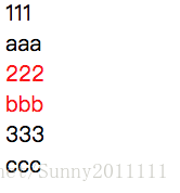
二、nth-child和nth-of-type的区别
1、p:nth-child(2):父元素中第2个元素且是p标签
2、p:nth-of-type(2):父元素中p标签里第二个元素
3、.item:nth-of-type(2):若父元素中有多种标签,则按照标签分类,每类中第2个元素且类名为item的元素,若改为.child:nth-of-type(1)则没有选中元素
.text .child:nth-of-type(2){
    color: red;
}
<div class="text">
  <div>111</div>
  <span >aaa</span>
  <div class="child">222</div>
  <span class="child">bbb</span>
  <div class="child">333</div>
  <span class="child">ccc</span>
</div>
效果如下:
三、色块与文本居中
遇到文字前面加色块的情况一般是这样

如果想文字与色块居中可以这样设计,色块里包含一段文本,并将设置此段文本的CSS为visibility: hidden
HTML如下:
  <span class="color-block"><span class="text"></span></span>
  <span>Hello</span>
CSS如下:
    .color-block{
      background: black;
      display: inline-block;
      width: 10px;
      height: 30px;
    }
    .text{
      visibility: hidden;    /*隐藏文本*/
      line-height: 30px;     /*文本行高与色块高度一致*/
    }
四、元素水平垂直居中
1、块级元素水平居中,给块级元素加上“margin: 0 auto;”即可
2、inline-block元素水平居中,需给父元素加上“text-align: center;”
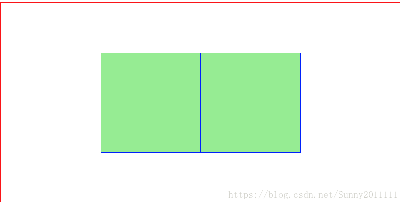
3、浮动元素水平垂直居中
HTML如下:
<div class="parent">
  <div class="child"></div>
  <div class="child"></div>
</div>
CSS如下:

    .parent {
      border: solid red 1px;
      width: 800px;
      height: 400px;
    }
    .child {
      float: left;
      width: 200px;
      height: 200px;
      position: relative;
      top: 25%;    /*随父元素高度自行调整,百分比是相对于父元素的高度而言的*/
      left: 25%;   /*随浮动元素个数及父元素宽度自行调整,百分比是相对于父元素的宽度而言的*/
      background: lightgreen;
      border: solid blue 1px;
    }
效果如下:
4、绝对定位元素水平垂直居中
div宽高已知:
.ele {
    position: absolute;
    top: 高度值;
    width: 宽度值;
    top: 50%;
    left: 50%;
    margin-top: -(高度值/2);
    margin-left: -(宽度值/2);
}
div宽高未知:
.ele {
    position: absolute;
    top: 50%;
    left: 50%;
    transform: translate(-50%, -50%);  /*百分比均相对于元素自身的宽和高,第一个是X方向,第二个是Y方向*/
}
五、文本水平垂直居中(同图片)
1、单行文本水平垂直居中,height和line-height相同,以及text-align: center必不可少
<div class="parent">hello world</div>.parent {
border: solid red 1px;
width: 400px;
height: 100px;
line-height: 100px;
text-align: center;
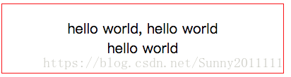
}2、多行文本水平垂直居中,垂直方向设置display: table-cell; vertical-align: middle;
<div class="parent">hello world, hello world<br>hello world</div>.parent {
border: solid red 1px;
width: 400px;
height: 100px;
display: table-cell;
vertical-align: middle;
text-align: center;
}效果如下:
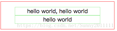
3、父元素中有多个子元素,这些子元素垂直居中
<div class="parent">
  <div class="child">hello world, hello world</div>
  <div class="child">hello world</div>
</div>
.parent {
border: solid red 1px;
width: 400px;
height: 100px;
display: table-cell;
vertical-align: middle;
text-align: center; /*文本居中*/
}
.child {
border: solid lightgreen 1px;
width: 300px;
margin: 0 auto; /*div居中*/
}效果如下:
六、背景图水平垂直居中
<div class="parent"></div>.parent {
border: solid red 1px;
width: 400px;
height: 400px;
background-image: url('./src/assets/img/问号.png');
background-position: center; /*图片水平垂直居中*/
background-repeat: no-repeat;
}还有其他居中方式可以参考:http://www.html-js.com/article/4613