1. 画基本的散点图 plt.scatterdata[:, 0], data[:, 1], marker='o', color='r', label='class1', alpha=0.4)
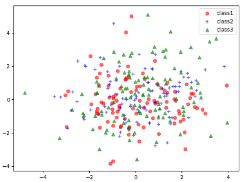
np.random.multivariate_normal 根据均值和协方差生成多行列表
mu_vec1 = np.array([0, 0])
# 表示协方差
cov_mat1 = np.array([[2, 0], [0, 2]])
# 生成一个100行2列的正态分布
x1_samples = np.random.multivariate_normal(mu_vec1, cov_mat1, 100)
x2_samples = np.random.multivariate_normal(mu_vec1+0.2, cov_mat1+0.2, 100)
x3_samples = np.random.multivariate_normal(mu_vec1+0.4, cov_mat1+0.4, 100)
plt.scatter(x1_samples[:, 0], x1_samples[:, 1], marker='o', color='r', alpha=0.6, label='class1')
plt.scatter(x2_samples[:, 0], x2_samples[:, 1], marker='+', color='b', alpha=0.6, label='class2')
plt.scatter(x3_samples[:, 0], x3_samples[:, 1], marker='^', color='g', alpha=0.6, label='class3')
plt.legend()
plt.show()
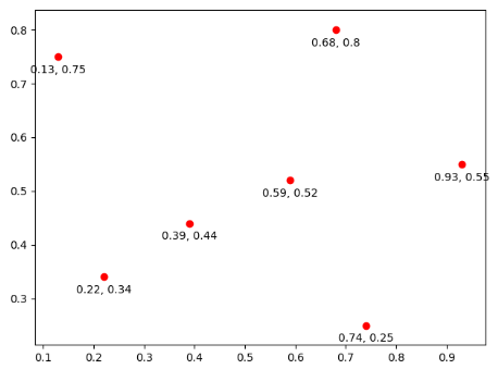
2. 将散点图的文本显现出来,plt.annotate('%s, %s'%(x, y), xy=(x, y), xytext=(0.1, -15), textcoords='offset points', ha='center')
x_coords = [0.13, 0.22, 0.39, 0.59, 0.68, 0.74, 0.93]
y_coords = [0.75, 0.34, 0.44, 0.52, 0.80, 0.25, 0.55]

plt.scatter(x_coords, y_coords, color='r')
# 第一种方式
# for x, y  in zip(x_coords, y_coords):
#     plt.text(x, y, '{0}, {1}'.format(x, y))
# 第二种方式
for x, y in zip(x_coords, y_coords):
    # plt.annotate() 第一个参数是显现的值,xy表示标注值的位置, xytext表示离标准值的位置,textcoords表示将文本显现,ha表示对齐的方式
    plt.annotate('%s, %s'%(x, y), xy=(x, y), xytext=(0.1, -15), textcoords='offset points', ha='center')
plt.show()
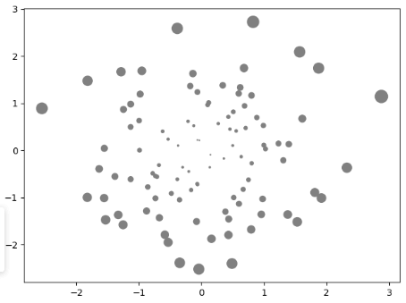
3. 使用plt.scatter()里面的s属性来控制圆的大小,根据距离原点的距离来画圆的大小
mu_vec1 = np.array([0, 0])
# 标准差
cov_mat1 = np.array([[1, 0], [0, 1]])
X = np.random.multivariate_normal(mu_vec1, cov_mat1, 100)
plt.scatter(X[:, 0], X[:, 1], s=((X[:, 0]**2 + X[:, 1]**2 )* 20), color='gray')

plt.show()