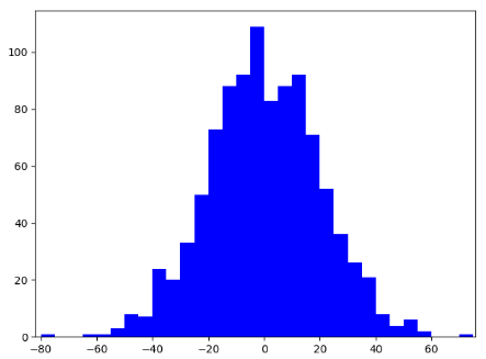
1.plt.hist(array, bins, color) # array表示数值, bins表示的是bin的范围
data = np.random.normal(0, 20, 1000)
# 画出bins值
bins = np.arange(-100, 100, 5)
plt.hist(data, bins, color='b')
# 进行x轴范围的设置
plt.xlim([data.min()-5, data.max()+5])
2. 将两个直方图放在一张图上
import random

# random.guass一种快速生成高斯数的方法
data1 = [random.gauss(15, 10) for i in range(500)]
data2 = [random.gauss(5, 5) for i in range(500)]
bins = np.arange(-50, 50, 2.5)

plt.hist(data1, bins, alpha=0.3, label='class1')
plt.hist(data2, bins, alpha=0.3, label='class2')
plt.legend()
plt.show()
