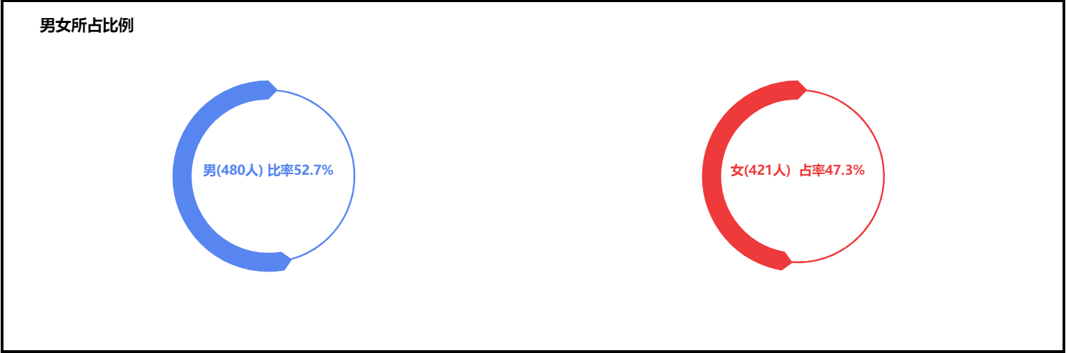
图表效果如下:
具体代码如下:
-
-
<html>
-
<head>
-
<meta charset="UTF-8">
-
<title>关系图案例 </title>
-
<!-- 引入 ECharts 文件 -->
-
<script src="js/echarts4.0.js" type="text/javascript" charset="utf-8"> </script>
-
</head>
-
<body>
-
<!-- 为 ECharts 准备一个具备大小(宽高)的 容器 -->
-
<div id="chart1" style="width: 80%;height: 400px;top: 50px;left: 10%;border: 3px solid #000;"> </div>
-
</body>
-
</html>
-
-
<script type="text/javascript">
-
// 基于准备好的容器(这里的容器是id为chart1的div),初始化echarts实例
-
var chart1 = echarts.init( document.getElementById( "chart1"));
-
-
// 指定图表的配置项和数据
-
var option = {
-
title: {
-
text: '男女所占比例',
-
left : '3%', // 标题距离左侧边距
-
top : '3%', // 标题距顶部边距
-
textStyle: {
-
color: '#000'
-
}
-
},
-
series: [{
-
type: "pie", // 系列1类型: 饼图
-
center: [ "25%", "50%"], // 饼图的中心(圆心)坐标,数组的第一项是横坐标,第二项是纵坐标。[ default: ['50%', '50%'] ]
-
radius: [ "49%", "50%"], // 饼图的半径,数组的第一项是内半径,第二项是外半径。[ default: [0, '75%'] ]
-
// 可以将内半径设大显示成圆环图(Donut chart)。
-
clockWise: false, // 饼图的扇区是否是顺时针排布。[ default: true ]
-
startAngle: 90, // 起始角度,支持范围[0, 360]。 [ default: 90 ]
-
hoverAnimation: true, // 是否开启 hover 在扇区上的放大动画效果。[ default: true ]
-
itemStyle: { // 图形样式
-
normal: {
-
color: "#5886f0", // 图形的颜色
-
borderColor: "#5886f0", // 图形的描边颜色
-
borderWidth: 20, // 描边线宽。为 0 时无描边。[ default: 0 ]
-
borderType: 'solid', // 柱条的描边类型,默认为实线,支持 'solid', 'dashed', 'dotted'。
-
label: { // 图形内部标签
-
show: true, // 是否显示标签
-
textStyle: { // 标签文本样式
-
fontSize: 15,
-
fontWeight: "bold" // 标签字体加粗,'normal','bold','bolder','lighter',100 | 200 | 300 | 400...
-
},
-
position: "center" // 标签的位置,'outside'(饼图扇区外侧,通过视觉引导线连到相应的扇区)
-
// 'inside'(饼图扇区内部); 'inner' 同 'inside'。
-
// 'center'(在饼图中心位置。)
-
},
-
labelLine: { // 标签的视觉引导线样式,在 label 位置 设置为'outside'的时候会显示视觉引导线。
-
show: false
-
}
-
},
-
emphasis: { // 高亮的扇区和标签样式(起强调作用)
-
color: "#5886f0",
-
borderColor: "#5886f0",
-
borderWidth: 20,
-
borderType: 'solid',
-
label: {
-
textStyle: {
-
fontSize: 15,
-
fontWeight: "bold"
-
}
-
}
-
}
-
},
-
data: [{ value: 52.7, name: "男(480人) 比率52.7%"},
-
{ name: " ", value: 47.3,
-
itemStyle: {
-
normal: {
-
color: "#5886f0",
-
borderColor: "#5886f0",
-
borderWidth: 0,
-
label: {
-
show: false
-
},
-
labelLine: {
-
show: false
-
}
-
},
-
emphasis: {
-
color: "#5886f0",
-
borderColor: "#5886f0",
-
borderWidth: 0
-
}
-
}
-
}
-
]
-
}, {
-
type: "pie", // 系列2类型: 饼图
-
center: [
-
"75.0%",
-
"50%"
-
],
-
radius: [
-
"49%",
-
"50%"
-
],
-
clockWise: false,
-
hoverAnimation: true,
-
itemStyle: {
-
normal: {
-
label: {
-
show: true,
-
textStyle: {
-
fontSize: 15,
-
fontWeight: "bold"
-
},
-
position: "center"
-
},
-
labelLine: {
-
show: false
-
},
-
color: "#ee3a3a",
-
borderColor: "#ee3a3a",
-
borderWidth: 20
-
},
-
emphasis: {
-
label: {
-
textStyle: {
-
fontSize: 15,
-
fontWeight: "bold"
-
}
-
},
-
color: "#ee3a3a",
-
borderColor: "#ee3a3a",
-
borderWidth: 20
-
}
-
},
-
data: [{
-
value: 47.3,
-
name: "女(421人) 占率47.3%"
-
},
-
{
-
name: " ",
-
value: 52.7,
-
itemStyle: {
-
normal: {
-
label: {
-
show: false
-
},
-
labelLine: {
-
show: false
-
},
-
color: "#ee3a3a",
-
borderColor: "#ee3a3a",
-
borderWidth: 0
-
},
-
emphasis: {
-
color: "#ee3a3a",
-
borderColor: "#ee3a3a",
-
borderWidth: 0
-
}
-
}
-
}
-
]
-
}
-
]
-
};
-
-
// 使用刚指定的配置项和数据显示图表
-
chart1.setOption(option);
-
-
</script>
想要使用该图表,只需要 复制以上代码 ,再下载 echarts.js 在页面文件中引入即可.
注:本文的一个关键点就是环形图内部标签位置的设置,相关的配置项是 position,其取值分别为:
'outside'(饼图扇区外侧,通过视觉引导线连到相应的扇区);
'inside'(饼图扇区内部);
'inner' 同 'inside';
'center'(在饼图中心位置);
echarts.js 下载链接: http://echarts.baidu.com/download.html