最终效果如下:
附录:
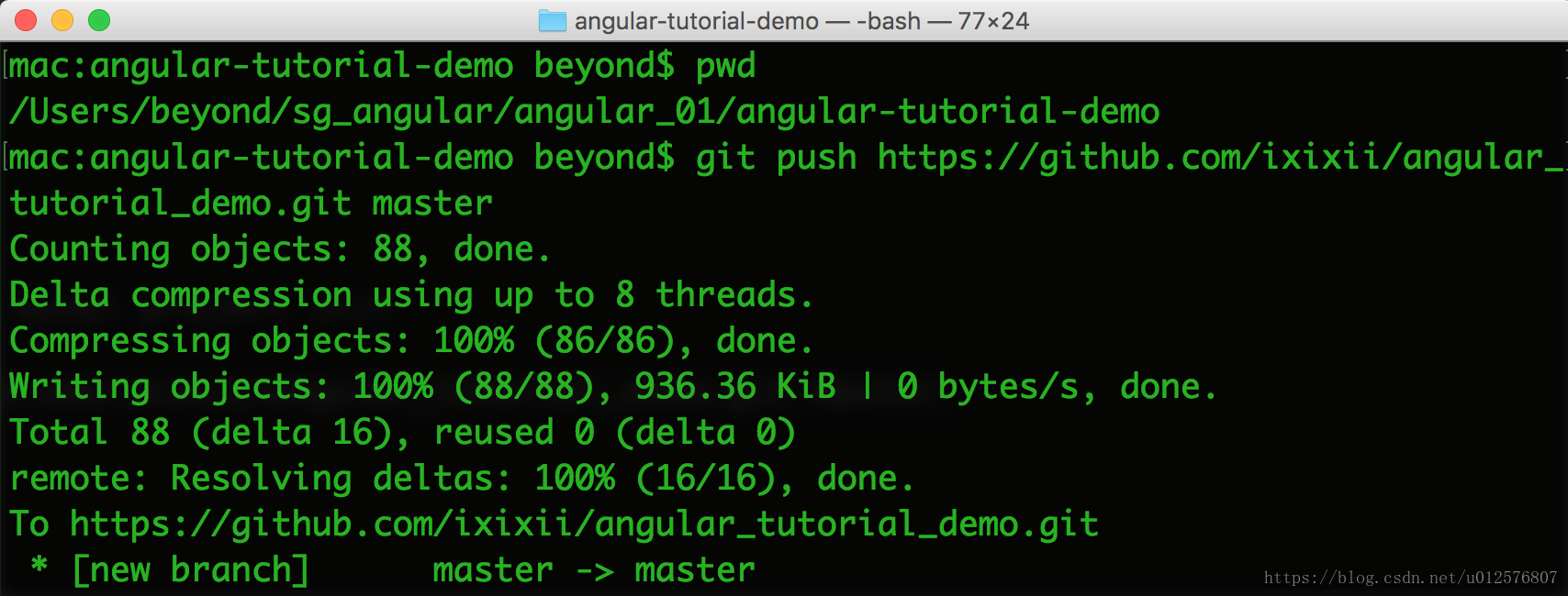
github地址: https://github.com/ixixii/angular_tutorial_demo.git
cd /Users/beyond/sg_angular/angular_01/angular-tutorial-demo
git status
git add src/app/
git commit -m 'first commit'
git push https://github.com/ixixii/angular_tutorial_demo.git master
.
Angular2官方文档地址: https://angular.io/tutorial/toh-pt1
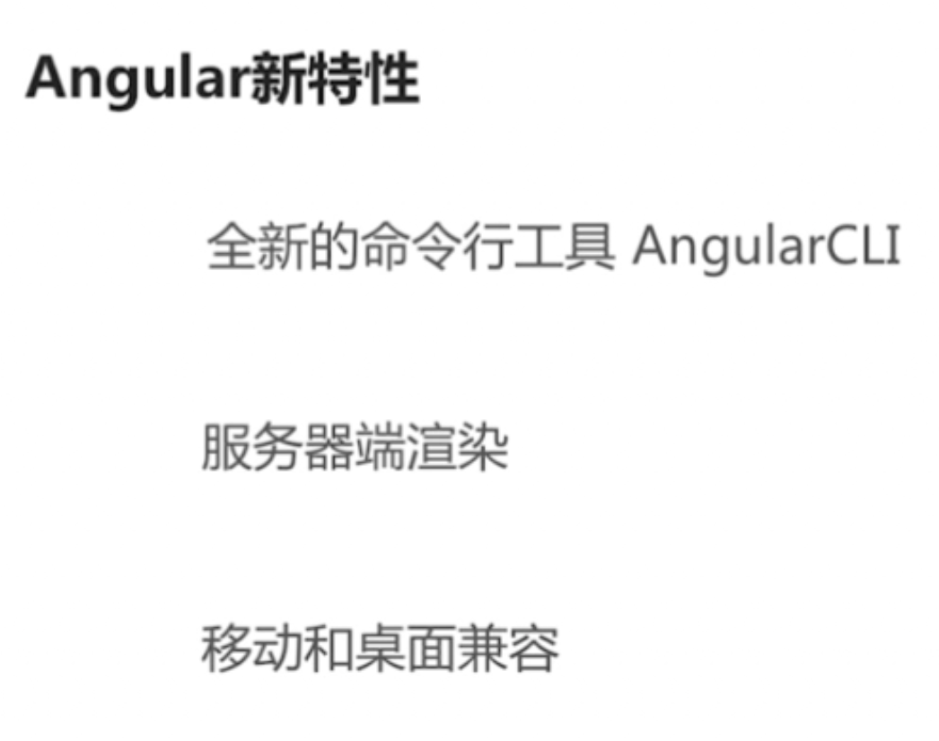
由于内容太长,分为上中下三篇
QuickStart
Good tools make application development quicker and easier to maintain than if you did everything by hand.
The Angular CLI is a command line interface tool that can create a project, add files,
and perform a variety of ongoing development tasks such as testing, bundling, and deployment.
The goal in this guide is to build and run a simple Angular application in TypeScript,
using the Angular CLI while adhering to the Style Guide recommendations that benefit every Angular project.
By the end of the chapter, you'll have a basic understanding of development with the CLI
and a foundation for both these documentation samples and for real world applications.
And you can also download the example.
Step 1. Set up the Development Environment
You need to set up your development environment before you can do anything.
注意: Install Node.js® and npm if they are not already on your machine.
Verify that you are running at least Node.js version 8.x or greater and npm version 5.x or greater by running node -v and npm -v in a terminal/console window.
因为: Older versions produce errors, but newer versions are fine.
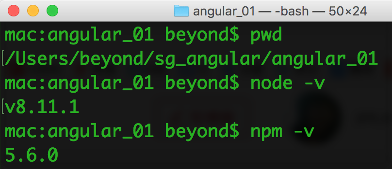
Then install the Angular CLI globally.
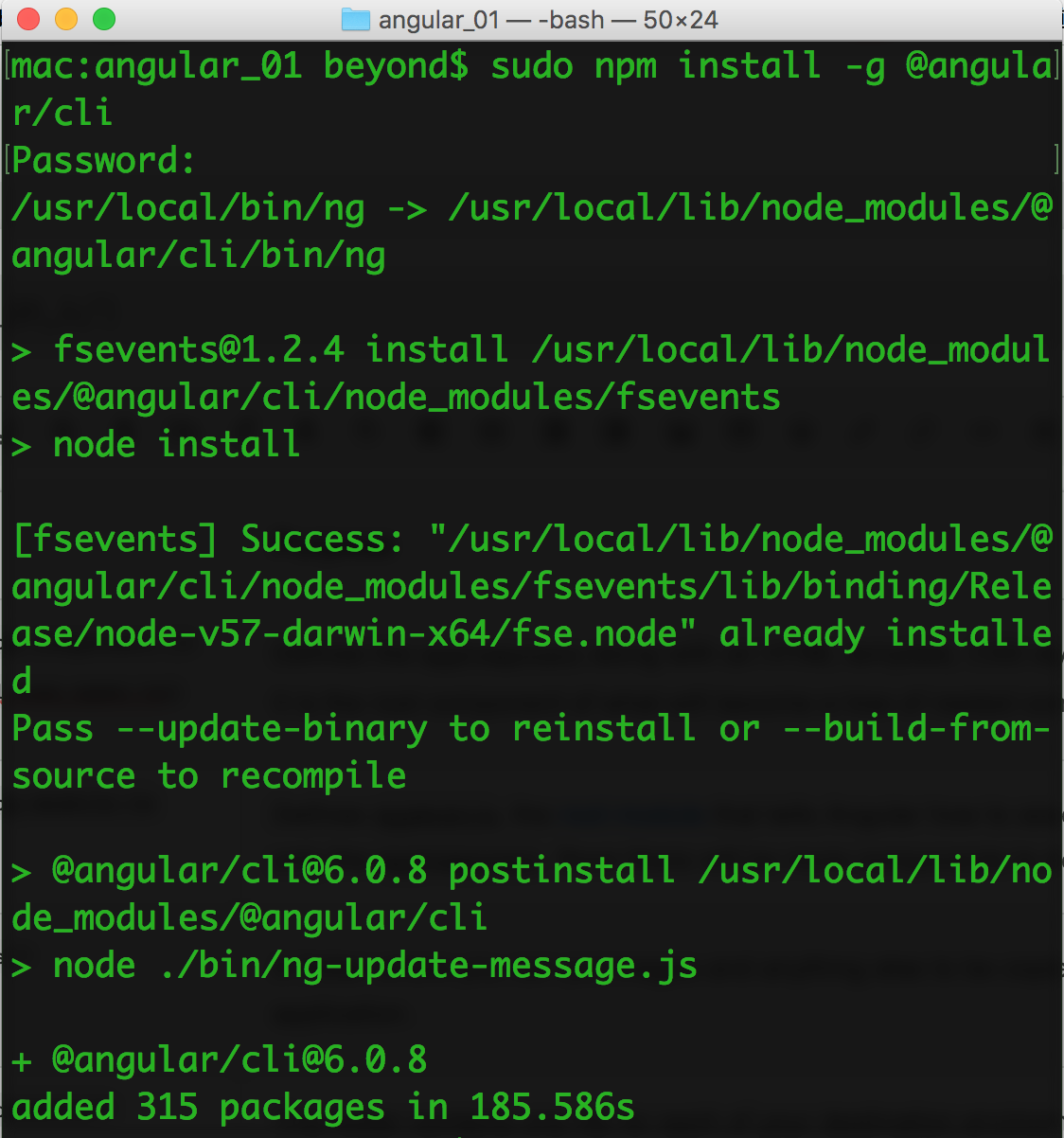
content_copysudo npm install -g @angular/cli
Step 2. Create a new project
Open a terminal window.
Generate a new project and default app by running the following command:
content_copyng new my-app
如图所示: asdf
The Angular CLI installs the necessary npm packages, creates the project files, and populates the project with a simple default app.
This can take some time.
You can add pre-packaged functionality to a new project by using the ng add command.
The ng add command transforms a project by applying the schematics in the specified package.
For more information, see the Angular CLI documentation.
Angular Material provides schematics for typical app layouts.
See the Angular Material documentation for details.
Step 3: Serve the application
Go to the project directory and launch the server.
content_copycd my-app
ng serve --open
The ng serve command launches the server, watches your files, and rebuilds the app as you make changes to those files.
Using the --open (or just -o) option will automatically open your browser on
http://localhost:4200/.
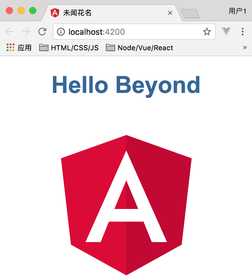
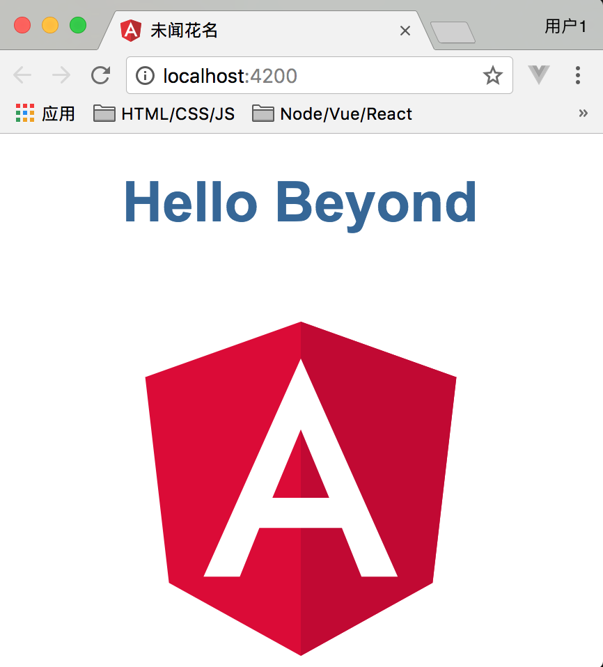
Your app greets you with a message:
Step 4: Edit your first Angular component
The CLI created the first Angular component for you.
This is the root component and it is named app-root. You can find it in ./src/app/app.component.ts.
Open the component file and change the title property from 'app' to 'My First Angular App!'.
content_copyexport class AppComponent {
  title = 'Hello Beyond';
}
The browser reloads automatically with the revised title.
That's nice, but it could look better.
Open src/app/app.component.css and give the component some style.
content_copyh1 {
  color: #369;
  font-family: Arial, Helvetica, sans-serif;
  font-size: 250%;
}
Looking good!

What's next?
That's about all you'd expect to do in a "Hello, Beyond" app.
You're ready to take the Tour of Heroes Tutorial and build a small application that demonstrates the great things you can build with Angular.
Or you can stick around a bit longer to learn about the files in your brand new project.
Project file review
An Angular CLI project is the foundation for both quick experiments and enterprise solutions.
The first file you should check out is README.md. It has some basic information on how to use CLI commands.
Whenever you want to know more about how Angular CLI works make sure to visit the Angular CLI repository and Wiki.
Some of the generated files might be unfamiliar to you.
The src folder
Your app lives in the src folder.
All Angular components, templates, styles, images, and anything else your app needs go here.
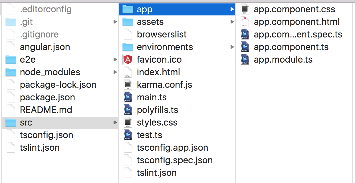
???Any files outside of this folder are meant to support building your app???
| File | Purpose |
|---|---|
|
Defines the It is the root component of what will become a tree of nested components as the application evolves. |
|
Defines Right now it declares only the Soon there will be more components to declare. |
|
A folder where you can put images and anything else to be copied wholesale when you build your application. |
|
This folder contains one file for each of your destination environments, each exporting simple configuration variables to use in your application. The files are replaced on-the-fly when you build your app. You might use a different API endpoint for development than you do for production or maybe different analytics tokens. You might even use some mock services. Either way, the CLI has you covered. |
|
A configuration file to share target browsers between different front-end tools. |
|
Every site wants to look good on the bookmark bar. Get started with your very own Angular icon. |
|
The main HTML page that is served when someone visits your site. Most of the time you'll never need to edit it. The CLI automatically adds all so you never need to add any |
|
Unit test configuration for the Karma test runner, used when running |
|
The main entry point for your app. Compiles the application with the JIT compiler and bootstraps the application's root module ( You can also use the AOT compiler without changing any code by appending the to the |
|
Different browsers have different levels of support of the web standards. Polyfills help normalize those differences. You should be pretty safe with but be sure to check out the Browser Support guide for more information. |
|
Your global styles go here. Most of the time you'll want to have local styles in your components for easier maintenance, but styles that affect all of your app need to be in a central place. |
|
This is the main entry point for your unit tests. It has some custom configuration that might be unfamiliar, but it's not something you'll need to edit. |
|
TypeScript compiler configuration for the Angular app ( and for the unit tests ( |
|
Additional Linting configuration for TSLint together with Codelyzer, used when running Linting helps keep your code style consistent. |
The root folder
The src/ folder is just one of the items inside the project's root folder.
Other files help you build, test, maintain, document, and deploy the app.
These files go in the root folder next to src/.
| File | Purpose |
|---|---|
|
Inside They shouldn't be inside because e2e tests are really a separate app that just so happens to test your main app. That's also why they have their own |
|
|
|
Simple configuration for your editor to make sure everyone that uses your project has the same basic configuration. Most editors support an See http://editorconfig.org for more information. |
|
Git configuration to make sure autogenerated files are not committed to source control. |
|
Configuration for Angular CLI. In this file you can set several defaults and also configure what files are included when your project is built. Check out the official documentation if you want to know more. |
|
You can also add your own custom scripts here. |
|
End-to-end test configuration for Protractor, used when running |
|
Basic documentation for your project, pre-filled with CLI command information. Make sure to enhance it with project documentation so that anyone checking out the repo can build your app! |
|
TypeScript compiler configuration for your IDE to pick up and give you helpful tooling. |
|
Linting configuration for TSLint together with Codelyzer, used when running Linting helps keep your code style consistent. |
Next Step
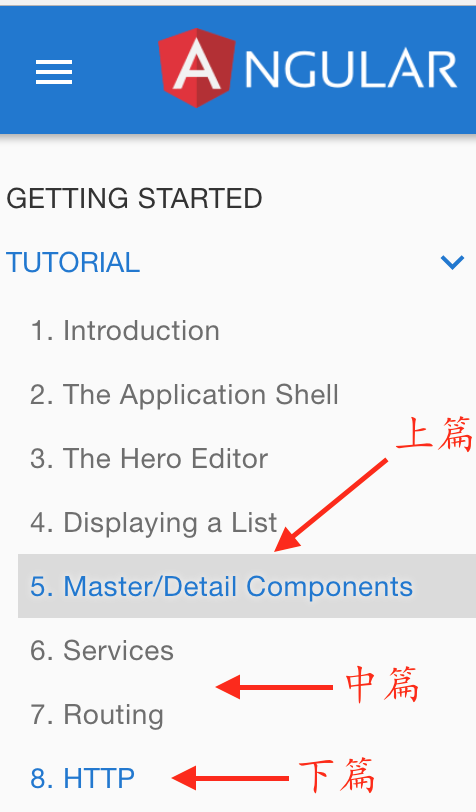
If you're new to Angular, continue with the tutorial.
You can skip the "Setup" step since you're already using the Angular CLI setup.
Tutorial: Tour of Heroes
The Tour of Heroes tutorial covers the fundamentals of Angular.
In this tutorial you will build an app that helps a staffing agency (劳务中介) manage its stable of heroes.
This basic app has many of the features you'd expect to find in a data-driven application.
1. It acquires and displays a list of heroes,
2. edits a selected hero's detail,
3. and navigates among different views of heroic data.
By the end of the tutorial you will be able to do the following:
- Use built-in Angular directives to show and hide elements and display lists of hero data.
- Create Angular components to display hero details and show an array of heroes.
- Use one-way data binding for read-only data.
- Add editable fields to update a model with two-way data binding.
- Bind component methods to user events, like keystrokes and clicks.
- Enable users to select a hero from a master list and edit that hero in the details view.
- Format data with pipes.
- Create a shared service to assemble the heroes.
- Use routing to navigate among different views and their components.
You'll learn enough Angular to get started and gain confidence that Angular can do whatever you need it to do.
After completing all tutorial steps,
the final app will look like this live example / download example.
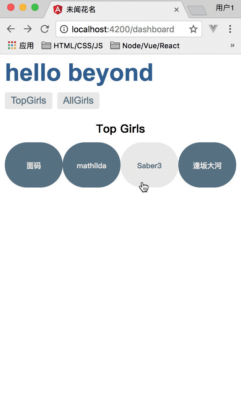
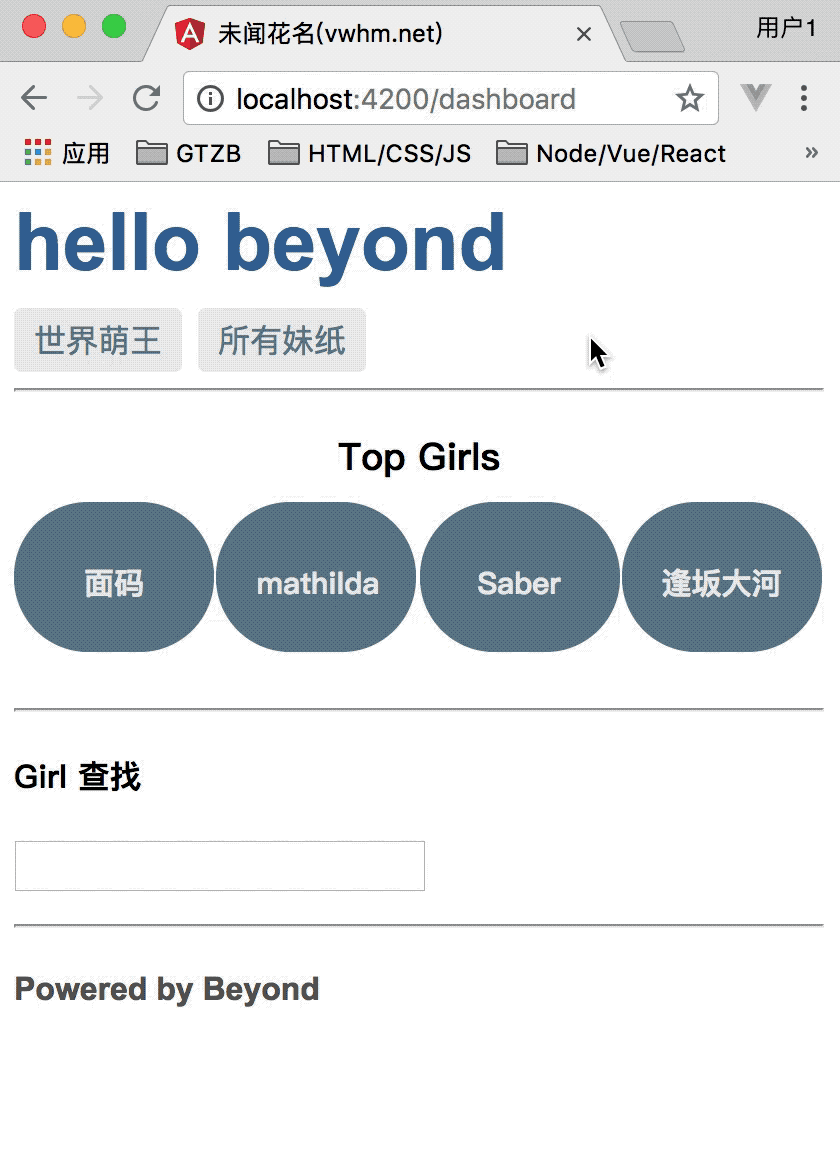
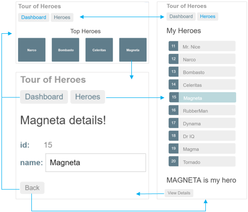
What you'll build
Here's a visual idea of where this tutorial leads,
beginning with the "Dashboard" view and the most heroic heroes:
You can click the two links above the dashboard ("Dashboard" and "Heroes")
to navigate between this Dashboard view and a Heroes view.
If you click the dashboard hero "Magneta,"
the router opens a "Hero Details" view where you can change the hero's name.
Clicking the "Back" button returns you to the Dashboard.
Links at the top take you to either of the main views.
If you click "Heroes," the app displays the "Heroes" master list view.
When you click a different hero name,
the read-only mini detail beneath the list reflects the new choice.
You can click the "View Details" button to drill into the editable details of the selected hero.
The following diagram captures all of the navigation options.
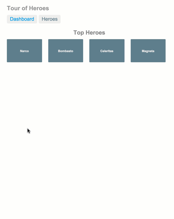
Here's the app in action:
最终效果图:
The Application Shell
Install the Angular CLI
Install the Angular CLI, if you haven't already done so. (前面已经全局安装过了)
content_copysudo npm install -g @angular/cli
Create a new application
Create a new project named angular-tour-of-heroes with this CLI command.
content_copyng new angular-tour-of-heroes
The Angular CLI generated a new project with a default application and supporting files.
You can add pre-packaged functionality to a new project by using the ng add command.
The ng add command transforms a project by applying the schematics in the specified package.
For more information, see the Angular CLI documentation.
Angular Material provides schematics for typical app layouts.
See the Angular Material documentation for details.
Serve the application
Go to the project directory and launch the application.
content_copycd angular-tour-of-heroes
ng serve --open
The ng serve command builds the app, starts the development server, watches the source files,
and rebuilds the app as you make changes to those files.
The --open flag opens a browser to http://localhost:4200/.
You should see the app running in your browser.
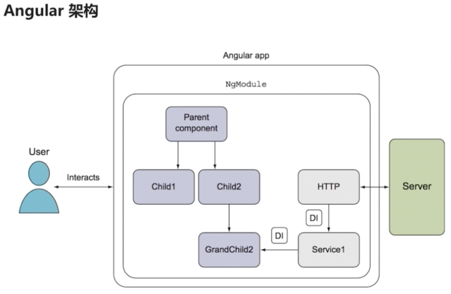
Angular components
The page you see is the application shell.
The shell is controlled by an Angular component named AppComponent.
Components are the fundamental building blocks of Angular applications.
They display data on the screen, listen for user input, and take action based on that input.
Change the application title
Open the project in your favorite editor or IDE
and navigate to the src/app folder.
You'll find the implementation of the shell AppComponent distributed over three files:
app.component.ts— the component class code, written in TypeScript.app.component.html— the component template, written in HTML.app.component.css— the component's private CSS styles.
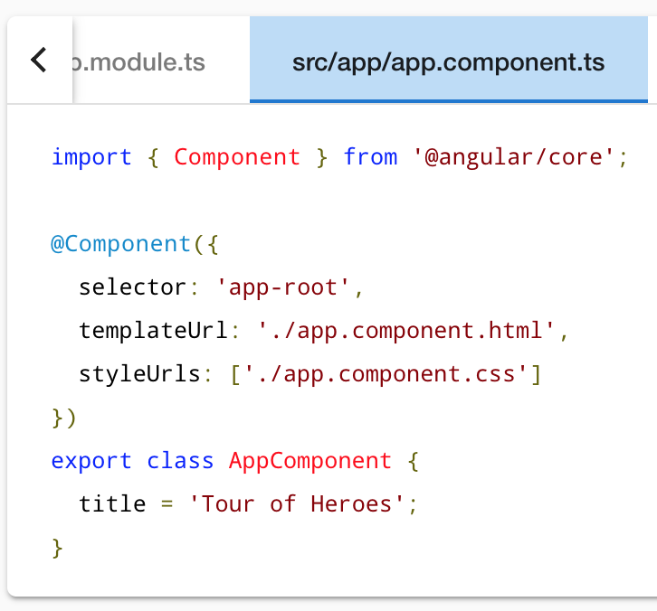
Open the component class file (app.component.ts)
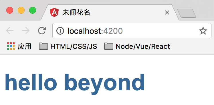
and change the value of the title property to 'Tour of Heroes'.
content_copytitle = 'Tour of Heroes';
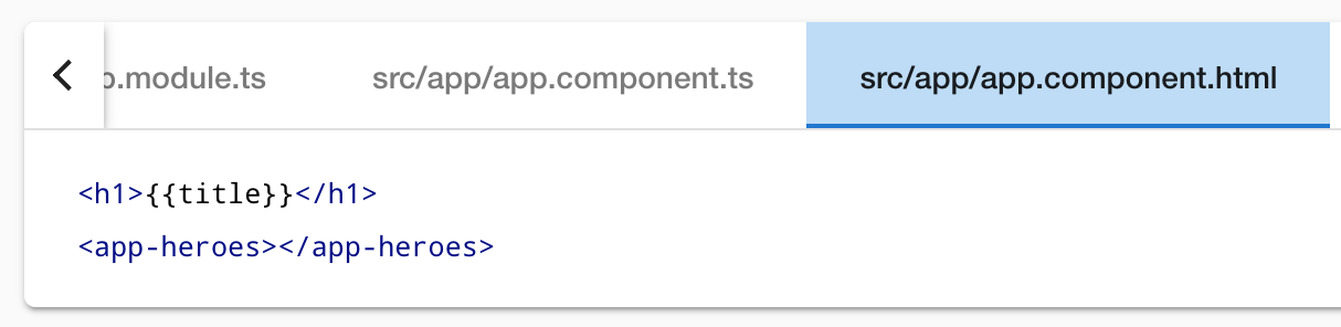
Open the component template file (app.component.html)
and delete the default template generated by the Angular CLI.
Replace it with the following line of HTML.
app.component.html (template)content_copy<h1>{{title}}</h1>
The double curly braces are Angular's interpolation binding syntax.
This interpolation binding presents the component's title property value inside the HTML header tag.
The browser refreshes and displays the new application title.
Add application styles
Most apps strive for a consistent look across the application.
The CLI generated an empty styles.css for this purpose.
Put your application-wide styles there.
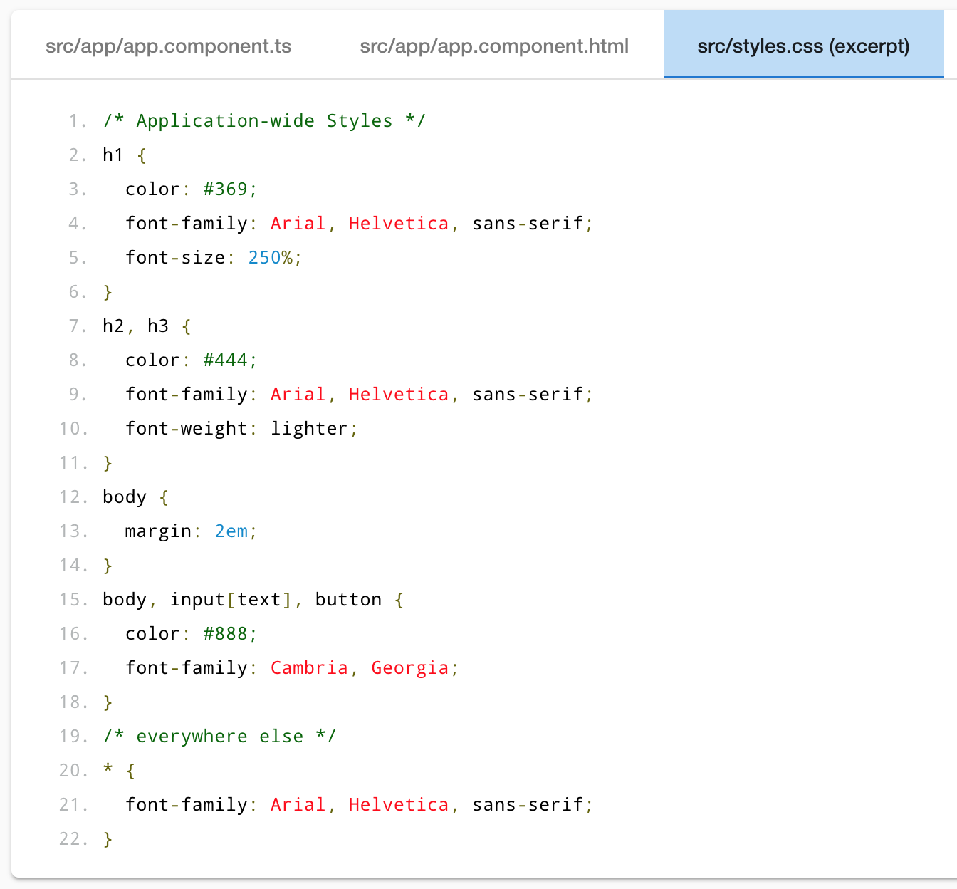
Here's an excerpt from the styles.css for the Tour of Heroes sample app.
content_copy
- /* Application-wide Styles */
- h1 {
- color: #369;
- font-family: Arial, Helvetica, sans-serif;
- font-size: 250%;
- }
- h2, h3 {
- color: #444;
- font-family: Arial, Helvetica, sans-serif;
- font-weight: lighter;
- }
- body {
- margin: 2em;
- }
- body, input[text], button {
- color: #888;
- font-family: Cambria, Georgia;
- }
- /* everywhere else */
- * {
- font-family: Arial, Helvetica, sans-serif;
- }
效果如下:
Final code review
The source code for this tutorial and the complete Tour of Heroes global styles are available in the live example / download example.
Here are the code files discussed on this page

.
Summary
- You created the initial application structure using the Angular CLI.
- You learned that Angular components display data.
- You used the double curly braces of interpolation to display the app title.
The Hero Editor
The application now has a basic title.
Next you will create a new component to display hero information
and place that component in the application shell.
Create the heroes component
Using the Angular CLI,
generate a new component named heroes.
content_copyng generate component heroes
The CLI creates a new folder, src/app/heroes/
and generates the three files of the HeroesComponent.
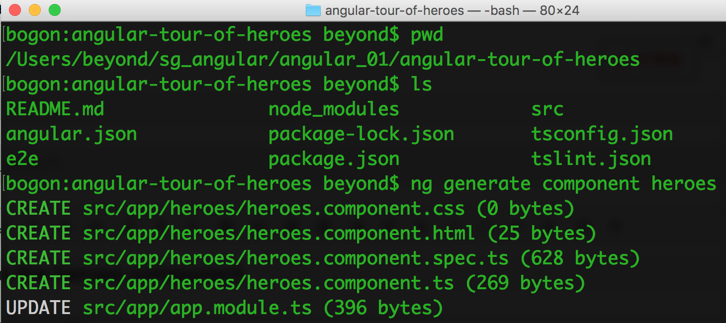
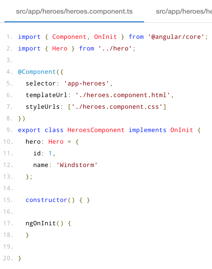
The HeroesComponent class file is as follows:
content_copyimport { Component, OnInit } from '@angular/core';

@Component({
  selector: 'app-heroes',
  templateUrl: './heroes.component.html',
  styleUrls: ['./heroes.component.css']
})
export class HeroesComponent implements OnInit {

  constructor() { }

  ngOnInit() {
  }

}
You always import the Component symbol from the Angular core library
and annotate(注解) the component class with @Component.
@Component is a decorator function(装饰器函数) that specifies the Angular metadata for the component.
The CLI generated three metadata properties:
selector— the component's CSS element selector(组件的css元素选择器???)templateUrl— the location of the component's template file(模板文件).styleUrls— the location of the component's private CSS styles(私有的CSS样式).
The CSS element selector, 'app-heroes', matches the name of the HTML element
that identifies this component within a parent component's template.
The ngOnInit is a lifecycle hook
Angular calls ngOnInit shortly after creating a component. It's a good place to put initialization logic.
Always export the component class so you can import it elsewhere ... like in the AppModule.
Add a hero property
Add a hero property to the HeroesComponent for a hero named "Windstorm."
content_copyhero = 'あの日見た花の名前を僕達はまだ知らない';
Show the hero
Open the heroes.component.html template file.
Delete the default text generated by the Angular CLI
and replace it with a data binding to the new hero property.
content_copy{{hero}}
Show the HeroesComponent view
To display the HeroesComponent, you must add it to the template of the shell AppComponent.
Remember that app-heroes is the element selector for the HeroesComponent.
So add an <app-heroes> element to the AppComponent template file, just below the title.
content_copy<h1>{{title}}</h1>
<app-heroes></app-heroes>
Assuming that the CLI ng serve command is still running,
the browser should refresh
and display both the application title and the hero name.
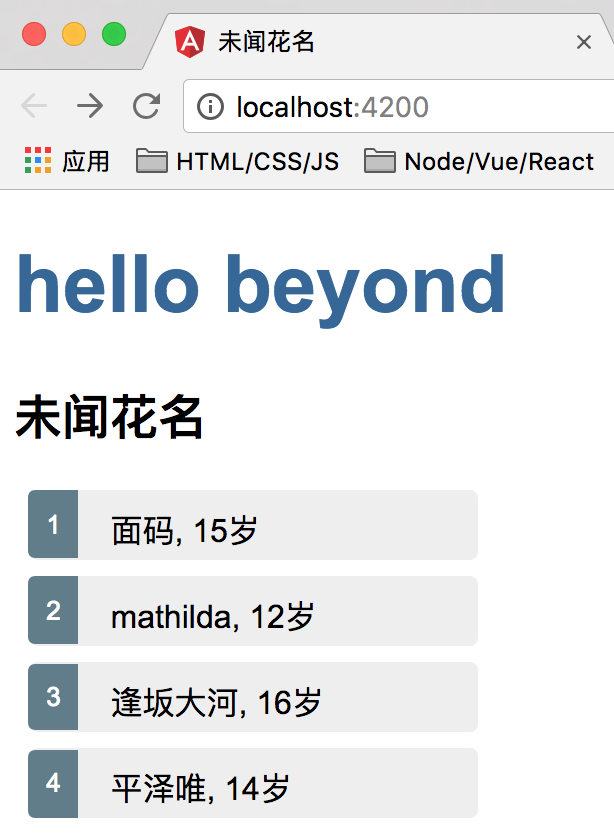
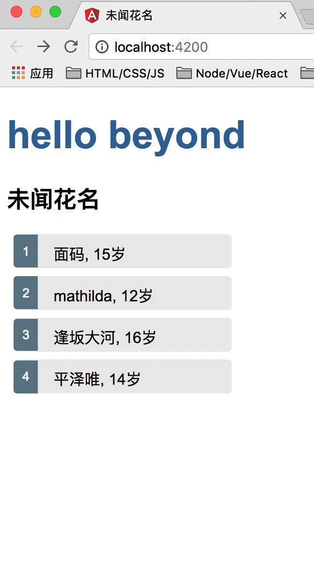
效果如下:
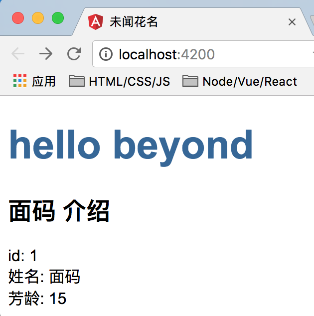
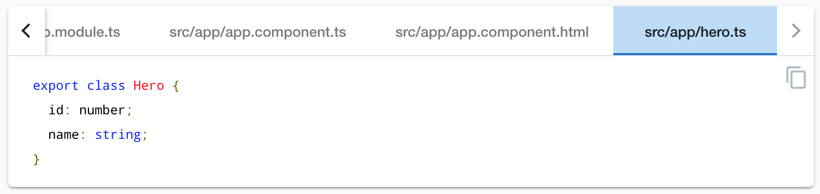
Create a Hero class
A real hero is more than a name.
Create a Hero class in its own file in the src/app folder.
Give it id and name and age properties.
content_copyexport class Hero {
  id: number;
  name: string;
}
Return to the HeroesComponent class
and import the Hero class.
Refactor the component's hero property to be of type Hero.
Initialize it with an id of 1 and the name "面码" and the age 15.
The revised HeroesComponent class file should look like this:
content_copyimport { Component, OnInit } from '@angular/core';
import { Hero } from '../hero';

@Component({
  selector: 'app-heroes',
  templateUrl: './heroes.component.html',
  styleUrls: ['./heroes.component.css']
})
export class HeroesComponent implements OnInit {
  hero: Hero = {
    id: 1,
    name: 'Windstorm'
  };

  constructor() { }

  ngOnInit() {
  }

}
The page no longer displays properly
because you changed the hero from a string to an object.
Show the hero object
Update the binding in the template to announce the hero's name
and show both id and name in a details layout like this:
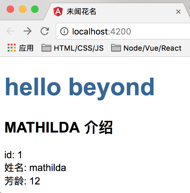
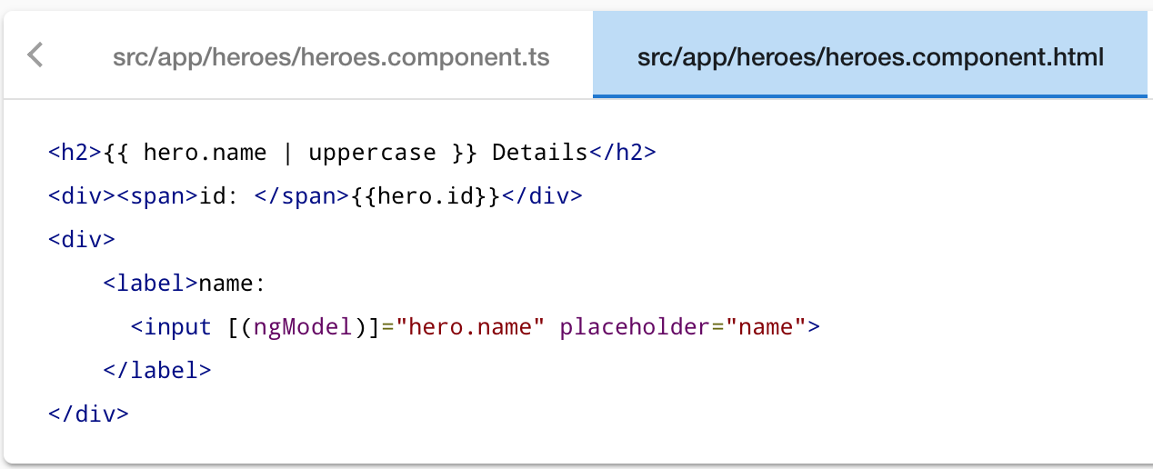
content_copy<h2>{{ hero.name }} Details</h2>
<div><span>id: </span>{{hero.id}}</div>
<div><span>name: </span>{{hero.name}}</div>
The browser refreshes and display's the hero's information.
如下所示:
Format with the UppercasePipe
Modify the hero.name binding like this.
content_copy<h2>{{ hero.name | uppercase }} 介绍</h2>
The browser refreshes
and now the hero's name is displayed in capital(大写的) letters.
The word uppercase in the interpolation binding,
right after the pipe operator ( | ), activates the built-in UppercasePipe.
Pipes are a good way to format strings, currency amounts, dates and other display data.
Angular ships with several built-in pipes and you can create your own.
Edit the hero
Users should be able to edit the hero name in an <input> textbox.
The textbox should both display the hero's name property
and update that property as the user types.
That means data flow from the component class out to the screen
and from the screen back to the class.
To automate that data flow,
setup a two-way data binding between the <input> form element and the hero.name property.
Two-way binding
Refactor(重构) the details area in the HeroesComponent template
so it looks like this:
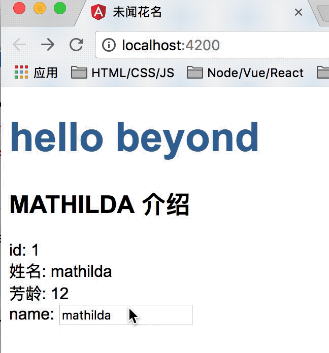
src/app/heroes/heroes.component.html (HeroesComponent's template)content_copy<div>
<label>name:
<input [(ngModel)]="hero.name" placeholder="name">
</label>
</div>
[(ngModel)] is Angular's two-way data binding syntax.
Here it binds the hero.name property to the HTML textbox
so that data can flow in both directions:
from the hero.nameproperty to the textbox,
and from the textbox back to the hero.name.
The missing FormsModule
Notice that the app stopped working when you added [(ngModel)].
To see the error, open the browser development tools and look in the console for a message like
content_copyTemplate parse errors:
Can't bind to 'ngModel' since it isn't a known property of 'input'.
Although ngModel is a valid Angular directive, it isn't available by default.
It belongs to the optional FormsModule and you must opt-in to using it.
AppModule
Angular needs to know how the pieces of your application fit together
and what other files and libraries the app requires.
This information is called metadata
Some of the metadata is in the @Component decorators
that you added to your component classes.
Other critical metadata is in @NgModule decorators.
The most important @NgModule decorator annotates the top-level AppModule class.
The Angular CLI generated an AppModule class in src/app/app.module.ts when it created the project.
This is where you opt-in to the FormsModule.
Import FormsModule
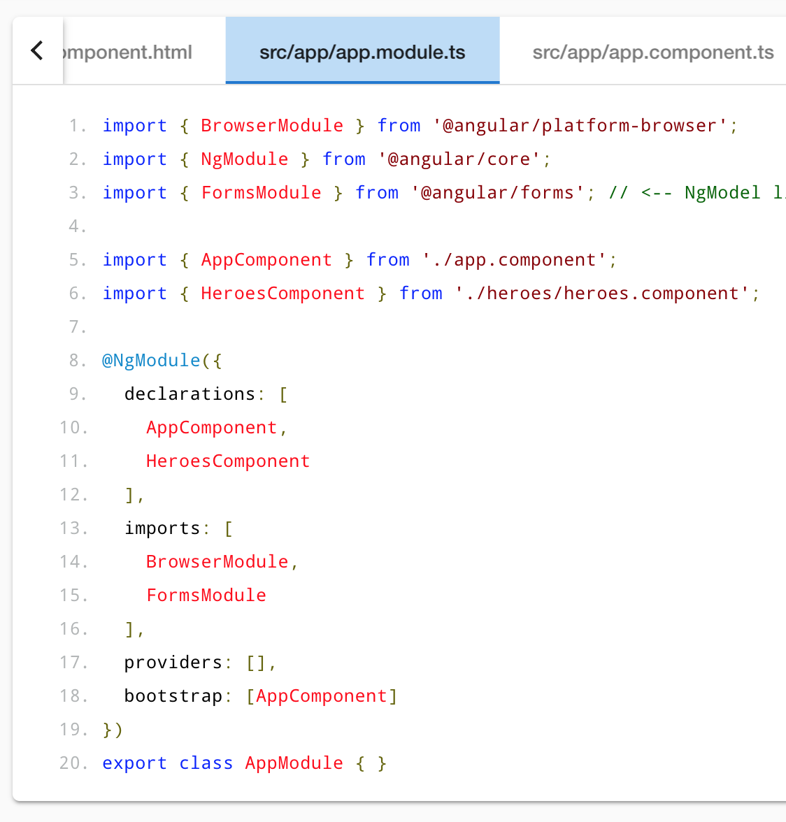
Open AppModule (app.module.ts)
and import the FormsModule symbol from the @angular/forms library.
content_copyimport { FormsModule } from '@angular/forms'; // <-- NgModel lives here
Then add FormsModule to the @NgModule metadata's imports array,
which contains a list of external modules that the app needs.
app.module.ts ( @NgModule imports)content_copyimports: [
BrowserModule,
FormsModule
],
When the browser refreshes, the app should work again.
You can edit the hero's name
and see the changes reflected immediately in the <h2> above the textbox.
如下所示:
Declare HeroesComponent
Every component must be declared in exactly one NgModule.
You didn't declare the HeroesComponent.
So why did the application work?
It worked because the Angular CLI declared HeroesComponent in the AppModule when it generated that component.
Open src/app/app.module.ts
and find HeroesComponent imported near the top.
content_copyimport { HeroesComponent } from './heroes/heroes.component';
The HeroesComponent is declared in the @NgModule.declarations array.
content_copydeclarations: [
  AppComponent,
  HeroesComponent
],
Note that AppModule declares both application components:
AppComponent and HeroesComponent.
Final code review
Your app should look like this live example / download example.
Here are the code files discussed on this page.
1. heroes.component.ts中代码如下所示
2. heroes.component.html中代码如下所示:
3. app.module.ts中代码如下所示:
4. app.component.ts中代码如下 所示:
5. app.component.html中代码如下所示:
6. hero.ts中代码如下所示:
Summary
- You used the CLI to create a second
HeroesComponent. - You displayed the
HeroesComponentby adding it to theAppComponentshell. - You applied the
UppercasePipeto format the name. - You used two-way data binding with the
ngModeldirective. - You learned about the
AppModule. - You imported the
FormsModulein theAppModuleso that Angular would recognize and apply thengModeldirective. - You learned the importance of declaring components in the
AppModuleand appreciated that the CLI declared it for you.
Display a Heroes List
In this page, you'll expand the Tour of Heroes app to display a list of heroes,
and allow users to select a hero and display the hero's details.
Create mock heroes
You'll need some heroes to display.
Eventually you'll get them from a remote data server.
For now, you'll create some mock heroes and pretend they came from the server.
Create a file called mock-heroes.ts in the src/app/ folder.
Define a HEROES constant as an array of ten heroes and export it.
The file should look like this.
src/app/mock-heroes.tscontent_copyimport { Hero } from './hero';
export const HEROES: Hero[] = [
{ id: 11, name: 'Mr. Nice' },
{ id: 12, name: 'Narco' },
{ id: 13, name: 'Bombasto' },
{ id: 14, name: 'Celeritas' },
{ id: 15, name: 'Magneta' },
{ id: 16, name: 'RubberMan' },
{ id: 17, name: 'Dynama' },
{ id: 18, name: 'Dr IQ' },
{ id: 19, name: 'Magma' },
{ id: 20, name: 'Tornado' }
];
Displaying heroes
You're about to display the list of heroes at the top of the HeroesComponent.
Open the HeroesComponent class file and import the mock HEROES.
content_copyimport { HEROES } from '../mock-heroes';
Add a heroes property to the class that exposes these heroes for binding.
content_copyheroes = HEROES;
List heroes with *ngFor
Open the HeroesComponent template file (即heroes.component.html文件)
and make the following changes:
- Add an
<h2>at the top, - Below it add an HTML unordered list (
<ul>) - Insert an
<li>within the<ul>that displays properties of ahero. - Sprinkle some CSS classes for styling (you'll add the CSS styles shortly).
Make it look like this:
heroes.component.html (heroes template)content_copy<h2>My Heroes</h2>
<ul class="heroes">
<li>
<span class="badge">{{hero.id}}</span> {{hero.name}}
</li>
</ul>
Now change the <li> to this: (核心指令 *ngFor="let hero of heroes")
content_copy<li *ngFor="let hero of heroes">
The *ngFor is Angular's repeater directive.
It repeats the host element for each element in a list.
In this example
<li>is the host elementheroesis the list from theHeroesComponentclass.heroholds the current hero object for each iteration through the list.
Don't forget the asterisk (*) in front of ngFor.
It's a critical part of the syntax.
After the browser refreshes, the list of heroes appears.
Style the heroes
The heroes list should be attractive
and should respond visually when users hover over and select a hero from the list.
In the first tutorial, you set the basic styles for the entire application in styles.css.
That stylesheet didn't include styles for this list of heroes.
You could add more styles to styles.css and keep growing that stylesheet as you add components.
You may prefer instead to define private styles for a specific component
and keep everything a component needs— the code, the HTML, and the CSS —together in one place.
This approach(方法,途经) makes it easier to re-use the component somewhere else
and deliver the component's intended appearance even if the global styles are different.
You define private styles either inline in the @Component.styles array
(???Excuse Me??? inline in the @Component.styles array)
or as stylesheet file(s) identified in the @Component.styleUrls array.
When the CLI generated the HeroesComponent,
it created an empty heroes.component.css stylesheet for the HeroesComponent
and pointed to it in @Component.styleUrls like this.
content_copy@Component({
  selector: 'app-heroes',
  templateUrl: './heroes.component.html',
  styleUrls: ['./heroes.component.css']
})
Open the heroes.component.css file and paste in the private CSS styles for the HeroesComponent.
You'll find them in the final code review at the bottom of this guide.
Styles and stylesheets identified in @Component metadata are scoped to that specific component. The heroes.component.css styles apply only to the HeroesComponent and don't affect the outer HTML or the HTML in any other component.
样式代码如下:
.class_ul_heroes {
  /*background-color: #369;*/
  margin: 0 0 2em 0;
  list-style-type: none;
  padding: 0;
  width: 15em;
}

.class_ul_heroes li {
  cursor: pointer;
  /* 为子元素准备的 */
  position: relative;
  left: 0;
  background-color: #EEE;
  margin: .5em;
  padding: .3em 0;
  height: 1.6em;
  border-radius: 4px;
}

.class_ul_heroes .text {
  position: relative;
  top: -3px;
}

.class_ul_heroes .class_span_badge {
  display: inline-block;
  font-size: small;
  color: white;
  padding: 0.8em 0.7em 0 0.7em;
  background-color: #607D8B;
  line-height: 1em;
  /* ... */
  position: relative;
  left: -1px;
  top: -4px;
  height: 1.8em;
  margin-right: .8em;
  border-radius: 4px 0 0 4px;
}

.class_ul_heroes li:hover {
	color: #607D8B;
	background-color: #DDD;
	left: .1em;
}
效果如下:
Master/Detail
When the user clicks a hero in the master list,
the component should display the selected hero's details at the bottom of the page.
In this section, you'll listen for the hero item click event and update the hero detail.
Add a click event binding
Add a click event binding to the <li> like this: (核心代码: (click)="onSelectFunction(hero)" )
content_copy<li *ngFor="let hero of heroes" (click)="onSelectFunction(hero)">
This is an example of Angular's event binding syntax.
The parentheses around click tell Angular to listen for the <li> element's click event.
When the user clicks in the <li>, Angular executes the onSelectFunction(hero) expression.
onSelectFunction() is a HeroesComponent method that you're about to write.
Angular calls it with the hero object displayed in the clicked <li>,
the same hero defined previously in the *ngFor expression. (参数hero就是for循环中的hero)
Add the click event handler
Rename the component's hero property to selectedHero but don't assign it.
Beacuse there is no selected hero when the application starts.
Add the following onSelectFunction() method,
which assigns the clicked hero from the template to the component's selectedHero.
content_copyselectedHero: Hero;

onSelectFunction(hero: Hero): void {
  this.selectedHero = hero;
}
Update the details template
The template still refers to the component's old hero property which no longer exists.
Rename hero to selectedHero.
content_copy<h2>{{ selectedHero.name | uppercase }} Details</h2>
<div><span>id: </span>{{selectedHero.id}}</div>
<div>
  <label>name:
    <input [(ngModel)]="selectedHero.name" placeholder="name">
  </label>
</div>
Hide empty details with *ngIf (条件渲染)
After the browser refreshes, the application is broken.
Open the browser developer tools and look in the console for an error message like this:
content_copyHeroesComponent.html:3 ERROR TypeError: Cannot read property 'name' of undefined
Now click one of the list items. The app seems to be working again.
The heroes appear in a list and details about the clicked hero appear at the bottom of the page.
What happened?
When the app starts, the selectedHero is undefined by design.
Binding expressions in the template that refer to properties of selectedHero
— expressions like {{selectedHero.name}}— must fail because there is no selected hero at all.
The fix
The component should only display the selected hero details if the selectedHero exists.
1. Wrap the hero detail HTML in a <div>.
2. Add Angular's *ngIf directive to the <div> and set it to selectedHero.
Don't forget the asterisk (*) in front of ngIf.
It's a critical part of the syntax.
content_copy<div *ngIf="selectedHero">

  <h2>{{ selectedHero.name | uppercase }} Details</h2>
  <div><span>id: </span>{{selectedHero.id}}</div>
  <div>
    <label>name:
      <input [(ngModel)]="selectedHero.name" placeholder="name">
    </label>
  </div>

</div>
After the browser refreshes, the list of names reappears.
The details area is blank. Click a hero and its details appear.
Why it works
When selectedHero is undefined, the ngIf removes the hero detail from the DOM.
There are no selectedHero bindings to worry about.
When the user picks a hero, 点击事件触发后, selectedHero has a value
and ngIf puts the hero detail into the DOM.
Style the selected hero
It's difficult to identify the selected hero in the list when all <li> elements look alike.
If the user clicks "Magneta",
that hero should render with a distinctive but subtle background color like this:
That selected hero coloring is the work of the .selected CSS class in the styles you added earlier.
You just have to apply the .selected class to the <li> when the user clicks it.
条件绑定 class样式名
The Angular class binding makes it easy to add and remove a CSS class conditionally.
Just add [class.some-css-class-name]="some-condition" to the element you want to style.
Add the following [class.class_li_selected] binding to the <li> in the HeroesComponent template:
content_copy[class.class_li_selected]="hero === selectedHero"
When the current row hero is the same as the selectedHero,
Angular adds the selected CSS class.
When the two heroes are different, Angular removes the class.
The finished <li> looks like this:
content_copy<li *ngFor="let hero of heroes"
  [class.selected]="hero === selectedHero"
  (click)="onSelect(hero)">
  <span class="badge">{{hero.id}}</span> {{hero.name}}
</li>
效果如下:
Final code review
Your app should look like this live example / download example.
Here are the code files discussed on this page, including the HeroesComponent styles.
src/app/heroes/heroes.component.ts 代码如下:
- import { Component, OnInit } from '@angular/core';
- import { Hero } from '../hero';
- import { HEROES } from '../mock-heroes';
- @Component({
- selector: 'app-heroes',
- templateUrl: './heroes.component.html',
- styleUrls: ['./heroes.component.css']
- })
- export class HeroesComponent implements OnInit {
- heroes = HEROES;
- selectedHero: Hero;
- constructor() { }
- ngOnInit() {
- }
- onSelect(hero: Hero): void {
- this.selectedHero = hero;
- }
- }
src/app/heroes/heroes.component.html模板代码如下:
src/app/heroes/heroes.component.css样式文件代码如下:
.class_ul_heroes {
  /*background-color: #369;*/
  margin: 0 0 2em 0;
  list-style-type: none;
  padding: 0;
  width: 15em;
}

.class_ul_heroes li {
  cursor: pointer;
  /* 为子元素准备的 */
  position: relative;
  left: 0;
  background-color: #EEE;
  margin: .5em;
  padding: .3em 0;
  height: 1.6em;
  border-radius: 4px;
}

.class_ul_heroes .text {
  position: relative;
  top: -3px;
}

.class_ul_heroes .class_span_badge {
  display: inline-block;
  font-size: small;
  color: white;
  padding: 0.8em 0.7em 0 0.7em;
  background-color: #607D8B;
  line-height: 1em;
  /* ... */
  position: relative;
  left: -1px;
  top: -4px;
  height: 1.8em;
  margin-right: .8em;
  border-radius: 4px 0 0 4px;
}

.class_ul_heroes li:hover {
  color: #607D8B;
  background-color: #DDD;
  left: .1em;
}


/* 点击时选中后的 高亮效果 */
.class_li_selected {
  background-color: #CFD8DC !important;
  color: rgb(153,57,60);
}

.class_ul_heroes li.selected:hover {
  background-color: #BBD8DC !important;
  color: rgb(153,57,60);
}
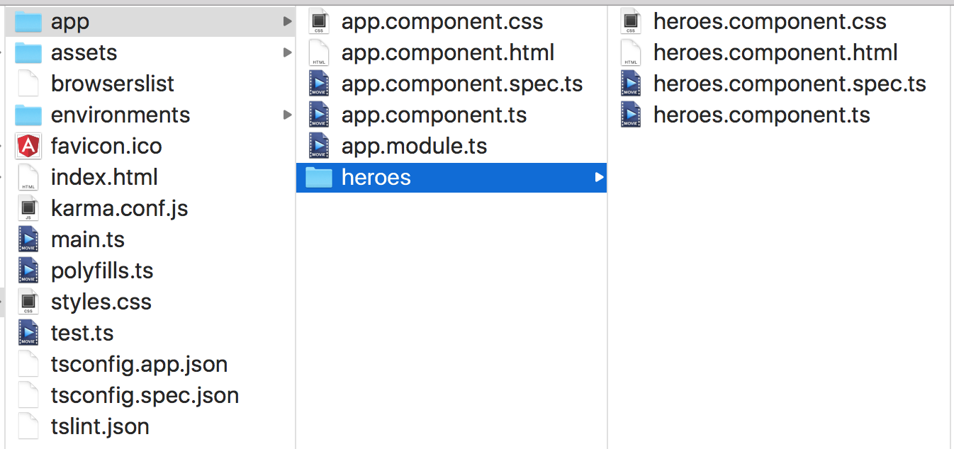
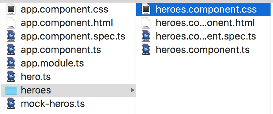
目录结构如下:
Summary
- The Tour of Heroes app displays a list of heroes in a Master/Detail view.
- The user can select a hero and see that hero's details.
- You used
*ngForto display a list. - You used
*ngIfto conditionally include or exclude a block of HTML. - You can toggle a CSS style class with a
classbinding.
Master/Detail Components
At the moment, the HeroesComponent displays both the list of heroes and the selected hero's details.
Keeping all features in one component as the application grows will not be maintainable.
You'll want to split up large components into smaller sub-components,
each focused on a specific task or workflow.
In this page, you'll take the first step in that direction by moving the hero details into a separate, reusable HeroDetailComponent.
The HeroesComponent will only present the list of heroes.
The HeroDetailComponent will present details of a selected hero.
Make the HeroDetailComponent
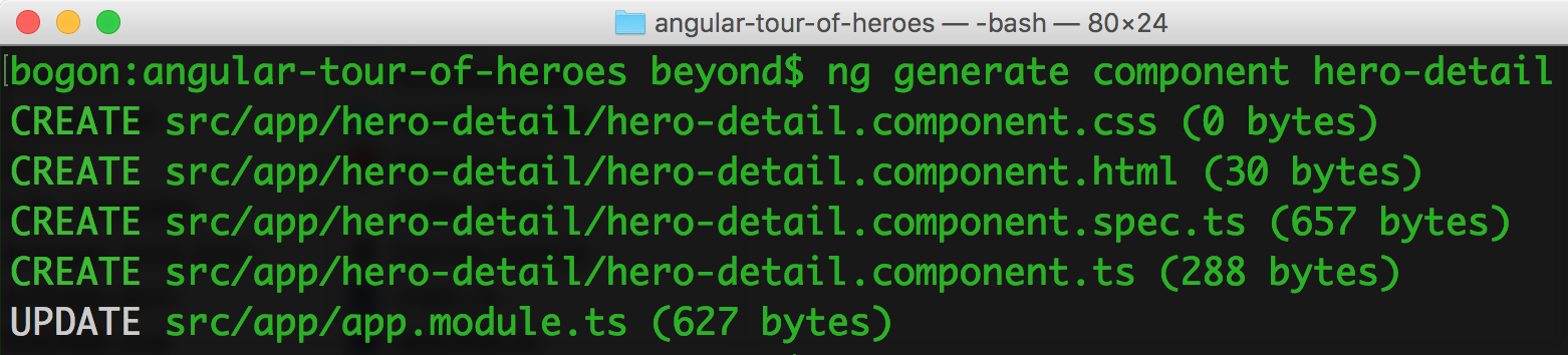
Use the Angular CLI to generate a new component named hero-detail.
content_copyng generate component hero-detail
The command scaffolds the HeroDetailComponent files
and declares the component in AppModule.
Write the template
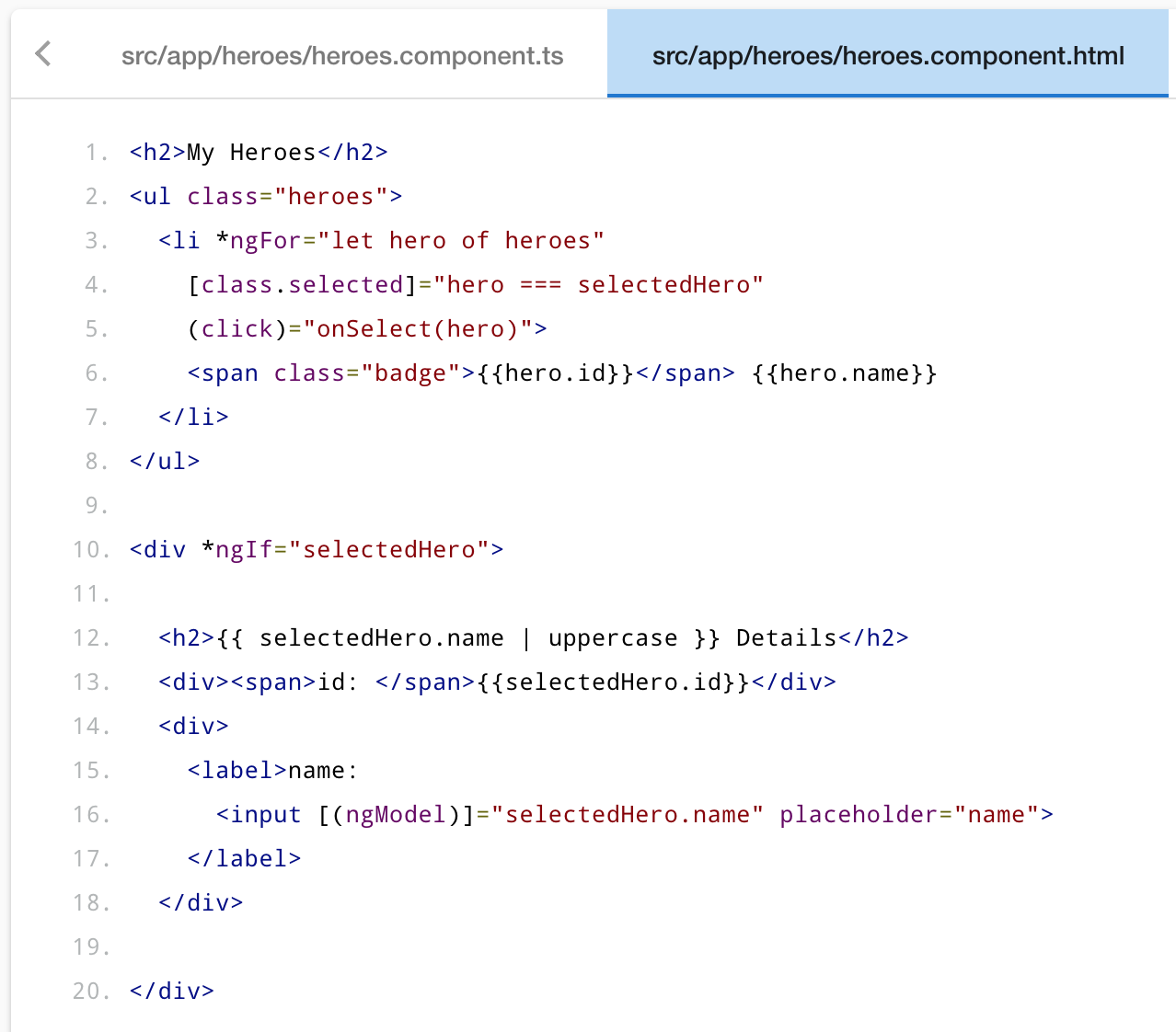
Cut the HTML for the hero detail from the bottom of the HeroesComponent template
and paste it over the generated boilerplate in the HeroDetailComponent template.
The pasted HTML refers to a selectedHero.
The new HeroDetailComponent can present any hero, not just a selected hero.
So replace "selectedHero" with "hero" everywhere in the template.
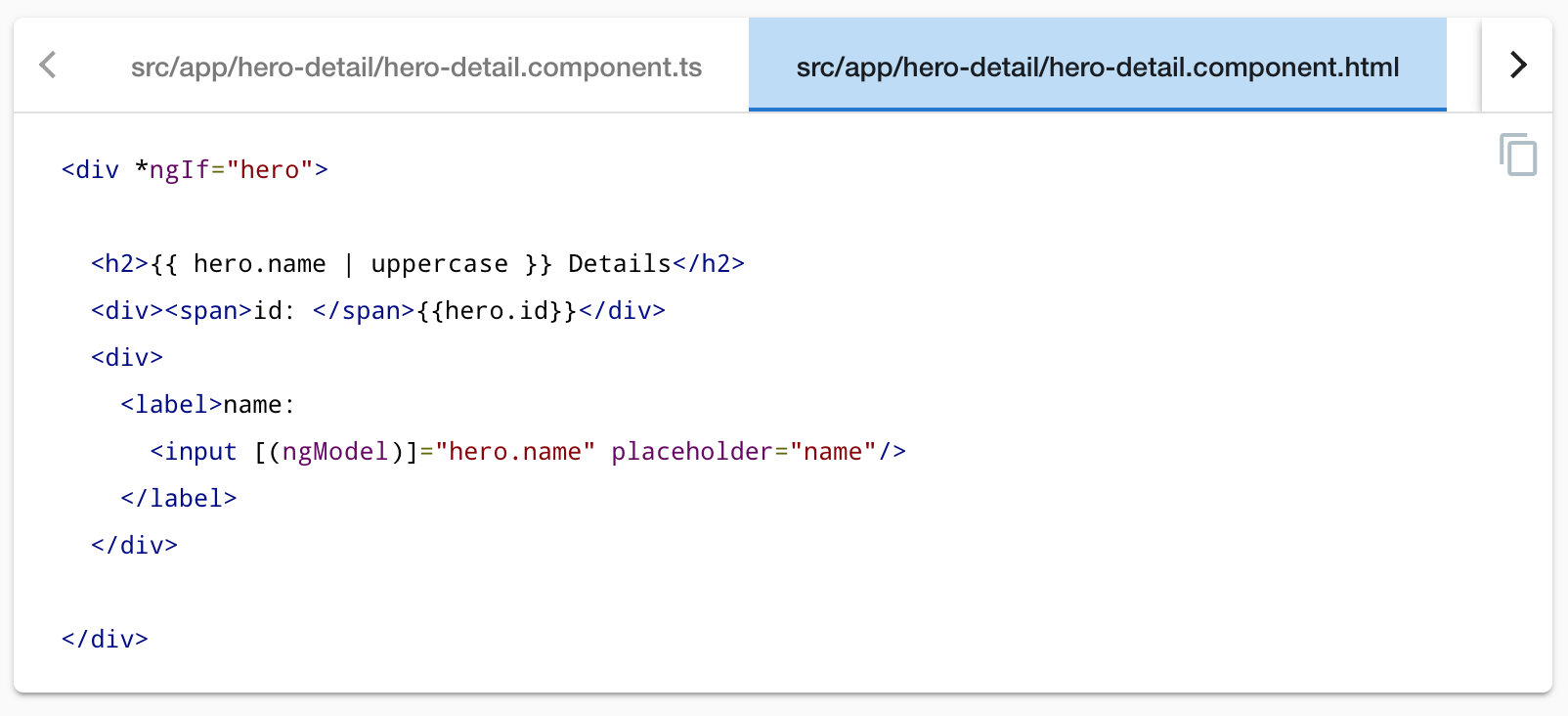
When you're done, the HeroDetailComponent template should look like this:
content_copy<div *ngIf="hero">

  <h2>{{ hero.name | uppercase }} Details</h2>
  <div><span>id: </span>{{hero.id}}</div>
  <div>
    <label>name:
      <input [(ngModel)]="hero.name" placeholder="name"/>
    </label>
  </div>

</div>
Add the @Input() hero property
The HeroDetailComponent template binds to the component's hero property which is of type Hero.
Open the HeroDetailComponent class file and import the Hero symbol.
content_copyimport { Hero } from '../hero';
HeroDeatilComponent这个子组件中的 数据源是自父类传递过来的
The hero property must be an Input property, annotated with the @Input() decorator,
because the external HeroesComponent will bind to it like this.
在父组件的样板文件中 heros.component.html是这样给子组件传递数据hero的:
content_copy<app-hero-detail [hero]="selectedHero"></app-hero-detail>
Amend the @angular/core import statement to include the Input symbol.
// 引入input symbol,这样就可以接收父组件传递过来的数据hero了
content_copyimport { Component, OnInit, Input } from '@angular/core';
Add a hero property, preceded by the @Input() decorator.
@Input() 表示该属性来自父组件
content_copy@Input() hero: Hero;
That's the only change you should make to the HeroDetailComponent class.
There are no more properties.
There's no presentation logic.
This component simply receives a hero object through its hero property and displays it.
Show the HeroDetailComponent
The HeroesComponent is still a master/detail view.
It used to display the hero details on its own, before you cut that portion of the template.
Now it will delegate to the HeroDetailComponent.
The two components will have a parent/child relationship.
The parent HeroesComponent will control the child HeroDetailComponent
by sending it a new hero to display whenever the user selects a hero from the list.
You won't change the HeroesComponent class but you will change its template.
Update the HeroesComponent template
The HeroDetailComponent selector is 'app-hero-detail'.
Add an <app-hero-detail> element near the bottom of the HeroesComponent template,
where the hero detail view used to be.
Bind the HeroesComponent.selectedHero to the element's hero property like this.
核心代码: [hero]="selectedHero"
heroes.component.html (HeroDetail binding)content_copy<app-hero-detail [hero]="selectedHero"></app-hero-detail>
[hero]="selectedHero" is an Angular property binding.
It's a one way data binding from the selectedHero property of the HeroesComponent
to the hero property of the target element, which maps to the hero property of the HeroDetailComponent.
Now when the user clicks a hero in the list, the selectedHero changes.
When the selectedHero changes, the property binding updates hero
and the HeroDetailComponent displays the new hero.
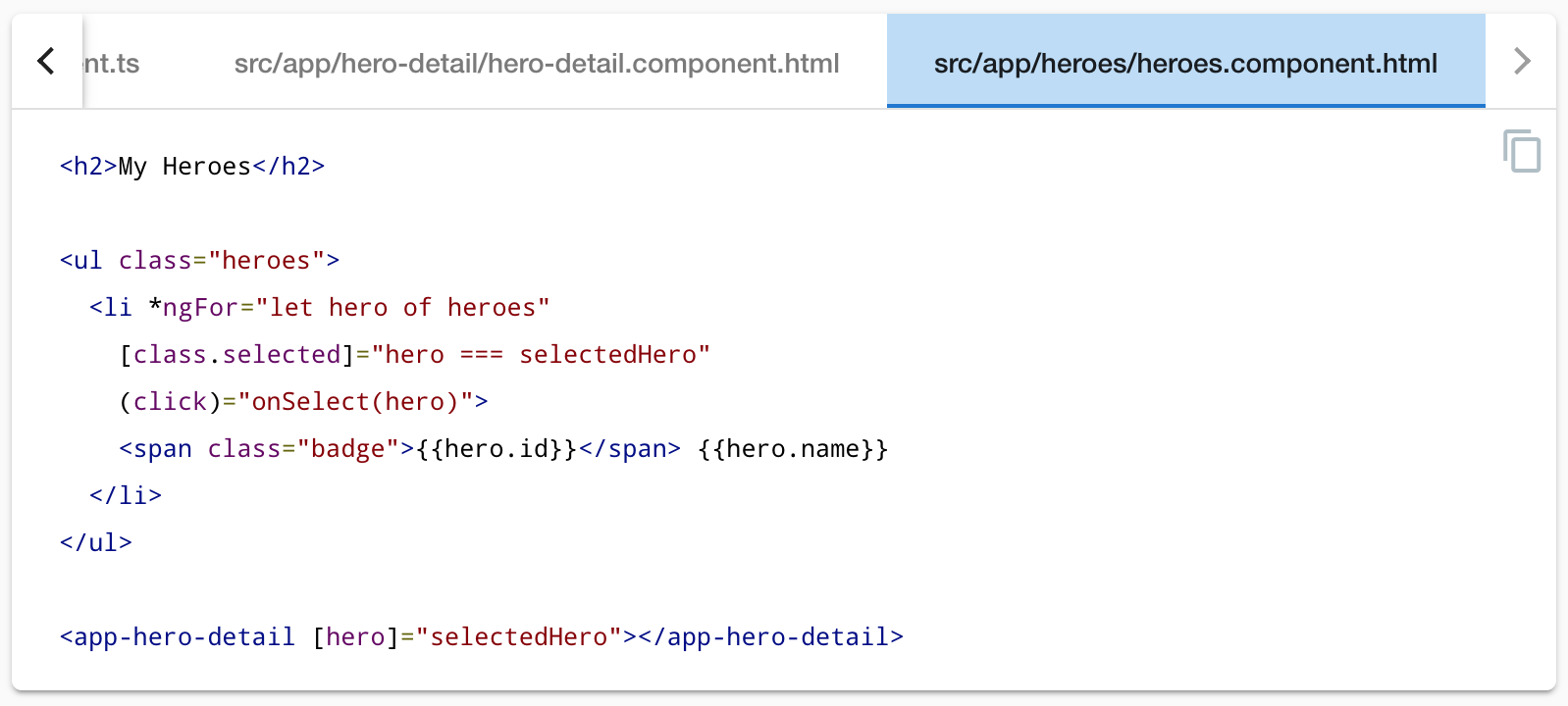
The revised HeroesComponent template should look like this:
content_copy<h2>My Heroes</h2>

<ul class="heroes">
  <li *ngFor="let hero of heroes"
    [class.selected]="hero === selectedHero"
    (click)="onSelect(hero)">
    <span class="badge">{{hero.id}}</span> {{hero.name}}
  </li>
</ul>

<app-hero-detail [hero]="selectedHero"></app-hero-detail>
The browser refreshes and the app starts working again as it did before.
What changed?
As before, whenever a user clicks on a hero name, the hero detail appears below the hero list.
Now the HeroDetailComponent is presenting those details instead of the HeroesComponent.
Refactoring the original HeroesComponent into two components yields benefits(产生益处), both now and in the future:
You simplified the
HeroesComponentby reducing its responsibilities.You can evolve the
HeroDetailComponentinto a rich hero editor without touching the parentHeroesComponent.You can evolve the
HeroesComponentwithout touching the hero detail view.You can re-use the
HeroDetailComponentin the template of some future component.
Final code review
Here are the code files discussed on this page and your app should look like this live example / download example.
src/app/hero-detail/hero-detail.component.ts代码如下:
- import { Component, OnInit, Input } from '@angular/core';
- import { Hero } from '../hero';
- @Component({
- selector: 'app-hero-detail',
- templateUrl: './hero-detail.component.html',
- styleUrls: ['./hero-detail.component.css']
- })
- export class HeroDetailComponent implements OnInit {
- @Input() hero: Hero;
- constructor() { }
- ngOnInit() {
- }
- }
app.module.ts代码如下:
import { BrowserModule } from '@angular/platform-browser';
import { NgModule } from '@angular/core';
// 表单双向绑定
import { FormsModule } from '@angular/forms';


import { AppComponent } from './app.component';
import { HeroesComponent } from './heroes/heroes.component';
import { HeroDetailComponent } from './hero-detail/hero-detail.component';


@NgModule({
  declarations: [
    AppComponent,
    HeroesComponent,
    HeroDetailComponent
  ],
  imports: [
    BrowserModule,
    // 添加双向绑定所需要的模块
    FormsModule
  ],
  providers: [],
  bootstrap: [AppComponent]
})
export class AppModule { }
Summary
- 子组件(HeroDetailComponent) You created a separate, reusable
HeroDetailComponent.
- 父组件传值给子组件. You used a property binding to give the parent
HeroesComponentcontrol over the childHeroDetailComponent.
- You used the
@Inputdecorator to make theheroproperty available for binding by the externalHeroesComponent.
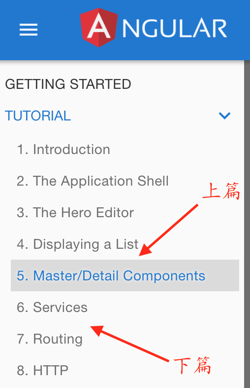
由于内容太长,分成上 下两部分
上部分先到这儿
下部分另写一篇
未完待续,下一章节,つづく