1.前言
看了Andrew ng的课程,用python sklearn总结一下逻辑回归。这就不说理论了,直接上py代码
2.环境配置
不多说,用的python3.x,numpy包,环境下载pycharm,然后file->setting->Project Interpreter->右侧绿色+号->搜索输入需要的包进行安装,然后可能有报错日志,根据日志循环上述过程安装缺少的包。
3.python代码
(1)ex2data1数据资源:https://download.csdn.net/download/bjjoy2009/10478703
(2)回归函数(LogisticRegression)详细说明请看:
https://blog.csdn.net/loveliuzz/article/details/78708359
import numpy as np
import matplotlib.pyplot as plt
from sklearn.linear_model import LogisticRegression
from sklearn.model_selection import train_test_split
from sklearn.preprocessing import StandardScaler
from matplotlib.colors import ListedColormap

# 绘制原始数据图
def plot_data():
    data = np.loadtxt("ex2data1.txt", delimiter=",")
    data0 = data[data[:, 2] == 0]
    data1 = data[data[:, 2] == 1]
    plt.plot(data0[:, 0], data0[:, 1], 'o')
    plt.plot(data1[:, 0], data1[:, 1], '+')
    plt.xlabel("score1")
    plt.ylabel("score2")
    plt.title("two exam score")
    plt.show()


def sigmoid(z):
    return 1/(1 + np.exp(-z))

# 绘制决策边界,
def plot_decision_regions(X, y, classifier, test_idx=None, resolution=0.02):
    # setup marker generator and color map
    markers = ('s', 'x', 'o', '^', 'v')
    colors = ('red', 'blue', 'lightgreen', 'gray', 'cyan')
    cmap = ListedColormap(colors[:len(np.unique(y))])
    # plot the decision surface
    x1_min, x1_max = X[:, 0].min() - 1, X[:, 0].max() + 1
    x2_min, x2_max = X[:, 1].min() - 1, X[:, 1].max() + 1
    xx1, xx2 = np.meshgrid(np.arange(x1_min, x1_max, resolution), np.arange(x2_min, x2_max, resolution))
    Z = classifier.predict(np.array([xx1.ravel(), xx2.ravel()]).T)
    Z = Z.reshape(xx1.shape)
    plt.contour(xx1, xx2, Z, alpha=0.4, cmap=cmap)
    plt.xlim(xx1.min(), xx1.max())
    plt.ylim(xx2.min(), xx2.max())
    # plot class samples
    for idx, cl in enumerate(np.unique(y)):
        plt.scatter(x=X[y == cl, 0], y=X[y == cl, 1],alpha=0.8, c=cmap(idx),marker=markers[idx], label=cl)
    # highlight test samples
    if test_idx:
        X_test, y_test = X[test_idx, :], y[test_idx]
        plt.scatter(X_test[:, 0], X_test[:, 1], c='', alpha=1.0, linewidth=1, marker='o', s=55, label='test set')
    plt.show()

# 绘制决策边界,数据标准化后,适用于0=theta1*x1+theta2*x2+theta0
def plot_decision_line(x_regular, Y, classifier):
    # 绘制数据图,o是分类1,+分类2
    data_regular = np.hstack((x_regular, Y.reshape(100, 1)))
    data0 = data_regular[data_regular[:, 2] == 0]
    data1 = data_regular[data_regular[:, 2] == 1]
    plt.plot(data0[:, 0], data0[:, 1], 'o')
    plt.plot(data1[:, 0], data1[:, 1], '+')
    # 绘制决策边界
    xx1 = np.arange(np.min(x_regular), np.max(x_regular), 0.01)
    exam2 = -(classifier.coef_[0][0] * xx1 + classifier.intercept_[0]) / classifier.coef_[0][1]
    plt.plot(xx1, exam2)
    plt.xlabel("exam1")
    plt.ylabel("exam2")
    plt.title("regular exam score")
    plt.show()


# 测试集,画图对预测值和实际值进行比较
def test_validate(x_test, y_test, y_predict, classifier):
    x = range(len(y_test))
    plt.plot(x, y_test, "ro", markersize=8, zorder=3, label=u"true_v")
    plt.plot(x, y_predict, "go", markersize=14, zorder=2, label=u"predict_v,$R^2$=%.3f" % classifier.score(x_test, y_test))
    plt.legend(loc="center left")
    plt.xlabel("number")
    plt.ylabel("true?")
    plt.show()


def logistic_regression():
    data = np.loadtxt("ex2data1.txt", delimiter=",")
    # 提取数据
    x = data[:, 0:2]
    y = data[:, 2]

    # 对数据的训练集进行标准化
    ss = StandardScaler()
    x_regular = ss.fit_transform(x)
    # 划分训练集与测试集
    x_train, x_test, y_train, y_test = train_test_split(x_regular, y, test_size=0.1)

    lr = LogisticRegression()
    lr.fit(x_train, y_train)

    # 模型效果获取
    r = lr.score(x_train, y_train)
    print("R值(准确率):", r)
    print("theta: ", lr.coef_)
    print("截距(theta0):", lr.intercept_)
    # 预测
    y_predict = lr.predict(x_test)  # 预测

    # 绘制原始数据
    plot_data()
    # 绘制决策边界,自己写的
    plot_decision_line(x_regular, y, classifier=lr)
    # 绘制决策边界,博客找的方法
    plot_decision_regions(x_regular, y, classifier=lr)
    # 绘制测试集结果验证
    test_validate(x_test=x_test, y_test=y_test, y_predict=y_predict, classifier=lr)


logistic_regression()
4.运行结果
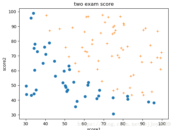
(1)plot_data()方法实现原始数据散点图。蓝点是未通过0,黄加号是通过1,横坐标score1是课程1得分,纵坐标score2是课程2得分。
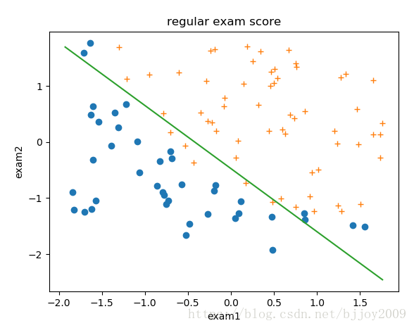
(2)plot_decision_line()自定义绘制决策边界方法,这里分数数据进行标准化,边界直线图公式0=theta1*x1+theta2*x2+theta0 –>x2=-(theta1*x1+theta0)/theta2,x1和x2对应exam1和exam2得分。theta通过sklearn的逻辑回归方法算出,具体看代码。
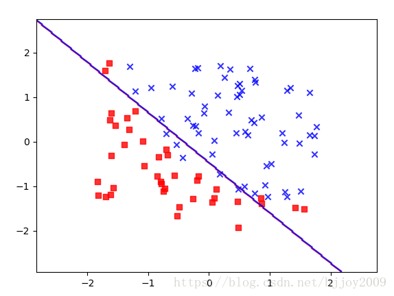
(3)plot_decision_regions其它博客给出绘制决策边界方法,挺好看的,大致和上边图一样
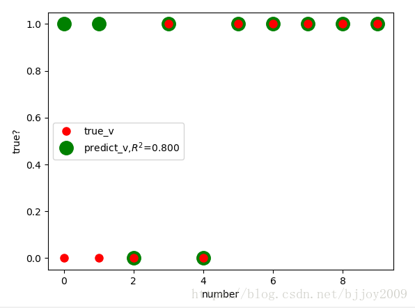
(4)test_validate计算测试数据集准确度
红点是真实值,绿点是根据training set得到回归方程计算出的预测值,这里测试集只有10个数据。
5总结
主要逻辑都在logistic_regression()方法中,sklearn方法参数很多,需要稍微看看博客文档,理论还是看看课程比较好。
sklearn文档:http://scikit-learn.org/stable/index.html
matplotlib文档:https://matplotlib.org/gallery/index.html