前言
第十三届蓝桥杯全国软件和信息技术专业人才大赛(软件类)新开了Web应用开发比赛,已经组织了几次模拟赛和楼赛,这里主要记录模拟赛题目和设计的知识点,帮助参赛者更好的复习琐碎的知识点和代码,有写的不对的地方欢迎指教并讨论.
文章目录
一、【Bug 调试】修复网站显示问题
- 题目描述:网页的css样式不显示,需要修复.
- 题目分析:文件引入错误.
- 题目代码
<link href="css/index.css" rel="stylesheet" type="text/css">
二、【Bug 调试】修复注册验证问题
- 题目描述:书写一个判断方法,判断输入的手机号是否符合前三个数字是:186 134-139 150-152.
- 题目分析:使用正则表达式进行判断.
| 符号 | 含义 | 举例 |
|---|---|---|
| ^ | 以……开头 | ^(123)字符串以123开头 |
| $ | 以……结尾 | 000$表示以000结尾 |
| [0-9] | 表示从0到9的任何数字 | [4-9]表示4-9的任何数字 |
| [a-z] | 表示从a到z的字母 | [abc]表示abc中的任何一个 |
| | | 或者 | 186|132 两个数字都行 |
| \d | 数字 | \d 代表任何数字 |
| \s | 空白字符 | |
| n+ | 至少一个 | 0+表示0,00,000等 |
| n* | 0或一个或多个 | 0*表示没有,0,00等 |
| n? | 0或1个 | 0?表示没有或0 |
| {} | 前面的字符有多少个 | \d{8}表示有八个数字 |
- 题目代码
function isPhone(phoneNumber) {


  var arr = /^(186|13[4-9]|15[0-2])\d{8}$/;
  // var arr = /^1(86|\[34-39]|\[50-52])\d{8}$/
  var flag = arr.test(phoneNumber);
  return flag
}
三、【功能实现】封装函数实现个人所得税计算器
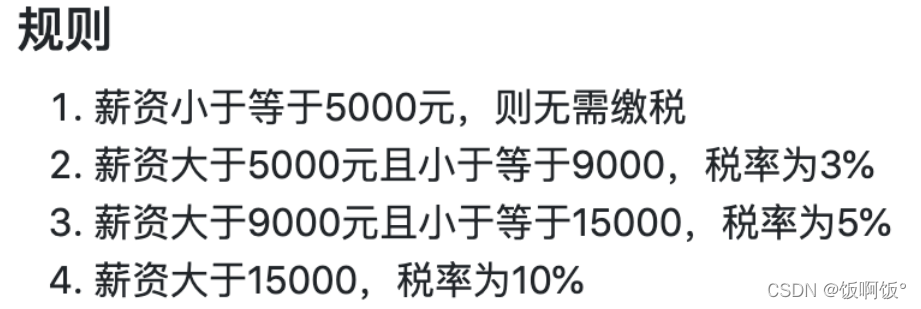
- 题目描述:
- 题目分析:采用if-else语句,对输入的金额分类。
- 题目代码
function cal(salary) {


    // TODO: 在此处补充代码
    if (salary <= 5000) return 0
    else if(salary > 5000 && salary <= 9000) return (salary-5000)*0.03
    else if(salary > 9000 && salary <= 15000) return (salary-5000)*0.05
    else return (salary-5000)*0.1
}
四、【页面布局】Flex 经典骰子布局
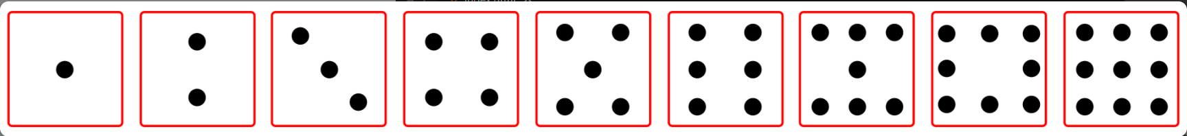
- 题目描述:利用弹性布局知识,完成骰子布局,骰子最终状态如图.
- 题目分析: 主要使用了弹性布局的相关属性.
| 属性名称 | 属性意义 | 属性可能的值 | |
|---|---|---|---|
| 容器的属性 | flex-direction | 决定item排列方向 | row,row-reverse,column,column-reverse |
| justify-content | item在主轴上的对齐方式 | flex-start,flex-end,center,space-between,space-around | |
| flex-wrap | 排列不下时,item如何换行 | nowrap,wrap,wrap-reverse | |
| align-content | 侧轴上子元素的排列方式(多行) | flex-start,flex-end,center,space-between,space-around,stretch | |
| align-items | 侧轴上子元素的排列方式(单行) | flex-start,flex-end,center,space-between,space-around,stretch | |
| flex-flow | 复合属性 | 相当于同时设置了flex-direction和flex-wrap | |
| item的属性 | order | 定义item的排列顺序 | 整数,默认为0,越小越靠前 |
| flex-grow | 当有多余空间时,item的放大比例 | 默认为0,即有多余空间时也不放大 | |
| flex-shrink | 当空间不足时,item的缩小比例 | 默认为1,即空间不足时缩小 | |
| flex-basis | 项目在主轴上占据的空间 | 长度值,默认为auto | |
| flex | grow,shrink,basis的简写 | 默认值为0 1 auto | |
| align-self | 单个item独特的对齐方式 | 同align-items,可覆盖align-items属性 |
-
题目代码
骰子一:div1,主轴默认为横轴,主轴上的排列为居中,非主轴上的排列为居中.div1 { justify-content: center; align-items: center; }骰子二:div2,主轴设置为纵轴,主轴上的排列为均匀排列,非主轴上排列为居中
.div2 {


	flex-direction: column;
    justify-content: space-around;
    align-items: center;

}
骰子三:div3,主轴默认为横轴,主轴上的排列为均匀排列,非主轴上居中排列,此时情况为居中一排,再单独设计第一个点的位置为start,第二个点的位置为end
.div3 {


    justify-content: space-around;
    align-items: center;
    padding: 10px;
}
.div3 :nth-child(1) {


	align-self: flex-start;
}
.div3 :nth-child(3) {


	align-self: flex-end;
}
骰子45679:divn,由于共同点都是在纵轴上均匀排列,设定主轴为纵轴,排列方式为均匀,不需要指定非主轴;再对里面每一个div进行设定,首先需要对子div指定排列方式:display: flex;因为外部的源代码中都指定过了;再设定主轴为横轴,排列方式为均匀即可。
.divn {


	flex-direction: column;
	justify-content: space-around;
}
.divn div{


    display: flex;
    justify-content:space-around;
}
骰子8:div8,继承divn中的部分,调整第二个子div的布局,排列应该是扩展,但是由于没有间距不好看,再根据图片调整间距
.divn .div8{


    display: flex;
    justify-content: space-between;
    padding: 0 6px;
}
五、【页面布局】制作网站首页
- 题目描述:给知乎日报排版.
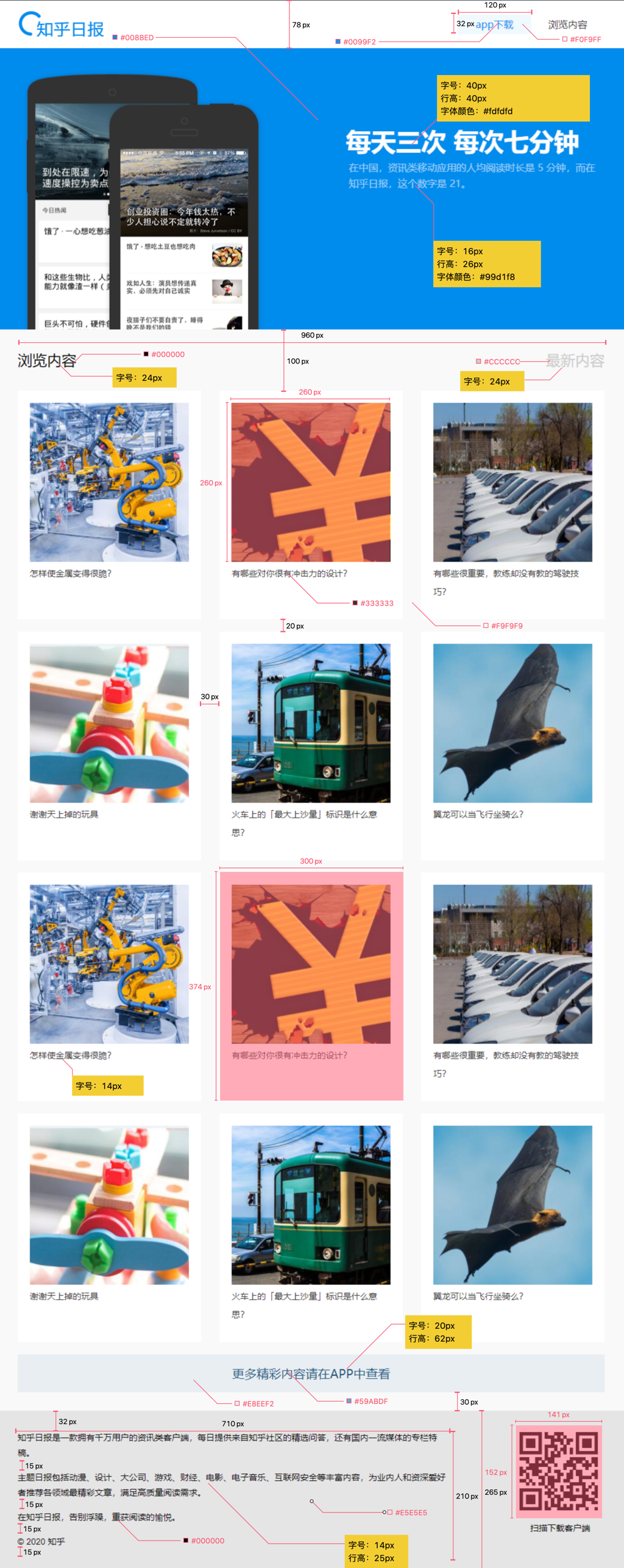
- 题目分析:考察的是CSS盒子模型的应用.
- 题目代码:
* {


    margin: 0;
    padding: 0;
    box-sizing: border-box;
    font-weight: normal;
}
a {


    text-decoration: none;
}
ul {


    list-style: none;
}

body {


    width: 1024px;
    margin: 0 auto;
    background-color: #f9f9f9;
}

/* navbox */
.navbox {


    display: flex;
    height: 78px;
    justify-content: space-between;
    align-items: center;
    background-color: #fff;
}
.navbox img {


    height: 50px;
    margin-left: 30px;
}
.navbox .navright {


    margin-right: 50px;
    height: 32px;
}
.navbox .navright :first-child {


    display: inline-block;
    height: 32px;
    width: 120px;
    color: #0099F2;
    background-color: #f0f9ff;
    text-align: center;
    line-height: 32px;
}
.navbox .navright :nth-child(2) {


    display: inline-block;
    height: 32px;
    width: 120px;
    color: black;
    text-align: center;
    line-height: 32px;
}


/* container */

.container {


    display: flex;
    height: 500px;
    background-color: #008bed;
    justify-content: space-between;
    position: relative;
}
.container .img{


    align-self: flex-end;
    margin-left: 20px;
}

.container .content {


    align-self: center;
    margin-right: 40px;
    width: 410px;
}

.container .content h2 {


    font-size: 40px;
    line-height: 40px;
    color: #fdfdfd;
}

.container .content .info {


    font-size: 16px;
    line-height: 26px;
    color: #99d1f8;
}

/* tabtitle */
.tabtitle {


    height: 100px;
    width: 960px;
    display: flex;
    justify-content: space-between;
    margin: 0 auto;
    align-items: center;

}

.tabtitle h3 {


    color: #000000;
    font-size: 24px;
}

.tabtitle h4 {


    color: #cccccc;
    font-size: 24px;
}

/* list */
.list {


    width: 960px;
    margin: 0 auto;
}
.list ul {


    display: flex;
    justify-content:space-between;
    flex-wrap: wrap;

}
.list ul li {


    width: 300px;
    height: 374px;
    background-color: #fff;
    margin-bottom: 20px;
    text-align: center;
}

.list ul li img {


    height: 260px;
    width: 260px;
    margin-top: 20px;
}

.list ul li p{


    text-align: start;
    margin-left: 25px;
    color: #333333;
    font-size: 14px;
}

.list .more {


    height: 62px;
    line-height: 62px;
    font-size: 20px;
    text-align: center;
    background-color: #e8eef2;
    margin-bottom: 30px;
}
.list .more a {


    color: #59abdf;
}

/* footer */
.footer {


    background-color: #e5e5e5;
}

.footer .footerBox {


    width: 960px;
    height: 265px;
    margin: 0 auto;
    display: flex;
    justify-content: space-between;
}

.footer .footerBox .footerL {


    width: 710px;
    padding-top: 32px;
}

.footer .footerBox .footerL p {


    font-size: 14px;
    line-height: 25px;
    margin-bottom: 15px;
}

.footer .footerBox .footerR {


    width: 141px;
    height: 152px;
    text-align: center;
    margin-top: 30px;
}
六、【页面布局】响应式 Gulp 中文网
- 题目描述,根据页面宽度适应不同布局。在
index.html文件<style>中加入下述@media媒体查询规则。 - 题目分析
当屏幕宽度max-width为1400px时,页面效果如下(不包括图上尺寸标记)。

@media screen and (max-width : 1400px) {


	nav .content {


		width: 900px;
	}
	main section,
    main section ul {


    	width: 900px;
    }
}
当屏幕宽度 max-width 为 900px 时,页面效果如下(不包括图上尺寸标记)

@media screen and (max-width : 900px) {


	nav .content {


		width: 700px;
	}
    main section,
    main section ul {


    	width: 700px;
    }
    main ul li {


    	width: 100%;
    }
    main ul li:nth-child(even){


    	margin-left:0;
    }
}
当屏幕宽度 max-width 为 650px 时,头部导航隐藏,并在右侧显示图标,底部列表的宽度为 100% ,页面效果如下。

@media screen and (max-width : 650px) {


	nav .list {


		display: none;
	}
	nav .content .menu {


		display: block;
		position: absolute;
		top: 15px;
		right: 10px;
	}
	main section,
    main section ul {


    	width: 650px;
    }
    main ul li {


    	width: 100%;
    }
    main ul li:nth-child(even){


    	margin-left:0;
    }
}
七、【数据交互】天气预报查询
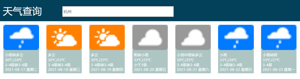
- 题目描述:通过 jQuery ajax 请求杭州一周天气预报数据,并将请求到的一周天气预报数据绑定到 HTML 中。得到如下页面:
- 题目分析:本题涉及到jQuery相关知识,现在整理如下:
(1)jQuery的入口函数:
$(function(){


   .......
})
(2)jQuery ajax请求数据:
$.ajax({

    url:"....",success:function(result){


	console.log(result);       //可以输出请求结果
}})
(3)jQuery基础选择器
| 名称 | 用法 | 描述 |
|---|---|---|
| ID选择器 | $(“#id”) | 获取指定ID的元素 |
| 全选选择器 | $(“*”) | 获取所有元素 |
| 类选择器 | $(“.class”) | 获取同一类class的元素 |
| 标签选择器 | $(“div”) | 获取同一类标签的元素 |
| 并集选择器 | $(“div,p,li”) | 获取多个元素 |
| 交集选择器 | $(“li.current”) | 获取交集元素 |
(4)jQuery层级选择器
| 名称 | 用法 | 描述 |
|---|---|---|
| 子代选择器 | $(“ul>li”) | 获取亲儿子层级的元素 |
| 后代选择器 | $(“ul li”) | 获取所有后代元素 |
(5)jQuery筛选选择器
| 名称 | 用法 | 描述 |
|---|---|---|
| :first | $(“li:first”) | 获取第一个li元素 |
| :last | $(“li:last”) | 获取最后一个li元素 |
| :eq(index) | $(“li:eq(2)”) | 获取索引为2的li元素,index从0开始 |
| :odd | $(“li:odd”) | 获取索引为奇数的li元素 |
| :even | $(“li:even”) | 获取索引为偶数的li元素 |
(6)设置属性语法
attr("属性","属性值")
(7)html(),text(),val()三种方法
html()方法
$("#par").html('<a href=" ">这是一个p标签</a>');
text()方法
$("#par").text('<a href=" ">这是一个p标签</a>');
//获取这个元素里面的文本
$("#par").text();
val()方法
$("input").val("123");  //设置一个值
$("input").val();  //获取元素
- 题目代码:
 function getweather() {


     //TODO:请补充代码
     $.ajax({

    url:"js/weather.json",success:function(result){


        data = result.result
        for(var i = 0;i < data.length;i++){


            $(`.item:eq(${

      i})>img`).attr('src',data[i].weather_icon)
            $(`.item:eq(${

      i}) .item-mess>:first-child`).text(data[i].weather)
            $(`.item:eq(${

      i}) .item-mess >:nth-child(2) `).text(data[i].temperature)
            $(`.item:eq(${

      i}) .item-mess >:nth-child(3) `).text(data[i].wind)
            $(`.item:eq(${

      i}) .item-mess >:nth-child(4) :first-child`).text(data[i].days)
            $(`.item:eq(${

      i}) .item-mess >:nth-child(4) :nth-child(2)`).text(data[i].week)
        }
     }})
}

getweather();
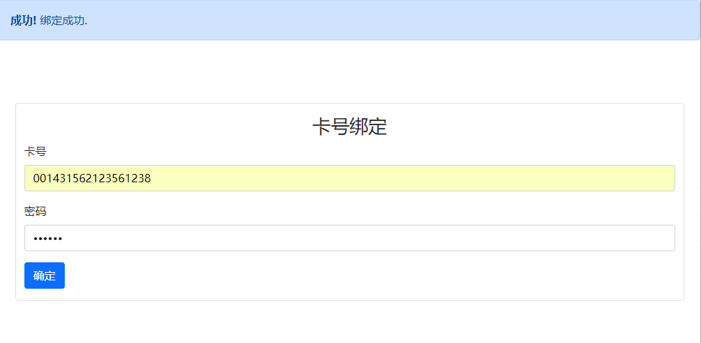
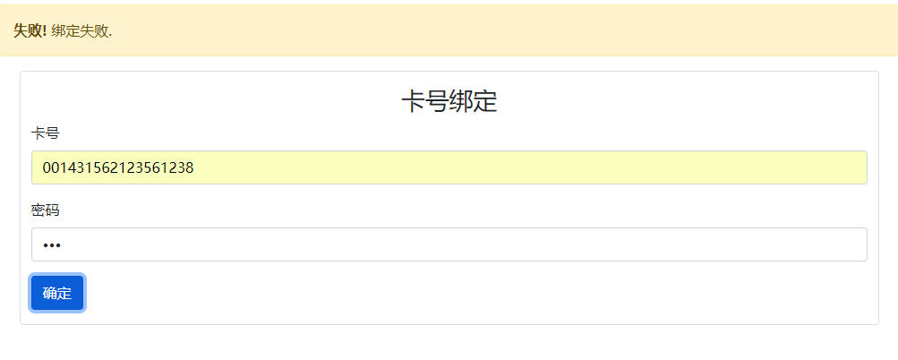
八、【数据交互】实现卡号绑定功能
- 题目描述:通过 jQuery ajax 请求用户列表数据,实现用户输入完卡号与密码后,与 ajax 请求到的卡号数据进行比对,当卡号和密码匹配成功时,则提示绑卡成功,效果如下所示:
- 题目分析:主要还是使用jQuery的知识,和上题类似。
- 题目代码:
function bind(cardno, password) {


    //Todo:补充代码
    $.ajax({

    url:"js/cardnolist.json",success:function(result){


        let data = result.cardnolist
        let flag = 0;
        data.forEach(item=>{


            if(item.cardno == cardno && item.password == password){


                flag = 1;
            }
        })
        if(flag){


            $("#tip1").attr('class','alert alert-primary alert-dismissible show')
            $("#tip2").attr('class','alert alert-primary alert-dismissible fade')
        }else{


            $("#tip1").attr('class','alert alert-primary alert-dismissible fade')
            $("#tip2").attr('class','alert alert-primary alert-dismissible show')
        }
    }})

}
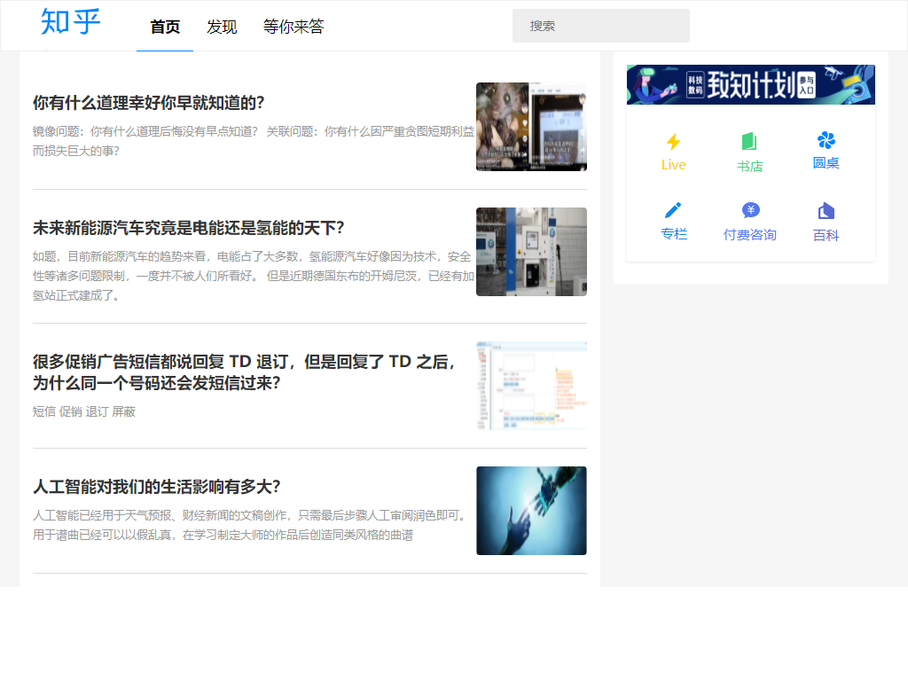
九、【数据交互】知乎首页数据动态化
- 题目描述:通过 axios 请求知乎首页文章列表数据,并响应式布局。
- 题目分析:就是vue的基本应用,没啥可说的。
- 题目代码:
<template>
  <div class="list">
    <div
      class="list-item"
      v-for="(info,index) in listInfo" :key="info.id"
    >
      <img
        class='list-pic'
   :src='info.imgUrl'
      />
      <div class="list-info" >
        <p class='title'>{

   {info.title}}</p>
        <p class='desc'>{

   {info.desc}}</p>
      </div>
    </div>
  </div>
</template>
<script>
import axios from 'axios'
export default {


  data() {


    return {


      listInfo:{

      },
    };
  },
  mounted(){


    this.getData();
  },
  methods:{


    async getData(){


      let result = await axios.get("static/data/list.json")
      this.listInfo = result.data.data.listInfo;
    }
  }
};
</script>
十、【API 开发】RESTful API 开发
- 题目描述:补全 index.js 获取用户列表 RESTful API。
- 题目代码:
app.get('/list',function(req,res){


    fs.readFile(path.resolve(__dirname,'./users.json'),'utf-8',function(err,data){


        data = JSON.parse(data);
        res.json(data)
    })
})