1.通过添加监听事件onorientationchange,然后判断window.orientation这个参数:
window.addEventListener("onorientationchange" in window ? "orientationchange" : "resize", isPortrait, false);

        function isPortrait() {
          console.log(window.orientation)
          if (window.orientation === 180 || window.orientation === 0) {
            console.log('竖屏');
            return true;
          }
          if (window.orientation === 90 || window.orientation === -90 ){
            console.log('横屏');
            return false;
          }
        }
window.orientation参数对应的屏幕方向:
Andriod:0 或180 横屏
Andriod: 90 或 -90 竖屏
ipad,iphone: 90 或 -90 横屏
ipad,iphone: 0 或180 竖屏
2. window.matchMedia("(orientation: portrait)") 方法
var screenDirection = window.matchMedia("(orientation: portrait)");
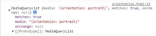
console.log(screenDirection)返回的是一个MediaQueryList对象,matches值为true表示为竖屏,反之就是横屏:
安卓手机在某些浏览器中可以禁止页面横屏:
QQ和微信中浏览器:
<meta name="x5-orientation" content="portrait">
UC浏览器:
<meta name="screen-orientation" content="portrait">