
文章目录
接下来进入Android 的入门基础知识,来了解Android中的布局.Android中有六大布局,其中分别是 RelativeLayout(相对布局),LinearLayout(线性布局),TableLayout(表格布局) ,FrameLayout(帧布局),ConstraintLayout(约束布局),GridLayout(网格布局) . 在实际的界面布局中我们最常用的是使用线性布局与相对布局结合使用,这个能达到较好的页面效果
一、RelativeLayout 相对布局
RelativeLayout相对布局管理器,需要有一个参考对象来进行页面布局,所以性对布局的实现前提是要有一个参考的组件,例如桌面的顶端,左侧,右侧,底部
相对页面布局语法格式:
<RelativeLayout xmlns:android="http://schemas.android.com/apk/res/android"
   //这里写属性列表>
</RelativeLayout>

以标记开始以结束,属性后面是XML命名空间的属性
RelativeLayout 有以下主要属性:
- gravity : 用于设置布局中的各个控件的对齐方式
- ignoreGravity: 用于分离gravity属性的控制
RelativeLayout 提供了一个内部类,类中又提供了许多重要的属性来更好的控制界面中的各个控件,其支持XML属性:
(1)、以布局管理器作为参考的属性:
- layout_alignParentTop: 布局管理器的顶部对齐
- layout_alignParentBotton: 布局管理器的底部对齐
- layout_alignParentLeft: 布局管理器的左对齐
- layout_alignParentRight: 布局管理器的右对齐
- layout_alignParentEnd: 新加入属性的右对齐
- layout_centerVertical: 布局管理器垂直居中
- layout_centerHorizontal: 布局管理器水平居中
(2)、以其他组件作为参考的属性:
- layout_toLeftOf: 参考组件的左边
- layout_toStartOf: 新加属性同上
- layout_toRigntOf: 参考组件的右边
- layout_above: 参考组件得上方
- layout_below: 参考组件的下方
- layout_alignLeft: 参考组件的左边界对齐
- layout_alignStart:新加属性同上
- layout_alignRight: 参考组件的右边界对齐
- layout_alignEnd: 新加属性同上
- layout_alignTop: 参考组件的上边界对齐
- layout_alignBottomt: 参考组件的下边界对齐
(3)、 设置组件在布局管理器上下左右中的偏移量:
- layout_margin:设置组件在布局管理器中的偏移量
- layout_marginTop: 设置与布局管理器顶端的偏移量
- layout_marginBottom:设置与布局管理器底部的偏移量
- layout_marginLeft:设置与布局管理器左边的偏移量
- layout_marginRight:设置与布局管理器右边的偏移量
- layout_marginEnd: 同上
- layout_marginStart: 同上
- layout_marginHorizontal: 设置与布局管理器水平的偏移量
- layout_marginVertical:设置与布局管理器垂直的偏移
(4)、设置组件内容与组件边框的填充量:
- padding: 内部元素的上下左右进行填充
- paddingBottom: 底部填充
- paddingTop: 顶部填充
- paddingLeft: 左边距填充
- paddingRight: 右边距填充
- paddingStart:同上
- paddingSEnd:同上
- paddingVertical: 垂直填充
- paddingHorizonta: 水平填充
实例:
<?xml version="1.0" encoding="utf-8"?>
<RelativeLayout xmlns:android="http://schemas.android.com/apk/res/android"
    xmlns:app="http://schemas.android.com/apk/res-auto"
    xmlns:tools="http://schemas.android.com/tools"
    android:layout_width="match_parent"
    android:layout_height="match_parent"
    tools:context=".MainActivity">
    <Button
        android:id="@+id/btn_1"
        android:layout_width="wrap_content"
        android:layout_height="wrap_content"
        android:text="我是button1"
        android:layout_centerInParent="true"
        />
    <Button
        android:layout_width="wrap_content"
        android:layout_height="wrap_content"
        android:text="我是button2"
        android:layout_alignParentLeft="true"
        android:layout_alignParentTop="true"
        android:layout_marginLeft="10dp"
        />
    <Button
        android:layout_width="wrap_content"
        android:layout_height="wrap_content"
        android:text="我是button3"
        android:layout_alignParentRight="true"
        android:layout_alignParentTop="true"
        android:layout_marginRight="10dp"
        />
    <Button
        android:layout_width="wrap_content"
        android:layout_height="wrap_content"
        android:text="我是button4"
        android:layout_alignParentLeft="true"
        android:layout_alignParentBottom="true"
        android:layout_marginLeft="10dp"
        />
    <Button
        android:layout_width="wrap_content"
        android:layout_height="wrap_content"
        android:text="我是button5"
        android:layout_alignParentRight="true"
        android:layout_alignParentBottom="true"
        android:layout_marginRight="10dp"
        />
    <Button
        android:layout_width="wrap_content"
        android:layout_height="wrap_content"
        android:text="我是button6"
        android:layout_toLeftOf="@id/btn_1"
        android:layout_alignTop="@id/btn_1"
        />
    <Button
        android:layout_width="wrap_content"
        android:layout_height="wrap_content"
        android:text="我是button7"
        android:layout_toRightOf="@id/btn_1"
        android:layout_alignTop="@id/btn_1"
        />
    <Button
        android:layout_width="wrap_content"
        android:layout_height="wrap_content"
        android:text="我是button9"
        android:layout_below="@id/btn_1"
        android:layout_alignStart="@id/btn_1"
        />
    <Button
        android:layout_width="wrap_content"
        android:layout_height="wrap_content"
        android:text="我是button8"
        android:layout_above="@id/btn_1"
        android:layout_alignStart="@id/btn_1"
        />
</RelativeLayout>

二、LinearLayout 线性布局
LinearLayout (线性布局)管理器是将其中的组件按照水平或者垂直的方向来排列,好比串手链一样,一个一个的串起来然后再按照水平或者垂直的方式排列就可以了
线性布局语法格式:
<LinearLayout xmlns:android="http://schemas.android.com/apk/res/android"
//属性列表
// 使用 android:orientation="vertical|Horizontal" 设置排列方式
>
</LinearLayout>
LinearLayout的属性:
- orientation: 布局排列方式 ,默认 vertical:垂直排列,horizontal:水平排列
- gravity: 布局管理器中组件的显示位置,选值可以取组合 例如:left|bottom
- layout_width: 布局宽度,取wrap_content为包括其自身内容;match_parent为与父容器同宽度
- layout_height: 布局高度,与layout_width相同,取wrap_content为包括其自身内容;match_parent为与父容器同宽度
- background: 布局背景
- id : 用于标识其他组件
- layout_weight: 权重,用于控制区域的划分
实例:
<?xml version="1.0" encoding="utf-8"?>
<LinearLayout xmlns:android="http://schemas.android.com/apk/res/android"
    xmlns:app="http://schemas.android.com/apk/res-auto"
    xmlns:tools="http://schemas.android.com/tools"
    android:layout_width="match_parent"
    android:layout_height="match_parent"
    android:orientation="vertical"
    tools:context=".LinearActivity">

    <LinearLayout
        android:layout_width="match_parent"
        android:layout_height="wrap_content"
        android:orientation="horizontal">

        <Button
            android:layout_width="wrap_content"
            android:layout_height="wrap_content"
            android:layout_weight="1"
            android:text="1" />
        <Button
            android:layout_width="wrap_content"
            android:layout_height="wrap_content"
            android:layout_weight="1"
            android:text="2" />
        <Button
            android:layout_width="wrap_content"
            android:layout_height="wrap_content"
            android:layout_weight="1"
            android:text="3" />
        <Button
            android:layout_width="wrap_content"
            android:layout_height="wrap_content"
            android:layout_weight="1"
            android:text="+" />
    </LinearLayout>

    <LinearLayout
        android:layout_width="match_parent"
        android:layout_height="wrap_content"
        android:orientation="horizontal">
        <Button
            android:layout_width="wrap_content"
            android:layout_height="wrap_content"
            android:layout_weight="1"
            android:text="4" />
        <Button
            android:layout_width="wrap_content"
            android:layout_height="wrap_content"
            android:layout_weight="1"
            android:text="5" />
        <Button
            android:layout_width="wrap_content"
            android:layout_height="wrap_content"
            android:layout_weight="1"
            android:text="6" />
        <Button
            android:layout_width="wrap_content"
            android:layout_height="wrap_content"
            android:layout_weight="1"
            android:text="-" />
    </LinearLayout>

    <LinearLayout
        android:layout_width="match_parent"
        android:layout_height="wrap_content"
        android:orientation="horizontal">
        <Button
            android:layout_width="wrap_content"
            android:layout_height="wrap_content"
            android:layout_weight="1"
            android:text="7" />
        <Button
            android:layout_width="wrap_content"
            android:layout_height="wrap_content"
            android:layout_weight="1"
            android:text="8" />
        <Button
            android:layout_width="wrap_content"
            android:layout_height="wrap_content"
            android:layout_weight="1"
            android:text="9" />
        <Button
            android:layout_width="wrap_content"
            android:layout_height="wrap_content"
            android:layout_weight="1"
            android:text="*" />
    </LinearLayout>

    <LinearLayout
        android:layout_width="match_parent"
        android:layout_height="wrap_content"
        android:orientation="horizontal">
        <Button
            android:layout_width="wrap_content"
            android:layout_height="wrap_content"
            android:layout_weight="1"
            android:text="0" />
        <Button
            android:layout_width="wrap_content"
            android:layout_height="wrap_content"
            android:layout_weight="1"
            android:text="/"
            android:background="#047EFD"/>
        <Button
            android:layout_width="wrap_content"
            android:layout_height="wrap_content"
            android:layout_weight="1"
            android:text="="
            />

    </LinearLayout>

</LinearLayout>

三、FrameLayout 帧布局
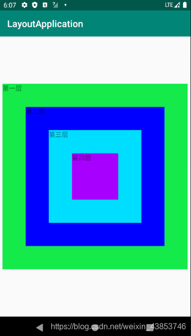
FrameLayout(帧布局) 管理器是比较简单的一个布局,这个布局是直接在屏幕上分配一块区域,组件默认置于左上角,这种布局没有任何的定位,布局大小由内部最大控件决定,新创建的控件会覆盖在上一个控件上,就像三明治一样一层一层叠起来,所以帧布局并不常用
帧布局语法格式:
<FrameLayout xmlns:android="http://schemas.android.com/apk/res/android"
// 列表属性
>

</FrameLayout>
FrameLayout属性:
- Foreground: 设置布局管理器的前景色
- foregroundGravity: 设置前景图像的Gravity属性,即前景图像的显示位置
实例:
<?xml version="1.0" encoding="utf-8"?>
<FrameLayout xmlns:android="http://schemas.android.com/apk/res/android"
    xmlns:app="http://schemas.android.com/apk/res-auto"
    xmlns:tools="http://schemas.android.com/tools"
    android:layout_width="match_parent"
    android:layout_height="match_parent"
    tools:context=".LYXFrameLayoutActivity">
<!--    第一层在控件的最下面-->
    <TextView
    android:layout_width="400dp"
    android:layout_height="400dp"
    android:background="#12eb4a"
    android:text="第一层"
    android:layout_gravity="center" />
    <TextView
        android:layout_width="300dp"
        android:layout_height="300dp"
        android:background="#0000ff"
        android:text="第二层"
        android:layout_gravity="center" />
    <TextView
        android:layout_width="200dp"
        android:layout_height="200dp"
        android:background="#00deff"
        android:text="第三层"
        android:layout_gravity="center" />
    <TextView
        android:layout_width="100dp"
        android:layout_height="100dp"
        android:background="#a800ff"
        android:text="第四层"
        android:layout_gravity="center" />

</FrameLayout>
四、TableLayout 表格布局
TableLayout 表格布局,顾名思义,即通过表格来管理内部的组件排列,表格管理器通过设定行和列来划分区域,布局管理器中可以设置隐藏,也可以设置伸展或者收缩的属性
表格布局语法:
<TableLayout xmlns:android="http://schemas.android.com/apk/res/android"
//列表属性
>
<TableRow 列表属性>添加组件</TableRow>
<TableRow 列表属性>添加组件</TableRow>
<TableRow 列表属性>添加组件</TableRow>
.......
</TableLayout>
TableLayout 继承了LinearLayout ,故支持LinearLayout的所有属性,TableLayout还有以下属性:
- collapseColumns: 隐藏列 (序号从0开始,例如要隐藏第一列则写0,隐藏第二列则写1…,多个列用
,隔开) - shrinkColumns: 收缩列
- stretchColumns: 拉伸列
实例:
<?xml version="1.0" encoding="utf-8"?>
<TableLayout xmlns:android="http://schemas.android.com/apk/res/android"
    xmlns:app="http://schemas.android.com/apk/res-auto"
    xmlns:tools="http://schemas.android.com/tools"
    android:layout_width="match_parent"
    android:layout_height="match_parent"
    tools:context=".LYXTableLayoutActivity"
    android:stretchColumns="0"
    android:shrinkColumns="2">
    <TableLayout
        android:stretchColumns="0">
        <TableRow>
            <Button
                android:layout_width="wrap_content"
                android:layout_height="wrap_content"
                android:text="标题"
                />
        </TableRow>
    </TableLayout>

    <TableLayout
        android:stretchColumns="0"
        android:shrinkColumns="1"
        android:collapseColumns="3">
    <TableRow>
        <Button
            android:layout_width="wrap_content"
            android:layout_height="wrap_content"
            android:text="长长的按钮" />
        <Button
            android:layout_width="wrap_content"
            android:layout_height="wrap_content"
            android:text="我被压缩了" />
        <Button
            android:layout_width="wrap_content"
            android:layout_height="wrap_content"
            android:text="正常的按钮" />
        <Button
            android:layout_width="wrap_content"
            android:layout_height="wrap_content"
            android:text="我被隐藏了" />
    </TableRow>
    </TableLayout>

    <TableLayout
        android:stretchColumns="0"
        android:shrinkColumns="1">
    <TableRow>
        <Button
            android:layout_width="wrap_content"
            android:layout_height="wrap_content"
            android:text="正常吗"
            />
        <Button
            android:layout_width="wrap_content"
            android:layout_height="wrap_content"
            android:text="我被压缩了"
            />
        <Button
            android:layout_width="wrap_content"
            android:layout_height="wrap_content"
            android:text="正常的按钮"
            />
        <Button
            android:layout_width="wrap_content"
            android:layout_height="wrap_content"
            android:text="正常的按钮"
            />
    </TableRow>
    </TableLayout>

    <TableLayout
        android:collapseColumns="1">
        <TableRow>
            <Button
                android:layout_width="wrap_content"
                android:layout_height="wrap_content"
                android:text="正常的按钮" />
            <Button
                android:layout_width="wrap_content"
                android:layout_height="wrap_content"
                android:text="我被压缩了" />
            <Button
                android:layout_width="wrap_content"
                android:layout_height="wrap_content"
                android:text="正常的按钮"
                />
            <Button
                android:layout_width="wrap_content"
                android:layout_height="wrap_content"
                android:text="正常的按钮"
                />
        </TableRow>
    </TableLayout>

    <TableLayout
        android:collapseColumns="0"
        android:shrinkColumns="1">
        <TableRow>
            <Button
                android:layout_width="wrap_content"
                android:layout_height="wrap_content"
                android:text="我被隐藏了" />
            <Button
                android:layout_width="wrap_content"
                android:layout_height="wrap_content"
                android:text="我被压缩了" />
            <Button
                android:layout_width="wrap_content"
                android:layout_height="wrap_content"
                android:text="正常的按钮" />
            <Button
                android:layout_width="wrap_content"
                android:layout_height="wrap_content"
                android:text="正常的按钮" />
        </TableRow>
    </TableLayout>

    <TableLayout
        android:stretchColumns="2"
        android:shrinkColumns="2">
        <TableRow>
            <Button
                android:layout_width="wrap_content"
                android:layout_height="wrap_content"
                android:text="正常的按钮" />
            <Button
                android:layout_width="wrap_content"
                android:layout_height="wrap_content"
                android:text="我被压缩了"
                />
            <Button
                android:layout_width="wrap_content"
                android:layout_height="wrap_content"
                android:text="我被拉伸了" />
        </TableRow>
    </TableLayout>

</TableLayout>

五、GridLayout 网格布局
网格布局是在Android4.0 以后提出来的,他与表格布局管理器类似,但比表格布局更加灵活,可以跨行跨列摆放组件
网格布局 语法格式:
<GridLayout xmlns:android="http://schemas.android.com/apk/res/android"
//列表属性
>

</GridLayout>
GridLayout 属性:
- columnCount: 指定网格的最大列数
- orientation: 设定放入组件的排列方式
- rowCount: 指定网格的最大行数
- useDefaultMargins: 指定是否使用默认边距
- rowOrderPreserves: 设置边界显示的顺序和行索引是否相同
- alignmentMode: 指定布局管理器的对齐模式
- columnOrderPreserves: 设置边界显示的顺序和列索引是否相同
为了控制各个组件的排列,网格布局管理器还有以下属性:
- layout_column: 指定该组件位于网格的第几列
- layout_columnSpan指定该组件横向跨几列(索引从0开始)
- layout_columnWeight: 指定该组件列上的权重
- layout_gravity: 指定该组件用什么方式占据网格的空间
- layout_row: 指定该组件位于网格的第几行
- layout_rowSpan: 指定组件纵向跨几行
- layout_rowWeight: 指定该组件行上的权重
注意:如果一个组件需要设置跨行或者跨列,需要先设置layout_columnSpan或者layout_cowSpan,然后在设置layout_gravity属性为fill,这样就可以填满横跨的行或列
实例:
<?xml version="1.0" encoding="utf-8"?>
<GridLayout xmlns:android="http://schemas.android.com/apk/res/android"
    xmlns:app="http://schemas.android.com/apk/res-auto"
    xmlns:tools="http://schemas.android.com/tools"
    android:layout_width="match_parent"
    android:layout_height="match_parent"
    android:columnCount="4"
    android:rowCount="6"
    tools:context=".LYXGridLayoutActivity">

    <EditText
        android:layout_columnSpan="4"
        android:layout_gravity="top|right"
        android:layout_marginLeft="5dp"
        android:background="#fff"
        android:text="0"
        android:textSize="50dp"/>
    <Button
        android:text="+"
        android:layout_columnWeight="1"
        android:layout_rowWeight="1"
        android:textSize="20dp"
        android:textColor="#00f"/>
    <Button
        android:text="-"
        android:layout_columnWeight="1"
        android:layout_rowWeight="1"
        android:textSize="20dp"/>
    <Button
        android:text="*"
        android:layout_columnWeight="1"
        android:layout_rowWeight="1"
        android:textSize="20dp"/>
    <Button
        android:text="/"
        android:layout_columnWeight="1"
        android:layout_rowWeight="1"
        android:textSize="20dp"/>
    <Button
        android:text="1"
        android:layout_columnWeight="1"
        android:layout_rowWeight="1"
        android:textSize="20dp"/>
    <Button
        android:text="2"
        android:layout_columnWeight="1"
        android:layout_rowWeight="1"
        android:textSize="20dp"/>
    <Button
        android:text="3"
        android:layout_columnWeight="1"
        android:layout_rowWeight="1"
        android:textSize="20dp"/>
    <Button
        android:text="%"
        android:layout_columnWeight="1"
        android:layout_rowWeight="1"
        android:textSize="20dp"/>
    <Button
        android:text="4"
        android:layout_columnWeight="1"
        android:layout_rowWeight="1"
        android:textSize="20dp"/>
    <Button
        android:text="5"
        android:layout_columnWeight="1"
        android:layout_rowWeight="1"
        android:textSize="20dp"/>
    <Button
        android:text="6"
        android:layout_columnWeight="1"
        android:layout_rowWeight="1"
        android:textSize="20dp"/>
    <Button
        android:text="."
        android:layout_columnWeight="1"
        android:layout_rowWeight="1"
        android:textSize="20dp"/>
    <Button
        android:text="7"
        android:layout_columnWeight="1"
        android:layout_rowWeight="1"
        android:textSize="20dp"/>
    <Button
        android:text="8"
        android:layout_columnWeight="1"
        android:layout_rowWeight="1"
        android:textSize="20dp"/>
    <Button
        android:text="9"
        android:layout_columnWeight="1"
        android:layout_rowWeight="1"
        android:textSize="20dp"/>
    <Button
        android:text="="
        android:layout_rowSpan="2"
        android:layout_gravity="fill"
        android:background="#047EFD"
        android:layout_columnWeight="1"
        android:layout_rowWeight="1"
        android:textSize="20dp"/>
    <Button
        android:text="C"
        android:layout_gravity="fill_horizontal"
        android:layout_columnWeight="2"
        android:layout_rowWeight="1"
        android:layout_columnSpan="2"
        android:textSize="20dp"/>
    <Button
        android:text="0"
        android:layout_rowSpan="1"
        android:layout_columnWeight="1"
        android:layout_rowWeight="1"
        android:textSize="20dp"/>
</GridLayout>

六、ConstraintLayout 约束布局
ConstraintLayout 是Android Studio 2.2提出的新的可视化操作布局方
掌握Constraint Layout的使用: