一定要给大家推荐这个项目,作者大大真的好慷慨,这是一个很有意思的项目,感谢作者大大开源他的项目。
先放下作者大大的github地址:
https://github.com/shaozhun/vue_company_web
接下来我们来看一下动图
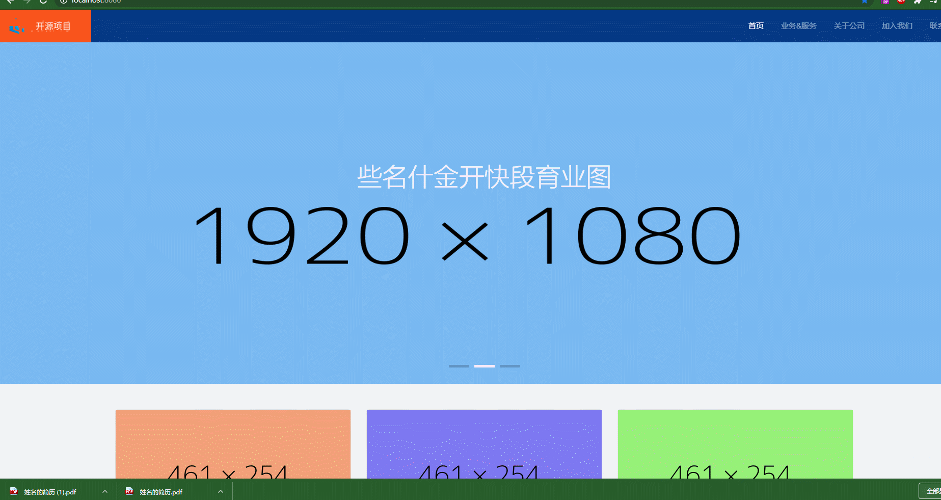
项目中作者大大很明确的标注了图片的大小,真的很赞。
接下来我们一起看项目哇
作者大大使用了这个网站,来创建可以直接引用的图片的大小:https://dummyimage.com/
在index.html中引用
<!DOCTYPE html>
<html>

<head>
  <meta charset="utf-8">
  <meta name="viewport"
    content="width=device-width, minimum-scale=1.0, maximum-scale=1.0, initial-scale=1.0, user-scalable=no">
  <meta name="description" content="官方网站">
  <meta name="author" content="SHAOZHUN">
  <title>公司名称</title>
  <link rel="dns-prefetch" href="http://dummyimage.com/">
</head>

<body>
  <div id="app"></div>
  <!-- built files will be auto injected -->
</body>

</html>
接下来看main.js
main.js中引用了一个轮播,以及reset.css,还有路由
//main.js
// The Vue build version to load with the `import` command
// (runtime-only or standalone) has been set in webpack.base.conf with an alias.
import Vue from 'vue'
import App from './App'
import router from './router'
import 'css/reset.css'
import VueAwesomeSwiper from 'vue-awesome-swiper'

import 'swiper/dist/css/swiper.css'

Vue.config.productionTip = false
Vue.use(VueAwesomeSwiper)
/* eslint-disable no-new */
new Vue({
  el: '#app',
  router,
  components: { App },
  template: '<App/>'
})
//App.vue
<template>
  <div id="app">
    <router-view/>
  </div>
</template>

<script>
export default {
  name: 'App'
}
</script>

<style>

</style>
接下来看的是router.js,也是很普通的哦
import Vue from 'vue'
import Router from 'vue-router'
import Home from '@/pages/home/Home'
import Contact from '@/pages/contact/Contact'
import About from '@/pages/about/About'
import Join from '@/pages/join/Join'
import Business from '@/pages/business/Business'
import NotFound from '@/pages/notfound/NotFound'

Vue.use(Router)

export default new Router({
  mode: 'history',
  routes: [
    {
      path: '/',
      name: 'Home',
      component: Home
    }, {
      path: '/contact',
      name: 'Contact',
      component: Contact
    }, {
      path: '/about',
      name: 'About',
      component: About
    }, {
      path: '/join',
      name: 'Join',
      component: Join
    }, {
      path: '/business',
      name: 'Business',
      component: Business
    }, {
      path: '*',
      name: 'NotFound',
      component: NotFound
    }
  ],
  scrollBehavior (to, from, savePosition) {
    return { x: 0, y: 0 }
  }
})
我本来以为会有一些特殊的处理的,接下来我们看对应的页面的组件
第一个是Home页面

home页面中引用了好几个组件,里面还有直接请求数据然后传给子组件的
<template>
  <div>
    <Home-Nav :navindex="0"></Home-Nav>
    <Home-Swiper></Home-Swiper>
    <Home-Product :list="list1"></Home-Product>
    <Home-Product :list="list2"></Home-Product>
    <Home-Product :list="list3"></Home-Product>
    <Home-Partner></Home-Partner>
    <Home-Expert></Home-Expert>
    <Home-Join></Home-Join>
    <Home-Footer></Home-Footer>
  </div>
</template>

<script>
import HomeNav from '../common/Nav'
import HomeSwiper from './components/Swiper'
import HomeProduct from '../common/Product'
import HomePartner from './components/Partner'
import HomeExpert from './components/Expert'
import HomeJoin from './components/Join'
import HomeFooter from '../common/Footer'

import axios from 'axios'
import url from '../../modules/api.js'
export default {
  name: 'Home',
  components: {
    HomeNav, HomeSwiper, HomeProduct, HomePartner, HomeJoin, HomeFooter, HomeExpert
  },
  data () {
    return {
      list1: [],
      list2: [],
      list3: []
    }
  },
  mounted () {
    axios.get(url.productLists).then(res => {
      this.list1 = res.data.list
    })
    axios.get(url.productLists).then(res => {
      this.list2 = res.data.list
    })
    axios.get(url.productLists).then(res => {
      this.list3 = res.data.list
    })
  }
}
</script>

<style scoped>
</style>
首先看一下Home-Nav组件
<template>
  <div>
    <header class="header clear">
      <nav class="navbar" v-show="navshow">
        <a class="navbar-brand">
          <img height="32" src="../../assets/image/logo.png" />
          <!-- <img height="32" src="../../assets/image/logo.png" /> -->
        </a>
        <ul class="menu clear">
          <router-link tag="li" to="/" :class="{fff:navindex===0}">首页</router-link>
          <router-link tag="li" to="/business" :class="{fff:navindex===1}">业务&服务</router-link>
          <router-link tag="li" to="/about" :class="{fff:navindex===2}">关于公司</router-link>
          <router-link tag="li" to="/join" :class="{fff:navindex===3}">加入我们</router-link>
          <router-link tag="li" to="/contact" :class="{fff:navindex===4}">联系我们</router-link>
        </ul>
        <span class="more" @click="downmenuClick()">
          <div class="icon-twrap" p-id="599">
            <svg
              class="icon"
              style="width: 1em; height: 1em;vertical-align: middle;fill: currentColor;overflow: hidden;"
              viewBox="0 0 1024 1024"
              version="1.1"
              xmlns="http://www.w3.org/2000/svg"
              p-id="601"
            >
              <path
                d="M925 811H99.5c-12 0.7-23.5-5.3-29.7-15.7-6.2-10.3-6.2-23.3 0-33.6s17.7-16.4 29.7-15.7H925c12-0.7 23.5 5.3 29.7 15.7 6.2 10.3 6.2 23.3 0 33.6-6.3 10.4-17.7 16.4-29.7 15.7zM925 534.7H99.5c-12 0.7-23.5-5.3-29.7-15.7-6.2-10.3-6.2-23.3 0-33.6s17.7-16.4 29.7-15.7H925c12-0.7 23.5 5.3 29.7 15.7 6.2 10.3 6.2 23.3 0 33.6-6.3 10.3-17.7 16.4-29.7 15.7zM925 279.7H99.5c-12 0.7-23.5-5.3-29.7-15.7-6.2-10.3-6.2-23.3 0-33.6s17.7-16.4 29.7-15.7H925c12-0.7 23.5 5.3 29.7 15.7 6.2 10.3 6.2 23.3 0 33.6-6.3 10.3-17.7 16.4-29.7 15.7z"
                p-id="602"
              />
            </svg>
          </div>
        </span>
      </nav>
    </header>
    <nav class="nav-down" v-show="downmenuShow">
      <ul class="downmenu clear">
        <router-link tag="li" to="/" :class="{fff:navindex===0}">首页</router-link>
        <router-link tag="li" to="/business" :class="{fff:navindex===1}">业务&服务</router-link>
        <router-link tag="li" to="/about" :class="{fff:navindex===2}">关于公司</router-link>
        <router-link tag="li" to="/join" :class="{fff:navindex===3}">加入我们</router-link>
        <router-link tag="li" to="/contact" :class="{fff:navindex===4}">联系我们</router-link>
      </ul>
    </nav>
  </div>
</template>
<script>
export default {
  name: 'Nav',
  data () {
    return {
      downmenuShow: false,
      navshow: true,
      height: 0,
      timer: null
    }
  },
  props: {
    navindex: Number
  },
  mounted () {
  },
  // created () {
  //   window.addEventListener('scroll', this.handleScroll)
  // },
  // destroyed () {
  //   window.removeEventListener('scroll', this.handleScroll)
  // },
  methods: {
    downmenuClick () {
      this.downmenuShow = !this.downmenuShow
    },
    // handleScroll (e) {
    //   if (this.timer) {
    //     clearTimeout(this.timer)
    //   }
    //   this.timer = setTimeout(() => {
    //     const top = document.documentElement.scrollTop
    //     if (this.height < top) {
    //       this.navshow = false
    //       this.height = top
    //     } else {
    //       this.navshow = true
    //       this.height = top
    //     }
    //   }, 50)
    // }
  }

}
</script>
<style scoped>
.clear::after {
  content: "";
  display: block;
  clear: both;
}
.fff {
  color: #fff !important;
  pointer-events: none;
}
header {
  position: fixed;
  background: #043985;
  z-index: 99;
  top: 0;
  left: 0;
  right: 0;
  color: rgba(255, 255, 255, 0.5);
}
.navbar-brand {
  display: inline-block;
  padding: 16px 14px;
}
.header .navbar-brand {
  float: left;
  background-color: #fa541c;
}
.header .navbar-brand img {
  height: 32px;
  width: 152px;
  vertical-align: middle;
  border-style: none;
}
.menu {
  float: right;
}
.menu li {
  float: left;
  padding: 24px 17px;
  font-size: 15px;
  cursor: pointer;
}
.nav-down ul li {
  margin-left: 50%;
  transform: translateX(-25%);
}
.more {
  display: none;
  float: right;
  margin-right: 15px;
  margin-top: 15px;
  border: 1px solid #cccccc;
  padding: 10px;
}
.nav-down {
  z-index: 100;
  position: fixed;
  top: 64px;
  left: 0;
  right: 0;
  background: #043985;
  color: rgba(255, 255, 255, 0.5);
}
.downmenu li {
  padding: 10px;
  font-size: 16px;
  cursor: pointer;
}
header li:hover,
.nav-down li:hover {
  color: rgba(255, 255, 255, 0.75);
}
@media screen and (max-width: 767px) {
  .menu,
  .language {
    display: none;
  }
  .more {
    display: block;
  }
}
@media screen and (min-width: 767px) {
  .nav-down {
    display: none;
  }
}
@media screen and (max-width: 496px) {
  .header .navbar-brand {
    float: left;
    background-color: #043985;
  }
  .downmenu {
    border-top: 1px solid #fff;
    height: 181px;
  }
  .nav-down {
    overflow: hidden;
    animation: mymove 0.5s;
  }
  @keyframes mymove {
    from {
      height: 0px;
    }
    to {
      height: 181px;
    }
  }
}
</style>
轮播在Swiper.vue中
<template>
  <div class="banner-wrap">
    <div class="wrapper">
      <swiper :options="swiperOptions" v-if="list.length">
        <swiper-slide v-for="item in list" :key="item.id">
          <div class="imgwrapepr">
            <div class="banner-info">
              <h1>{{item.h1}}</h1>
              <!-- <p>{{$t('lang.slide1p')}}</p> -->
            </div>
            <img class="bannerimg" :src="item.url" />
          </div>
        </swiper-slide>
        <div class="swiper-pagination" slot="pagination"></div>
      </swiper>
    </div>
  </div>
</template>

<script>
// swiper options example:
import axios from 'axios'
import url from '../../../modules/api.js'
export default {
  name: 'HomeSwiper',
  data () {
    return {
      swiperOptions: {
        loop: true,
        pagination: '.swiper-pagination',
        autoplay: 4000
      },
      list: []
    }
  },
  mounted () {
    axios.get(url.bannerLists).then(res => {
      this.list = res.data.img
    })
  }
}
</script>
<style scoped>
.banner-wrap {
  display: flex;
  justify-content: center;
  width: 100%;
  height: 734px;
  overflow: hidden;
  position: relative;
}
.wrapper {
  width: 100%;
  height: 100%;
  position: absolute;
  top: 0;
  z-index: 0;
}
.imgwrapepr {
  height: 884px;
  width: 100%;
  margin: 0 auto;
  position: relative;
}
.bannerimg {
  width: 100%;
  height: 100%;
  background-position: center;
  background-size: cover;
  background-repeat: no-repeat;
}
.banner-info {
  position: absolute;
  top: 300px;
  left: 50%;
  transform: translateX(-50%);
}
.banner-info h1 {
  color: #fff;
  font-size: 50px;
  font-weight: 300;
  line-height: 50px;
  margin-bottom: 25px;
}
.banner-info p {
  color: #fff;
  font-size: 17px;
  font-weight: 400;
}
.wrapper >>> .swiper-pagination {
  position: absolute;
  bottom: 180px;
}
@media screen and (max-width: 767px) {
  .banner-info h1 {
    width: 100%;
    word-break: keep-all;
    word-break: normal;
    padding-right: 30px;
  }
  .banner-info {
    width: 60%;
    word-wrap: break-word;
    word-break: normal;
    text-align: center;
    margin-left: 5%;
    padding-right: 5%;
    position: absolute;
    top: 300px;
  }
}
@media screen and (max-width: 496px) {
  .banner-wrap {
    height: 586px;
  }
  .banner-info {
    top: 260px;
  }
  .swiper-pagination {
    bottom: 340px !important;
  }
  .banner-info h1 {
    font-size: 30px;
    line-height: 38px;
    word-break: keep-all;
  }
}
</style>
接下来是Partner.vue组件
<template>
  <div class="container">
    <h2 class="text-center">合作伙伴</h2>
    <p class="text-center">很荣幸,能与众多行业优秀客户共同成长</p>
    <div class="row">
      <div class="item" v-for="item in list" :key="item.id">
        <img class="w-100" :src="item.url" />
      </div>
    </div>
  </div>
</template>
<script>
import axios from 'axios'
import url from '../../../modules/api.js'
export default {
  name: 'Partner',
  data () {
    return {
      list: []
    }
  },
  mounted () {
    axios.get(url.partnerList).then(res => {
      this.list = res.data.list
    })
  }
}
</script>
<style scoped>
.container {
  margin-top: 50px;
  background: #ffffff;
}
.container h2 {
  font-weight: 500;
  font-size: 40px;
  padding-top: 30px;
  padding-bottom: 10px;
}
.text-center {
  text-align: center;
}
.row {
  width: 1175px;
  padding-top: 10px;
  margin: 0 auto;
  display: -ms-flexbox;
  display: flex;
  -ms-flex-wrap: wrap;
  flex-wrap: wrap;
  padding-bottom: 40px;
}
img {
  width: 170px;
  height: 84.2px;
  padding: 0 10px 0 0;
}
@media screen and (max-width: 1175px) {
  .row {
    max-width: 70%;
  }
  .item {
    width: 16.66667%;
  }
  img {
    width: 80px;
    height: 47.36px;
  }
}
@media screen and (max-width: 767px) {
  .row {
    max-width: 70%;
  }
  .item {
    width: 33.33333%;
  }
  img {
    width: 160px !important;
    height: 84.2px !important;
  }
}
@media screen and (max-width: 496px) {
  .row {
    max-width: 70%;
  }
  .item {
    width: 33.33333%;
  }
  img {
    width: 80px !important;
    height: 47.36px !important;
  }
}
</style>
Expert.vue同Partner.vue的类似,都是获取数据再进行渲染
<template>
  <div class="container">
    <h2 class="text-center">专家智库</h2>
    <p class="text-center">很自豪,能为各领域的发展提供满意方案</p>
    <div class="row">
      <div class="item" v-for="item in list" :key="item.id">
        <img class="w-100" :src="item.url" />
      </div>
    </div>
  </div>
</template>
<script>
import axios from 'axios'
import url from '../../../modules/api.js'
export default {
  name: 'Partner',
  data () {
    return {
      list: []
    }
  },
  mounted () {
    axios.get(url.expertList).then(res => {
      this.list = res.data.list
    })
  }
}
</script>
<style scoped>
.container {
  margin: 50px 0;
  background: #ffffff;
}
.container h2 {
  font-weight: 500;
  font-size: 40px;
  padding-top: 30px;
  padding-bottom: 10px;
}
.text-center {
  text-align: center;
}
.row {
  width: 1175px;
  margin: 0 auto;
  display: -ms-flexbox;
  display: flex;
  -ms-flex-wrap: wrap;
  flex-wrap: wrap;
  padding-bottom: 40px;
}
img {
  width: 240px;
  height: 240px;
  border-radius: 50%;
  margin: 30px 30px 0 10px;
}
@media screen and (max-width: 1175px) {
  .row {
    max-width: 86%;
  }
  .item {
    width: 25%;
  }
  img {
    width: 150px !important;
    height: 150px !important;
  }
}
@media screen and (max-width: 767px) {
  .row {
    max-width: 86%;
  }
  .item {
    width: 50%;
  }
  img {
    width: 150px !important;
    height: 150px !important;
  }
}
/* @media screen and (max-width: 496px) {
  .row {
    max-width: 86%;
  }
  .item {
    width: 50%;
  }
  img {
    width: 200px !important;
    height: 200px !important;
  }
} */
</style>
我发现作者大大用的mock数据也挺有意思的,可以看一下api.js
let url = {
  bannerLists: '/bannerimg',
  productLists: '/productList',
  partnerList: '/partnerList',
  expertList: '/expertList',
  contactList: '/contactList',
  producDetailtList: '/producDetailtList'
}

// 开发环境和生产环境的切换
let host = 'http://rap2.taobao.org:38080/app/mock/247553'

for (let key in url) {
  if (url.hasOwnProperty(key)) {
    url[key] = host + url[key]
  }
}

export default url
/*  */
接下来是join.vue页面
<template>
  <div class="container">
    <div class="inner">
      <h2>
       加入<strong>公司COMPANY<sup>®</sup></strong>
      </h2>
      <hr />
      <p>互联网已成为这个时代的基础设施,利用不断演进的技术,让我们一起构建更加光辉灿烂的未来.</p>
      <p>
        <a href="https://jobs.51job.com/" target="_blank" class="submit">投递简历</a>
      </p>
      <p class="small">为便于检索,请按统一格式填写邮件标题:职位-姓名,如:AAA-张三</p>
    </div>
  </div>
</template>
<script>
export default {
  name: 'Join'
}
</script>
<style scoped>
.container {
  background-image: url("http://dummyimage.com/1980x500/79aff2");
  background-position: top center;
  background-size: cover;
  background-attachment: fixed;
  background-repeat: no-repeat;
  height: 500px;
  position: relative;
  display: flex;
  justify-content: center;
}
.container .inner {
  background: rgba(255, 255, 255, 0.9);
  position: absolute;
  top: 80px;
  margin-bottom: 30px;
  text-align: center;
  width: 85%;
  margin: 0 auto;
}
.container .inner h2 {
  padding: 40px 10px;
  font-size: 30px;
}
.container .inner h2 strong {
  font-size: 30px;
  font-weight: bold;
}
.container .inner p {
  padding: 15px 10px;
  font-size: 16px;
}
.submit {
  font-size: 20px;
  line-height: 30px;
  text-align: center;
  letter-spacing: normal;
  color: #fff;
  background: #007bff;
  border-radius: 4.8px;
  padding: 15px;
}
.small {
  font-size: 14px !important;
  color: #6c757d !important;
  margin-bottom: 40px;
}
</style>
接下来看这个页面

//Contact.vue
<template>
  <div>
    <Home-Nav :navindex="4"></Home-Nav>
    <Home-Banner :list="list"></Home-Banner>
    <Home-Product1></Home-Product1>
    <Home-Footer></Home-Footer>
  </div>
</template>

<script>
import HomeNav from '../common/Nav'
import HomeBanner from '../common/Banner'
import HomeProduct1 from './components/ContactItem'
import HomeFooter from '../common/Footer'

export default {
  name: 'Home',
  components: {
    HomeNav, HomeFooter, HomeProduct1, HomeBanner
  },
  data () {
    return {
      list: [{
        id: 4,
        h2: '联系我们',
        p: '我们珍惜您每一次的联系,冀望将来光辉的前景。'
      }]
    }
  }
}
</script>

<!-- Add "scoped" attribute to limit CSS to this component only -->
<style scoped>
</style>
Banner.vue
<template>
  <div class="container" :style="styleObj">
    <div class="inner">
      <h2>{{list[0].h2}}</h2>
      <div class="divider my-3"></div>
      <p>{{list[0].p}}</p>
    </div>
  </div>
</template>
<script>
export default {
  name: 'Banner',
  props: {
    list: Array
  },
  data () {
    return {
      styleObj: '',
      styleObj1: { backgroundImage: 'url(http://dummyimage.com/1851x500/f2b479)' },
      styleObj2: { backgroundImage: 'url(http://dummyimage.com/1851x500/9179f2)' },
      styleObj3: { backgroundImage: 'url(http://dummyimage.com/1851x500/84f279)' },
      styleObj4: { backgroundImage: 'url(http://dummyimage.com/1851x500/f279a7)' }
    }
  },
  mounted () {
    if (this.list[0].id === 1) {
      this.styleObj = this.styleObj1
    }
    if (this.list[0].id === 2) {
      this.styleObj = this.styleObj2
    }
    if (this.list[0].id === 3) {
      this.styleObj = this.styleObj3
    }
    if (this.list[0].id === 4) {
      this.styleObj = this.styleObj4
    }
  }
}
</script>
<style scoped>
.container {
  background-position: top center;
  background-size: cover;
  background-attachment: fixed;
  background-repeat: no-repeat;
  height: 500px;
  position: relative;
  display: flex;
  justify-content: center;
}
.container .inner {
  position: absolute;
  top: 80px;
  margin-bottom: 30px;
  text-align: center;
  margin: 0 auto;
  color: #fff;
  padding: 0 30px;
}
.container .inner h2 {
  margin-top: 120px;
  padding-bottom: 20px;
  font-size: 50px;
  border-bottom: 2px solid white;
}
.container .inner p {
  padding: 15px 10px;
  font-size: 16px;
}
</style>
ContactItem.vue
<template>
  <div class="container">
    <div class="card-deck services">
      <div class="card border-0 rounded-0" v-for="item in list" :key="item.id">
        <img class="w-100" :src="item.url" />
        <div class="card-body text-center py-5">
          <h5 class="card-title font-weight-bold">{{item.h2}}</h5>
          <p class="card-text">
            {{item.number}}
            <br />
            {{item.add}}
          </p>
        </div>
      </div>
    </div>
  </div>
</template>
<script>
import axios from 'axios'
import url from '../../../modules/api.js'
export default {
  name: 'Product',
  data () {
    return {
      list: []
    }
  },
  mounted () {
    axios.get(url.contactList).then(res => {
      this.list = res.data.list
    })
  }
}
</script>
<style scoped>
.container {
  max-width: 1150px;
  margin: 0 auto;
  margin-top: 50px;
}
@media screen and (min-width: 576px) {
  .card-deck {
    display: -ms-flexbox;
    display: flex;
    -ms-flex-flow: row wrap;
    flex-flow: row wrap;
    margin-right: -15px;
    margin-left: -15px;
  }
  .card-deck .card {
    -ms-flex: 1 0 0%;
    flex: 1 0 0%;
    margin-right: 15px;
    margin-bottom: 0;
    margin-left: 15px;
  }
}
/* @media screen and (max-width: 576px) {
} */
.card {
  position: relative;
  display: -ms-flexbox;
  display: flex;
  -ms-flex-direction: column;
  flex-direction: column;
  min-width: 0;
  word-wrap: break-word;
  background-color: #fff;
  background-clip: border-box;
  border: 1px solid rgba(0, 0, 0, 0.125);
  border-radius: 5px;
  margin: 0 20px;
  margin-bottom: 20px;
}
.w-100 {
  width: 100% !important;
}
img {
  vertical-align: middle;
  border-style: none;
}
.text-center {
  text-align: center !important;
}
.font-weight-bold {
  font-weight: 700 !important;
}
.card-title {
  font-size: 22px;
  margin-top: 30px;
  margin-bottom: 10px;
}
.card-text:last-child {
  margin-bottom: 0;
}
.card-text {
  line-height: 20px;
  padding-bottom: 30px;
}
img {
  height: 241.97px;
}
@media screen and (max-width: 767px) {
  img {
    height: 180.97px !important;
    width: 100px !important;
  }
}
@media screen and (max-width: 487px) {
  img {
    height: 241.97px !important;
  }
}
</style>
//Footer.vue
<template>
  <div class="container">
    <p>
      <small>
        Copyright © 2013-2020 COMPANY<sup>®</sup>
        All rights reserved.
        <a href="http://www.beian.miit.gov.cn/"  target="_blank">粤ICP备XXXXXXXX号-X</a>
      </small>
    </p>
  </div>
</template>
<script>
export default {
  name: 'Footer'
}
</script>
<style scoped>
.container {
  max-width: 100%;
}
p {
  padding: 50px;
  text-align: center;
}
</style>

关于公司页面和前面的应该是比较类似的
<template>
  <div>
    <Home-Nav :navindex="2"></Home-Nav>
    <Home-Banner :list="list"></Home-Banner>
    <Home-Main></Home-Main>
    <Home-Footer></Home-Footer>
  </div>
</template>

<script>
import HomeNav from '../common/Nav'
import HomeBanner from '../common/Banner'
import HomeMain from './components/Main'
import HomeFooter from '../common/Footer'

export default {
  name: 'Home',
  components: {
    HomeNav, HomeFooter, HomeBanner, HomeMain
  },
  data () {
    return {
      list: [{
        id: 2,
        h2: '关于公司',
        p: '我们着眼未来,相信前程似锦'
      }]
    }
  }
}
</script>

<!-- Add "scoped" attribute to limit CSS to this component only -->
<style scoped>
</style>
//Main.vue
<template>
  <div class="container">
    <div class="main clear">
      <div class="main-inner">
        <h2>
          <strong>公司COMPANY</strong>
        </h2>
        <p class="text-muted">成功源于共享,创新成就未来</p>
        <hr />
        <p>
          <strong>公司COMPANY</strong>
          于2099年13月成立,是一家公司COMPANY公司COMPANY公司COMPANY公司COMPANY公司COMPANY公司COMPANY公司COMPANY公司COMPANY公司COMPANY公司COMPANY公司COMPANY公司COMPANY公司COMPANY公司COMPANY公司COMPANY。
        </p>
        <p>以“构建战略级科技创新服务生态系统”为使命,公司介绍公司介绍公司介绍公司介绍公司介绍公司介绍公司介绍公司介绍公司介绍公司介绍公司介绍公司介绍公司介绍公司介绍公司介绍公司介绍公司介绍公司介绍公司介绍公司介绍公司介绍公司介绍公司介绍公司介绍</p>
      </div>
      <div class="box">
        <img src="http://dummyimage.com/450x490/79aff2" />
      </div>
    </div>
  </div>
</template>
<script>
export default {
  name: 'Banner'
}
</script>
<style scoped>
.clear::after {
  display: block;
  clear: both;
  content: "";
}
.container {
  overflow: hidden;
}
.main {
  margin-top: 80px;
  position: relative;
  margin-left: 30px;
}
.main-inner {
  background: #fff;
  padding: 0 40px;
  float: left;
  max-width: 50%;
  position: absolute;
  right: 690px;
}
@media screen and (max-width: 1360px) {
  .main-inner {
    right: 600px;
  }
  .box {
    margin-right: 0 !important;
  }
}
@media screen and (max-width: 1200px) {
  .main-inner {
    right: 20%;
  }
  .box {
    opacity: 0;
  }
}
@media screen and (max-width: 756px) {
  .main {
    height: 600px;
  }
  .main-inner {
    max-width: 90% !important;
    right: 5%;
  }
  .box {
    display: none;
  }
}

.main h2 {
  font-size: 36px;
  font-weight: bolder;
  /* margin-block-start: 0.83em;
  margin-block-end: 0.83em; */
  margin-top: 0.83rem;
  margin-bottom: 0.83rem;
}
.main p {
  font-size: 16px;
  font-weight: 400;
  line-height: 1.5;
  color: #212529;
  text-align: left;
  margin-top: 0;
  margin-bottom: 1rem;
}
.box {
  width: 450px;
  height: 490px;
  float: right;
  margin-right: 20%;
  margin-top: -20px;
}
.box img {
  width: 450px;
  height: 490px;
}
@media screen and (max-width: 496px) {
  .main {
    margin-top: 30px;
    padding: 10%;
    height: 700px;
  }
  .main-inner {
    max-width: 90% !important;
    right: 10%;
  }
}
</style>

//Join.vue
<template>
  <div>
    <Home-Nav :navindex="3"></Home-Nav>
    <Home-Banner :list="list"></Home-Banner>
    <Join-Item></Join-Item>
    <Home-Join></Home-Join>
    <Home-Footer></Home-Footer>
  </div>
</template>

<script>
import HomeNav from '../common/Nav'
import HomeBanner from '../common/Banner'
import JoinItem from './components/JoinItem'
import HomeJoin from '../home/components/Join'
import HomeFooter from '../common/Footer'

export default {
  name: 'Home',
  components: {
    HomeNav, HomeFooter, HomeBanner, JoinItem, HomeJoin
  },
  data () {
    return {
      list: [{
        id: 3,
        h2: '加入我们',
        p: '互联网已成为这个时代的基础设施,利用不断演进的技术,让我们一起构建光辉灿烂的未来。'
      }]
    }
  }
}
</script>

<!-- Add "scoped" attribute to limit CSS to this component only -->
<style scoped>
</style>
//JoinItem.vue
<template>
  <div class="container">
    <div class="card-deck services">
      <div class="card border-0 rounded-0" v-for="item in list" :key="item.id">
        <img class="w-100" :src="item.url" />
        <div class="card-body text-center py-5">
          <h5 class="card-title font-weight-bold">{{item.p}}</h5>
          <p class="card-text">{{item.p1}}</p>
        </div>
      </div>
    </div>
  </div>
</template>
<script>
import axios from 'axios'
import url from '../../../modules/api.js'
export default {
  name: 'Product',
  data () {
    return {
      list: []
    }
  },
  mounted () {
    axios.get(url.contactList).then(res => {
      this.list = res.data.list
    })
  }
}
</script>
<style scoped>
.container {
  max-width: 1150px;
  margin: 0 auto;
  padding: 50px 0;
}
p {
  word-break: keep-all;
}
@media screen and (min-width: 576px) {
  .card-deck {
    display: -ms-flexbox;
    display: flex;
    -ms-flex-flow: row wrap;
    flex-flow: row wrap;
    margin-right: -15px;
    margin-left: -15px;
  }
  .card-deck .card {
    -ms-flex: 1 0 0%;
    flex: 1 0 0%;
    margin-right: 15px;
    margin-bottom: 0;
    margin-left: 15px;
  }
}
/* @media screen and (max-width: 576px) {
} */
.card {
  position: relative;
  display: -ms-flexbox;
  display: flex;
  -ms-flex-direction: column;
  flex-direction: column;
  min-width: 0;
  word-wrap: break-word;
  background-color: #fff;
  background-clip: border-box;
  border: 1px solid rgba(0, 0, 0, 0.125);
  border-radius: 5px;
  margin: 0 20px;
  margin-bottom: 20px;
}
.w-100 {
  width: 100% !important;
}
img {
  vertical-align: middle;
  border-style: none;
}
.text-center {
  text-align: center !important;
}
.font-weight-bold {
  font-weight: 700 !important;
}
.card-title {
  font-size: 22px;
  margin-top: 30px;
  margin-bottom: 10px;
}
.card-text:last-child {
  margin-bottom: 0;
}
.card-text {
  line-height: 20px;
  padding-bottom: 30px;
}
img {
  height: 241.97px;
}
@media screen and (max-width: 767px) {
  img {
    height: 180.97px !important;
    width: 100px !important;
  }
}
@media screen and (max-width: 487px) {
  img {
    height: 241.97px !important;
  }
}
</style>

最后一个页面也是结合之前的页面进行组合的
<template>
  <div>
    <Home-Nav :navindex="1"></Home-Nav>
    <Home-Banner :list="list"></Home-Banner>
    <Business-Item :businessList="businessList"></Business-Item>
    <Home-Footer></Home-Footer>
  </div>
</template>

<script>
import HomeNav from '../common/Nav'
import HomeBanner from '../common/Banner'
import BusinessItem from '../common/BussinessItem'
import HomeFooter from '../common/Footer'
import axios from 'axios'
import url from '../../modules/api.js'
export default {
  name: 'Bussiness',
  components: {
    HomeNav, HomeFooter, HomeBanner, BusinessItem
  },
  data () {
    return {
      list: [{
        id: 1,
        h2: '业务&服务',
        p: '我们从企业业务实际出发,提出富有前瞻性的解决方案,并将策略和执行结合起来。'
      }],
      businessList: []
    }
  },
  mounted () {
    axios.get(url.producDetailtList).then(res => {
      this.businessList = res.data.list
    })
  }
}
</script>

<!-- Add "scoped" attribute to limit CSS to this component only -->
<style scoped>
</style>
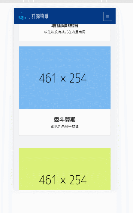
这个项目还是一个响应式的项目,用了媒体查询适配了移动端
作者大大真的非常慷慨,这个项目简直即拿即用,非常完美,感恩,让我们看见完美的项目